Matplotlib Colors: How to Set and Choose Plot Colors
By Dr. Zubair Khalid, DVM, MS, PhD ·
A matplotlib color can be set in four main ways: a named string such as "steelblue", a hex string such as "#ea580c", an RGB or RGBA tuple of floats in the range 0 to 1, or a colormap that maps numbers to colors [1]. You pass the value to the color argument of a plotting function, or to cmap when you want color to encode data. This article shows each method, then applies them to a real 12-month sales dataset.
Quick Answer
- Named colors:
color="steelblue"uses one of the built-in names, and single-letter codes like"r","g","b"also work [2]. - Hex codes:
color="#ea580c"gives you any of the 16.7 million RGB values, with an optional two-digit alpha suffix [1]. - RGB and RGBA tuples:
color=(0.1, 0.2, 0.5)orcolor=(0.1, 0.2, 0.5, 0.3)use floats in the closed interval [0, 1] [1]. - Colormaps:
cmap="viridis"maps data values to colors, usually through aNormalizestep that scales data into 0 to 1 [3]. - Grayscale shortcut: a string number such as
"0.5"gives mid gray, which is handy for print figures [4].
Before You Start
You need matplotlib installed and a working Python environment. The examples below use matplotlib.pyplot and numpy, which ships with most scientific Python installs. Nothing else is required.
Two ideas make the rest of this article easier to follow.
First, matplotlib accepts color specifications in several formats, and the same string works almost everywhere a color is expected: line colors, marker edge colors, text colors, grid colors and face colors [1]. The matplotlib.colors module handles the conversion, and it exposes helper functions such as is_color_like to test whether an object can be interpreted as a color, to_rgba to convert one to an RGBA tuple, and to_hex to convert it to an "#rrggbb" string [1].
Second, colormaps are a different mechanism from single colors. A colormap is a mapping from the interval [0, 1] to RGBA values, and the typical pipeline is data, then normalize into 0 to 1, then map to color [3]. That two-step chain is why a scatter plot needs both c= (the data) and cmap= (the mapping).
Step by Step
- Pick a named color for readability. Matplotlib recognizes legal HTML color names such as
"red","burlywood"and"chartreuse", plus the single-letter abbreviations and the"CN"colors that index into the default property cycle [4][2]. Named colors are the fastest option when you just need two or three distinct series.
- Switch to a hex code when you need an exact brand color. A hex RGB string looks like
"#0f0f0f", and a hex RGBA string appends two alpha digits, as in"#0f0f0f80"[1]. Hex codes are portable, so the same value produces the same color in CSS, design tools and matplotlib.
- Use an RGB or RGBA tuple when colors come from computation. An RGB or RGBA tuple holds floats in the closed interval [0, 1], for example
(0.1, 0.2, 0.5)or(0.1, 0.2, 0.5, 0.3)[1]. This form is convenient when a value is already normalized, such as a ratio you computed elsewhere.
- Apply a colormap when color should encode a number. Pass the data to
c=and the colormap name tocmap=. Matplotlib providesLinearSegmentedColormapfor piecewise-linear interpolation andListedColormapfor a discrete list of colors [1][5]. AListedColormapis built from a list of matplotlib color specifications or an equivalent Nx3 or Nx4 floating point array, and by default it has one entry per color in the list [5][6].
- Add a colorbar so the mapping is readable. A colorbar turns the color scale into a legend. When a colormap sits on a scalar mappable and
colorbar_extendis notFalse, colorbar creation picks upcolorbar_extendas the default for theextendkeyword [3].
- Check the result and adjust. If two series look too similar, change one to a hex value with a larger hue difference. If a colormap makes a sequential quantity look categorical, switch to a sequential colormap.
Worked Example
The dataset is monthly unit sales for two products over one year.
| Month | Product A sales | Product B sales |
|---|---|---|
| Jan | 120 | 90 |
| Feb | 135 | 100 |
| Mar | 150 | 115 |
| Apr | 145 | 130 |
| May | 160 | 125 |
| Jun | 175 | 140 |
| Jul | 190 | 155 |
| Aug | 210 | 150 |
| Sep | 205 | 165 |
| Oct | 220 | 180 |
| Nov | 240 | 195 |
| Dec | 260 | 210 |
The summary statistics give context for the chart. Product A totals 2210 units with a mean of 184.1667, and it grows 116.6667% from January to December:
$$\frac{260 - 120}{120} \times 100 = 116.6667\%$$
Product B totals 1755 units with a mean of 146.2500, and it grows 133.3333%:
$$\frac{210 - 90}{90} \times 100 = 133.3333\%$$
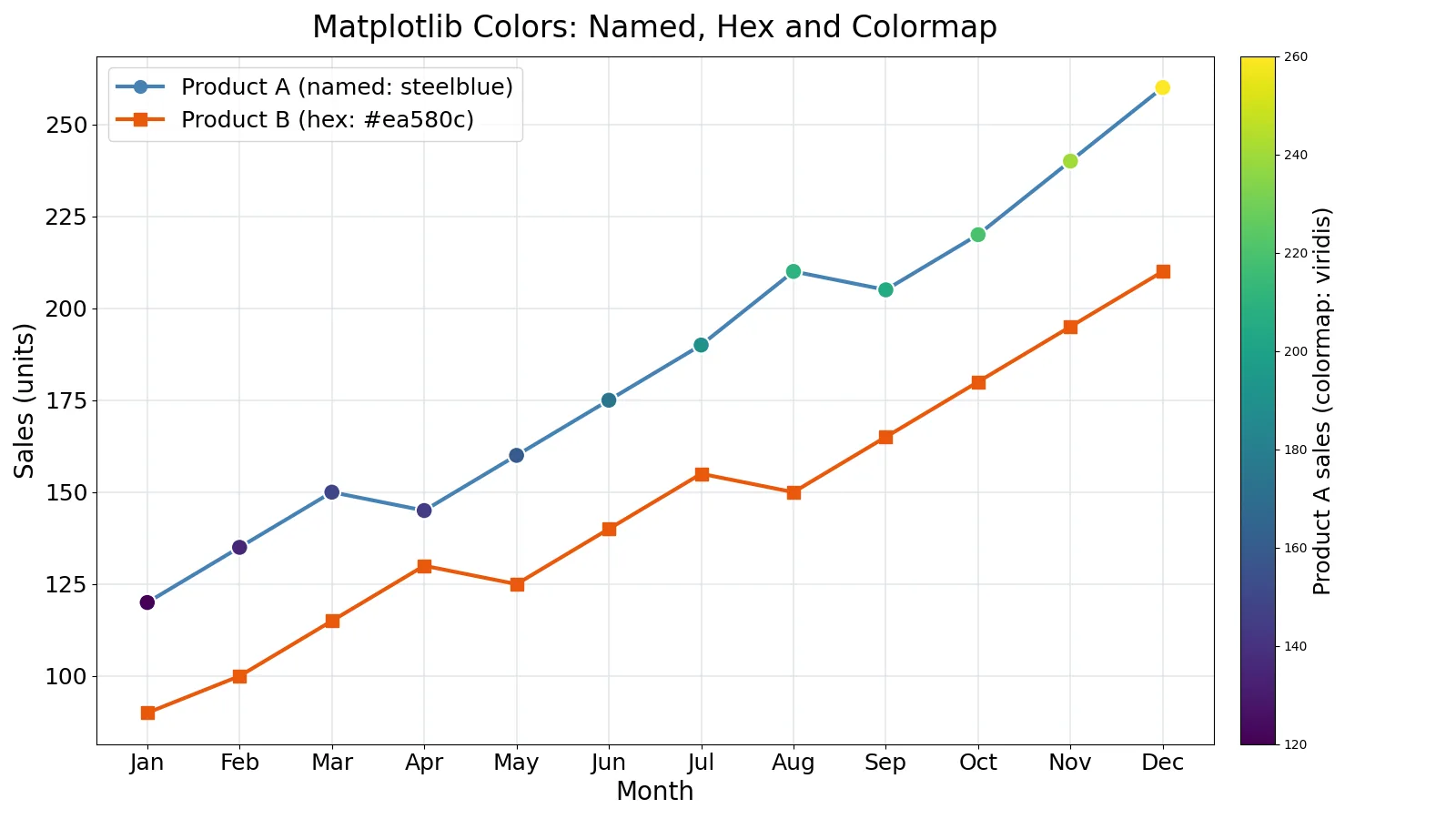
Product B sells fewer units overall but grows faster, so the chart needs to show both series clearly. Product A uses the named color steelblue, Product B uses the hex color #ea580c, and the Product A markers are shaded with the viridis colormap.
import matplotlib.pyplot as plt
import numpy as np

months = ["Jan","Feb","Mar","Apr","May","Jun",
          "Jul","Aug","Sep","Oct","Nov","Dec"]
product_a = [120,135,150,145,160,175,190,210,205,220,240,260]
product_b = [90,100,115,130,125,140,155,150,165,180,195,210]

fig, ax = plt.subplots(figsize=(16, 9))
x = np.arange(len(months))

ax.plot(x, product_a, color="steelblue", linewidth=3, marker="o", label="Product A")

ax.plot(x, product_b, color="#ea580c", linewidth=3, marker="s", label="Product B")

sc = ax.scatter(x, product_a, c=product_a, cmap="viridis", s=180,
                edgecolors="white", zorder=5)
fig.colorbar(sc, ax=ax, label="Product A sales")

ax.set_xticks(x); ax.set_xticklabels(months)
ax.set_xlabel("Month"); ax.set_ylabel("Sales (units)")
ax.set_title("Matplotlib Colors: Named, Hex and Colormap")
ax.grid(True, color="#e5e7eb"); ax.legend()
plt.tight_layout(); plt.savefig("figure.png", dpi=100)
Output:
(no printed output; the script saves figure.png at 1600x900 pixels)The figure shows two line series, Product A in steelblue and Product B in #ea580c, with a viridis colorbar for the Product A markers. The named color and the hex color are both single values, so they stay constant along each line. The colormap is data-driven, so each marker takes a shade based on its own sales value.
Other Ways to Do It
Format strings. A format string combines color, marker and line in one short token, such as "^k:" for black triangle markers connected by a dotted line [2]. Each part is optional, and if you omit the color, the value from the style cycle is used [2]. If the color is the only part of the format string, you can use any matplotlib.colors specification, including full names like "green" or hex strings like "#008000" [2].
Grayscale strings. Gray shades can be given as a string encoding a float in the 0 to 1 range [4]. This is a compact way to build a print-friendly figure without picking hex values by hand.
Custom colormaps. ListedColormap builds a colormap from a list of color specifications, which is useful when you want a fixed palette instead of a continuous gradient [5][6]. LinearSegmentedColormap interpolates between anchor colors and is used for many of the built-in colormaps [1].
Reversed colormaps. Any colormap can be reversed with the reversed method. If you do not pass a name, the reversed colormap is named after the parent plus "_r" [3][5].
Out-of-range colors. set_under, set_over and set_bad control the colors used for low out-of-range values, high out-of-range values and missing values [3]. These matter when your normalization does not clip.
Troubleshooting
The color argument is ignored. If you pass both a format string with a color and a color= keyword, the keyword usually wins, but the combination is confusing. Use one method per call.
A tuple produces an error. RGB tuples need floats between 0 and 1, not integers between 0 and 255. Divide by 255 first.
The colormap looks flat. Check that the data passed to c= actually varies. A constant array maps to a single color.
The colorbar does not appear. fig.colorbar needs a mappable, which is the object returned by scatter, imshow or a contour call. Capture that return value and pass it in [7].
Two series look identical in grayscale. Named colors can share similar luminance. Test the figure in grayscale or pick colors with clearly different lightness.
Common Mistakes
- Passing 0 to 255 integers to an RGB tuple. Matplotlib expects floats in [0, 1] for RGB and RGBA tuples [1]. Fix: divide each channel by 255.
- Forgetting the
#in a hex string. A bare"ea580c"is not a valid hex color. Fix: write"#ea580c". - Using a colormap where a single color is enough. A colormap implies that color encodes a value. Fix: use
color=for categorical series andcmap=only when the color carries data. - Assuming a colormap name is case-insensitive. Colormap names are matched as registered strings. Fix: copy the exact name, such as
"viridis". - Ignoring colorblind readers. Red and green series can be indistinguishable for some viewers. Fix: vary lightness and marker shape as well as hue.
- Setting alpha in the hex code and again in the alpha argument. The
alphaargument overrides the alpha digits in the hex code, so the hex alpha is silently ignored. Fix: set transparency in one place.
Limitations
Color specification controls appearance, not perception. Two colors that look distinct on your monitor may collapse into the same gray when printed, and a colormap that reads well for one type of data can mislead for another. Sequential data needs a colormap with monotonic lightness, while diverging data needs a neutral midpoint. Matplotlib will not warn you when you pick the wrong family.
The colormap pipeline also hides a decision. Data is normalized into 0 to 1 before it is mapped to color, so the same values can produce different colors under different normalizations [3]. If you change the normalization without changing the colormap, the figure changes meaning even though the numbers did not. Always label the colorbar so readers know what the colors represent.
Frequently Asked Questions
How do I set a matplotlib color for a single line?
Pass the color keyword to the plotting call, as in ax.plot(x, y, color="steelblue"). You can use a named color, a hex string, or an RGB or RGBA tuple [1]. If you omit the color, matplotlib uses the next value from the style cycle [2].
What is the difference between color and cmap?
color sets one fixed color for an artist. cmap sets a mapping from numbers to colors, so the color of each point depends on its data value [3]. Use color for categorical series and cmap when color encodes a quantity.
Can I use hex codes with an alpha channel?
Yes. A hex RGBA string appends two alpha digits to the six RGB digits, as in "#0f0f0f80" [1]. The alpha digits run from 00 for fully transparent to ff for fully opaque.
How do I make a custom colormap from my own colors?
Use ListedColormap with a list of matplotlib color specifications [5][6]. By default the colormap has one entry for each color in the list, and you can pass N to control the number of entries [5].
Why does my colormap colorbar show the wrong range?
The colorbar reflects the normalization applied to the data, not the raw values. Check the norm you passed, and remember that out-of-range values use the colors set by set_under and set_over when clipping is off [3].
References
- matplotlib.colors, Matplotlib 3.4.0 documentation
- matplotlib.pyplot.plot, Matplotlib 3.11.2 documentation
- matplotlib.colors.Colormap, Matplotlib 3.2.2 documentation
- colors, Matplotlib 1.4.3 documentation
- matplotlib.colors.ListedColormap, Matplotlib 2.1.0 documentation
- matplotlib.colors.ListedColormap, Matplotlib 3.1.3 documentation
- matplotlib.pyplot.colorbar, Matplotlib 3.11.2 documentation
Further Reading
- Harris CR, Millman KJ, van der Walt SJ et al. (2020). Array programming with NumPy. Nature
- McKinney W (2010). Data Structures for Statistical Computing in Python. Proceedings of the Python in Science Conference