Segmented Bar Chart: Definition and Examples
By Dr. Zubair Khalid, DVM, MS, PhD ·
A segmented bar chart is a bar chart in which each bar is divided into segments that represent the parts of a whole for that category. Every bar has the same total length, and the segments inside it show what share of that group falls into each subcategory. You use it when you want to compare proportions across groups, not raw totals.
Quick Answer
- A segmented bar chart (also called a stacked bar chart or segment bar graph) shows one bar per group, split into colored segments for each subcategory.
- Each bar represents 100% of that group, so the segments show proportions, not counts.
- You read it by comparing segment sizes across bars, not by comparing total bar heights, because all bars are the same length.
- It is the standard visual companion to a two-way table of relative frequencies [1].
- Use it to spot associations between two categorical variables, such as whether satisfaction differs by region.
What a Segmented Bar Chart Means
In plain terms, a segmented bar chart takes a whole and cuts it into slices, then repeats that for several groups side by side. Each bar is one group. Each colored block inside the bar is one subcategory. The blocks stack from the bottom to the top until the bar is full.
The precise statistical definition is narrower. A segmented bar chart is a graphical display of a two-way table in which the bars represent one categorical variable and the segments within each bar represent the conditional relative frequencies of a second categorical variable, given the first [1]. Because the segments are relative frequencies, each bar sums to 1 (or 100%).
This matters because it separates two questions. A regular bar chart answers "how many?" A segmented bar chart answers "what proportion, and does that proportion change from group to group?" The LibreTexts statistics material treats bar graphs as the general family for categorical data and lists segmented bars as a specialized variation that keeps the same underlying principles [2].
How It Works
The mechanism is simple division. For each group, you divide every subcategory count by that group's total.
For a group $g$ and a subcategory $s$:
$$p_{g,s} = \frac{n_{g,s}}{n_g}$$
where:
- $p_{g,s}$ is the proportion of group $g$ in subcategory $s$
- $n_{g,s}$ is the count of people or items in group $g$ and subcategory $s$
- $n_g$ is the total count for group $g$, equal to $\sum_s n_{g,s}$
Because every segment is divided by the same group total, the segments in a bar add to 1:
$$\sum_s p_{g,s} = 1$$
That single property is what makes the bars comparable. If you plotted raw counts instead, a group with 55 respondents would produce a taller bar than a group with 45, and the visual comparison would mix size with composition. Dividing by the group total removes the size difference and leaves only the shape.
Worked Example
A survey asked 200 respondents across 4 regions to rate their satisfaction. The raw counts are below.
| Region | Satisfied | Neutral | Dissatisfied | Total |
|---|---|---|---|---|
| North | 42 | 8 | 5 | 55 |
| South | 30 | 12 | 8 | 50 |
| East | 25 | 15 | 10 | 50 |
| West | 20 | 15 | 10 | 45 |
The grand total is 200 respondents, and 117 of them are satisfied overall, which is 58.5%.
Step 1. Take the raw counts per region. North is [42, 8, 5], South is [30, 12, 8], East is [25, 15, 10], and West is [20, 15, 10].
Step 2. Divide each count by its region total.
- North: 42/55 = 76.3636%, 8/55 = 14.5455%, 5/55 = 9.0909%
- South: 30/50 = 60.0000%, 12/50 = 24.0000%, 8/50 = 16.0000%
- East: 25/50 = 50.0000%, 15/50 = 30.0000%, 10/50 = 20.0000%
- West: 20/45 = 44.4444%, 15/45 = 33.3333%, 10/45 = 22.2222%
Step 3. Stack the percentages into one bar per region. Every bar now sums to 100%.
The same calculation in Python:
import pandas as pd
df = pd.DataFrame({
    'Satisfied':    [42, 30, 25, 20],
    'Neutral':      [ 8, 12, 15, 15],
    'Dissatisfied': [ 5,  8, 10, 10],
}, index=['North','South','East','West'])
pct = df.div(df.sum(axis=1), axis=0) * 100
print(pct.round(2))
Output:
       Satisfied  Neutral  Dissatisfied
North      76.36    14.55          9.09
South      60.00    24.00         16.00
East       50.00    30.00         20.00
West       44.44    33.33         22.22
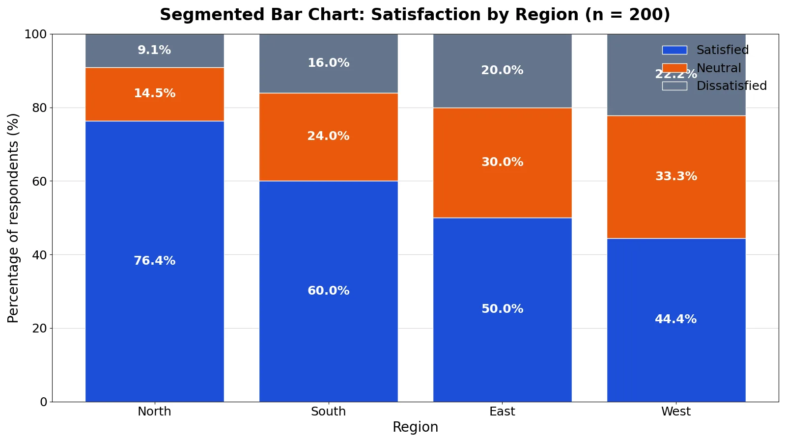
The finished chart is a stacked bar chart showing the percentage breakdown of 200 survey respondents across 4 regions and 3 satisfaction categories. North has the highest Satisfied share at 76.4%, and the Satisfied segment shrinks steadily as you move from North to West.
How to Interpret It
Read a segmented bar chart in two passes.
First, compare the same segment across bars. The Satisfied segment is 76.4% in North and 44.4% in West. That is a 32-point gap, and it is the main story in the data.
Second, compare the overall shape of each bar. If the bars all look alike, the two variables are probably independent. If the shapes differ noticeably, there is likely an association [1]. In the example, the bars change shape in a consistent direction, so satisfaction and region appear to be associated.
Two cautions apply. The bottom segment is the easiest to compare because it shares a common baseline. Segments higher up start at different heights, so their apparent sizes are harder to judge. And because every bar is full height, the chart tells you nothing about how many people are in each region. North has 55 respondents and West has 45, and you cannot see that difference here.
When to Use It (and when not to)
Use a segmented bar chart when:
- You have two categorical variables and want to compare composition across groups.
- Your groups have different totals and you want to remove that size difference.
- You want to show parts of a whole for several groups at once, which a single pie chart cannot do [3].
- You are following up a two-way table of relative frequencies with a visual [1].
Do not use it when:
- You care about absolute counts. Use a grouped bar chart instead.
- You have many subcategories. Past about five segments, the middle blocks become hard to compare.
- You have only one group. A pie chart or a single stacked bar is simpler, and the pie chart guidance on proportions of a whole still applies [3].
- Your subcategories have a natural order, such as "low, medium, high." A diverging or ordered stack reads better than an arbitrary color order.
If you are still deciding between chart families, the comparison of chart types and the guide to choosing the right chart both walk through the tradeoffs. To build one quickly, the bar graph maker handles stacked layouts directly.
Segmented Bar Chart vs Grouped Bar Chart
Both charts display two categorical variables. They differ in what they put on the axis.
| Feature | Segmented bar chart | Grouped bar chart |
|---|---|---|
| Bar layout | One bar per group, split into segments | One cluster of bars per group |
| What the length shows | Proportion within the group | Raw count or value |
| Bar totals | All equal (100%) | Vary by group |
| Best for | Comparing composition across groups | Comparing counts across groups |
| Weakness | Hides group size | Harder to see proportions |
| Subcategory limit | About 5 before it gets crowded | Flexible, but wide clusters get busy |
The choice comes down to one question. If the group totals are similar and you care about counts, use grouped bars. If the group totals differ and you care about proportions, use segmented bars.
Common Mistakes
- Plotting raw counts instead of percentages. The bars end up different lengths, so you cannot compare composition. Fix: divide each count by its group total before stacking.
- Comparing total bar heights. In a percentage segmented bar chart, every bar is 100%, so height carries no information. Fix: compare segment widths, not bar heights.
- Using too many segments. Six or more colors turn the middle of each bar into a guessing game. Fix: group small categories into an "Other" segment or switch to a different chart.
- Forgetting that the bottom segment is easiest to read. Readers overestimate differences in upper segments. Fix: order segments so the one you care about sits at the bottom.
- Mixing percentage and count labels. A bar labeled "45" next to a bar labeled "60%" confuses everyone. Fix: label all segments as percentages, and put group totals in the axis labels.
- Ignoring unequal group sizes. A 76% Satisfied share in a group of 55 is not the same evidence as 76% in a group of 5. Fix: show the group total somewhere on the chart.
Limitations
A segmented bar chart cannot show absolute magnitude. Once you convert to percentages, a group of 500 and a group of 5 look identical if their compositions match. If the size of each group matters to your argument, you need a second chart or a count label.
The chart also struggles with precision. Human eyes compare lengths along a common baseline well, but they compare areas and offset positions poorly. Segments in the middle of a stack are consistently misjudged, and small differences between adjacent segments are easy to miss. When the exact percentages matter, pair the chart with the underlying table, and see the comparison of data tables and graphs for how the two formats complement each other.
Frequently Asked Questions
What is the difference between a segmented bar chart and a stacked bar chart?
They are the same chart under two names. "Stacked bar chart" is the more common term in software menus, and "segmented bar chart" is the term used in statistics teaching materials [1]. When the bars are scaled to 100%, some writers call it a 100% stacked bar chart.
Does a segmented bar chart have to add up to 100%?
Not always, but it should if you want to compare proportions. If you stack raw counts, the bars have different totals and the segments are not comparable across groups. Scaling each bar to 100% is what makes the comparison valid.
How many segments can a segmented bar chart have?
Around four or five works well. Beyond that, the middle segments become hard to distinguish and the color legend gets long. If you have more subcategories, combine the smallest ones into a single group.
Can a segmented bar chart show an association between two variables?
Yes, that is one of its main uses. If the segment patterns are similar across all bars, the variables look independent. If the patterns differ, there is likely an association [1]. The eraser factory exercise in the same LibreTexts material uses exactly this logic to decide which machine needs fixing.
When should I use a pie chart instead?
Use a pie chart when you have a single group and want to show its parts. Use a segmented bar chart when you have several groups and want to compare their parts side by side. The pie chart definition and examples cover the single-group case in more detail.
References
- 6.3.2: Using Data Displays to Find Associations - Mathematics LibreTexts/06%3A_Associations_in_Data/6.03%3A_New_Page/6.3.2%3A_Using_Data_Displays_to_Find_Associations)
- 6.5: Bar Graphs - Mathematics LibreTexts
- Types of data visualization - Data Visualization - Guides at University of Houston
Further Reading
- Weissgerber TL, Milic NM, Winham SJ et al. (2015). Beyond Bar and Line Graphs: Time for a New Data Presentation Paradigm. PLOS Biology
- Rougier NP, Droettboom M, Bourne PE (2014). Ten Simple Rules for Better Figures. PLoS Computational Biology
- NIST/SEMATECH e-Handbook: Graphical Techniques
Related Articles
- Pie Chart Examples: When They Work and When They Mislead
- Chart vs Graph: Differences and When to Use Each
- Data Visualization Basics: How to Choose the Right Chart
- How to Make a Bar Chart in Excel (Step by Step)
- What Is a Pie Chart? Definition, Uses and Examples
- Bar Chart vs. Box Plot vs. Dot Plot
- Bar Charts vs. Box Plots vs. Scatter Plots
- Tabular Data: What It Is and How to Analyze It