How to Make a Bar Chart in Excel (Step by Step)
By Dr. Zubair Khalid, DVM, MS, PhD ·
To make a bar chart in Excel, select your data, go to Insert > Charts > Insert Column or Bar Chart, and pick Clustered Bar. Excel draws the chart immediately, and you can then add axis titles, data labels, and number formats from the Chart Design tab. The whole process takes about a minute once your data is arranged in two columns.
Quick Answer
- Put your category labels in one column and your numeric values in the column to the right.
- Select the full range, including the header row.
- Go to Insert > Charts > Insert Column or Bar Chart > Clustered Bar.
- Add axis titles and data labels from Chart Design > Add Chart Element.
- Right-click an axis and choose Format Axis to change number formats such as Currency.
Before You Start
A bar chart compares individual items. In Excel, the categories sit on the vertical axis and the values run along the horizontal axis [1]. That is the opposite of a column chart, where categories sit on the horizontal axis. If your category names are long, a bar chart reads better because the labels have room to sit horizontally.
Your data needs a simple shape. For a single series, arrange it in one column or row of values plus one column or row of labels [2]. The worked example below uses two columns: category names in column A and monthly sales in column B.
Two habits save time later:
- Keep the header row. Excel uses it for the chart title and legend.
- Avoid blank rows inside the range. If your data is not in a continuous range, you can select nonadjacent cells, but the selection must form a rectangle [2].
If you want a broader tour of chart types before committing, see How to Make a Chart in Excel.
Step by Step
- Enter your data. Type category names in column A and values in column B, with headers in row 1.
- Select the range. Click cell A1 and drag to B6, or select any single cell inside a continuous range and let Excel expand the selection [2].
- Insert the chart. Go to Insert > Charts > Insert Column or Bar Chart > Clustered Bar. A clustered bar chart shows bars in 2-D format and compares values across categories [3].
- Select the chart. Click on the chart so the Chart Design tab appears.
- Add the horizontal axis title. Go to Chart Design > Add Chart Element > Axis Titles > Primary Horizontal, then type "Monthly Sales".
- Add the vertical axis title. Go to Chart Design > Add Chart Element > Axis Titles > Primary Vertical, then type "Product Category".
- Add data labels. Go to Chart Design > Add Chart Element > Data Labels > Outside End. The values now sit at the end of each bar.
- Format the value axis. Right-click the horizontal axis, select Format Axis, and set the number format to Currency.
If you need more than one series per category, the same menu path works, and the layout details are covered in How to Make a Clustered Bar Chart in Excel.
Worked Example
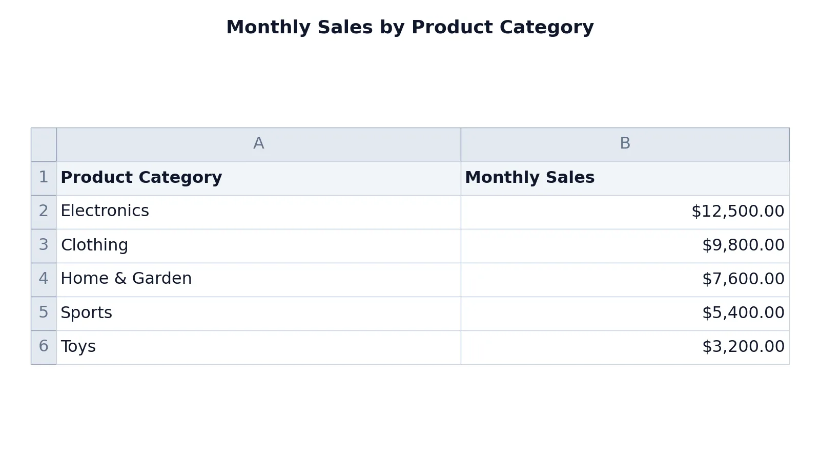
The table below holds monthly sales for five product categories. Column A holds the category names and column B holds the sales figures.
| A | B | |
|---|---|---|
| 1 | Product Category | Monthly Sales |
| 2 | Electronics | 12500 |
| 3 | Clothing | 9800 |
| 4 | Home & Garden | 7600 |
| 5 | Sports | 5400 |
| 6 | Toys | 3200 |
These are entered values, not formulas, so each cell returns exactly what you type. If you later want to derive a figure such as a total, you would write a formula in an empty cell, for example =SUM(B2:B6), which returns 38500. The basics of writing formulas like that are covered in How to Make a Formula in Excel.
Follow the steps above with this range and you get a clustered bar chart showing monthly sales for five product categories, with labeled axes and data labels. Excel plots the first category nearest the axis origin, so Electronics sits at the bottom with the longest bar at 12500, and Toys sits at the top with the shortest bar at 3200. The currency format on the horizontal axis turns 12500 into a currency value so the scale reads cleanly.
Other Ways to Do It
Recommended Charts. Select your data, then click Recommended Charts on the Insert tab to preview suggestions based on how your data is arranged [1]. Excel tailors the suggestions to your data, and long category text often pushes it toward a clustered bar chart [4].
Keyboard shortcut. Select the data and press Alt+F1 to insert a chart immediately [1]. It may not pick the best chart type for your data, so check the result and switch types if needed.
Screen reader path. Press Alt+Windows logo key, N to open the Insert tab, then press B for a Bar chart, use the right arrow key to choose the subtype, and press Enter [4].
Mac. In Excel for Mac, click the Insert tab, then click Recommended Charts or a specific chart type [5]. The Chart Design tab then gives you Add Chart Element, Quick Layout, and the style gallery [5].
Outside Excel. If you just need a quick visual and do not want to open a spreadsheet, the Bar Graph Maker takes pasted values and draws the chart for you.
Troubleshooting
The chart shows one bar per row instead of per category. Excel guessed the wrong orientation. Use Switch Row/Column on the Chart Design tab to flip it [5].
The wrong cells ended up in the chart. Click Select Data on the Chart Design tab and edit the range [5].
A category is missing. Check for a hidden row or column. Hidden data is excluded from the chart by default, and you can either unhide it or use chart filters to control which points appear [2].
The axis shows raw numbers instead of currency. Right-click the axis, choose Format Axis, and set the number format.
The bars are hard to compare. Sort the source data by value before charting, or switch to a different subtype. Stacked bar charts show how individual items relate to a whole, and 100% stacked bars compare the percentage each value contributes to a total across categories [3].
Common Mistakes
- Selecting only the numbers. Excel then invents category labels like 1, 2, 3. Fix: include the label column in the selection.
- Leaving the header row out. You lose the automatic title and legend text. Fix: start the selection at the header cell.
- Using a bar chart for time series. Bars compare items, not trends. Fix: use a line chart for change over time, as described in How to Make a Line Chart in Excel.
- Mixing units in one axis. Sales in dollars and counts in the same chart produce a misleading scale. Fix: split into two charts or use a secondary axis.
- Forgetting axis titles. Readers cannot tell what the numbers mean. Fix: add both titles from Add Chart Element.
- Leaving data labels off a small chart. With five or fewer bars, labels remove the need to read the axis. Fix: add Outside End labels.
Limitations
A bar chart shows comparison, not causation, and it cannot show how values changed over time. If your categories are ordered by date, a line chart or an X Y graph communicates the trend better, as covered in How to Create an X Y Graph in Excel.
Bar charts also mislead when the value axis does not start at zero, because bar length is the whole point of the chart. A truncated axis makes small differences look large. Keep the axis at zero unless you have a specific reason to cut it, and say so in the chart if you do.
Frequently Asked Questions
How do I create a bar graph in Excel with two columns of data?
Put labels in the left column and values in the right column, then select both columns including the headers. Go to Insert > Charts > Insert Column or Bar Chart > Clustered Bar. Excel uses the left column for categories and the right column for bar lengths.
What is the difference between a bar chart and a column chart in Excel?
The data is the same, but the orientation differs. In a bar chart, categories run along the vertical axis and values along the horizontal axis [1]. In a column chart, the axes swap. Bar charts suit long category names because the labels sit horizontally.
How do I add data labels to a bar chart?
Click the chart, then go to Chart Design > Add Chart Element > Data Labels and choose a position such as Outside End. The labels place each value at the end of its bar, so readers do not have to trace back to the axis.
Can I change the bar chart to a different chart type later?
Yes. With the chart selected, click Change Chart Type on the Chart Design tab and pick another option [5]. Your data stays linked, so the new chart uses the same range.
Why does my bar chart show the categories in the wrong order?
Excel plots categories in the order they appear in the source range. Sort the source data the way you want the bars to appear, or right-click the category axis, choose Format Axis, and reverse the category order.
References
- Create a chart from start to finish | Microsoft Support
- Select data for a chart | Microsoft Support
- Available chart types in Office | Microsoft Support
- Use a screen reader to create a chart and select a chart in Excel | Microsoft Support
- Create a chart in Excel for Mac | Microsoft Support
Further Reading
- Broman KW, Woo KH (2018). Data Organization in Spreadsheets. The American Statistician
- Ziemann M, Eren Y, El-Osta A (2016). Gene name errors are widespread in the scientific literature. Genome Biology