How to Make a Clustered Bar Chart in Excel (Step by Step)
By Dr. Zubair Khalid, DVM, MS, PhD ·
A clustered bar chart in Excel compares two or more data series across the same categories, drawing the bars side by side instead of stacked. It is the right choice when you want to see, for example, how Q1, Q2, and Q3 sales compare within each region. This guide walks through the data layout, the exact menu path, and the formatting settings that make the chart readable.
Quick Answer
- Put categories in the first column and one column per series to its right, with a header row.
- Select the whole range, then go to Insert > Charts > Insert Column or Bar Chart > Clustered Bar [1][2].
- Excel plots categories on the vertical axis and values on the horizontal axis in a bar chart [1].
- Right-click any bar and choose Format Data Series to set Gap Width and Series Overlap.
- If the series and categories come out swapped, switch the rows and columns of the plot [3].
Before You Start
A clustered bar chart needs a rectangular block of numbers. One column holds the category labels, and each remaining column holds one series. The header row supplies the series names, so leave it in the selection.
Excel decides which axis gets which data based on the shape of your selection. It places the larger number of rows or columns on the horizontal axis, and if rows and columns are equal it plots rows on the vertical axis and columns on the horizontal axis [3]. That rule explains most of the "my chart looks wrong" moments you will hit.
Bar charts are horizontal by default in Excel. The categories run down the vertical axis and the values run along the horizontal axis [1]. If you want vertical columns, choose the Column subtype instead. The two are separate entries in the same Insert menu.
If you are new to charting in general, the workflow is the same across chart types, so it helps to read how to make a chart in Excel first and come back here for the clustered specifics.
Step by Step
- Lay out the data. Enter category labels in column A and one column per series in B, C, D, and so on. Add a header row so Excel can name the series automatically.
- Select the range. Click the first cell of the header row and drag to the last value cell. In the example below that is A1:D5.
- Insert the chart. Go to Insert > Charts > Insert Column or Bar Chart > Clustered Bar [1][2]. Excel drops the chart onto the sheet.
- Check the orientation. Confirm that your categories sit on the vertical axis and the values on the horizontal axis. If they are reversed, see the Troubleshooting section.
- Format the series. Right-click any bar and choose Format Data Series. Set Gap Width to 50% and Series Overlap to 0%. Gap Width controls the space between category groups, and Series Overlap controls whether bars in the same group touch or separate.
- Add a title. Click the chart title and type a descriptive name such as "Quarterly Sales by Region".
- Adjust the axis if needed. If the value axis starts at a number that exaggerates differences, right-click the axis, open Format Axis, and set the minimum to 0.
Worked Example
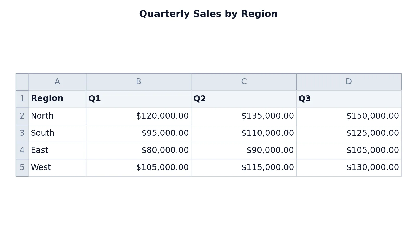
The dataset below tracks quarterly sales for four regions. Column A holds the categories, and columns B through D hold the three series.
| A | B | C | D | |
|---|---|---|---|---|
| 1 | Region | Q1 | Q2 | Q3 |
| 2 | North | 120000 | 135000 | 150000 |
| 3 | South | 95000 | 110000 | 125000 |
| 4 | East | 80000 | 90000 | 105000 |
| 5 | West | 105000 | 115000 | 130000 |
The values are plain numbers, so no formulas are involved. If you want to derive a series from other cells instead of typing it, how to make a formula in Excel covers the syntax.
The interface steps are:
- Select range A1:D5.
- Go to Insert > Charts > Insert Column or Bar Chart > Clustered Bar.
- Right-click any bar and choose Format Data Series.
- Set Gap Width to 50% and Series Overlap to 0%.
- Add chart title "Quarterly Sales by Region".
The result is a chart with four category groups (North, South, East, West) running down the vertical axis. Each group contains three bars, one for Q1, one for Q2, and one for Q3, so you can read the quarter-over-quarter pattern within each region at a glance.
If you want to build the same figure without opening Excel, the Bar Graph Maker accepts pasted values and produces a comparable grouped layout.
Other Ways to Do It
Keyboard shortcut. Select the data and press ALT + F1 to create a chart immediately, though Excel may not pick the clustered bar subtype for you [2].
Recommended Charts. On the Insert tab, open Recommended Charts and check the previews. If a clustered bar appears there, selecting it applies the subtype in one click [2].
Switch the plot orientation. With the chart selected, use the Switch Row/Column command on the Chart Design tab to move series between axes [3]. This is the fastest fix when Excel guesses wrong.
Change the subtype later. Right-click the chart, choose Change Chart Type, and pick a different bar variant. The same menu holds the stacked and 100% stacked options, which answer different questions [1].
Troubleshooting
The bars are vertical, not horizontal. You picked a Column subtype. Right-click the chart, choose Change Chart Type, and select Clustered Bar.
Categories and series are swapped. Excel plotted your series as categories. Use Switch Row/Column on the Chart Design tab [3].
Only one series appears. Your selection missed a column, or the extra column had no header. Reselect the full range including the header row.
Bars are too thin or too fat. Open Format Data Series and adjust Gap Width. Lower values make bars thicker.
The value axis starts above zero. Right-click the axis, open Format Axis, and set the minimum bound to 0. A truncated axis makes small differences look large.
The legend is missing or wrong. Click the chart, open the Chart Elements button, and toggle Legend on. Then confirm your header row was included in the original selection.
Common Mistakes
- Leaving the header row out of the selection. Excel then names the series "Series1", "Series2", and so on. Fix it by reselecting the range with row 1 included.
- Mixing units in one chart. Plotting revenue in dollars next to a count of orders on the same axis makes the smaller series invisible. Fix it by splitting into two charts or moving one series to a secondary axis.
- Sorting the categories alphabetically when order matters. Excel plots categories in the order they appear in the sheet. Fix it by sorting the source rows before you insert the chart.
- Setting Series Overlap to 100%. That makes the bars sit on top of each other and hides the comparison. Fix it by returning overlap to 0%.
- Truncating the value axis. Starting the axis at a high number exaggerates differences between regions. Fix it by setting the minimum to 0.
- Using a clustered bar for parts of a whole. Clustered bars compare values, they do not show how each piece contributes to a total [1]. Fix it by switching to a stacked bar when the total is the point.
Limitations
A clustered bar chart gets crowded fast. Once you pass roughly four or five series, the bars inside each group become thin and the legend turns into a lookup exercise. If you need more series than that, consider a line chart or a small-multiple layout instead.
The chart also hides totals. Because each bar is drawn independently, a reader cannot see the combined value of a category without adding it up mentally [1]. When the sum matters more than the individual parts, a stacked bar is the better tool. And because Excel plots categories in sheet order, an unsorted source table produces an unsorted chart, which can bury the pattern you were trying to show.
Frequently Asked Questions
What is the difference between a clustered bar chart and a stacked bar chart?
A clustered bar chart draws the series side by side within each category so you can compare individual values [1]. A stacked bar chart places them end to end so you can see how each series contributes to a category total [1]. Choose clustered when the comparison is between series, and stacked when the total is the message.
How do I switch the rows and columns in my chart?
Select the chart, then use the Switch Row/Column command on the Chart Design tab [3]. Excel moves the data between the category axis and the series axis. This is the standard fix when your regions appear in the legend instead of on the axis.
Why does my clustered bar chart show the categories in the wrong order?
Excel plots categories in the order they appear in the worksheet, not in alphabetical or numeric order. Sort the source rows before inserting the chart, or sort the underlying table and the chart will follow. Reordering the chart alone will not change the sheet.
Can I add a fourth or fifth series?
Yes, but readability drops quickly. Each additional series adds another bar to every category group, so the bars get thinner and the legend gets longer. Past four or five series, a line chart usually communicates the comparison better.
How do I make the bars wider?
Right-click any bar, choose Format Data Series, and lower the Gap Width percentage. A lower gap width leaves more room for the bars themselves. If the bars still look thin, you probably have too many series for the chart width, so widen the chart or reduce the series count.
References
- Available chart types in Office | Microsoft Support
- Create a chart from start to finish | Microsoft Support
- Change how rows and columns of data are plotted in a chart | Microsoft Support
Further Reading
- Broman KW, Woo KH (2018). Data Organization in Spreadsheets. The American Statistician
- Ziemann M, Eren Y, El-Osta A (2016). Gene name errors are widespread in the scientific literature. Genome Biology
- Microsoft Support: Excel help and learning