Chart vs Graph: Differences and When to Use Each
By Dr. Zubair Khalid, DVM, MS, PhD ·
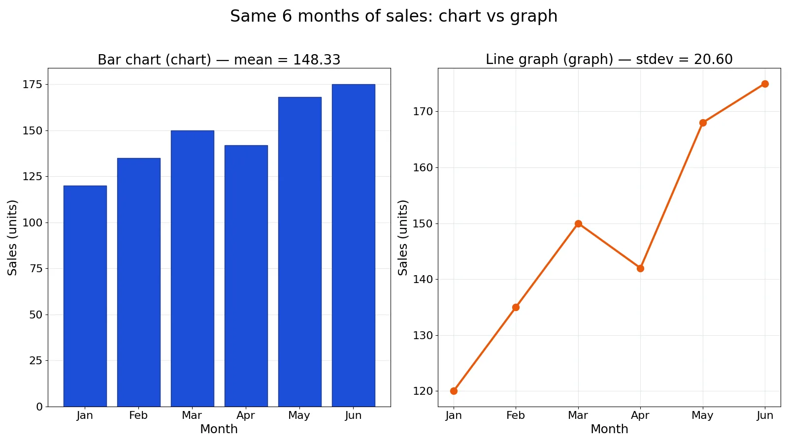
Chart vs graph is one of those distinctions that seems trivial until you are labeling a figure in a report and second-guessing yourself. The short version: every graph is a chart, but not every chart is a graph. A graph is a specific kind of chart that plots values against a coordinate system, usually with an x-axis and a y-axis.
This article breaks down the chart and graph difference, shows where the terms overlap, and gives you a worked example so you can see both formats side by side. By the end you will know which word to use and which visualization to build.
Quick Answer
- A chart is the broad category. It covers any visual display of data, including tables, diagrams, pie charts, bar charts, and graphs [1].
- A graph is a subtype of chart that shows data as points, lines, or bars positioned against axes, often tied to a mathematical function [1].
- Use graph when the relationship between variables matters, such as change over time or correlation between two measures.
- Use chart when you want the general term, or when the visual is not axis-based, such as a pie chart or a data table.
- In everyday writing, most people use the two words interchangeably, and that is usually fine. The distinction matters most when you are labeling figures, teaching, or writing documentation.
Key Differences
| Feature | Chart | Graph |
|---|---|---|
| Scope | Broad category for all data visuals | Subtype of chart |
| Axes required | No | Usually yes (x and y) |
| Typical examples | Pie chart, data table, flowchart, infographic | Line graph, bar graph, scatter plot |
| Best for | Organizing and comparing large datasets in detail | Showing relationships and trends quickly |
| Mathematical function | Not required | Often represents one [1] |
| Reader effort | Higher, more detail to parse | Lower, faster to grasp [1] |
The core idea from the University of Nevada, Las Vegas guide is that charts organize and compare multiple sets of large quantitative datasets, while graphs illustrate data in a more picture-like format and can show complex relationships without bogging readers down with details [1].
Chart Explained
A chart is any visual that presents data. That includes tables, diagrams, pie charts, bar charts, and graphs. The term is a catch-all, which is why it is the safer word when you are unsure.
Charts shine when the data needs to be analyzed in detail [1]. A well-built table lets a reader scan exact values. A pie chart shows how parts make up a whole. A flowchart maps a process. None of these require a coordinate system.
If you are comparing a data table against a visual, the tradeoff is precision versus speed. A table gives exact numbers. A chart gives shape and pattern. That tension is the subject of Data Table vs Graph: Differences and When to Use Each, which is worth reading if you regularly decide between the two.
Pie charts are a good example of a chart that is not a graph. They compare parts of a whole and do not show changes over time [2]. They also mislead easily when there are too many slices or when the slices are similar in size. For the full picture, see Pie Chart Examples: When They Work and When They Mislead.
Graph Explained
A graph is a chart that uses a coordinate system. You plot values against axes, and the position of each mark carries meaning. Line graphs, bar graphs, scatter plots, and area graphs all qualify.
Graphs are built for relationships. A line graph tracks how a variable changes over time [1]. An X-Y plot shows whether two variables move together, move in opposite directions, or show no pattern at all [2]. That makes graphs the default choice when your question is about trend, correlation, or change.
The NCES guide draws a useful line between graph types. Line graphs track changes over short and long periods, and they beat bar graphs when the changes are small [2]. Bar graphs compare things between groups or track change over time, but they work best when the changes are larger [2]. Area graphs suit two or more related groups that make up one whole category [2].
If you want the anatomy of axes, scales, and plotted points, What Is a Graph? Definition, Parts and Examples covers it in detail. For the specific case of two-variable plots, What Is an XY Graph? Axes, Plotting and Examples walks through the mechanics.
Worked Example
Here is a small dataset: monthly unit sales for a small retail shop over 6 months.
| Month | Sales |
|---|---|
| Jan | 120 |
| Feb | 135 |
| Mar | 150 |
| Apr | 142 |
| May | 168 |
| Jun | 175 |
The steps below compute the summary statistics you would put in a caption or a dashboard tile.
- Data (months, sales): [('Jan', 120), ('Feb', 135), ('Mar', 150), ('Apr', 142), ('May', 168), ('Jun', 175)]
- n (count of months): n = 6
- Sum of sales: SUM = 120+135+...+175 = 890
- Mean (Excel AVERAGE): AVERAGE = 890/6 = 148.3333
- Sample stdev (Excel STDEV.S, n-1): STDEV.S = sqrt(sum((x-148.3333)^2)/(6-1)) = 20.5977
- Population stdev (Excel STDEV.P, n): STDEV.P = sqrt(sum((x-148.3333)^2)/6) = 18.8031
- Range: MAX-MIN = 175-120 = 55
The mean sales figure is:
$$\bar{x} = \frac{890}{6} = 148.3333$$
The sample standard deviation uses the n-1 denominator:
$$s = \sqrt{\frac{\sum (x_i - \bar{x})^2}{n-1}} = 20.5977$$
Here is the same computation in Python.
import statistics
sales = [120, 135, 150, 142, 168, 175]
mean = statistics.mean(sales)          # 148.3333
sd_s = statistics.stdev(sales)         # 20.5977  (Excel STDEV.S)
sd_p = statistics.pstdev(sales)        # 18.8031  (Excel STDEV.P)
print(f"mean={mean:.4f}, stdev_s={sd_s:.4f}, stdev_p={sd_p:.4f}, sum={sum(sales)}, range={max(sales)-min(sales)}")
Output:
mean=148.3333, stdev_s=20.5977, stdev_p=18.8031, sum=890, range=55Now the visualization choice. The same six numbers can be drawn two ways. A bar chart on the left treats each month as a separate category to compare. A line graph on the right treats the months as a continuous sequence and emphasizes the upward trend from 120 to 175.
Both are correct. The bar chart answers "which month sold the most?" The line graph answers "is sales trending up?" That is the practical heart of the chart vs graph decision. The data did not change. The question did.
Notice the sample standard deviation (20.5977) is larger than the population standard deviation (18.8031). That gap is expected with a small n. If you are unsure which to report, Mean vs Median: Differences and When to Use Each covers the related question of which center to report when your data is skewed.
Which One Should You Use?
Start with your question, not the visual.
- Change over time? Use a line graph. It tracks a variable across periods and handles small changes better than bars [2].
- Compare groups? Use a bar chart. It compares things between different groups, and it handles larger changes well [2].
- Parts of a whole? Use a pie chart, but only with a handful of slices. Pie charts do not show changes over time [2].
- Two related groups over time? Use an area graph. It suits two or more related groups that form one whole category [2].
- Relationship between two variables? Use an X-Y plot. It reveals positive, negative, or absent relationships [2].
- Exact values needed? Use a table. Charts and graphs trade precision for pattern.
For a broader decision framework, Data Visualization Basics: How to Choose the Right Chart lays out the full selection process. If your data is categorical and stacked, Segmented Bar Chart: Definition and Examples shows how to handle multiple subgroups in one view.
On terminology: if the visual has axes, "graph" is always defensible. If it does not, "chart" is the correct word. When in doubt, "chart" is the safer umbrella term.
Common Mistakes
- Calling a pie chart a graph. A pie chart has no axes and no coordinate system. Fix: call it a pie chart, or use "chart" as the general term.
- Using a bar graph for small changes over time. Bars make small differences hard to see. Fix: switch to a line graph when the changes are small [2].
- Using a line graph for unrelated categories. Connecting categories that have no order implies a trend that does not exist. Fix: use a bar chart for unordered groups.
- Cramming too many lines into one graph. Multiple-line graphs compare variables, but too many lines make the chart unclear and confuse the audience [1]. Fix: split into small multiples or drop the least important series.
- Reporting the wrong standard deviation. Sample and population formulas differ, and the values differ too (20.5977 versus 18.8031 in the example above). Fix: use STDEV.S for a sample, STDEV.P for a full population.
- Assuming "chart" and "graph" are always interchangeable. They overlap most of the time, but not when the visual lacks axes. Fix: check whether a coordinate system is present before choosing the word.
Limitations
The chart versus graph distinction is a naming convention, not a rule enforced by any standard body. Different style guides, textbooks, and software tools use the terms differently, so you will find sources that call a bar chart a bar graph and sources that treat them as separate categories. The definitions here follow the common academic usage, where a graph is a chart with a coordinate system [1].
Terminology also will not save a bad visualization. Calling something a graph does not make it clearer, and a well-labeled chart beats a poorly designed graph every time. The choice of visual type matters far more than the label you put on it. If your chart type is wrong for the question, no amount of correct vocabulary will fix the reader's confusion.
Frequently Asked Questions
Is a bar chart a graph?
Yes, in most usage. A bar chart plots values against axes, so it fits the definition of a graph. Many style guides call it a bar graph for that reason. The two terms describe the same visual, and either label is acceptable as long as you are consistent within a document.
What is the difference between charts and graphs?
A chart is the broad category for any visual display of data, including tables, diagrams, and pie charts. A graph is a subtype of chart that uses a coordinate system, usually with an x-axis and a y-axis [1]. Every graph is a chart, but charts like pie charts and tables are not graphs.
Should I use a bar chart or a line graph?
Use a line graph when you are tracking change over time, especially when the changes are small [2]. Use a bar chart when you are comparing different groups or when the changes over time are larger [2]. If your categories have no natural order, a bar chart is the safer choice.
Can I use chart and graph interchangeably?
In casual writing, yes, and most readers will not notice. In technical writing, labeling, and teaching, keep the distinction. Use "graph" when axes are present and "chart" when they are not. Consistency within a single document matters more than picking the theoretically perfect word.
What is the difference between a chart and a table?
A table lists exact values in rows and columns. A chart presents data visually to show pattern and shape. Tables win when readers need precise numbers. Charts win when readers need to spot a trend quickly. The tradeoff is precision versus speed, and it is covered in more depth in Data Table vs Graph: Differences and When to Use Each.
References
- Charts and Graphs - Data Visualization - LibGuides at University of Nevada, Las Vegas
- How Do I Choose Which Type of Graph to Use?-NCES Kids' Zone
Further Reading
- Weissgerber TL, Milic NM, Winham SJ et al. (2015). Beyond Bar and Line Graphs: Time for a New Data Presentation Paradigm. PLOS Biology
- Rougier NP, Droettboom M, Bourne PE (2014). Ten Simple Rules for Better Figures. PLoS Computational Biology
- NIST/SEMATECH e-Handbook: Graphical Techniques
- Cleveland WS, McGill R (1984). Graphical Perception: Theory, Experimentation, and Application to the Development of Graphical Methods. Journal of the American Statistical Association
Related Articles
- Data Table vs Graph: Differences and When to Use Each
- Data Visualization Basics: How to Choose the Right Chart
- Pie Chart Examples: When They Work and When They Mislead
- Segmented Bar Chart: Definition and Examples
- What Is an XY Graph? Axes, Plotting and Examples
- Bar Charts vs. Box Plots vs. Scatter Plots
- How to Choose the Right Chart Type for Your Research Data
- Bar Chart vs. Box Plot vs. Dot Plot