What Is a Pie Chart? Definition, Uses and Examples
By Dr. Zubair Khalid, DVM, MS, PhD ·
A pie chart is a circular graph divided into slices, where each slice shows one category's share of a total. The slice angle and area are proportional to the value it represents, so all slices together add up to 100 percent. Use one when you want to show a simple parts-to-whole relationship across a handful of categories.
Quick Answer
- A pie chart definition in one line: a circle split into slices whose sizes are proportional to the quantities they represent [1].
- Each slice's central angle equals its share of the total times 360 degrees.
- Pie charts work best for parts-to-whole comparisons with a small number of categories [2].
- They are weak when categories have similar values, because the eye struggles to compare close slice sizes [2].
- The earliest known pie chart is credited to William Playfair's Statistical Breviary of 1801 [1].
What a Pie Chart Means
In plain terms, a pie chart is a round chart that looks like a sliced pie. Each slice is one category, and the size of the slice tells you how big that category is compared with the whole. If one slice takes up half the circle, that category is half of the total.
The precise statistical definition is stricter. A pie chart is a circular statistical graphic divided into slices to illustrate numerical proportion. The arc length of each slice, and therefore its central angle and area, is proportional to the quantity it represents [1]. That proportionality is the whole point. The chart encodes a share as a physical angle and area, so a reader can compare parts to the whole at a glance.
People also search for this idea under several names. "Pie graph definition" and "pie diagram definition" mean the same thing. Some sources call it a circle chart [1]. Whatever the label, the mechanics are identical: one circle, several slices, each slice sized by its share.
How It Works
The mechanism is a simple proportion. For each category, you divide its value by the total of all values, then multiply by 360 degrees to get the slice's central angle.
$$\text{Slice angle} = \frac{\text{Category value}}{\text{Total of all values}} \times 360^\circ$$
Here is what each symbol means.
- Category value: the count or amount for one slice, such as the number of responses in group A.
- Total of all values: the sum of every category value, which is the whole.
- 360 degrees: the full angle of a circle, so the slices together fill it exactly.
If you prefer percentages, the same proportion works with 100 instead of 360.
$$\text{Slice percentage} = \frac{\text{Category value}}{\text{Total of all values}} \times 100\%$$
Because every slice uses the same total, the percentages always sum to 100 percent. That self-checking property is one reason pie charts are popular for survey results and budget breakdowns.
Worked Example
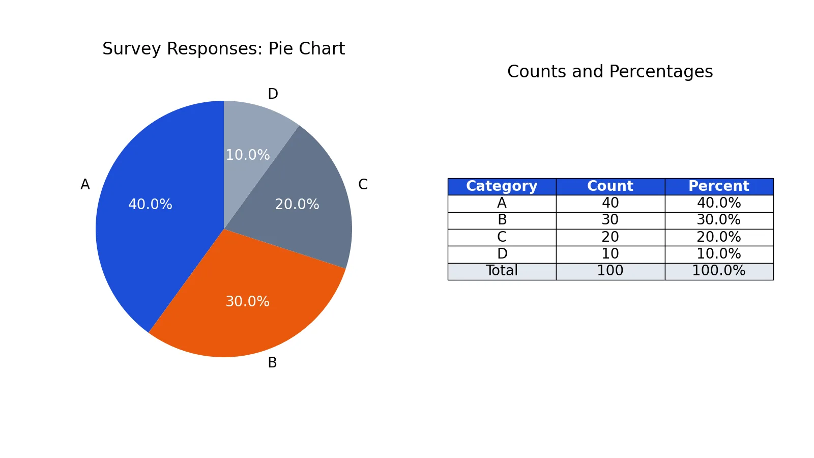
Suppose a survey collected responses across four categories, A, B, C and D. The counts are shown below.
| Category | Count |
|---|---|
| A | 40 |
| B | 30 |
| C | 20 |
| D | 10 |
Step 1. Add the counts to get the total.
40 + 30 + 20 + 10 = 100
Step 2. Convert each count to a percentage by dividing by the total and multiplying by 100.
- A: 40 / 100 * 100 = 40.0000%
- B: 30 / 100 * 100 = 30.0000%
- C: 20 / 100 * 100 = 20.0000%
- D: 10 / 100 * 100 = 10.0000%
Step 3. Check that the percentages sum to 100.
40.0000 + 30.0000 + 20.0000 + 10.0000 = 100.0000%
The check passes, so the slices are valid. Category A is the largest slice at 40 percent, and D is the smallest at 10 percent.
You can draw this in Python with matplotlib.
import matplotlib.pyplot as plt
labels = ['A', 'B', 'C', 'D']
counts = [40, 30, 20, 10]
plt.pie(counts, labels=labels, autopct='%1.1f%%')
plt.title('Survey Responses')
plt.show()
Output:
(no printed output; plt.show() opens the chart window)The resulting chart shows four slices labeled A=40.0%, B=30.0%, C=20.0% and D=10.0%.
How to Interpret It
Read a pie chart by comparing each slice to the whole circle, not to the other slices alone. A slice that covers a quarter of the circle is 25 percent. A slice that covers half is 50 percent. The full circle is always the total.
Start with the largest slice to find the dominant category. Then look at how the remaining slices divide the rest. In the survey example, A alone is 40 percent, so it is the single biggest group, while B, C and D together make up the other 60 percent.
Be careful with similar slices. When two categories are close in value, the eye cannot reliably tell which is bigger [2]. If the exact ranking matters, read the labels or the underlying numbers instead of judging by eye. For a deeper look at where this works and where it fails, see pie chart examples: when they work and when they mislead.
When to Use It (and when not to)
Use a pie chart when you have a parts-to-whole relationship and a small number of categories. It is a good fit for showing how different brands contribute to revenue, or how passenger classes split on a ship, because the goal is the relationship of parts to the whole [2]. Business reporting uses them often for percentages of customer types, revenue by product and profit by country [2].
Do not use a pie chart when the values are very similar. When categories are close, a bar chart is easier to read because it compares lengths on a common scale [2]. Skip the pie chart too when you have many categories, since thin slices become hard to label and compare. If you need to compare two or more groups side by side, a segmented bar chart usually communicates the comparison more clearly.
A quick rule: if the message is "this part is about half of the whole," a pie chart works. If the message is "this category is slightly larger than that one," use a bar chart.
Pie Chart vs Bar Chart
Both charts show the same numbers, but they answer different questions. A pie chart emphasizes the share of a whole. A bar chart emphasizes the size of each category against a common axis.
| Feature | Pie chart | Bar chart |
|---|---|---|
| Encodes values as | Angle and area | Length |
| Best for | Parts of a whole | Comparing categories |
| Number of categories | Few | Many |
| Similar values | Hard to compare | Easy to compare |
| Shows a total | Yes, the full circle | No, unless stated |
The key difference is what the reader can judge. Lengths on a shared axis are easier to compare than angles, which is why bar charts win when precise comparison matters [2]. Pie charts win when the share of the whole is the story.
Common Mistakes
- Using a pie chart for too many categories. Thin slices are hard to read. Fix: group small categories into an "Other" slice or switch to a bar chart.
- Comparing similar slices by eye. Close values look nearly identical. Fix: add percentage labels or use a bar chart.
- Forgetting that slices must sum to 100 percent. If your values do not total the whole, the chart misleads. Fix: check the sum before plotting.
- Using a 3D or tilted pie chart. Perspective distorts slice sizes so a smaller slice can look larger. Fix: use a flat 2D pie chart [1].
- Mixing parts and wholes. A pie chart needs categories that together form one total. Fix: if the categories overlap or are not exhaustive, use a different chart.
- Leaving out the total. A slice of 40 percent means little without knowing the base. Fix: state the total count or amount.
Limitations
A pie chart cannot show change over time, relationships between variables, or more than one whole at once. It encodes values as angles and areas, which people judge less accurately than lengths, so it is a poor tool for precise comparison [2]. When categories are similar in size, the chart hides the difference instead of revealing it.
It also breaks down with many categories. As slices get thinner, labels crowd and the chart becomes unreadable. A pie chart is a summary view, not an analysis tool. If you need to compare groups, track trends, or rank many items, another chart type will serve you better.
Frequently Asked Questions
What is the simple definition of a pie chart?
A pie chart is a circle divided into slices, where each slice represents a category's share of the total. The slice angle and area are proportional to the value it stands for [1]. All slices together form the whole, which is 100 percent.
What is the difference between a pie chart and a pie graph?
There is no real difference. "Pie chart" and "pie graph" are two names for the same circular graphic. Some sources also call it a circle chart [1]. The choice of word does not change how it is built or read.
When should you not use a pie chart?
Avoid a pie chart when categories have similar values, when there are many categories, or when you need to compare groups or track change over time. In those cases a bar chart is easier to interpret [2]. Use a pie chart only for a simple parts-to-whole message.
How do you calculate the size of each slice?
Divide each category value by the total of all values, then multiply by 360 degrees for the angle or by 100 for the percentage. For example, a value of 40 out of 100 gives 40 percent, or 144 degrees. The slices always sum to the full circle.
Who invented the pie chart?
The earliest known pie chart is generally credited to William Playfair's Statistical Breviary of 1801 [1]. The French engineer Charles Joseph Minard also used pie charts later, in 1858, to map cattle sent to Paris for consumption [1].
References
Further Reading
- Weissgerber TL, Milic NM, Winham SJ et al. (2015). Beyond Bar and Line Graphs: Time for a New Data Presentation Paradigm. PLOS Biology
- Rougier NP, Droettboom M, Bourne PE (2014). Ten Simple Rules for Better Figures. PLoS Computational Biology
- NIST/SEMATECH e-Handbook: Graphical Techniques
- Cleveland WS, McGill R (1984). Graphical Perception: Theory, Experimentation, and Application to the Development of Graphical Methods. Journal of the American Statistical Association