Pie Chart Examples: When They Work and When They Mislead
By Dr. Zubair Khalid, DVM, MS, PhD ·
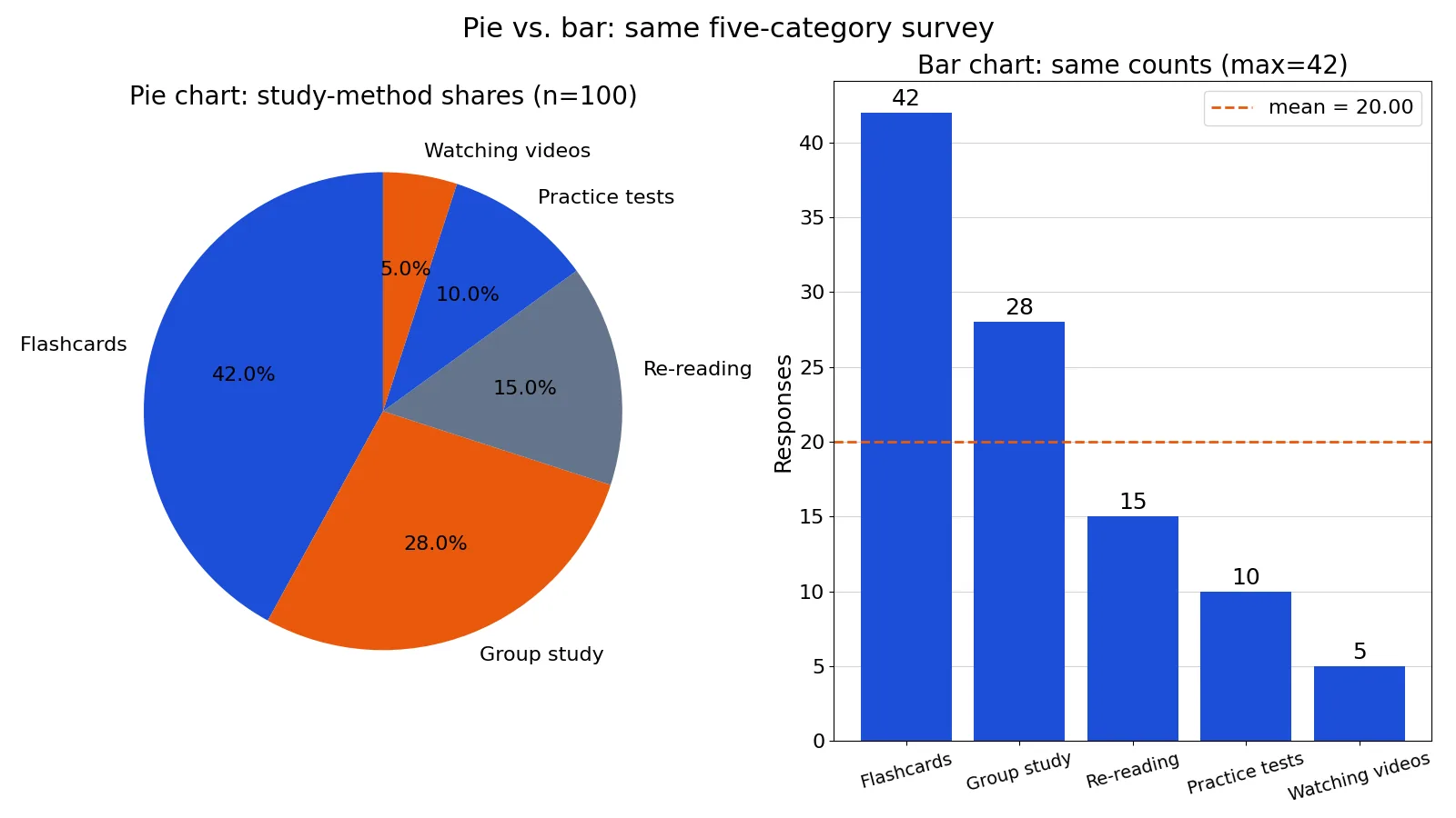
Pie charts answer one question well: how does a whole split into parts? If you need to show that flashcards account for 42% of study-method preferences, a pie chart can do it. If you need to compare five similar values or track change over time, it usually fails.
Quick Answer
- A pie chart shows a single categorical variable split into parts of one whole, and each slice is a share of 100% [1].
- Use it when you have a small number of categories, ideally five or fewer, and the parts differ enough to see [1].
- Avoid it when slices are similar in size, because the eye judges angles and areas poorly [2].
- The math is simple: share = count / total, and slice angle = share x 360 degrees [3].
- When you need precise comparisons, a bar chart or dot chart is easier to read [2].
What a Pie Chart Means
A pie chart is a circle divided into slices, where each slice represents the count or percentage of observations in one category of a variable [1]. The whole circle stands for 100% of the data, so every slice is a fraction of that total.
The precise statistical definition is narrower. A pie chart displays a single categorical variable measured on a nominal or ordinal scale, and it requires that every observation belongs to exactly one category. If a respondent could pick two study methods, the shares would sum to more than 100% and the chart would be wrong. That single-choice requirement is what makes the parts-to-whole relationship valid.
How It Works
Two formulas drive every pie chart. The share of each category is its count divided by the total:
$$\text{share}_i = \frac{\text{count}_i}{\sum_{j=1}^{k} \text{count}_j}$$
The slice angle converts that share into degrees of the circle:
$$\text{angle}_i = \text{share}_i \times 360^\circ$$
Here is what each symbol means. $\text{count}_i$ is the number of observations in category $i$. The denominator $\sum_{j=1}^{k} \text{count}_j$ is the sum of all category counts, which equals the total number of observations. $k$ is the number of categories. $\text{share}_i$ is a proportion between 0 and 1. Multiplying by 360 gives the central angle, and all angles must sum to 360 degrees.
Worked Example
A survey asked students to name their preferred study method, and each student chose one option. The raw counts are below.
| Method | Count |
|---|---|
| Flashcards | 42 |
| Group study | 28 |
| Re-reading | 15 |
| Practice tests | 10 |
| Watching videos | 5 |
Step 1, find the total. The sum of counts is 42 + 28 + 15 + 10 + 5 = 100.
Step 2, compute each share. Divide each count by 100: 42/100 = 0.4200, 28/100 = 0.2800, 15/100 = 0.1500, 10/100 = 0.1000, and 5/100 = 0.0500.
Step 3, convert to percentages. Multiply each share by 100: 42.00%, 28.00%, 15.00%, 10.00%, and 5.00%.
Step 4, compute slice angles. Multiply each share by 360: 151.2000 degrees, 100.8000 degrees, 54.0000 degrees, 36.0000 degrees, and 18.0000 degrees.
Step 5, check the angles. They sum to 360.0000 degrees, which confirms the arithmetic.
In Excel, if the counts sit in B2 through B6, the total formula in B7 is =SUM(B2:B6), which returns 100. The percentage in C2 is =B2/$B$7*100, which returns 42.0000. The angle in D2 is =B2/SUM($B$2:$B$6)*360, which returns 151.2000.
The same chart in Python:
import matplotlib.pyplot as plt
labels = ['Flashcards','Group study','Re-reading','Practice tests','Watching videos']
counts = [42, 28, 15, 10, 5]
fig, (ax1, ax2) = plt.subplots(1, 2, figsize=(16, 9))
ax1.pie(counts, labels=labels, autopct='%1.1f%%')
ax2.bar(labels, counts)
plt.tight_layout(); plt.savefig('figure.png', dpi=100)
total = sum(counts)
print(f"total={total}; percentages={[round(c/total*100, 1) for c in counts]}; "
      f"angles={[round(c/total*360, 1) for c in counts]}; mean={total/len(counts):.4f}")
Output:
total=100; percentages=[42.0, 28.0, 15.0, 10.0, 5.0]; angles=[151.2, 100.8, 54.0, 36.0, 18.0]; mean=20.0000The figure shows the pie and bar chart side by side. The pie slices show percent shares, and the bar chart shows raw counts with a mean of 20.00. Notice how much easier it is to see that practice tests (10) and watching videos (5) differ when they sit on a common bar scale.
How to Interpret It
Read a pie chart by comparing each slice to the whole circle, not to its neighbors. In the example, flashcards take up 42.00% of the circle, which is close to half. That is a parts-to-whole statement, and it is the strength of the format [1].
The weakness appears when you compare two slices. The re-reading slice is 15.00% and the practice-tests slice is 10.00%. On the pie, that five-point gap is a small angle difference of 18 degrees, and most readers cannot estimate it reliably. The bar chart makes the same gap obvious because both bars start from zero on the same scale [2]. Cleveland's research found that people judge position along a common scale far more accurately than they judge angles [2].
When to Use It (and when not to)
Use a pie chart when the parts-to-whole message is the point and the categories are few. A good example is showing how different product lines contribute to total revenue, where one line clearly dominates and the rest are visibly smaller [1]. Business reporting uses this pattern often, including percentages of customer types, revenue by product, and profit by country [1].
Use it when one or two slices carry the story. The Titanic passenger chart works because the goal is to show that over half of passengers held third-class tickets, and the remaining passengers split roughly evenly between first and second class [1].
Do not use a pie chart when values are similar. When the parts-to-whole values are close, a bar chart is easier to interpret [1]. Do not use one when you have many categories, because a pie chart becomes difficult to read when it contains many similar slices [4]. Do not use one for change over time, since a pie chart has no time axis. If you need to compare groups across a second variable, a segmented bar chart handles that job better.
Pie Chart vs Bar Chart
Both display a categorical variable, but they answer different questions. A pie chart shows how parts relate to the whole. A bar chart compares category values against a shared scale [4].
| Feature | Pie Chart | Bar Chart |
|---|---|---|
| Question answered | Parts of a whole | Comparison across categories |
| Visual encoding | Angle and area | Length or position |
| Accuracy of reading | Lower for close values [2] | Higher, position on a common scale [2] |
| Best category count | Few, around five or fewer [1] | Many categories fine [4] |
| Shows percentages | Yes, sums to 100% | Only if you add them |
| Shows raw counts | Indirectly | Directly |
| Change over time | Not suitable | Suitable with grouped bars |
The practical rule: if your sentence starts with "what share," a pie chart may fit. If it starts with "which is bigger" or "how much more," use bars.
Common Mistakes
- Using a pie chart for similar values. When slices differ by a few points, readers cannot rank them. Fix it by switching to a bar chart or dot chart [2].
- Including too many categories. Ten thin slices turn the circle into noise. Fix it by grouping small categories into an "Other" slice or using a bar chart [4].
- Letting percentages not sum to 100%. This happens with multi-select questions. Fix it by confirming each respondent chose exactly one option before charting.
- Forgetting to label slices. An unlabeled pie forces readers to guess. Fix it by adding category names and percentages directly on or beside each slice [3].
- Using 3D or exploded pies. Tilting the circle distorts the angles that carry the data. Fix it by keeping the chart flat and two-dimensional.
- Comparing two pies side by side. Readers must mentally align slices across two circles. Fix it by using a grouped or segmented bar chart instead.
Limitations
A pie chart cannot show more than one variable at a time, and it cannot show relationships between categories beyond their shares. It also cannot display negative values, since a negative share of a whole has no meaning. If your data includes losses or deficits, a bar chart is the only sensible option.
The deeper limitation is perceptual. The eye is good at judging linear measures and bad at judging relative areas and angles [2]. Every pie chart asks readers to do the harder task. That does not make pie charts useless, but it does mean you should reserve them for cases where the message is coarse, such as "about half" or "the smallest slice," and use a chart with a common scale when the message is precise.
Frequently Asked Questions
What are some good examples of a pie chart?
Good examples include revenue share by product line, market share by brand, and passenger class on the Titanic [1]. Each has a small number of categories and a clear parts-to-whole story. The study-method survey above is another, with five categories and one dominant slice.
How many slices should a pie chart have?
Keep it to about five or fewer. Pie charts work when there are a small number of levels [1]. Beyond that, slices get thin and the chart becomes hard to read, especially when several slices are similar in size [4].
Why do people say pie charts are bad?
The main reason is perceptual. People judge angles and areas less accurately than lengths or positions on a common scale [2]. Cleveland noted that any data shown by a pie chart can also be shown by a dot chart, which supports more accurate judgments [2].
Can a pie chart show raw counts instead of percentages?
Yes, but the circle still represents the total, so the slices are proportional to the counts. In the worked example, the 42 flashcards out of 100 responses produce a 151.2-degree slice. Labeling with counts and percentages together is often the clearest option [3].
What should I use instead of a pie chart?
Use a bar chart when you need to compare categories, and a dot chart when you want the most accurate comparisons [2]. Use a segmented bar chart when you need to compare parts of a whole across several groups. For a single categorical variable with few categories, a pie chart is still acceptable [5].
References
- Pie Chart
- Stat 3011 (Geyer and Jones, Spring 2006) Pie and Bar Charts
- 3.6.1: Pie Charts - Mathematics LibreTexts/03%3A_More_Types_of_Fractions-_Decimals_Percents_Ratios_and_Rates/3.06%3A_Visualizing_Percents/3.6.00%3A_Pie_Charts)
- Data Visualization Techniques Explained with Examples
- Pie Charts
Further Reading
Related Articles
- What Is a Pie Chart? Definition, Uses and Examples
- Chart vs Graph: Differences and When to Use Each
- Residual Plots: How to Interpret Them with Examples
- Interval Scale Questions: Examples and How to Use Them
- Correlation Examples: Positive, Negative and Zero Relationships
- How Scientific Posters Mislead With Data Visualization
- Qualitative Data Examples: How to Recognize and Use Non-Numerical Evidence
- Statistical Symbols and Notation: A Quick Reference