Seaborn in Python: Plot Types and Examples
By Dr. Zubair Khalid, DVM, MS, PhD ·
Seaborn is a Python data visualization library built on top of matplotlib that provides a high-level interface for drawing attractive and informative statistical graphics [1]. You hand it a pandas DataFrame, name the columns you want on each axis, and it handles the drawing, grouping, and styling for you. This article covers the main plot types in seaborn and walks through a complete example with real numbers.
Quick Answer
- Seaborn is a Python visualization library based on matplotlib, with a high-level interface for statistical graphics [1].
- It works naturally with pandas DataFrames and tidy (long-form) data, so most plots are one function call [2].
- Common plot types include scatter plots, line plots, box plots, violin plots, histograms, bar plots, and regression plots.
- Figure-level functions like
relplot()combine a FacetGrid with an axes-level function such asscatterplot()[3]. - Seaborn does not replace matplotlib. Every seaborn plot produces matplotlib figures and axes, so you can still fine-tune with matplotlib when needed [2].
Before You Start
You need Python with pandas, seaborn, and matplotlib installed. The standard import block is:
import pandas as pd
import seaborn as sns
import matplotlib.pyplot as plt
Seaborn accepts data from pandas or numpy objects as well as built-in Python types like lists and dictionaries [4]. Most functions are oriented toward vectors of data, meaning each variable you plot should be a vector. When you plot x against y, each variable is a column in your table.
Seaborn draws a fundamental distinction between long-form and wide-form data tables and treats each differently [4]. Long-form data has one row per observation, with a column identifying the group and a column holding the value. This is the format you want for almost everything below. A long-form table for the flights dataset, for example, has three variables: year, month, and number of passengers [4].
The library is built around a specific model of how data should be structured and how variables map to visual elements [2]. Once you understand that model, the function signatures become predictable.
Step by Step
- Load your data into a DataFrame. Seaborn reads column names directly, so keep your data tidy with one observation per row.
- Pick the plot type that matches your question. Use
scatterplot()when both variables are numeric and you want to see a relationship [3]. Uselineplot()for trends over an ordered variable. Useboxplot()orviolinplot()to compare distributions across groups. Usehistplot()for a single variable's distribution.
- Map columns to visual roles. Assign columns to
x,y, and optionallyhue. The hue semantic colors points by a third variable, which adds a dimension to a two-dimensional plot [3].
- Choose a figure-level or axes-level function. Figure-level functions like
relplot()create their own figure and can facet across subplots. Axes-level functions likescatterplot()draw onto a matplotlib axes you control [3].
- Layer plots when you need more detail. You can call two axes-level functions in sequence to overlay them on the same axes.
- Label and show. Add a title with matplotlib, then call
plt.show().
Worked Example
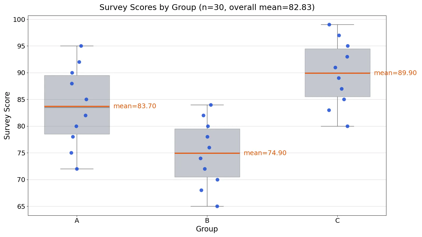
The dataset is 30 survey scores on a 0 to 100 scale, split evenly across three groups A, B, and C with 10 responses each. The goal is to compare the score distributions across groups.
| group | score |
|---|---|
| A | 72, 75, 78, 80, 82, 85, 88, 90, 92, 95 |
| B | 65, 68, 70, 72, 74, 76, 78, 80, 82, 84 |
| C | 80, 83, 85, 87, 89, 91, 93, 95, 97, 99 |
Loading the data gives df.shape = (30, 2), so 30 rows and 2 columns.
The group means are:
$$\bar{A} = \frac{837}{10} = 83.7000$$
$$\bar{B} = \frac{749}{10} = 74.9000$$
$$\bar{C} = \frac{899}{10} = 89.9000$$
The overall mean across all 30 scores is:
$$\bar{x} = \frac{2485}{30} = 82.8333$$
Group C has the highest average at 89.9000, group B the lowest at 74.9000, and the overall mean sits at 82.8333. A boxplot shows the spread and median of each group, and overlaying a strip plot shows every individual point so you can see the sample size and any clustering.
import pandas as pd
import seaborn as sns
import matplotlib.pyplot as plt

df = pd.DataFrame({
    "group": ["A"]*10 + ["B"]*10 + ["C"]*10,
    "score": [72,75,78,80,82,85,88,90,92,95,
              65,68,70,72,74,76,78,80,82,84,
              80,83,85,87,89,91,93,95,97,99],
})

sns.boxplot(data=df, x='group', y='score')
sns.stripplot(data=df, x='group', y='score', color='#1d4ed8', size=8)
m = df.groupby('group')['score'].mean()
print(f"Group means -> A: {m['A']:.4f}, B: {m['B']:.4f}, C: {m['C']:.4f}; overall mean: {df['score'].mean():.4f}")
plt.title('Survey Scores by Group')
plt.show()
Output:
Group means -> A: 83.7000, B: 74.9000, C: 89.9000; overall mean: 82.8333The boxplot shows the interquartile range and median for each group, and the blue points show the raw scores. Group A's scores run from 72 to 95, group B from 65 to 84, and group C from 80 to 99. The separation between B and C is visible at a glance, which is exactly what a side-by-side comparison is for. If you want a deeper read on how to interpret the boxes and whiskers, see Side-by-Side Boxplots: How to Read and Create Them.
Other Ways to Do It
Scatter plots for relationships. When both variables are numeric, scatterplot() is the most basic option, and it is the default kind in relplot() [3]. Adding a hue variable colors points by a third column, which is how you spot group differences in a relationship.
sns.relplot(data=df, x='group', y='score', hue='group')Line plots for trends. Use lineplot() or relplot(kind="line") when one axis is ordered, such as time. The figure-level relplot() combines a FacetGrid with either scatterplot() or lineplot() [3]. For the mechanics of reading these, see What Is a Line Plot? Definition and Examples.
Violin plots for distribution shape. A violin plot combines a box plot with a kernel density plot, showing summary statistics and the probability density of the data at different values [5]. Compared to a box plot, it reveals the full distribution shape, which helps when comparing multiple groups or looking for anomalies [5].
sns.violinplot(data=df, x='group', y='score', palette='pastel')Histograms and bar plots. Use histplot() for one numeric variable and barplot() for a summary statistic per category. Both accept the same data, x, and y pattern.
Regression plots. Use regplot() or lmplot() to fit and draw a trend line. These older functions are more limited in the data formats they accept than the rest of the library [4]. If you are checking how well a line fits, Residual Plots: How to Interpret Them with Examples covers the diagnostic side.
Troubleshooting
Nothing appears when you run the script. In a plain script, call plt.show() at the end. In a notebook, the figure usually renders inline without it.
A column name raises a KeyError. Check the exact spelling and case of the column in df.columns. Seaborn matches strings literally.
Points are hidden behind the boxes. Draw the boxplot first, then the strip plot, so the points land on top. That is the order used in the worked example.
Colors look wrong or a palette is rejected. Some palette arguments changed across versions. If a named palette errors, pass a list of colors or a single hex value instead.
The plot is cramped with many categories. Figure-level functions handle faceting better than stacking everything on one axes. Try relplot() or catplot().
Common Mistakes
- Passing wide-form data to a function expecting long-form. Seaborn treats the two formats differently [4]. Melt your table to long form with one row per observation before plotting.
- Forgetting that seaborn sits on matplotlib. Seaborn does not replace matplotlib, and all seaborn plots ultimately produce matplotlib figures and axes [2]. Use matplotlib calls for titles, axis labels, and fine control.
- Overlaying points before boxes. Draw the boxplot first and the strip plot second, or the points get covered.
- Using a scatter plot for categorical x.
scatterplot()is meant for numeric variables on both axes [3]. Usestripplot()orboxplot()for categories. - Ignoring the hue variable's cost. Each extra hue level multiplies the marks on the plot. With many levels the chart becomes unreadable.
- Trusting a violin plot with tiny groups. A kernel density estimate from a handful of points can look smooth and confident when it is not. Check the raw count first.
Limitations
Seaborn is an exploratory and presentation tool, not a statistical testing tool. It will draw a regression line and a confidence band, but it does not tell you whether an effect is significant, whether assumptions hold, or whether your sampling was sound. A clean-looking plot of biased data is still biased.
The defaults also hide decisions. Automatic aggregation, binning, and smoothing happen inside the plotting functions, and those choices can change what you see. A violin plot's shape depends on the bandwidth of the kernel density estimate, and a histogram's shape depends on the bin width. When a chart drives a decision, check how sensitive the picture is to those settings. For anything beyond quick exploration, drop down to matplotlib for finer control [2].
Frequently Asked Questions
What is seaborn used for?
Seaborn is used to create statistical graphics in Python. It provides a high-level interface for drawing attractive and informative statistical graphics on top of matplotlib [1]. Analysts use it for exploratory data analysis because it works directly with pandas DataFrames and produces readable plots with little code [2].
Is seaborn better than matplotlib?
Neither replaces the other. Seaborn builds on matplotlib, and every seaborn plot produces matplotlib figures and axes [2]. Seaborn gives you better default aesthetics and a high-level interface that often needs significantly less code, while matplotlib gives you finer control over every element [2].
What is the difference between relplot and scatterplot?
relplot() is a figure-level function that combines a FacetGrid with one of two axes-level functions, scatterplot() or lineplot() [3]. scatterplot() draws onto a single matplotlib axes. Use relplot() when you want to facet across subplots, and scatterplot() when you want to layer plots on one axes.
Does seaborn work with pandas DataFrames?
Yes. Seaborn is built for pandas and works naturally with DataFrames and tidy long-form data [2]. It also accepts numpy arrays and built-in Python types like lists and dictionaries [4]. A few older functions such as lmplot() and regplot() are more limited in what they accept [4].
How do I show a seaborn plot?
Call plt.show() from matplotlib after your plotting calls. In a Jupyter notebook the figure usually renders inline. If you need to save it, use matplotlib's savefig() on the current figure.
References
- seaborn: statistical data visualization, seaborn 0.13.2 documentation
- Seaborn, Programming for Financial Technology
- Visualizing statistical relationships, seaborn 0.13.2 documentation
- Data structures accepted by seaborn, seaborn 0.13.2 documentation
- A Brief Introduction to Seaborn - HumTech - UCLA