Side-by-Side Boxplots: How to Read and Create Them
By Dr. Zubair Khalid, DVM, MS, PhD ·
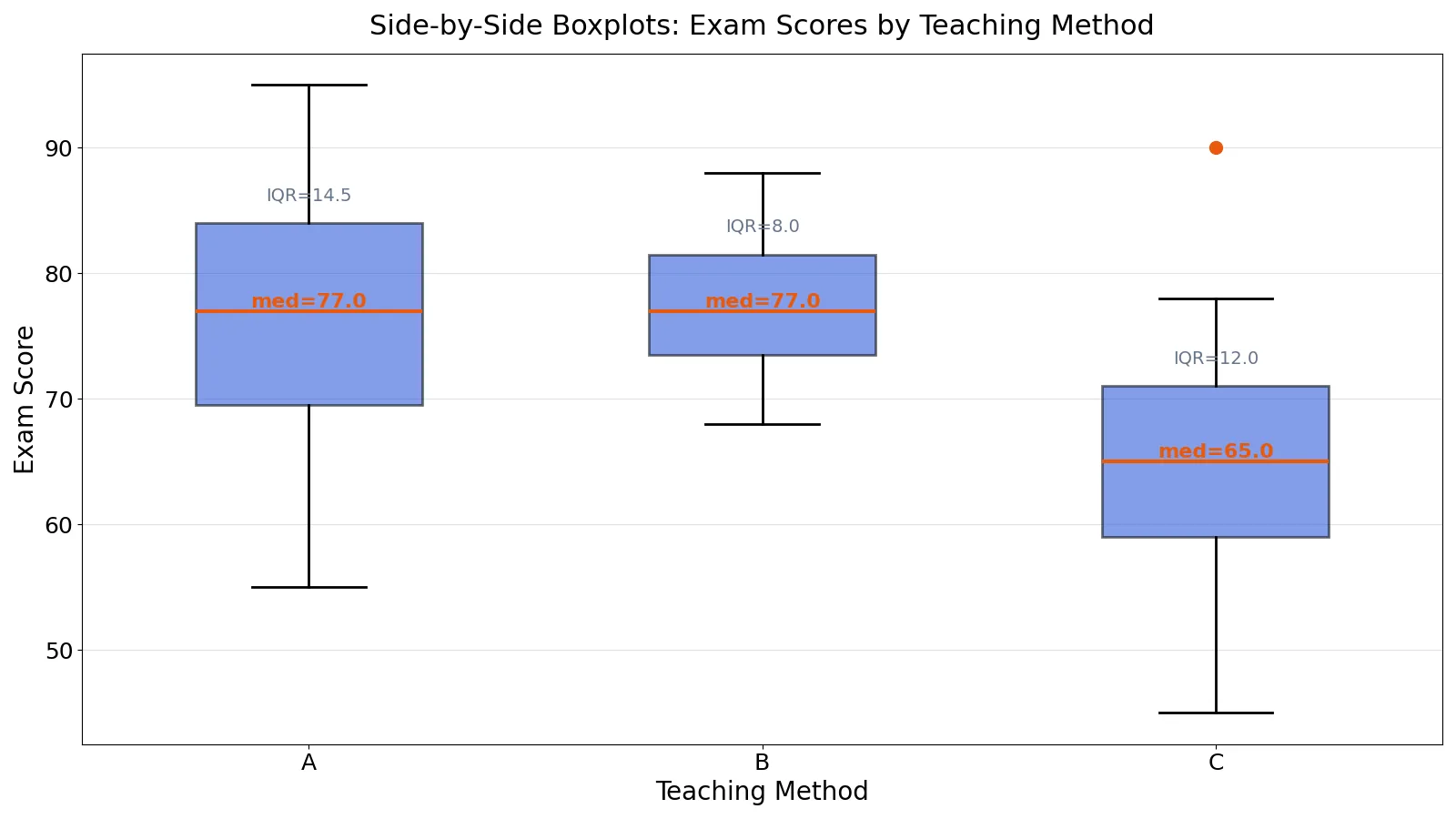
A side-by-side boxplot places several boxplots on one shared scale so you can compare the distribution of a numeric variable across groups. Each box shows the middle 50% of a group, the line inside shows the median, and the whiskers and outlier marks show the tails. This article explains what every part means, walks through a real dataset, and shows how to build one in Python.
Quick Answer
- A side-by-side boxplot compares the distribution of one numeric variable across two or more groups, all drawn on the same axis [1].
- Each box spans the first quartile (Q1) to the third quartile (Q3), so its height or length equals the interquartile range (IQR) [2].
- The line inside the box is the median. A long box means the middle half of that group's data is widely spread, and a short box means it is tightly packed [2].
- Whiskers extend to the most extreme values that are not outliers. Points beyond the 1.5 × IQR fences are drawn as separate marks [1][3].
- Read the plot in three passes: compare medians for location, compare box lengths for spread, then check for outliers and skew.
What Side-by-Side Boxplot Means
A side-by-side boxplot (also written side by side box plot or side by side box and whisker plot) is a set of boxplots drawn next to each other on a shared numeric axis, one per group.
The plain definition: it is a compact picture of how a numeric variable is distributed within each category of a grouping variable.
The precise statistical definition: for each group, the plot encodes the five-number summary (minimum, Q1, median, Q3, maximum) plus any points outside the outlier fences. The box covers the interquartile range, the median line marks the 50th percentile, and the whiskers run from the quartiles to the most extreme non-outlier observations [1][3].
A single boxplot summarizes one batch of data. Multiple boxplots drawn together compare several data sets or several groups within one data set [1]. That comparison is the whole point of the side-by-side layout.
How It Works
For each group, you compute five values and two fences.
$$IQR = Q3 - Q1$$
$$L1 = Q1 - 1.5 \times IQR$$
$$U1 = Q3 + 1.5 \times IQR$$
- $Q1$ is the first quartile, the value below which 25% of the group's data falls.
- $Q3$ is the third quartile, the value below which 75% of the data falls.
- $IQR$ is the interquartile range, the spread of the middle half of the data.
- $L1$ is the lower fence. Any value below it is flagged as a potential outlier.
- $U1$ is the upper fence. Any value above it is flagged as a potential outlier.
The box is drawn from $Q1$ to $Q3$. The median line sits inside it. The lower whisker runs from $Q1$ down to the smallest value that is still above $L1$, and the upper whisker runs from $Q3$ up to the largest value still below $U1$ [1]. Values outside the fences are plotted individually, usually as small circles or asterisks [1][3]. A boxplot that marks outliers this way is often called a modified boxplot, while a plain boxplot extends the whiskers all the way to the minimum and maximum and hides outliers [2].
When you draw several boxplots together, the box width is often set proportional to the number of points in each group, though many tools simply use equal widths [1].
Worked Example
The dataset below holds exam scores (0 to 100) for 45 students taught by method A, B, or C, with 15 students per method.
| Method | Scores |
|---|---|
| A | 72, 65, 88, 91, 55, 78, 83, 69, 74, 95, 62, 80, 85, 70, 77 |
| B | 68, 74, 79, 82, 71, 76, 85, 80, 73, 88, 70, 77, 81, 75, 84 |
| C | 60, 55, 72, 68, 50, 65, 78, 62, 58, 90, 45, 70, 66, 61, 74 |
Here are the computed statistics for each group.
| Group | n | Mean | SD | Q1 | Median | Q3 | IQR | Lower fence | Upper fence | Outliers |
|---|---|---|---|---|---|---|---|---|---|---|
| A | 15 | 76.2667 | 11.1577 | 69.5000 | 77.0000 | 84.0000 | 14.5000 | 47.7500 | 105.7500 | none |
| B | 15 | 77.5333 | 5.8538 | 73.5000 | 77.0000 | 81.5000 | 8.0000 | 61.5000 | 93.5000 | none |
| C | 15 | 64.9333 | 11.2851 | 59.0000 | 65.0000 | 71.0000 | 12.0000 | 41.0000 | 89.0000 | 90 |
Walk through group A. The quartiles use linear interpolation, giving Q1 = 69.5, median = 77, and Q3 = 84. The IQR is 84 - 69.5 = 14.5. The lower fence is 69.5 - 1.5 × 14.5 = 47.75, and the upper fence is 84 + 1.5 × 14.5 = 105.75. No score falls outside those fences, so group A has no outliers.
Group B is tighter. Its IQR is 8.0, so the middle half of its scores spans only eight points. Its fences run from 61.5 to 93.5, and again no score falls outside.
Group C sits lower. Its median is 65.0, its IQR is 12.0, and its fences run from 41.0 to 89.0. The score of 90 is above the upper fence, so it is flagged as an outlier.
Here is the code that produces the plot.
import matplotlib.pyplot as plt
A = [72, 65, 88, 91, 55, 78, 83, 69, 74, 95, 62, 80, 85, 70, 77]
B = [68, 74, 79, 82, 71, 76, 85, 80, 73, 88, 70, 77, 81, 75, 84]
C = [60, 55, 72, 68, 50, 65, 78, 62, 58, 90, 45, 70, 66, 61, 74]
fig, ax = plt.subplots(figsize=(16, 9))
bp = ax.boxplot([A, B, C], labels=['A', 'B', 'C'], patch_artist=True,
                medianprops=dict(color='#ea580c', linewidth=3))
for patch, c in zip(bp['boxes'], ['#1d4ed8', '#1d4ed8', '#1d4ed8']):
    patch.set_facecolor(c); patch.set_alpha(0.6)
ax.set_title('Exam Scores by Teaching Method')
ax.set_ylabel('Score'); ax.grid(True, axis='y', alpha=0.3)
plt.tight_layout(); plt.savefig('figure.png', dpi=100)
import numpy as np
for name, g in zip('ABC', [A, B, C]):
    q1, med, q3 = np.percentile(g, [25, 50, 75]); iqr = q3 - q1
    out = [x for x in g if x < q1 - 1.5*iqr or x > q3 + 1.5*iqr]
    print(f"{name}: median={med:.4f}, IQR={iqr:.4f}, outliers={out}")
Output:
A: median=77.0000, IQR=14.5000, outliers=[]
B: median=77.0000, IQR=8.0000, outliers=[]
C: median=65.0000, IQR=12.0000, outliers=[90]
How to Interpret It
Read a side-by-side boxplot in three passes.
First, compare medians. Methods A and B share a median of 77.0, while method C sits at 65.0. That is a 12-point gap in the typical score, which is the largest single difference in the chart.
Second, compare box lengths. Method A has the widest IQR at 14.5, so its middle half of scores is the most variable. Method B has the narrowest at 8.0, so its students clustered more tightly around the middle. A long box means a large IQR and a lot of variability in the middle half of the data, while a short box means little variability there [2].
Third, check the tails and outliers. Method C has one score at 90 above its upper fence. That single high performer lifts the mean from 63.14 (without it) to 64.93, which is still just below the median of 65.0.
You can also use the plot to answer two standard questions: does the location differ between subgroups, and does the variation differ between subgroups [1]. Here the answer to both is yes. Location differs because C sits lower, and variation differs because B is much tighter than A.
If you want to go deeper on spread, see Box Plot IQR: How to Read Interquartile Range in Boxplots. For the outlier rules in more detail, read Box Plot Outliers: How to Identify and Interpret Them.
When to Use It (and when not to)
Use a side-by-side boxplot when you have one numeric variable and one categorical grouping variable with a handful of groups, and you want to compare location, spread, and outliers at once. It handles large samples well and stays readable when group sizes differ [1]. It is a strong first look before any formal test of group differences.
Do not use it when you need to see the shape of each distribution in detail. A boxplot hides whether a group is bimodal, because two very different clusters can produce the same five-number summary. If shape matters, pair the boxplot with a histogram or a dotplot. The LibreTexts example draws vertical dotplots alongside boxplots for exactly this reason [2].
Also avoid it when your groups are few and your samples are tiny. With five or six observations per group, the quartiles are unstable and the box can mislead. A dot plot or a strip chart shows every point and is more honest at that size.
If you want to build one yourself, the Box Plot Maker handles the quartile math for you. For a full walkthrough of the manual steps, see How to Make a Box and Whisker Plot (Step by Step).
Side-by-Side Boxplot vs Single Boxplot
| Feature | Single boxplot | Side-by-side boxplot |
|---|---|---|
| Number of groups | One | Two or more |
| Main purpose | Summarize one distribution | Compare distributions across groups |
| Box width | Arbitrary [1] | Often proportional to group size, or equal [1] |
| Shared axis | Not applicable | Yes, all boxes share one numeric scale |
| Typical question | What does this batch look like? | Does location or variation differ between groups? [1] |
The single boxplot answers "what does this data look like." The side-by-side version answers "how do these groups differ." That shift from description to comparison is the reason the layout exists.
Common Mistakes
- Reading the box as the full range. The box covers only Q1 to Q3, the middle 50%. The whiskers and outlier marks carry the rest. Fix: always check the whisker ends before you describe the spread.
- Treating a longer box as a larger sample. Box length reflects the IQR, not the number of observations. Fix: check group sizes separately, since box width may or may not encode them [1].
- Ignoring outliers when comparing means. In the example, method C's outlier at 90 lifts the mean by almost two points. Fix: report the median alongside the mean, or note the outlier explicitly.
- Assuming the median is the mean. The median line is the 50th percentile. It equals the mean only in symmetric distributions. Fix: if you need the mean, ask the software to draw it as a separate marker [4].
- Comparing boxplots drawn on different axes. Two charts with different y-axis limits can make a small gap look large. Fix: put all groups on one shared scale.
- Using a plain boxplot and concluding there are no outliers. A non-modified boxplot extends whiskers to the minimum and maximum, so outliers are invisible [2]. Fix: use a modified boxplot that marks points beyond the fences.
Limitations
A boxplot cannot show the shape of a distribution. Two groups with identical five-number summaries can look completely different as histograms, one symmetric and one bimodal. The plot also says nothing about sample size unless you encode it in box width, and it gives no direct read on the mean or standard deviation.
The 1.5 × IQR rule is a convention, not a law. It flags points for a closer look, not points that are wrong. In small samples the fences are unstable, and in heavily skewed data the rule can flag many legitimate values on the long tail. Treat every flagged point as a question, not a verdict.
Frequently Asked Questions
What does a side-by-side boxplot show?
It shows the distribution of one numeric variable for each level of a grouping variable, all on a shared axis. You can compare medians for location, box lengths for spread, and outlier marks for extreme values [1]. It is a fast way to see whether groups differ before running a formal test.
How do you read a side by side box and whisker plot?
Start with the median lines to compare typical values. Then compare box lengths to judge variability in the middle half of each group [2]. Finally, look at whisker lengths and any points beyond them, which mark outliers under the 1.5 × IQR rule [1].
What is the difference between a boxplot and a modified boxplot?
A modified boxplot draws the whiskers only to the most extreme non-outlier values and marks outliers separately, usually with asterisks or circles [2][3]. A plain boxplot extends the whiskers to the minimum and maximum, so outliers are hidden inside the whiskers and you cannot see them [2].
Can a side-by-side boxplot show the mean?
Yes, if your software supports it. Matplotlib's boxplot function has a showmeans option that draws the mean as a point or a line, and it is off by default [4]. Adding the mean is useful when a distribution is skewed, because the gap between the mean and median becomes visible.
How many groups can you compare in one side-by-side boxplot?
There is no hard limit, but readability drops fast. Around four to eight groups usually works well on a standard chart. Beyond that, labels crowd and the comparison becomes hard to scan. If you have many groups, sort them by median so the pattern is easier to follow.
References
- 1.3.3.7. Box Plot
- 3.8: Interquartile Range and Boxplots (2 of 3) - Chemistry LibreTexts/03%3A_2-_Summarizing_Data_Graphically_and_Numerically/3.08%3A_Interquartile_Range_and_Boxplots_(2_of_3))
- 9.1: Encoding Univariate Data - Engineering LibreTexts/09%3A_Visualizing_Data/9.01%3A_Encoding_Univariate_Data)
- matplotlib.pyplot.boxplot, Matplotlib 3.11.2 documentation
Further Reading
- matplotlib.pyplot.subplots, Matplotlib 3.11.2 documentation
- Krzywinski M, Altman N (2014). Visualizing samples with box plots. Nature Methods
- Mcgill R, Tukey JW, Larsen WA (1978). Variations of Box Plots. The American Statistician
Related Articles
- Left-Skewed Box Plot: How to Read Skewness in Box Plots
- Stem and Leaf Plot: How to Make and Read One
- How to Make a Box and Whisker Plot (Step by Step)
- How to Make a Box Plot in Excel (Step by Step)
- Box Plot IQR: How to Read Interquartile Range in Boxplots
- How to Make and Read a Box Plot: Quartiles, Whiskers and Outliers
- Bar Chart vs. Box Plot vs. Dot Plot
- Bar Charts vs. Box Plots vs. Scatter Plots