What Is a Line Plot? Definition and Examples
By Dr. Zubair Khalid, DVM, MS, PhD ·
A lineplot is a graph that connects individual data points with straight line segments, usually to show how a value changes across an ordered sequence such as time. It answers questions like "Is this going up or down?" and "When did it peak?" faster than a table of numbers can. This article explains the definition, how to read a lineplot correctly, and when another chart type serves you better.
Quick Answer
- A lineplot plots one point per observation and joins consecutive points with a line.
- The horizontal axis is almost always an ordered variable: time, sequence, dose, or distance.
- The vertical axis holds the measured value.
- The slope between two points shows the direction and speed of change.
- Use it for trends over a continuous or ordered axis, not for comparing unrelated categories.
What a Lineplot Means
In plain terms, a lineplot is a picture of change. You mark each measurement as a dot, then draw a line from one dot to the next in the order the measurements occurred. The line is a visual shortcut for "this value followed that value."
The precise statistical definition: a lineplot is a two-dimensional graph of an ordered sequence of paired values $(x_i, y_i)$, where the points are connected by line segments in the order of the $x$ variable. It is a special case of a scatter plot in which the points are joined, and it assumes the $x$ variable has a meaningful order.
That last assumption matters. If your categories have no natural order, joining them with a line implies a progression that does not exist. A lineplot of "sales by product color" would be misleading because red does not come before blue in any meaningful sequence.
Lineplots appear under several names. In statistics and data analysis, "lineplot" and "line chart" are used interchangeably. In some contexts, a lineplot refers specifically to a dot-and-line display of a small dataset along a number line, but the trend-over-time meaning dominates in analytics work.
How It Works
A lineplot is built from a sequence of points. For each observation $i$, you have a pair:
$$(x_i, \; y_i)$$
where:
- $x_i$ is the position on the horizontal axis, usually a time period or an ordered index.
- $y_i$ is the measured value on the vertical axis.
- $i$ runs from 1 to $n$, the number of observations.
The line segment between point $i$ and point $i+1$ has a slope:
$$m_i = \frac{y_{i+1} - y_i}{x_{i+1} - x_i}$$
A positive $m_i$ means the value rose between those two points. A negative $m_i$ means it fell. A slope near zero means it held roughly steady.
When several series share the same axes, each gets its own line and its own color or marker style. This is how you compare two cities, two products, or two treatment groups on one chart. The lines are drawn independently, so the slope of each series is read on its own.
One detail worth knowing: the line between two points is an interpolation. It does not mean you measured anything between them. If you have monthly readings, the line crossing April does not tell you the value on April 15.
Worked Example
The dataset below holds monthly average temperature in degrees Fahrenheit for two cities over 12 months.
| Month | City A (°F) | City B (°F) |
|---|---|---|
| Jan | 30.2 | 58.6 |
| Feb | 33.1 | 60.1 |
| Mar | 42.5 | 63.4 |
| Apr | 53.8 | 67.2 |
| May | 63.4 | 72.8 |
| Jun | 72.9 | 78.5 |
| Jul | 78.1 | 82.3 |
| Aug | 76.5 | 82.0 |
| Sep | 68.2 | 78.9 |
| Oct | 56.4 | 72.1 |
| Nov | 44.7 | 65.3 |
| Dec | 34.0 | 59.4 |
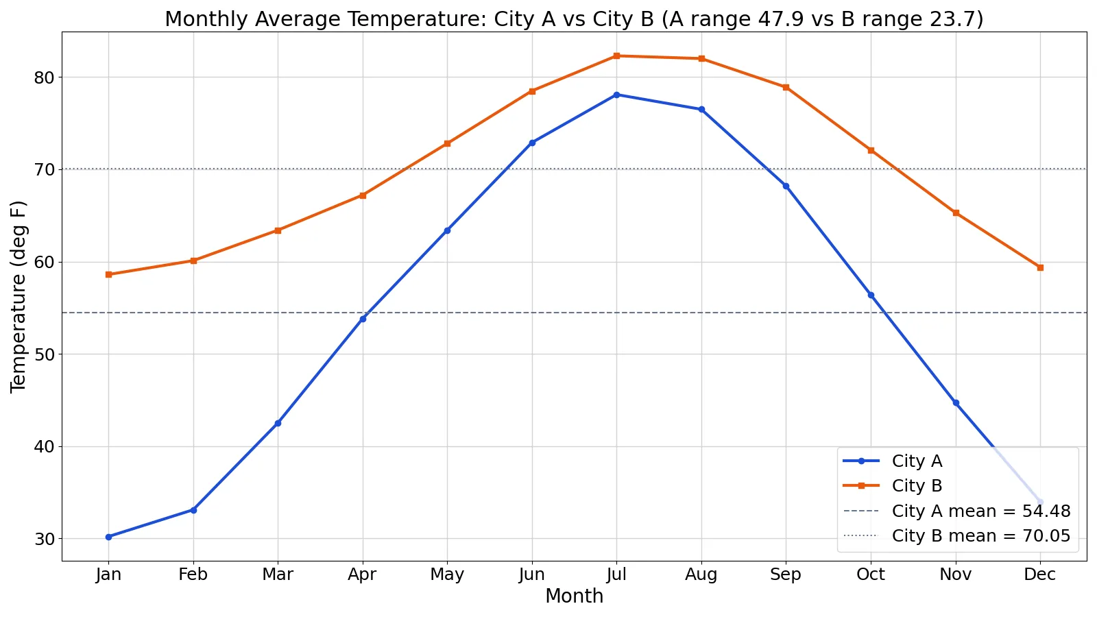
Plotting both columns against month gives a two-line lineplot. Here is the code that produced the summary numbers.
import numpy as np
months = ['Jan','Feb','Mar','Apr','May','Jun','Jul','Aug','Sep','Oct','Nov','Dec']
city_a = [30.2, 33.1, 42.5, 53.8, 63.4, 72.9, 78.1, 76.5, 68.2, 56.4, 44.7, 34.0]
city_b = [58.6, 60.1, 63.4, 67.2, 72.8, 78.5, 82.3, 82.0, 78.9, 72.1, 65.3, 59.4]
a = np.array(city_a); b = np.array(city_b)
print(f"A mean: {a.mean():.4f}")
print(f"B mean: {b.mean():.4f}")
print(f"A range: {a.max()-a.min():.4f}")
print(f"B range: {b.max()-b.min():.4f}")
Output:
A mean: 54.4833
B mean: 70.0500
A range: 47.9000
B range: 23.7000
Walking through the steps:
- City A monthly mean: sum(653.8) / 12 = 54.4833
- City B monthly mean: sum(840.6) / 12 = 70.0500
- City A range (max minus min): 78.1 - 30.2 = 47.9000
- City B range (max minus min): 82.3 - 58.6 = 23.7000
- City A peak month: argmax = Jul (78.1)
- City B peak month: argmax = Jul (82.3)
- City A trough month: argmin = Jan (30.2)
- City B trough month: argmin = Jan (58.6)
- City A linear trend slope: 1.2587 °F per month
- City B linear trend slope: 0.7217 °F per month
- Mean difference, B minus A: 70.0500 - 54.4833 = 15.5667
The lineplot of monthly average temperature for City A and City B across 12 months shows City A peaking at 78.1 in Jul and troughing at 30.2 in Jan, while City B peaks at 82.3 in Jul and troughs at 58.6 in Jan.
How to Interpret It
Read a lineplot in this order.
Direction. Follow each line left to right. City A climbs from 30.2 in Jan to 78.1 in Jul, then falls back to 34.0 in Dec. That is a clear seasonal arc.
Steepness. The steeper the segment, the faster the change. City A gains 11.3 degrees from Mar to Apr, a sharp jump. City B gains 3.8 degrees over the same span, a gentler rise.
Peaks and troughs. Both cities peak in Jul and trough in Jan. The timing matches, but the heights differ.
Spread between lines. The vertical gap between the two lines is the difference at that month. The mean gap is 15.5667 degrees, but the gap is not constant. It is widest in winter and narrowest in summer, which is a real feature of the data, not noise.
Overall trend. A fitted straight line gives one number for direction, but it is a poor summary of a seasonal arc. City A's fitted slope is 1.2587 °F per month and City B's is 0.7217 °F per month. These positive slopes mostly reflect the peak falling slightly after mid-year, not year-long warming, since both cities end December only a few degrees above their January values.
For related reading on reading fitted lines, see what slope means in regression.
When to Use It (and when not to)
Use a lineplot when:
- The horizontal axis is time or another ordered sequence.
- You want to show a trend, a cycle, or a rate of change.
- You are comparing a small number of series, typically two to five.
- The data points are evenly spaced or close to it.
Do not use a lineplot when:
- The categories are unordered. Use a bar chart instead.
- You want to show the distribution of a single variable. Use a histogram or a box plot.
- You have many overlapping series. Ten lines on one chart become unreadable. Consider small multiples.
- The x values are irregular and the gaps matter. A line implies continuity that may not exist.
If your goal is to show the relationship between two continuous variables with no natural order, an XY graph or scatter plot is the right choice. If you want to check whether a model fits, a residual plot is more informative.
Lineplot vs Scatter Plot
Both place points on two axes. The difference is whether the points are joined and whether order matters.
| Feature | Lineplot | Scatter Plot |
|---|---|---|
| Points connected | Yes, in x order | No |
| X variable | Ordered (time, sequence) | Any continuous variable |
| Main purpose | Show trend over order | Show relationship between variables |
| Implies continuity | Yes, between points | No |
| Typical use | Time series, growth curves | Correlation, regression |
If your x variable is a date, a lineplot is usually right. If your x variable is height and your y variable is weight, a scatter plot is right.
Common Mistakes
- Connecting unordered categories. Joining "red, blue, green" with a line invents a sequence. Fix: use a bar chart when categories have no order.
- Truncating the y axis to exaggerate change. Starting the y axis at 70 instead of 0 makes a 2-degree shift look dramatic. Fix: start at zero when the magnitude of change matters, or label the axis clearly if you must zoom.
- Reading between the points as measured data. The line is an interpolation, not evidence. Fix: mark the actual observations with dots so readers see what was measured.
- Overplotting too many series. Eight lines in eight colors is a puzzle, not a chart. Fix: split into small multiples or highlight one series at a time.
- Ignoring irregular spacing. If your x values are uneven, a straight line between them hides the gap. Fix: plot against the true numeric x value, not a category index.
- Confusing correlation with cause. Two lines rising together do not prove one drives the other. Fix: state the relationship as association unless you have a design that supports causation.
Limitations
A lineplot shows what happened at the measured points and nothing more. It cannot tell you why a value changed, whether the change is statistically significant, or what happens outside the observed range. Extending a line beyond the last data point is a forecast, and it needs a model, not a ruler.
Lineplots also hide distribution. If each point is an average of many observations, the line shows the mean and conceals the spread. A flat line can sit on top of wildly variable data. When spread matters, pair the lineplot with error bars or a band showing a range.
Frequently Asked Questions
What is the difference between a lineplot and a line graph?
They are the same thing in most data analysis contexts. Both connect ordered data points with line segments. Some textbooks reserve "lineplot" for a dot-and-line display of a small dataset along a number line, but in analytics the terms are used interchangeably.
Can a lineplot have more than one line?
Yes. Multiple lines on shared axes let you compare series, such as two cities or two products. Keep the count low, usually two to five, and use distinct colors plus a legend. Beyond that, split the chart into small multiples.
Should the y axis always start at zero?
Not always. For temperature, stock prices, or any value far from zero, starting at zero wastes space and flattens the signal. Starting at a nonzero value is acceptable if the axis is labeled and the truncation is obvious. The problem is doing it silently to exaggerate a small change.
What does a flat line mean?
A flat line means the value held roughly constant across the observed range. Check the y axis scale first, because a flat-looking line on a wide scale can still hide meaningful variation. Also check whether the points are averages, since averaging can smooth out real swings.
How do I plot a lineplot in Python?
Use matplotlib.pyplot.plot() for the line and scatter() for the markers, or use Seaborn's lineplot() function, which handles grouping and confidence intervals. For a quick survey of plotting options, see Seaborn plot types and examples. If you are reducing dimensions before plotting, a scree plot helps you choose how many components to keep.
References
This article draws on the standard references listed under Further Reading.
Further Reading
- Weissgerber TL, Milic NM, Winham SJ et al. (2015). Beyond Bar and Line Graphs: Time for a New Data Presentation Paradigm. PLOS Biology
- Rougier NP, Droettboom M, Bourne PE (2014). Ten Simple Rules for Better Figures. PLoS Computational Biology
- NIST/SEMATECH e-Handbook: Graphical Techniques
- Cleveland WS, McGill R (1984). Graphical Perception: Theory, Experimentation, and Application to the Development of Graphical Methods. Journal of the American Statistical Association
- Hunter JD (2007). Matplotlib: A 2D Graphics Environment. Computing in Science & Engineering
- Wilson G, Bryan J, Cranston K et al. (2017). Good enough practices in scientific computing. PLOS Computational Biology