R lines() Function: How to Add Lines to a Plot
By Dr. Zubair Khalid, DVM, MS, PhD ·
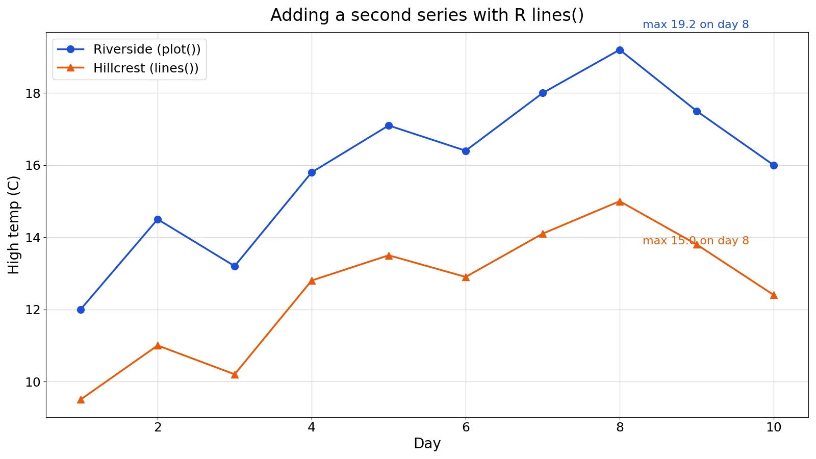
The R lines() function adds line segments to a plot that already exists. You call plot() first to create the axes and the first series, then call lines() to overlay one or more additional series on the same coordinate system. This is the standard base R way to compare two or more trends on one chart.
Quick Answer
lines(x, y, ...)draws connected line segments through the points(x, y)on the current plot.- It never creates a new plot. If no plot is open, the call fails or draws nothing useful.
- The first series usually comes from
plot(), and every later series comes fromlines(). - Arguments such as
col,lty,lwd, andtypecontrol appearance and are passed through to the underlying drawing code. lines()is generic, so it also works on special objects such as step functions [1].
Syntax
lines(x, y = NULL, type = "l", ...)
| Argument | Required? | Meaning |
|---|---|---|
x | Yes | Numeric vector of x coordinates, or an object with a lines method |
y | No | Numeric vector of y coordinates, same length as x. If omitted, x is plotted against its index |
type | No | Line style: "l" for lines, "b" for points joined by lines, "o" for overplotted points and lines, "h" for vertical lines, "s" and "S" for steps |
col | No | Line color, as a name or hex code |
lty | No | Line type, such as 1 solid, 2 dashed, 3 dotted |
lwd | No | Line width, a positive number |
... | No | Further graphical parameters passed to the drawing functions |
The type default is "l", so plain lines(x, y) draws a connected line. When x is a time series or another structured object, y can be omitted and the method extracts both coordinates.
How It Works
Base R graphics are drawn on a device with a current coordinate system. plot() sets up that system from the data ranges you pass, then draws. lines() reuses the same system and adds segments to it. Nothing about the axes, labels, or limits changes.
That behavior has one direct consequence. The y range of the first plot() call must cover every series you plan to add. If the second series sits outside the range, lines() still draws it, but the segments fall outside the visible plot area and you see nothing. Setting ylim explicitly on the first call is the reliable fix.
Because lines() is a generic function, it dispatches to class-specific methods. For a stepfun object, for example, the method accepts xval to control where the function is evaluated and col.hor to color the horizontal segments [1]. The same call pattern works for other classes that define a lines method.
The order of drawing matters for readability. Later calls paint over earlier ones, so draw the series you want visible on top last. Color and line type are the main tools for telling series apart, and a matching legend() call makes the chart self-explanatory.
Worked Example
The dataset holds daily high temperatures in Celsius for two cities over 10 days.
| day | riverside | hillcrest |
|---|---|---|
| 1 | 12.0 | 9.5 |
| 2 | 14.5 | 11.0 |
| 3 | 13.2 | 10.2 |
| 4 | 15.8 | 12.8 |
| 5 | 17.1 | 13.5 |
| 6 | 16.4 | 12.9 |
| 7 | 18.0 | 14.1 |
| 8 | 19.2 | 15.0 |
| 9 | 17.5 | 13.8 |
| 10 | 16.0 | 12.4 |
The steps are straightforward. Riverside's mean high is
$$\frac{12.0 + 14.5 + 13.2 + 15.8 + 17.1 + 16.4 + 18.0 + 19.2 + 17.5 + 16.0}{10} = 15.9700$$
Hillcrest's mean high is
$$\frac{9.5 + 11.0 + 10.2 + 12.8 + 13.5 + 12.9 + 14.1 + 15.0 + 13.8 + 12.4}{10} = 12.5200$$
Riverside peaks at 19.2000 C on day 8. Hillcrest peaks at 15.0000 C on day 8. On day 10 the gap is 16.0000 - 12.4000 = 3.6000 C.
The code builds the vectors, draws Riverside with plot(), then overlays Hillcrest with lines(). Both series use type = "b" so the points and the connecting lines are both visible.
day <- 1:10
riverside <- c(12.0, 14.5, 13.2, 15.8, 17.1, 16.4, 18.0, 19.2, 17.5, 16.0)
hillcrest <- c(9.5, 11.0, 10.2, 12.8, 13.5, 12.9, 14.1, 15.0, 13.8, 12.4)
plot(day, riverside, type = "b", col = "#1d4ed8", pch = 19,
     ylim = c(8, 20), xlab = "Day", ylab = "High temp (C)",
     main = "Daily high temperatures: Riverside vs Hillcrest")
lines(day, hillcrest, type = "b", col = "#ea580c", pch = 17)
legend("topleft", legend = c("Riverside", "Hillcrest"),
       col = c("#1d4ed8", "#ea580c"), pch = c(19, 17))
Output: Riverside mean 15.9700 C, Hillcrest mean 12.5200 C. Peaks are 19.2000 C and 15.0000 C, both on day 8. The day-10 gap is 3.6000 C.
The ylim = c(8, 20) argument is doing real work here. Riverside reaches 19.2 and Hillcrest drops to 9.5, so a range of 8 to 20 contains both series with a little breathing room.
More Examples
Add a horizontal reference line. Use abline() for straight reference lines, since it takes an intercept and slope directly. Use lines() when the reference is a computed series.
plot(day, riverside, type = "l", ylim = c(8, 20))
lines(day, rep(15.97, 10), col = "gray40", lty = 2)
Add a smoothed trend. Fit a model, predict over the same x values, and draw the fitted values on top of the raw points.
fit <- lm(riverside ~ day)
plot(day, riverside, pch = 19, ylim = c(8, 20))
lines(day, fitted(fit), col = "red", lwd = 2)
Draw several series in a loop. Build the vectors first, then loop over them so each one is added with its own color.
series <- list(riverside, hillcrest)
cols <- c("#1d4ed8", "#ea580c")
plot(day, riverside, type = "l", ylim = c(8, 20), col = cols[1])
for (i in 2:length(series)) lines(day, series[[i]], col = cols[i])
If you need to assemble the coordinate vectors from separate values, the article on c() in R: How to Create Vectors (With Examples) covers the concatenation step. For repeated or constant baselines, R ones: How to Create a Vector of Ones in R shows how to build a constant vector of the right length.
Errors and How to Fix Them
"plot.new has not been called yet." You called lines() before any plot existed. Call plot() first, or open a device with plot.new() and set the coordinate system with plot.window().
"Error in xy.coords(x, y): 'x' and 'y' lengths differ." The two vectors have different lengths. Check with length(x) and length(y) and trim or pad the shorter one.
"Error in plot.xy(xy.coords(x, y), type = type, ...): invalid plotting symbol." A pch value is out of range or not a valid character. Use a number from 0 to 25 or a single character.
Nothing appears on the plot. The added series lies outside the current axis limits. Reissue the first plot() call with a wider ylim or xlim that covers every series.
Lines appear but the legend is wrong. The legend colors and point characters must match the values used in plot() and lines(). Keep them in the same order in both places.
Common Mistakes
- Forgetting
ylimon the first plot. The default range covers only the first series, so later series get clipped. Fix: compute the range across all series and pass it explicitly. - Calling
lines()with only one vector when the x values are not 1, 2, 3. A single numeric vector is drawn against its index, so it will not line up with a plot whose x values differ. Fix: supply bothxandy. - Using
lines()to start a chart. It adds to an existing plot and cannot create one. Fix: start withplot()orplot.new()plusplot.window(). - Mixing up
lines()andabline().abline()takes intercept and slope for straight reference lines. Fix: uselines()for data-driven series andabline()for simple reference lines. - Reusing the same color for every series. Overlapping lines become unreadable. Fix: vary
colandlty, and add a legend. - Assuming
type = "b"andtype = "o"are identical. In"b"the line stops short of the points, in"o"the line runs through them. Fix: pick the one that matches the look you want.
Limitations
lines() only draws on the current plot and the current device. It cannot change axis limits, add a second y axis, or rescale existing data. If a new series needs a different scale, you have to transform the values yourself and label the axis accordingly, which is easy to misread.
Base R graphics redraw from scratch. There is no retained object you can edit later, so changing a line means rerunning the drawing code. For charts that need many layers, interactive updates, or precise theme control, a grammar-of-graphics package is usually a better fit. lines() remains the fastest option for quick overlays and for scripts where base graphics are already in use.
Frequently Asked Questions
What is the difference between lines() and plot() in R?
plot() creates a new plot, including the axes, labels, and the first series. lines() adds line segments to a plot that already exists and leaves the axes untouched. In practice you call plot() once and lines() for every additional series.
How do I add multiple lines to the same plot?
Call plot() for the first series, then call lines() once per additional series. Give each call its own col and lty so the series are distinguishable, and set ylim on the first call to cover all of them. Finish with a legend() call that matches the colors and line types.
Why does my lines() call produce no visible line?
The most common cause is that the series falls outside the current axis limits. Reissue the first plot() call with a ylim that spans every series. A second cause is a type value that draws nothing visible, or a line width or color that blends into the background.
Can lines() draw vertical or stepped lines?
Yes. type = "h" draws vertical lines from each point down to the x axis. type = "s" and type = "S" draw step functions, and the stepfun method accepts xval to control where the function is evaluated [1].
Does lines() work with time series and other objects?
Yes. lines() is generic, so it dispatches to a method when the input has a class with one defined. For a time series object you can often omit y and let the method extract the coordinates. For classes without a method, pass plain numeric vectors instead.
References
Further Reading
- Wickham H (2014). Tidy Data. Journal of Statistical Software
- Wickham H, Averick M, Bryan J et al. (2019). Welcome to the Tidyverse. Journal of Open Source Software
- An Introduction to R (R Core Team)
- Wickham H, Cetinkaya-Rundel M, Grolemund G. R for Data Science (2e)
- ggplot2 Reference