How to Make a Line Chart in Excel (Step by Step)
By Dr. Zubair Khalid, DVM, MS, PhD ·
To make a line chart in Excel, select your data range, go to Insert > Charts > Insert Line or Area Chart, and pick Line with Markers. Excel plots each column as a separate line, so you can compare trends across categories or time. The rest of this guide covers setup, formatting, and the mistakes that make charts hard to read.
Quick Answer
- Put your categories (such as months) in the left column and each series in its own column to the right.
- Select the whole range including headers, then go to Insert > Charts > Insert Line or Area Chart > Line with Markers.
- Click the chart and use Chart Elements (+) to turn on Legend and Axis Titles [1].
- Right-click the vertical axis and choose Format Axis to set number format, such as Currency with 0 decimal places.
- Line charts work best with multiple data series. With only one series, a scatter chart is often the better choice [1].
Before You Start
A line chart connects data points in order along the horizontal axis. That makes it a good fit for values that change over time, like monthly sales, daily traffic, or quarterly revenue. The horizontal axis holds evenly spaced categories, and the vertical axis holds the measured values [2].
The layout of your sheet matters more than most people expect. Excel reads the first row as series names and the first column as category labels. If your months sit in row 1 and your numbers run down the columns, Excel will treat months as series and produce a chart that looks wrong. Keep categories in the left column and one series per column to the right.
Check three things before you insert anything:
- Headers exist in the first row and first column.
- Numbers are stored as numbers, not text. Left-aligned values in a numeric column are a warning sign.
- There are no blank rows or columns inside the range. A blank column splits your selection into separate ranges.
If you are new to building formulas for calculated series, see how to make a formula in Excel first, since a chart can only plot what the cells already contain.
Step by Step
- Select the data range. Click cell A1 and drag to the bottom-right corner of your data, so the selection covers headers, labels, and all values. In the example below that is A1:C7.
- Insert the chart. Go to Insert > Charts > Insert Line or Area Chart > Line with Markers. Excel places the chart on the sheet and shows the Chart Design and Format tabs [2].
- Add chart elements. Click the chart, then use Chart Elements (+) to add Legend and Axis Titles [1]. The legend names each line, and the axis titles explain what the numbers mean.
- Edit the axis titles. Set the Horizontal (Category) Axis Title to "Month" and the Vertical (Value) Axis Title to "Sales ($)". Click the title text and type over it [2].
- Format the vertical axis. Right-click the axis, choose Format Axis, open Number, select Currency, and set decimal places to 0. This turns 12000 into $12,000 and makes the scale readable at a glance.
- Adjust the line style if needed. With the chart selected, use the Chart Design tab to pick a different chart style, or right-click a line and choose Format Data Series to change color, width, or marker shape [2].
- Move or resize the chart. Drag the chart border to reposition it, or drag a corner handle to resize. Keep it wide enough that the category labels do not overlap.
If you later want a different chart type for the same data, the process is nearly identical. The companion guide on how to make a chart in Excel covers the general workflow, and how to make a bar chart in Excel shows the same steps for categorical comparisons.
Worked Example
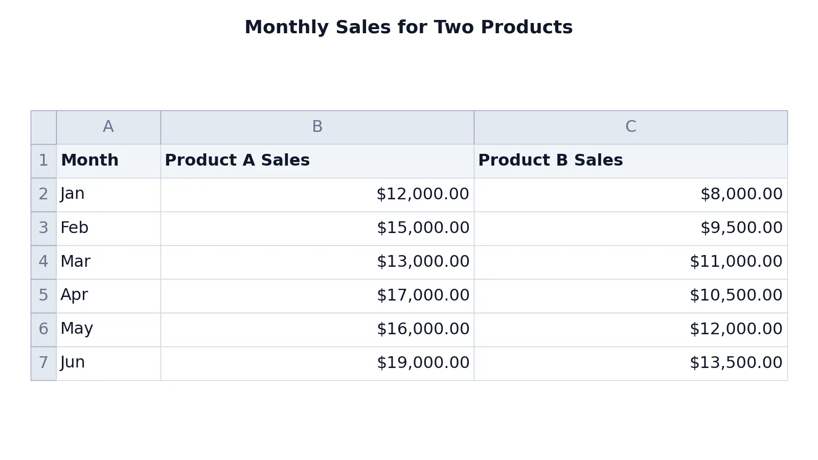
The table below holds six months of sales for two products. Column A holds the month labels, column B holds Product A sales, and column C holds Product B sales.
| A | B | C | |
|---|---|---|---|
| 1 | Month | Product A Sales | Product B Sales |
| 2 | Jan | 12000 | 8000 |
| 3 | Feb | 15000 | 9500 |
| 4 | Mar | 13000 | 11000 |
| 5 | Apr | 17000 | 10500 |
| 6 | May | 16000 | 12000 |
| 7 | Jun | 19000 | 13500 |
No formulas are needed here. The chart reads the values directly from the cells, so the plotted points are exactly the numbers shown above.
Follow the interface steps in order:
- Select range A1:C7.
- Go to Insert > Charts > Insert Line or Area Chart > Line with Markers.
- Click the chart, then use Chart Elements (+) to add Legend and Axis Titles.
- Edit the axis titles. Horizontal (Category) Axis Title = "Month", Vertical (Value) Axis Title = "Sales ($)".
- Format the vertical axis. Right-click the axis > Format Axis > Number > Currency, 0 decimal places.
The result is a line chart comparing monthly sales for Product A and Product B over six months, with a legend and axis titles. Product A rises from $12,000 in January to $19,000 in June with dips in March and May. Product B climbs more steadily from $8,000 to $13,500, with one small dip in April. Product A stays above Product B every month, while the gap between the lines swings from $2,000 in March to $6,500 in April, which is the kind of pattern a line chart is built to reveal.
If your data needs a calculated column before plotting, such as a running total or a growth rate, build it with a formula first. The guide on how to make a formula in Excel walks through the syntax.
Other Ways to Do It
Keyboard shortcut. Select the data and press ALT + F1 to create a chart immediately. Excel picks a chart type for you, which may not be a line chart, so check the result and change the type if needed [1].
Recommended Charts. Select your data, go to Insert > Charts > Recommended Charts, and look at the Recommended Charts tab to preview options. If nothing suits you, open the All Charts tab to see every chart type [1].
Change an existing chart. If you already have a column or bar chart, select it, open the Chart Design tab, and use Change Chart Type to switch to a line chart. The data selection stays the same.
Stacked and 100% stacked lines. Excel also offers stacked line and 100% stacked line charts, with or without markers. A 100% stacked line chart shows the percentage each value contributes over time. Stacked line charts add the data together, which may not be what you want, and the stacking can be hard to see [1].
Troubleshooting
The chart shows one flat line or wrong values. Excel may have treated your numbers as text. Select the column, check the number format, and re-enter any values that are stored as text.
Months appear as a legend instead of the horizontal axis. Your data is oriented the wrong way. Either transpose the data or use Select Data on the Chart Design tab to reassign the category axis labels.
A series is missing. A blank cell inside the range can break the line or drop the series. Fill the gap or use Select Data to confirm every series is included.
The vertical axis starts at zero and the lines look flat. Right-click the axis, open Format Axis, and adjust the minimum bound. Be careful here, since a truncated axis exaggerates small changes.
Category labels overlap. Widen the chart, reduce the font size of the axis labels, or rotate the labels using the alignment options in Format Axis.
The legend covers the data. Drag the legend to another position, or turn it off from Chart Elements (+) if the axis titles already make the series clear.
Common Mistakes
- Selecting only the numbers and skipping the headers. Excel then names the series "Series1" and "Series2". Include row 1 and column A in the selection so the legend and axis labels fill in automatically.
- Plotting categories in the wrong direction. If months run across row 1, Excel treats them as series. Keep categories in the left column and series in columns to the right.
- Using a line chart for unordered categories. Lines imply a sequence. For categories with no natural order, such as regions or product types, use a clustered bar chart instead.
- Leaving the vertical axis truncated without saying so. A minimum bound above zero makes small changes look dramatic. Label the axis clearly or start at zero.
- Adding a trendline and reading it as a forecast. A linear trendline describes the existing points. It does not predict future values unless you extend it deliberately [1].
- Cramming too many series into one chart. Past three or four lines, colors become hard to tell apart. Split the data into small multiples or use a different chart type.
Limitations
A line chart assumes the horizontal axis is evenly spaced and ordered. If your time intervals are uneven, such as measurements taken on random dates, the spacing on the chart will not match the real gaps between them. A scatter chart with connecting lines plots both axes as numeric values and handles uneven spacing correctly [2].
Line charts also hide detail. Each line summarizes a series with a single path, so variation within a period, outliers, and the distribution of values disappear. If you need to see spread or shape, a box plot or a histogram shows what a line cannot. Stacked line charts add another layer of distortion, since the upper lines sit on top of the lower ones and the totals can be misleading [1].
Frequently Asked Questions
How do I make a line chart in Excel with two series?
Put each series in its own column, with shared category labels in the left column. Select the full range including headers, then go to Insert > Charts > Insert Line or Area Chart and choose Line with Markers. Excel draws one line per column and adds a legend naming each one.
Why does my line chart show the wrong axis labels?
Excel assigns the first column as category labels only when the selection is shaped that way. If your labels sit in the first row, Excel reads them as series names. Use Select Data on the Chart Design tab to set the Horizontal (Category) Axis Labels to the correct range.
Should I use a line chart or a scatter chart?
Use a line chart when the horizontal axis holds evenly spaced categories such as months or quarters. Use a scatter chart when both axes are numeric measurements, especially when the spacing between points is uneven. The two types look similar but plot data differently [2].
How do I add a trendline to a line chart?
Select the chart, open Chart Elements (+), choose Trendline, and pick the type you want, such as Linear, Exponential, Linear Forecast, or Moving Average [1]. Format the line so it is visually distinct from the data series.
Can I change a line chart to another chart type later?
Yes. Select the chart, open the Chart Design tab, and use Change Chart Type. Your data selection carries over, so you can switch between line, bar, and other types without rebuilding the chart. For an XY style plot, see how to create an X Y graph in Excel.
References
- Create a chart from start to finish | Microsoft Support
- Present your data in a scatter chart or a line chart | Microsoft Support
Further Reading
- Broman KW, Woo KH (2018). Data Organization in Spreadsheets. The American Statistician
- Ziemann M, Eren Y, El-Osta A (2016). Gene name errors are widespread in the scientific literature. Genome Biology
- Microsoft Support: Excel help and learning
- McCullough B, Heiser DA (2008). On the accuracy of statistical procedures in Microsoft Excel 2007. Computational Statistics & Data Analysis