How to Show Standard Deviation on a Graph (With Examples)
By Dr. Zubair Khalid, DVM, MS, PhD ·
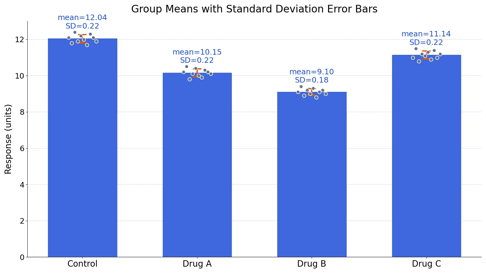
To show standard deviation on a graph, plot the mean of each group as a bar or point, then draw an error bar extending one standard deviation above and below that mean. The bar marks the typical spread of individual values around the mean, so wider bars mean more variable data. This article walks through the calculation, the plot, and the traps that make standard deviation on a graph misleading.
Quick Answer
- Compute the mean and the sample standard deviation for each group.
- Plot the mean as a bar, point, or line marker.
- Draw an error bar from $\text{mean} - \text{SD}$ to $\text{mean} + \text{SD}$.
- Label the bars clearly, for example "error bars show ±1 SD".
- Report the sample size $n$ for every group, because SD alone does not tell readers how precise the mean is.
Before You Start
You need one categorical grouping variable and one numeric measurement variable. In the example below, the grouping variable is treatment group and the measurement is a response value. Each group should have at least a handful of observations, and you should know whether your data are a sample or a full population, because the formula differs.
The sample standard deviation is
$$s = \sqrt{\frac{\sum_{i=1}^{n}(x_i - \bar{x})^2}{n-1}}$$
where $x_i$ are the individual values, $\bar{x}$ is the group mean, and $n$ is the number of values in the group. Dividing by $n-1$ gives the sample SD, which is what you want when your data are a sample from a larger population. If you need a refresher on the arithmetic, see how to calculate standard deviation.
Decide what the error bar should represent before you draw it. Standard deviation describes the spread of the raw observations. The standard error of the mean describes how precisely you have estimated the mean, and it is smaller than the SD by a factor of $\sqrt{n}$. These two bars answer different questions, and mixing them up is one of the most common problems in published figures [1][2]. If you actually want the precision of the mean, read about the standard error of the mean instead.
Step by Step
- Group your data. Split the measurements by the grouping variable, for example by treatment arm or by month. Standard deviation plots are used to see whether the spread varies between groups [3].
- Count each group. Record $n$ for every group. You will need it for the formula and for the figure caption.
- Compute each group mean. Sum the values and divide by $n$.
- Compute each deviation. Subtract the group mean from every value in that group.
- Square the deviations. This removes the sign so positive and negative gaps do not cancel.
- Sum the squared deviations. This is the sum of squares, often written SS.
- Divide by $n-1$. This gives the sample variance.
- Take the square root. This gives the sample standard deviation.
- Draw the error bars. For each group, plot a bar or point at the mean, then add a line from $\bar{x} - s$ to $\bar{x} + s$. In Excel, use the "Custom" error bar option and point it at your SD values. In Python, matplotlib and seaborn accept a
yerrargument. - Label the figure. State that the bars are ±1 SD and give the sample size per group.
Worked Example
The dataset is a small experiment with four treatment groups and 10 measurements per group, in response units.
| Group | Measurements |
|---|---|
| Control | 12.1, 11.8, 12.4, 11.9, 12.2, 12.0, 11.7, 12.3, 12.1, 11.9 |
| Drug A | 10.2, 10.5, 9.8, 10.1, 10.4, 10.0, 9.9, 10.3, 10.2, 10.1 |
| Drug B | 9.1, 9.4, 8.9, 9.2, 9.0, 9.3, 8.8, 9.1, 9.2, 9.0 |
| Drug C | 11.0, 11.5, 10.8, 11.2, 11.1, 11.3, 10.9, 11.4, 11.0, 11.2 |
Here is the full calculation for the Control group.
| Step | Value |
|---|---|
| Raw values | 12.1, 11.8, 12.4, 11.9, 12.2, 12.0, 11.7, 12.3, 12.1, 11.9 |
| $n$ | 10 |
| Mean | $120.4 / 10 = 12.0400$ |
| Deviations $(x - \bar{x})$ | 0.0600, -0.2400, 0.3600, -0.1400, 0.1600, -0.0400, -0.3400, 0.2600, 0.0600, -0.1400 |
| Squared deviations | 0.0036, 0.0576, 0.1296, 0.0196, 0.0256, 0.0016, 0.1156, 0.0676, 0.0036, 0.0196 |
| Sum of squared deviations | 0.4440 |
| Variance $= SS/(n-1)$ | $0.4440 / 9 = 0.0493$ |
| SD $= \sqrt{\text{variance}}$ | $\sqrt{0.0493} = 0.2221$ |
The same two numbers come straight out of a spreadsheet. In Excel, with the Control values in cells B2 to B11, =AVERAGE(B2:B11) returns 12.0400 and =STDEV.S(B2:B11) returns 0.2221. The STDEV.S function uses the $n-1$ denominator, which matches the hand calculation. The standard deviation calculator will do the same arithmetic if you want to check a group quickly.
Repeating the process for all four groups gives the values you plot.
| Group | Mean | SD | Lower bar | Upper bar |
|---|---|---|---|---|
| Control | 12.0400 | 0.2221 | 11.8179 | 12.2621 |
| Drug A | 10.1500 | 0.2173 | 9.9327 | 10.3673 |
| Drug B | 9.1000 | 0.1826 | 8.9174 | 9.2826 |
| Drug C | 11.1400 | 0.2221 | 10.9179 | 11.3621 |
The figure is a bar chart of the four means with orange error bars showing ±1 sample SD. Grey dots show the individual measurements behind each bar. The dots matter. Bar charts hide the distribution of the raw data, and showing the points alongside the summary is the recommended practice for small samples [4].
The Python code below reproduces the means and standard deviations.
import pandas as pd
df = pd.DataFrame({
    "Control": [12.1, 11.8, 12.4, 11.9, 12.2, 12.0, 11.7, 12.3, 12.1, 11.9],
    "Drug A":  [10.2, 10.5,  9.8, 10.1, 10.4, 10.0,  9.9, 10.3, 10.2, 10.1],
    "Drug B":  [ 9.1,  9.4,  8.9,  9.2,  9.0,  9.3,  8.8,  9.1,  9.2,  9.0],
    "Drug C":  [11.0, 11.5, 10.8, 11.2, 11.1, 11.3, 10.9, 11.4, 11.0, 11.2],
})
means = df.mean()
sds = df.std(ddof=1)  # sample SD, matches Excel STDEV.S
print(means.round(4).to_dict())
print(sds.round(4).to_dict())
Output:
{'Control': 12.04, 'Drug A': 10.15, 'Drug B': 9.1, 'Drug C': 11.14}
{'Control': 0.2221, 'Drug A': 0.2173, 'Drug B': 0.1826, 'Drug C': 0.2221}
The ddof=1 argument is what makes pandas match the sample formula. Leave it out and you get the population SD, which is slightly smaller.
Other Ways to Do It
Excel. Build a summary table with one row per group, then insert a bar or column chart from the means. Select the chart, open the error bar options, choose "Custom" as the error amount, and point the positive and negative boxes at the SD column. Do not use the built-in "Standard Deviation" option, because it computes the SD of the plotted means rather than the spread within each group. The steps are covered in more detail in how to calculate standard deviation in Excel.
Python. With matplotlib, pass the SD values to the yerr argument of bar or errorbar. With seaborn, pointplot and barplot accept errorbar="sd", which computes the SD from the raw observations in each group.
A standard deviation plot. Instead of plotting means with error bars, you can plot the group standard deviations themselves against the group label. This is a standard deviation plot, and it is used to check whether the spread changes across groups [3]. A reference line at the overall standard deviation makes shifts easy to spot [5]. This view is useful when the question is about variability rather than about averages.
A different measure of scale. If a group contains extreme outliers, the SD is inflated by them. The same plot can be drawn with a more resistant measure of spread such as the interquartile range [3].
Troubleshooting
The error bars look tiny. Check whether you plotted the standard error instead of the SD. The standard error is the SD divided by $\sqrt{n}$, so with $n = 10$ it is about a third of the SD.
The bars go below zero. That is fine mathematically. It only looks odd when the measurement cannot be negative, such as a count or a concentration. Consider whether a bar chart is the right choice at all.
Excel shows one error bar for all groups. The built-in "Standard Deviation" option computes one SD from the plotted means themselves and applies that single value to every point. Use "Custom" with your own SD column to give each group its own bar.
The SD is larger than the mean. This happens with highly variable data. It does not mean you made an error, but it does mean the mean is a weak summary of the group.
Your SD differs slightly from a colleague's. One of you used the population formula with $n$ in the denominator. For sample data, use $n-1$.
Common Mistakes
- Plotting the standard error and calling it the SD. The two bars look similar but mean different things. Label the figure with the exact quantity you plotted [1].
- Using the population formula on sample data. Dividing by $n$ instead of $n-1$ gives a downward-biased estimate. Use
STDEV.Sin Excel andddof=1in pandas. - Omitting the sample size. A short SD bar from 3 observations is far less informative than the same bar from 300. Always report $n$ [2].
- Hiding the raw data behind bars. Bar charts with error bars conceal outliers and skew. Add the individual points when the sample is small [4].
- Comparing overlapping bars as if it were a significance test. Error bars show spread or precision, not whether two groups differ. Overlap does not prove no difference, and separation does not prove one.
- Forgetting the caption. Readers cannot guess what the bars represent. Write "error bars show ±1 SD" in the caption.
Limitations
Standard deviation error bars describe the spread of your data. They do not tell you whether two group means are statistically different, and they do not shrink as your sample grows. If you want a visual cue about the precision of a mean, the standard error or a confidence interval is the appropriate choice, and it will be narrower.
The plot also compresses information. A mean and an SD can describe a symmetric, single-peaked distribution well, but the same two numbers can come from a skewed or bimodal dataset. Two groups with identical means and SDs can look completely different once you plot the raw values. Showing the individual points, or a box plot, avoids that loss [4]. For a broader look at how figures can mislead, see how to spot misleading graphs in scientific papers.
Frequently Asked Questions
What does a standard deviation error bar show?
It shows the spread of the individual measurements around the group mean. Roughly two thirds of the values in a roughly symmetric distribution fall within one SD of the mean. A longer bar means the observations are more scattered.
Should I use standard deviation or standard error on a graph?
Use the SD when the message is about how variable the data are. Use the standard error when the message is about how precisely you have estimated the mean. Whichever you choose, say so in the caption, because readers cannot tell the two apart by looking [1].
Can error bars overlap and the difference still be significant?
Yes. Error bars are not a hypothesis test. Two groups can have overlapping SD bars and still show a statistically significant difference in a formal test, especially with larger samples. Run the test rather than reading it off the chart.
How do I add standard deviation error bars in Excel?
Create a chart from your summary means, select it, and open the error bar options. Choose "Custom" and reference your own SD column for both the positive and negative error values, so each group gets its own bar. The built-in "Standard Deviation" option measures the spread of the plotted means, not the spread within each group.
Why is my standard deviation zero?
Every value in the group is identical, so there is no spread. Check the data for a copy-paste error or a column that was filled with a single value. A zero SD is valid but unusual in real measurements.
How many decimal places should I report?
Match the precision of your measurements. If the raw values are recorded to one decimal place, report the mean and SD to one or two. Extra digits suggest more precision than the data support.
References
- Altman DG, Bland JM (2005). Standard deviations and standard errors. BMJ
- Krzywinski M, Altman N (2013). Error bars. Nature Methods
- 1.3.3.28. Standard Deviation Plot
- Weissgerber TL, Milic NM, Winham SJ et al. (2015). Beyond Bar and Line Graphs: Time for a New Data Presentation Paradigm. PLOS Biology
- 1.3.3.28. Standard Deviation Plot
Further Reading
Related Articles
- Standard Deviation of a Binomial Distribution: Formula and Example
- How to Calculate Standard Deviation: Formula and Steps
- Mean and Standard Deviation: Definition, Formula and Examples
- Standard Error of the Mean: Formula and Example
- How to Calculate Standard Deviation in Excel
- How to spot misleading graphs in scientific papers