Relative Frequency Histogram: Definition and Examples
By Dr. Zubair Khalid, DVM, MS, PhD ·
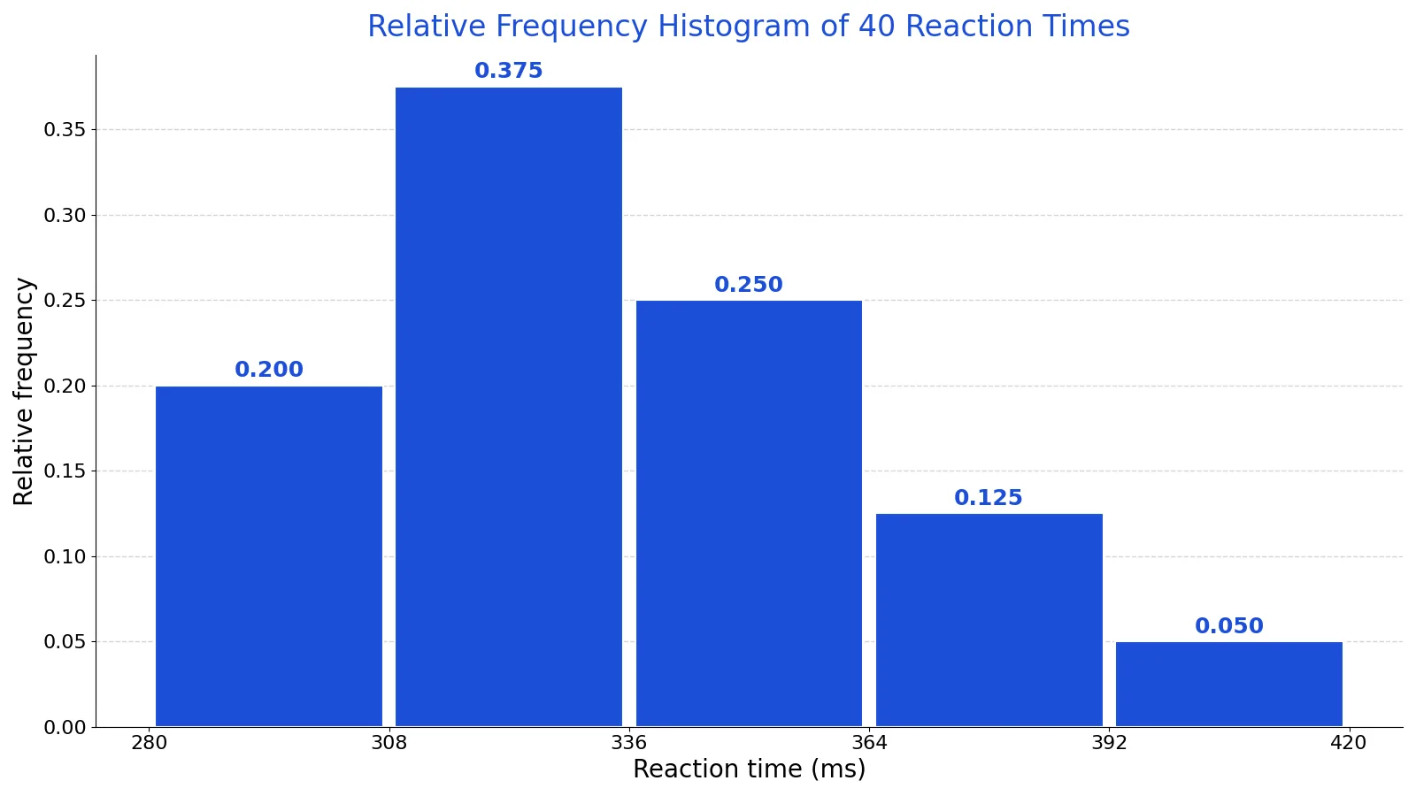
A relative frequency histogram is a bar chart for quantitative data where each bar's height is the proportion of observations in that bin, not the raw count. Because every bar is divided by the same sample size, the heights always sum to 1.00, which makes the shape comparable across datasets of different sizes.
Quick Answer
- A frequency histogram plots counts on the vertical axis. A relative frequency histogram plots proportions.
- Each bar height equals the bin count divided by the total number of observations: $\text{relative frequency} = f / n$.
- The bar heights of a relative frequency histogram sum to 1.00 (or 100% if you use percentages).
- The two histograms have identical shapes. Only the vertical axis scale changes [1].
- Use it when you want to compare distributions from samples of different sizes or estimate probabilities.
What a Relative Frequency Histogram Means
In plain terms, a relative frequency histogram answers "what share of the data falls here?" instead of "how many values fall here?" If 15 of 40 reaction times land in one bin, the bar for that bin reaches 0.375, meaning 37.5% of the sample sits in that range.
The precise definition: for a set of quantitative data split into non-overlapping classes, the relative frequency of a class is the number of observations in that class divided by the total number of observations [2]. A relative frequency histogram is a diagram that draws, for each class, a vertical bar whose length equals that class's relative frequency [2]. The bars touch, because the underlying variable is continuous and no value on the number line should be left uncovered unless its frequency is zero [3].
The distinction from a frequency histogram is only the vertical axis. A histogram that uses frequencies on the vertical axis is a frequency histogram, and one that uses relative frequencies is a relative frequency histogram [3]. The horizontal axis is labeled with what the data represents, and the graph has the same shape under either label [1].
How It Works
The mechanism is a single division applied to every bin.
$$rf_i = \frac{f_i}{n}$$
- $rf_i$ is the relative frequency of bin $i$, a number between 0 and 1.
- $f_i$ is the frequency of bin $i$, the count of observations that fall in that bin.
- $n$ is the total number of observations in the sample.
Because every bin is divided by the same $n$, the sum of all relative frequencies is exactly 1:
$$\sum_{i=1}^{k} rf_i = \frac{1}{n}\sum_{i=1}^{k} f_i = \frac{n}{n} = 1$$
where $k$ is the number of bins. This is the property that makes the chart useful. The sum of the relative frequency column in a frequency table is 1, and the last entry of a cumulative relative frequency column is also 1, indicating that 100% of the data has been accumulated [4]. Rounding can push the total slightly off 1, but it should stay close [4].
There is a second, less common normalization. You can divide each count by $n$ times the class width, which makes the area under the histogram equal 1 instead of the heights. That version is closer to a probability density function and is the right choice if you plan to overlay a density curve [5]. For everyday reading, the count-over-$n$ version is the intuitive one, since the bar height is the proportion of the sample [5].
Worked Example
The dataset is 40 reaction-time measurements in milliseconds from a lab task.
| 312 | 298 | 341 | 355 | 289 | 402 | 318 | 327 | 366 | 295 |
|---|---|---|---|---|---|---|---|---|---|
| 334 | 310 | 378 | 302 | 349 | 321 | 288 | 361 | 337 | 315 |
| 392 | 305 | 328 | 344 | 299 | 371 | 313 | 356 | 322 | 308 |
| 383 | 331 | 297 | 365 | 340 | 316 | 352 | 324 | 309 | 347 |
Step 1. Find the sample size. There are 40 values, so $n = 40$.
Step 2. Choose the range and bin width. The smallest value is 288 and the largest is 402, so a working range of 280 to 420 gives a span of 140. With 5 bins, the width is $140 / 5 = 28$.
Step 3. Define the bins. They are [280, 308), [308, 336), [336, 364), [364, 392), and [392, 420). A value equal to an edge goes into the bin on its right.
Step 4. Count each bin. The counts are 8, 15, 10, 5, and 2. They add to 40.
Step 5. Divide each count by 40.
| Bin (ms) | Count $f_i$ | Relative frequency $f_i / 40$ |
|---|---|---|
| [280, 308) | 8 | 0.2000 |
| [308, 336) | 15 | 0.3750 |
| [336, 364) | 10 | 0.2500 |
| [364, 392) | 5 | 0.1250 |
| [392, 420) | 2 | 0.0500 |
| Total | 40 | 1.0000 |
The tallest bar sits at 0.375, so 37.5% of the reaction times fall between 308 and 336 ms. The two slowest bins together hold 17.5% of the sample.
Here is the same computation in Python.
import numpy as np
times = [312, 298, 341, 355, 289, 402, 318, 327, 366, 295, 334, 310, 378, 302, 349, 321, 288, 361, 337, 315, 392, 305, 328, 344, 299, 371, 313, 356, 322, 308, 383, 331, 297, 365, 340, 316, 352, 324, 309, 347]
counts, edges = np.histogram(times, bins=5, range=(280, 420))
rel = counts / counts.sum()
print(counts)   # [8, 15, 10, 5, 2]
print(rel)      # [0.2, 0.375, 0.25, 0.125, 0.05]
Output:
counts = [8, 15, 10, 5, 2]; rel = [0.2, 0.375, 0.25, 0.125, 0.05]If you want the full table with cumulative columns alongside the counts, the steps are the same as building any frequency distribution, and the running total is covered in how to calculate cumulative relative frequency.
How to Interpret It
Read the vertical axis as a share, not a headcount. A bar at 0.25 means a quarter of the sample, whatever the sample size happens to be.
Three things to look at:
- Shape. The overall silhouette tells you whether the data are symmetric, skewed, or multi-peaked. The shape is identical to the frequency histogram, so you lose nothing by switching axes [1]. For a fuller vocabulary of shapes, see histogram shapes explained.
- Center and spread. The tallest region approximates the center, and the width of the occupied bins approximates the spread [1].
- Probability. With a large sample, a bar height is a reasonable estimate of the probability that a new observation lands in that bin. That reading is exactly why the normalization exists [5].
One practical note on sample size. When $n$ is small, only a few classes can be used and the histogram looks coarse. As $n$ grows, more classes become usable, the bars get finer, and with a very large sample the outline approaches a smooth curve [2].
When to Use It (and when not to)
Use a relative frequency histogram when:
- You are comparing two or more groups with different sample sizes. Proportions put them on the same scale.
- You want to communicate shares to a non-technical audience.
- You are treating the sample as an estimate of a population distribution.
- You need the bars to sum to 1 for a downstream calculation.
Do not use it when:
- Your reader needs actual counts. "12 students" is more actionable than "0.30 of students" in an operational report.
- You want to overlay a probability density curve. Use the density normalization instead, where area rather than height equals 1 [5].
- The data are categorical. A histogram requires a continuous or ordered numeric variable with touching bars, and a bar chart is the right display for categories [3].
Relative Frequency Histogram vs Frequency Histogram
The two charts share bins, edges, and shape. Only the vertical axis differs [2][3].
| Feature | Frequency histogram | Relative frequency histogram |
|---|---|---|
| Vertical axis | Count of observations | Proportion of observations |
| Bar height formula | $f_i$ | $f_i / n$ |
| Heights sum to | $n$ | 1.00 |
| Changes if $n$ changes | Yes | No, if the distribution is stable |
| Best for | Counts, totals, operational reporting | Comparing samples, estimating probabilities |
| Shape | Identical | Identical |
If you already have a frequency table, converting one to the other is a single column of division. The table structure itself is the same one described in frequency table: definition, how to make one, examples.
Common Mistakes
- Dividing by the number of bins instead of $n$. The denominator is always the total number of observations, not the number of classes. Fix: check that your relative frequencies sum to 1.00.
- Leaving gaps between bars. A histogram has contiguous boxes because the variable is continuous [1]. Fix: draw the bars touching unless a bin genuinely has zero frequency.
- Using unequal bin widths and reading heights as densities. With unequal widths, a taller bar may simply be a wider bin. Fix: use equal widths, or switch to the density normalization where area carries the meaning [5].
- Forgetting that edge values need a rule. A value exactly on a boundary must go into one bin only. Fix: state the convention, such as left-closed and right-open intervals, and apply it consistently.
- Comparing a relative frequency histogram to a frequency histogram without checking the axis. The shapes match, so a quick glance can hide the fact that the scales differ by a factor of $n$ [1]. Fix: read the axis label before drawing conclusions.
- Reporting rounded proportions that do not total 1. Rounding can push the sum off 1, and the cumulative column may not end at exactly 1 [4]. Fix: note the rounding, or carry more decimals.
Limitations
A relative frequency histogram is a summary, and summaries discard information. You cannot recover individual values, the exact median, or outliers from the bars. Two very different datasets can produce the same histogram if their values fall in the same bins.
The result also depends on choices you make. Changing the number of bins or shifting the edges changes the picture, sometimes substantially. With small samples, the bars are coarse and unstable, and a single observation can move a bar by a visible amount [2]. A relative frequency histogram estimates a distribution, but it is not the distribution itself.
Frequently Asked Questions
What is the difference between a histogram and a relative frequency histogram?
They use the same bins and produce the same shape. A histogram plots counts on the vertical axis, while a relative frequency histogram plots the count in each bin divided by the total number of observations [2][3]. The relative version always sums to 1, which makes it the better choice for comparing samples of different sizes.
How do you find the relative frequency of a bin?
Divide the bin's count by the total number of observations. If 15 of 40 values fall in a bin, the relative frequency is $15/40 = 0.375$, or 37.5% [4]. Repeat for every bin, then check that the results sum to 1.
Do the bars of a relative frequency histogram always add up to 1?
Yes, when you normalize by the total count. Each bar is $f_i / n$, so the sum is $n/n = 1$ [4]. Rounding can leave the total slightly above or below 1, and the cumulative column may not end at exactly 1, but both should be close [4].
Can relative frequencies be greater than 1?
Not with the count-over-$n$ normalization, since each proportion is at most 1. With the density normalization, where counts are divided by $n$ times the class width, relative frequencies greater than 1 are permissible [5]. That version is used when you want the area under the histogram to equal 1.
When should I use a relative frequency histogram instead of a frequency histogram?
Use it when sample sizes differ between the groups you are comparing, when you want to estimate probabilities, or when you want the bars to sum to 1 [5]. Stick with a frequency histogram when your audience needs actual counts, such as the number of defective parts or the number of patients in each age band.
References
- 2.3: Histograms, Frequency Polygons, and Time Series Graphs - Mathematics LibreTexts/02%3A_Descriptive_Statistics/2.03%3A_Histograms_Frequency_Polygons_and_Time_Series_Graphs)
- 2.1: Three Popular Data Displays - Statistics LibreTexts/02%3A_Descriptive_Statistics/2.01%3A_Three_Popular_Data_Displays)
- 2.2: Visual Summaries of Quantitative Data - Mathematics LibreTexts
- 2.2: Display Data - Statistics LibreTexts/02%3A_Descriptive_Statistics/2.02%3A_Display_Data)
- 1.3.3.14. Histogram