Histogram Shapes Explained: Bell-Shaped, Symmetric and Skewed
By Dr. Zubair Khalid, DVM, MS, PhD ·
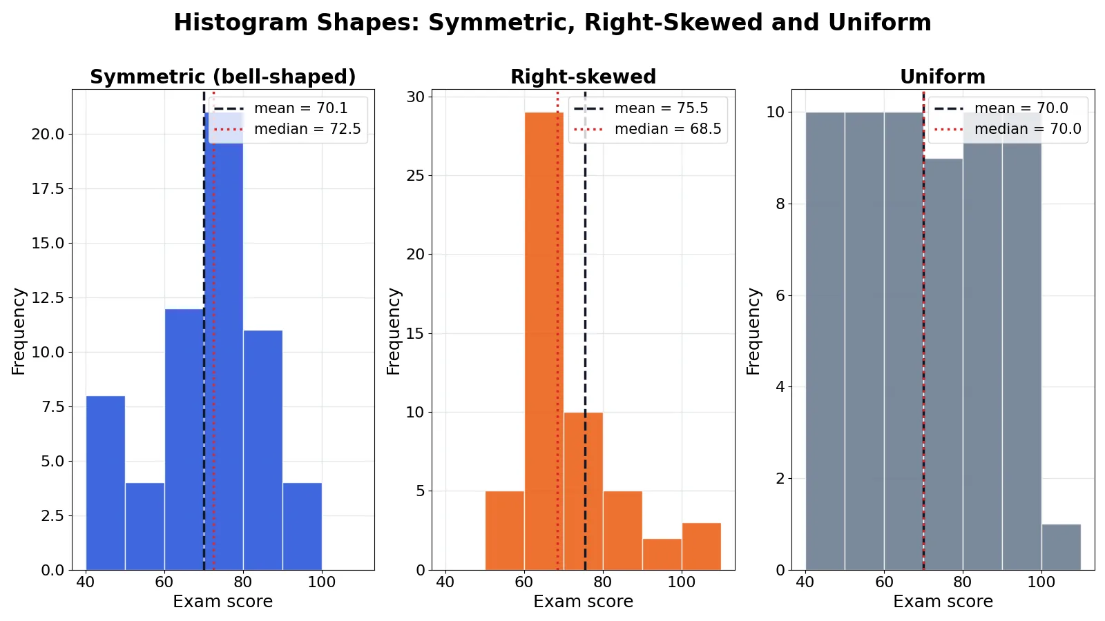
A histogram's shape is the quickest read you get on a dataset. If the bars rise to a single peak and fall away evenly on both sides, you have a bell-shaped histogram. If one tail stretches out further than the other, the data is skewed, and the direction of that tail tells you where the extreme values sit.
Quick Answer
- Symmetric: the left and right halves of the histogram are mirror images, so the mean and median sit close together [1].
- Bell-shaped: a symmetric histogram with one peak in the middle and tails that thin out gradually. The normal distribution is the classic example [2].
- Right-skewed (positive): the long tail points right, so the mean is pulled above the median [1].
- Left-skewed (negative): the long tail points left, so the mean drops below the median.
- Bimodal: two clear peaks, which usually means two groups are mixed in one dataset [2].
What Histogram Shapes Mean
A histogram shape is the outline you see when you plot how often values fall into each bin. The shape is a picture of the distribution, and it tells you where the typical value sits and how far the extremes reach.
The precise definition is narrower. A histogram is symmetric when the two halves of the bars appear as mirror images of one another [1]. A histogram is skewed when it is not symmetric, and the skew is named after the side with the longer, more drawn-out tail [1]. A histogram is unimodal when it has a single peak and bimodal when it has two [2]. The peak itself marks the sample mode, the value that occurs most often [2].
Those three properties, symmetry, tail length and number of peaks, cover most of the shapes you will meet in practice.
How It Works
You do not need a formula to read a histogram, but you do need one to confirm what your eye suspects. The most common check is the relationship between the mean and the median.
$$\text{Skew direction} = \text{sign}(\bar{x} - \tilde{x})$$
- $\bar{x}$ is the sample mean, the arithmetic average of all values.
- $\tilde{x}$ is the sample median, the middle value when the data is sorted.
- A positive difference means the mean sits to the right of the median, which points to a right tail.
- A negative difference means the mean sits to the left, which points to a left tail.
The mean is sensitive to extreme values because every observation contributes to the sum. The median only cares about position, so a handful of very large or very small values barely move it. When a tail stretches out, it drags the mean toward it and leaves the median behind. That gap is the fingerprint of skew.
For a symmetric, bell-shaped distribution the mean and median are effectively the same point, and that point is the peak of the histogram [1]. For a skewed distribution there is no single unambiguous center, which is why analysts report the median alongside the mean when the shape is not symmetric [1].
A formal skewness statistic sharpens the same idea. The adjusted Fisher-Pearson coefficient measures the asymmetry of the distribution around its mean. Values near zero indicate symmetry, positive values indicate a right tail, and negative values indicate a left tail.
Worked Example
The dataset is 60 exam scores from a class, ranging from 42 to 100, binned into 10-point intervals.
| Score | |||||
|---|---|---|---|---|---|
| 42 | 45 | 48 | 50 | 52 | 53 |
| 55 | 55 | 56 | 57 | 58 | 58 |
| 59 | 60 | 60 | 61 | 61 | 62 |
| 62 | 63 | 63 | 64 | 64 | 65 |
| 65 | 65 | 66 | 66 | 67 | 67 |
| 68 | 68 | 69 | 69 | 70 | 70 |
| 71 | 71 | 72 | 72 | 73 | 73 |
| 74 | 75 | 76 | 77 | 78 | 80 |
| 82 | 85 | 88 | 90 | 92 | 94 |
| 96 | 97 | 98 | 99 | 100 | 100 |
The bin edges are 40, 50, 60, 70, 80, 90, 100 and 110. The counts per bin are 3, 10, 21, 13, 4, 7 and 2. That gives a tall block in the 60 to 69 range and a thin scatter of high scores stretching to the right.
The summary statistics are:
- n = 60
- Mean = 4196 / 60 = 69.9333
- Median = (67 + 68) / 2 = 67.5000
- Sample SD (n-1, Excel STDEV.S) = 14.3950
- Population SD (n, Excel STDEV.P) = 14.2745
- Q1 (Excel QUARTILE.INC) = 60.7500
- Q3 (Excel QUARTILE.INC) = 76.2500
- IQR = 76.2500 - 60.7500 = 15.5000
- Mean - median = 69.9333 - 67.5000 = 2.4333
- Relative gap = 2.4333 / 14.3950 = 0.1690
- Sample skewness (adjusted Fisher-Pearson) = 0.5652
The mean sits 2.43 points above the median, and the skewness is positive at 0.5652. Both signals agree with the picture: the histogram is right-skewed.
import pandas as pd, numpy as np
scores = pd.Series([42,45,48,50,52,53,55,55,56,57,58,58,59,60,60,61,61,62,62,63,
                    63,64,64,65,65,65,66,66,67,67,68,68,69,69,70,70,71,71,72,72,
                    73,73,74,75,76,77,78,80,82,85,88,90,92,94,96,97,98,99,100,100])
counts, edges = np.histogram(scores, bins=range(40, 111, 10))
print('mean =', scores.mean(), 'median =', scores.median())
print('counts =', counts)
mean = 69.93333333333334 median = 67.5
counts = [ 3 10 21 13 4 7 2]The bin counts confirm the shape. Most of the class clusters between 60 and 79, and the small group of high scorers in the 90s and at 100 pulls the mean upward without moving the median much.
How to Interpret It
Read the shape first, then read the numbers that match it.
Symmetric and bell-shaped. The mean and median are close, and the peak marks the typical value. Standard deviations are meaningful here because the tails behave predictably. If you want the full picture of why this shape matters, see bell curve and normal distribution explained.
Right-skewed. A few large values stretch the right tail. Income, house prices and waiting times behave this way. Report the median as the typical value, because the mean is inflated by the tail [1].
Left-skewed. A few small values stretch the left tail. Scores on an easy test often look like this, with most people near the top and a small group far below. The mean is dragged down, so the median again describes the typical case better. For a fuller treatment, see left skewed distribution meaning.
Bimodal. Two peaks usually mean two populations are mixed together, such as two shifts, two regions or two customer segments. A bimodal histogram is a diagnostic signal, and asking why it is bimodal often leads to a better model of the underlying process [2].
Uniform. The bars are roughly level across the range. There is no single typical value, and the mean and median both sit near the middle of the range.
When to Use It (and when not to)
Use a histogram shape check early in any analysis. It tells you whether the mean is a fair summary, whether you should report the median instead, and whether your data contains more than one group. It is also the fastest way to spot data entry errors, since a stray value far from the rest of the data shows up as an isolated bar.
Do not rely on shape alone when the sample is small. With 20 or 30 observations, random variation produces peaks and gaps that look like real structure but are noise. Do not use shape to decide whether a distribution is normal in a formal sense either. Visual inspection is a screening step, not a test. And do not assume a bell-shaped histogram means the data came from a normal process, since many different processes produce similar-looking curves.
Histogram Shape vs Distribution Shape
The two terms are often used interchangeably, but they are not the same thing.
| Histogram shape | Distribution shape | |
|---|---|---|
| What it is | The outline of the bars you plotted | The theoretical curve the data came from |
| Depends on | Bin width and bin start point | The underlying process only |
| Stability | Changes when you change bins | Fixed for a given population |
| Use it for | A quick visual read of your sample | Probability statements and inference |
A histogram is an estimate. Change the bin width and the outline shifts, even though the data has not changed. The distribution is what the histogram is trying to show you. For a related view of how binning choices change the picture, see relative frequency histogram definition and examples.
Common Mistakes
- Judging skew from the tallest bar. The tallest bar shows the mode, not the direction of skew. Fix: compare the lengths of the two tails, then confirm with the mean minus median gap.
- Using too few or too many bins. Five bins hide real structure, and fifty bins turn noise into fake peaks. Fix: try a few bin widths and check whether the overall shape survives.
- Calling any asymmetric histogram skewed. A single outlier can create a long tail that is not a property of the population. Fix: check the skewness statistic and look at the raw values in the tail.
- Reporting the mean for a skewed variable. The mean is pulled toward the tail and overstates or understates the typical case [1]. Fix: report the median for skewed data, or report both and say which is which.
- Missing a bimodal shape. Two peaks can look like one wide peak if the bins are too coarse. Fix: narrow the bins before concluding the data is unimodal.
- Assuming a bell shape means normality. Many distributions are symmetric and bell-like without being normal. Fix: treat the shape as a hint and test formally if the distinction matters.
Limitations
A histogram shape is a summary of one sample, not a property of the population. Two samples from the same distribution can produce visibly different histograms, especially at small n. The shape also depends on choices you made, including bin width and where the first bin starts, so it is not a fixed quantity you can quote with confidence.
Shape tells you nothing about causation or about which model fits best. It also cannot distinguish a true second peak from a gap caused by rounding or by a measurement ceiling. Treat the shape as a starting question, not a final answer.
Frequently Asked Questions
What does a bell-shaped histogram tell you?
It tells you the data is symmetric with a single central peak and tails that thin out on both sides. The mean and median sit close together, near the peak. This shape is common in measurements that are the sum of many small independent effects, which is why the normal distribution is the standard example [2].
How do I tell if a histogram is skewed left or right?
Look at which tail is longer. If the tail stretches to the right, the histogram is right-skewed, and the mean will be greater than the median [1]. If the tail stretches to the left, it is left-skewed, and the mean will be less than the median. The mean-minus-median gap confirms what your eye sees.
Can a histogram be both symmetric and skewed?
No. Symmetric and skewed are opposites. A histogram is symmetric when its two halves are mirror images, and skewed when they are not [1]. A histogram can be symmetric and bimodal at the same time, but it cannot be symmetric and skewed at the same time.
What causes a bimodal histogram?
Two peaks usually mean the data contains two distinct groups. Examples include test scores from two different classes, delivery times from two shifts, or sensor readings from two locations. Splitting the data by the grouping variable and plotting each group separately often resolves the shape [2].
Does the shape change if I change the bin width?
Yes. Bin width and bin start point both affect the outline. Wider bins smooth the shape and can hide a second peak. Narrower bins reveal detail but also amplify random noise. The underlying distribution does not change, only your view of it.
References
- 1.3.3.14.6. Histogram Interpretation: Skewed (Non-Normal) Right
- 1.3.3.14.4. Histogram Interpretation: Symmetric and Bimodal
Further Reading
- NIST/SEMATECH e-Handbook of Statistical Methods
- OpenStax. Introductory Statistics 2e
- Krzywinski M, Altman N (2013). Importance of being uncertain. Nature Methods
- Krzywinski M, Altman N (2013). Significance, P values and t-tests. Nature Methods