Correlation Examples: Positive, Negative and Zero Relationships
By Dr. Zubair Khalid, DVM, MS, PhD ·
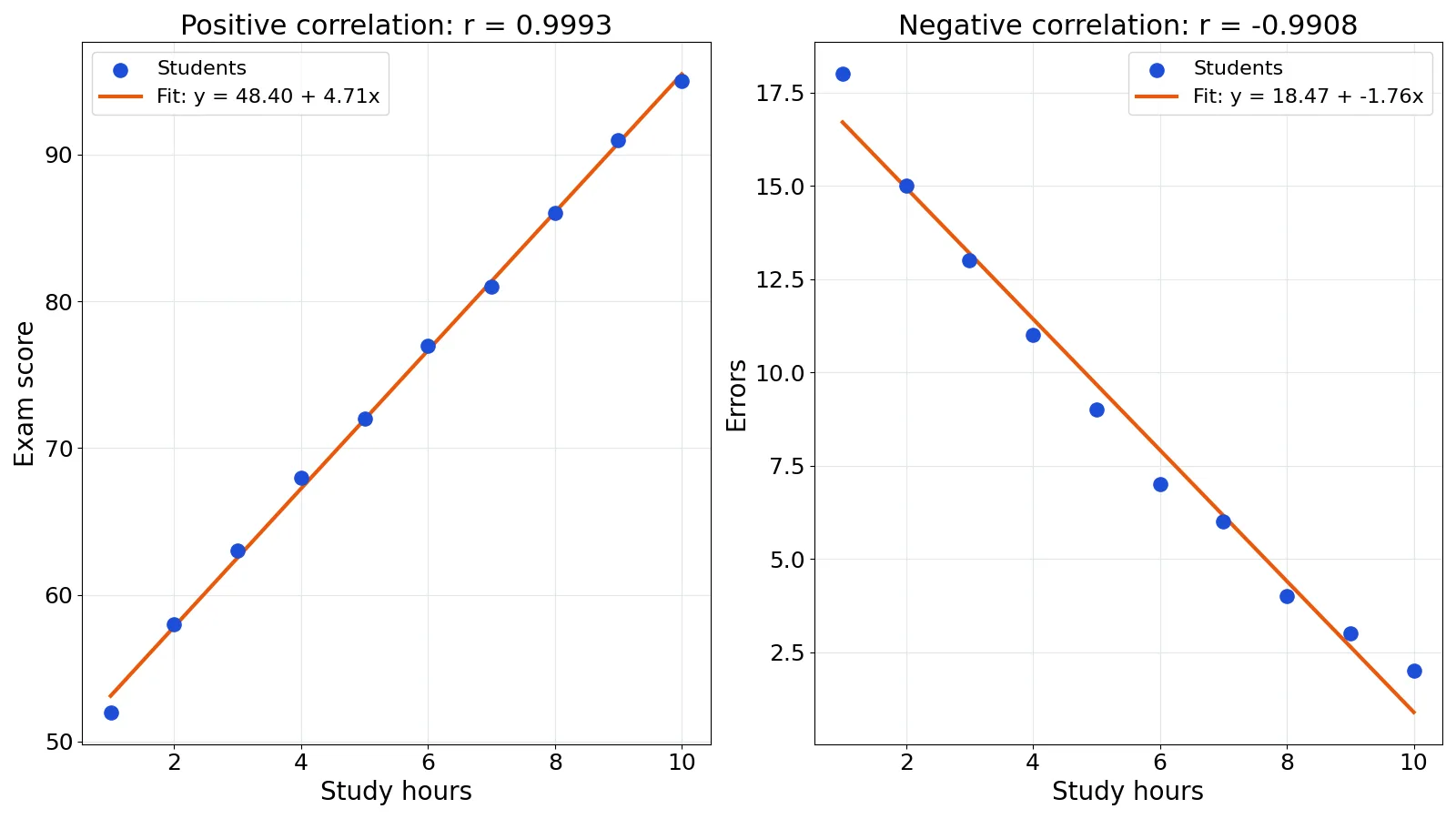
Correlation examples are easiest to understand when you can see the numbers behind them. A positive correlation means two variables move in the same direction, a negative correlation means they move in opposite directions, and a zero correlation means there is no straight-line pattern between them. This article walks through all three with real values, a full calculation, and the mistakes that trip people up.
Quick Answer
- Positive correlation: as one variable increases, the other tends to increase. In the dataset below, study hours and exam scores have $r = 0.9993$.
- Negative correlation: as one variable increases, the other tends to decrease. Study hours and errors made have $r = -0.9908$.
- Zero correlation: no linear pattern. A flat scatter plot gives $r$ near 0, but $r = 0$ does not prove the variables are unrelated [1].
- The coefficient $r$ always falls between -1 and 1. Values near 1 or -1 are strong, values near 0 are weak [1].
- Correlation is not causation. Ice cream sales and drowning deaths rise together, but hot weather drives both [2].
What Correlation Means
In plain terms, correlation describes how strongly two variables move together in a straight-line pattern. If high values of one variable tend to come with high values of the other, you have a positive relationship. If high values of one come with low values of the other, you have a negative relationship. If there is no pattern, you have a zero or near-zero relationship.
The precise statistical definition uses the Pearson correlation coefficient, written $r$. It measures the strength and direction of the linear relationship between two quantitative variables. The value is unitless, so it does not depend on whether you measure hours, dollars, or kilograms. That makes it easy to compare relationships across very different datasets.
One detail matters more than any other. $r = 0$ means there is no linear correlation, not that the variables are unrelated. A strong curved pattern can produce $r$ near 0 while the two variables are clearly connected [1]. This is why you should always plot your data before trusting a single number.
How It Works
The Pearson correlation coefficient compares how far each point sits from the mean of both variables. The formula is:
$$r = \frac{\sum (x_i - \bar{x})(y_i - \bar{y})}{\sqrt{\sum (x_i - \bar{x})^2} \cdot \sqrt{\sum (y_i - \bar{y})^2}}$$
Each symbol has a specific job:
- $x_i$ and $y_i$ are the individual data values for one observation.
- $\bar{x}$ and $\bar{y}$ are the means of the two variables.
- $(x_i - \bar{x})$ is how far a value sits from its own mean.
- The numerator multiplies those deviations together. When both are above their means, or both below, the product is positive. When one is above and the other below, the product is negative.
- The denominator rescales the result so $r$ always lands between -1 and 1 [1].
If you want to skip the arithmetic, the Correlation Coefficient Calculator returns $r$ from a pasted column of values.
Worked Example
The dataset below tracks 10 students, their weekly study hours, their exam score, and the number of errors they made on a practice test.
| Student | Hours | Score | Errors |
|---|---|---|---|
| S1 | 1 | 52 | 18 |
| S2 | 2 | 58 | 15 |
| S3 | 3 | 63 | 13 |
| S4 | 4 | 68 | 11 |
| S5 | 5 | 72 | 9 |
| S6 | 6 | 77 | 7 |
| S7 | 7 | 81 | 6 |
| S8 | 8 | 86 | 4 |
| S9 | 9 | 91 | 3 |
| S10 | 10 | 95 | 2 |
Positive relationship: hours vs score
- Mean study hours: $\bar{x} = 5.5000$
- Mean exam score: $\bar{y} = 74.3000$
- Numerator: $\sum (x - \bar{x})(y - \bar{y}) = 388.5000$
- Denominator: $9.0830 \times 42.8030 = 388.7779$
- Pearson $r = 388.5000 / 388.7779 = 0.9993$
That value sits almost on top of 1, so the relationship is very strong and positive. The fitted line has a slope of 4.7091 and an intercept of 48.4, meaning each extra hour of study is associated with roughly 4.7 more points.
Negative relationship: hours vs errors
- Mean errors: $\bar{y} = 8.8000$
- Numerator: $\sum (x - \bar{x})(y - \bar{y}) = -145.0000$
- Denominator: $9.0830 \times 16.1121 = 146.3455$
- Pearson $r = -145.0000 / 146.3455 = -0.9908$
The negative sign tells you the direction. More study hours go with fewer errors. The slope here is -1.7576 with an intercept of 18.4667.
Zero relationship
If every student scored the same value, the deviations on the score variable would all be zero, the denominator would collapse, and $r$ would be undefined. A more realistic zero case uses a varied second variable that has no pattern with hours, which produced $r = 0.3212$. By the bands below that is a weak positive relationship, not a true zero correlation, so a sample of genuinely unrelated values would usually give an $r$ even closer to 0 [3].
Here is the Python code that produced the two main coefficients:
import pandas as pd
from scipy.stats import pearsonr

df = pd.DataFrame({
    "hours": [1, 2, 3, 4, 5, 6, 7, 8, 9, 10],
    "score": [52, 58, 63, 68, 72, 77, 81, 86, 91, 95],
    "errors": [18, 15, 13, 11, 9, 7, 6, 4, 3, 2]
})

r_pos, p_pos = pearsonr(df["hours"], df["score"])
r_neg, p_neg = pearsonr(df["hours"], df["errors"])
print(f"Positive r = {r_pos:.4f}")
print(f"Negative r = {r_neg:.4f}")
Output:
Positive r = 0.9993
Negative r = -0.9908
In Excel, the same results come from =CORREL(A2:A11,B2:B11) for the positive case and =CORREL(A2:A11,C2:C11) for the negative case.
How to Interpret It
Read $r$ in two parts: the sign and the size.
The sign gives direction. A positive sign means the variables rise and fall together. A negative sign means one rises while the other falls. The size gives strength. The closer $r$ is to 1 or -1, the tighter the points cluster around a straight line. The closer $r$ is to 0, the looser the pattern [1].
A rough guide for everyday work:
| Value of r | Reading |
|---|---|
| 0.90 to 1.00 | Very strong positive |
| 0.70 to 0.89 | Strong positive |
| 0.40 to 0.69 | Moderate positive |
| 0.10 to 0.39 | Weak positive |
| -0.10 to 0.10 | Essentially none |
| -0.39 to -0.10 | Weak negative |
| -0.69 to -0.40 | Moderate negative |
| -0.89 to -0.70 | Strong negative |
| -1.00 to -0.90 | Very strong negative |
These bands are conventions, not laws. What counts as strong depends on your field. A correlation of 0.3 in social science survey data can be meaningful, while 0.3 in a physics measurement might signal a problem. For a deeper look at how to rank coefficient values, see which R-value represents the strongest correlation.
When to Use It (and when not to)
Use Pearson correlation when both variables are quantitative, the relationship looks roughly straight on a scatter plot, and you want a single number for direction and strength. It pairs naturally with regression, where the same data feeds a prediction model.
Avoid it in these situations:
- The pattern is curved. A U-shaped relationship between water and plant growth can show a positive correlation in one half of the data, a negative correlation in the other half, and no correlation across the full set [3]. Use a nonlinear relationship analysis instead.
- You have ordinal ranks. Use Spearman or Kendall coefficients, covered in ranking correlation coefficient.
- One variable is categorical. Pearson needs numbers on both sides.
- You want to claim cause. Correlation cannot do that job. See correlation vs causation.
Correlation vs Covariance
Covariance and correlation both measure how two variables move together. The difference is scale.
| Feature | Covariance | Correlation |
|---|---|---|
| Range | Unbounded | -1 to 1 |
| Units | Product of the two units | None |
| Direction | Yes | Yes |
| Strength | Hard to judge | Easy to judge |
| Depends on scale | Yes | No |
Covariance tells you the direction of the relationship but its size depends on the units, so a large covariance might just mean you measured in small units. Correlation divides out those scales, which is why it is easier to compare across studies. The full breakdown lives in correlation vs covariance.
Common Mistakes
- Assuming correlation means causation. Ice cream sales and drowning deaths correlate strongly, but hot weather drives both [2]. Fix: ask whether a third variable could explain the link before claiming one causes the other.
- Treating $r = 0$ as proof of no relationship. A perfect curve can produce $r = 0$ [1]. Fix: always plot the scatter before interpreting the number.
- Ignoring outliers. A single extreme point can flip a correlation from positive to negative or make it much stronger [4]. Fix: check for points far from the rest and rerun the analysis without them.
- Reading a weak $r$ as meaningful because the sample is large. With enough data, tiny correlations become statistically significant. Fix: judge practical size, not just the p-value.
- Comparing $r$ across groups without checking ranges. Restricting the range of one variable shrinks the correlation. Fix: confirm both groups cover a similar spread.
- Using Pearson on ranked or skewed data. The coefficient assumes a linear pattern and is sensitive to skew. Fix: switch to a rank-based method when the data are ordinal.
Limitations
Correlation captures only straight-line relationships. It says nothing about curved patterns, and it cannot tell you which variable influences which. It is also sensitive to outliers, so one unusual observation can distort the value in either direction [4]. A strong $r$ does not guarantee that predictions will be accurate outside the range of your data.
The coefficient also ignores the mechanism behind the numbers. Two variables can be tightly linked through a shared cause, through coincidence, or through a sampling quirk. With large datasets, random chance alone produces some surprisingly strong but meaningless correlations [2]. Always pair the number with a scatter plot and some subject knowledge.
Frequently Asked Questions
What is an example of positive correlation?
Study hours and exam scores are a classic case. In the dataset above, students who studied more scored higher, with $r = 0.9993$. Other examples include height and weight in adults, or temperature and ice cream sales [2].
What is an example of negative correlation?
Study hours and errors made move in opposite directions, giving $r = -0.9908$ in the worked example. The number of children a woman has and her life expectancy is another negative correlation, though better health care likely explains both [5].
Can a correlation be exactly zero?
Yes, but it is rare in real data. If one variable never changes, the correlation is undefined because the denominator is zero. In practice, unrelated variables give values close to zero but rarely exactly zero [3].
Does a correlation of 0.9 mean one variable causes the other?
No. A high $r$ only means the two variables move together in a straight-line pattern. A third variable, such as temperature or income, can drive both. The Planters peanut label wording exists precisely because studies show a relationship without proving cause [5].
How many data points do I need for a reliable correlation?
There is no fixed threshold, but small samples produce unstable estimates. With 10 points, a single outlier can swing $r$ dramatically [4]. For survey work, aim for at least 30 pairs, and always inspect the scatter plot alongside the coefficient.
References
- 10.2: Correlation - Statistics LibreTexts/10%3A_Regression_and_Correlation/10.02%3A_Correlation)
- 14.3: Correlation versus Causation - Statistics LibreTexts/03%3A_Relationships/14%3A_Correlations/14.03%3A_Correlation_versus_Causation)
- 12.6: Interpreting Correlations - Business LibreTexts
- 13.3: Correlation Considerations - Statistics LibreTexts
- 3.3.2: Correlation and Causation Scatter Plots - Mathematics LibreTexts
Further Reading
- NIST/SEMATECH e-Handbook of Statistical Methods
- Altman N, Krzywinski M (2015). Simple linear regression. Nature Methods
Related Articles
- Negative Correlation Examples: Definition and Real Data Cases
- What Is Zero Correlation? Definition and Examples
- No Correlation: Definition, Graphs and Examples
- Nonlinear Relationships: Definition and Examples
- Which R-Value Represents the Strongest Correlation? A Guide to Interpreting Correlation Coefficients
- Correlation Analysis in SPSS
- Correlational Research