How to Make a Histogram in Excel (Step by Step)
By Dr. Zubair Khalid, DVM, MS, PhD ·
If you want to know how to make a histogram in Excel, the fastest route is to select your numeric column and insert a Statistic Chart of type Histogram. Excel then groups the values into bins automatically, and you can adjust the bin width and overflow bin in the Format Axis pane. This guide walks through that path plus a formula-based method that gives you full control over the bin edges.
Quick Answer
- Put your numeric data in one column with a header, for example scores in
B1:B41. - Select the data, then go to Insert > Charts > Insert Statistic Chart > Histogram [1].
- Right-click the horizontal axis, choose Format Axis, and set Bin width and Overflow bin to control the grouping [1].
- If you need exact bin edges, build a bin table and count values with
COUNTIFS, then chart the counts. - Label both axes with Chart Design > Add Chart Element > Axis Titles so the chart reads clearly [1].
Before You Start
A histogram shows how often values fall into ranges. Each bar covers a bin, and the bar height is the count of values inside that bin. That is different from a bar chart, where each bar is a separate category.
Three things need to be true before you insert the chart.
First, your data must be numeric. Text values will not bin correctly. If you have text categories, the histogram groups identical categories and sums the value axis instead [1].
Second, clean the column. Remove blank cells, stray labels and text mixed into the numbers. A single text entry in a numeric column can shift how Excel reads the range.
Third, decide on your bin width before you format. A bin width of 10 on scores from 60 to 100 gives you four or five bars. A bin width of 2 gives you twenty. The right choice depends on how much detail you need.
The built-in histogram chart is available in Excel 2016 and later, including Microsoft 365 [1][2].
Step by Step
- Lay out your data. Put a header in the first cell and the values below it. In the example below, scores sit in
B2:B41.
- Select the data range. Click the header cell and drag down to the last value, so
B1:B41is selected.
- Insert the histogram. Go to Insert > Charts > Insert Statistic Chart > Histogram [1]. Excel places a chart on the sheet with automatic bins.
- Open the axis options. Right-click the horizontal axis of the chart and select Format Axis, then choose Axis Options [1].
- Set the bin width. In the Format Axis task pane, set Bin width to the size of each range. By default the first bin starts at the smallest value, so a width of 10 on this data gives bins such as [62, 72] and (72, 82]. To get 60-69, 70-79 and so on, also set Underflow bin to 69.
- Set the overflow bin. Enter the upper limit you want to keep separate. Setting Overflow bin to 100 keeps the top range clean.
- Add axis titles. Click the chart, then go to Chart Design > Add Chart Element > Axis Titles and label the horizontal axis Score and the vertical axis Frequency [1].
- Format the bars. Use the Format tab to change gap width, fill color and border so the bars are easy to compare.
If you prefer to see the counts before you chart, the formula method in the next section gives you the numbers in cells first.
Worked Example
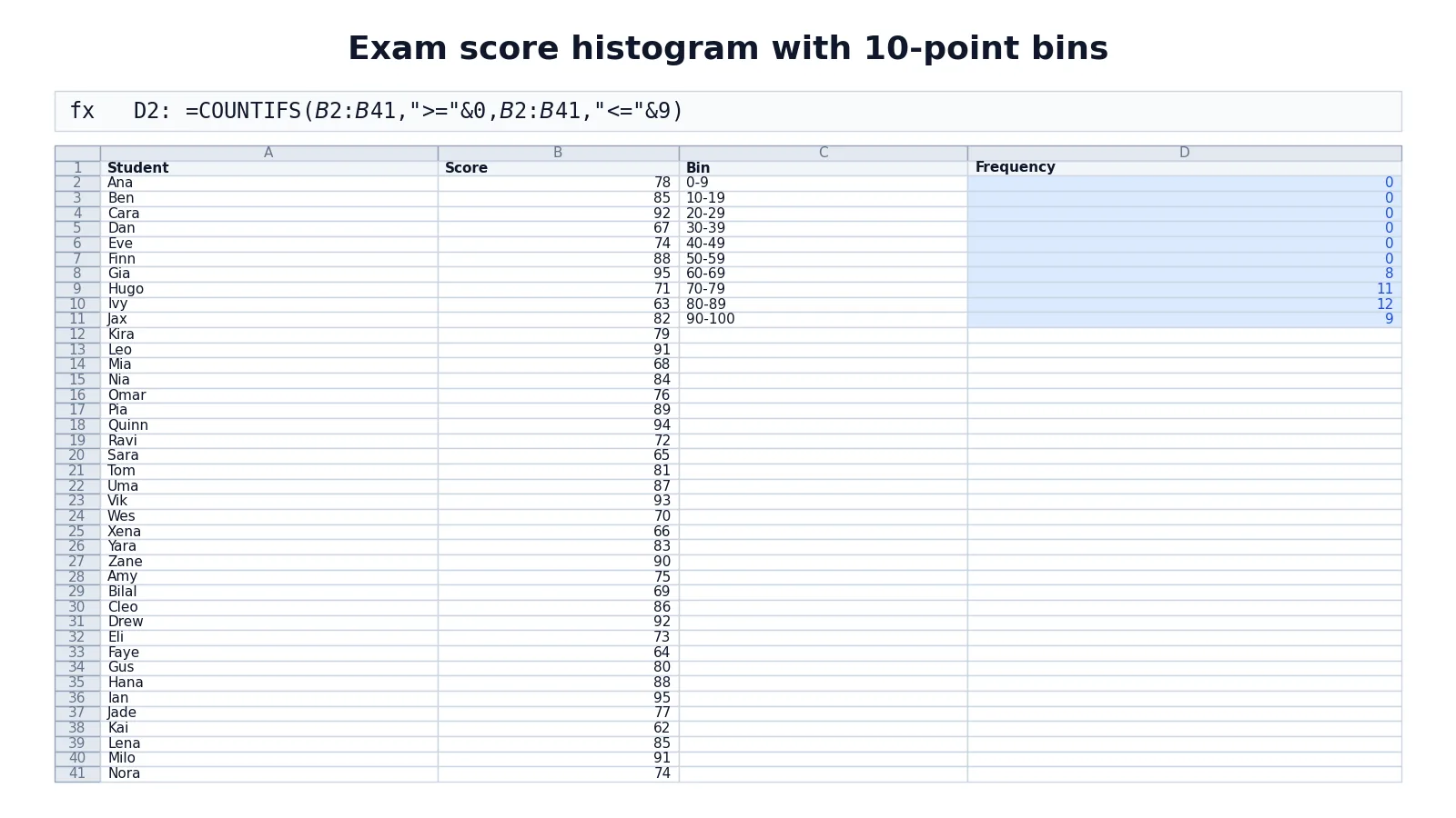
The dataset is 40 exam scores for a class, listed by student name in column A and score in column B. Column C holds bin labels and column D holds the frequency formulas.
| Row | A | B | C | D |
|---|---|---|---|---|
| 1 | Student | Score | Bin | Frequency |
| 2 | Ana | 78 | 0-9 | =COUNTIFS($B$2:$B$41,">="&0,$B$2:$B$41,"<="&9) -> 0 |
| 3 | Ben | 85 | 10-19 | =COUNTIFS($B$2:$B$41,">="&10,$B$2:$B$41,"<="&19) -> 0 |
| 4 | Cara | 92 | 20-29 | =COUNTIFS($B$2:$B$41,">="&20,$B$2:$B$41,"<="&29) -> 0 |
| 5 | Dan | 67 | 30-39 | =COUNTIFS($B$2:$B$41,">="&30,$B$2:$B$41,"<="&39) -> 0 |
| 6 | Eve | 74 | 40-49 | =COUNTIFS($B$2:$B$41,">="&40,$B$2:$B$41,"<="&49) -> 0 |
| 7 | Finn | 88 | 50-59 | =COUNTIFS($B$2:$B$41,">="&50,$B$2:$B$41,"<="&59) -> 0 |
| 8 | Gia | 95 | 60-69 | =COUNTIFS($B$2:$B$41,">="&60,$B$2:$B$41,"<="&69) -> 8 |
| 9 | Hugo | 71 | 70-79 | =COUNTIFS($B$2:$B$41,">="&70,$B$2:$B$41,"<="&79) -> 11 |
| 10 | Ivy | 63 | 80-89 | =COUNTIFS($B$2:$B$41,">="&80,$B$2:$B$41,"<="&89) -> 12 |
| 11 | Jax | 82 | 90-100 | =COUNTIFS($B$2:$B$41,">="&90,$B$2:$B$41,"<="&100) -> 9 |
| 12 | Kira | 79 | ||
| 13 | Leo | 91 | ||
| 14 | Mia | 68 | ||
| 15 | Nia | 84 | ||
| 16 | Omar | 76 | ||
| 17 | Pia | 89 | ||
| 18 | Quinn | 94 | ||
| 19 | Ravi | 72 | ||
| 20 | Sara | 65 | ||
| 21 | Tom | 81 | ||
| 22 | Uma | 87 | ||
| 23 | Vik | 93 | ||
| 24 | Wes | 70 | ||
| 25 | Xena | 66 | ||
| 26 | Yara | 83 | ||
| 27 | Zane | 90 | ||
| 28 | Amy | 75 | ||
| 29 | Bilal | 69 | ||
| 30 | Cleo | 86 | ||
| 31 | Drew | 92 | ||
| 32 | Eli | 73 | ||
| 33 | Faye | 64 | ||
| 34 | Gus | 80 | ||
| 35 | Hana | 88 | ||
| 36 | Ian | 95 | ||
| 37 | Jade | 77 | ||
| 38 | Kai | 62 | ||
| 39 | Lena | 85 | ||
| 40 | Milo | 91 | ||
| 41 | Nora | 74 |
The formula pattern is the same in every row. It counts values greater than or equal to the lower bound and less than or equal to the upper bound:
$$ \text{Frequency} = \text{COUNTIFS}(\text{range}, "\geq" \& \text{low}, \text{range}, "\leq" \& \text{high}) $$
The counts total 40, which matches the number of students. The distribution peaks in the 80-89 bin with 12 students, followed by 70-79 with 11 and 90-100 with 9. The lower bins are empty because no score falls below 60.
To turn this table into a chart, select C1:D11 and insert a column chart, or select B1:B41 and insert a Statistic Chart histogram with a bin width of 10 and an underflow bin of 69. Both produce the same shape. With a bin width of 10 alone, Excel starts the first bin at 62 and the bars differ.
Other Ways to Do It
The Analysis ToolPak. The Histogram analysis tool calculates individual and cumulative frequencies for a range of data and a set of bins [2]. It writes the results into a new range rather than drawing a chart, so you chart the output yourself. You need the ToolPak enabled first.
The FREQUENCY function. FREQUENCY is an array function that returns counts per bin in one step. Enter it over a range one cell longer than your bin list (the extra cell counts values above the last bin), then chart the results. It is faster than writing ten separate COUNTIFS formulas, but it is less forgiving if your bin list changes.
PivotTable grouping. Drop the numeric field into Rows and Values, then group the row field by a fixed interval. This is handy when you also want to slice the data by another column.
Recommended Charts. You can also create a histogram from the All Charts tab in Recommended Charts [1]. This is useful when you are not sure which chart type fits.
Whichever route you take, the chart itself is a standard Excel chart, so the formatting skills from how to make a chart in Excel apply directly.
Troubleshooting
The chart shows one giant bar. Your bin width is too large, or Excel is treating the whole range as a single bin. Open Format Axis and reduce the bin width.
The bars are in the wrong order or the axis looks odd. Check that the horizontal axis is set to the numeric bin option and not By Category. By Category is for text labels [1].
Counts do not match your data. Verify the range in your formula. A common slip is locking the wrong rows, so $B$2:$B$41 becomes $B$2:$B$40 and drops the last value.
The histogram option is missing. The built-in histogram chart needs Excel 2016 or later [1][2]. On older versions, use the Analysis ToolPak or FREQUENCY instead.
Empty bins appear at the bottom. That is expected when your data does not reach the lower bins. You can trim the bin list to start at your minimum value.
Common Mistakes
- Using unequal bin widths. Bars of different widths make the chart misleading. Keep every bin the same size, or state the widths clearly.
- Leaving gaps in the bin list. A missing range silently drops values. Check that each bin starts where the previous one ended.
- Double-counting boundary values. If one bin ends at 69 and the next starts at 69, that value lands in both. Use 60-69, 70-79 so the edges do not overlap.
- Charting raw values instead of counts. A histogram plots frequency, not the original numbers. If your bars show scores, you selected the wrong column.
- Forgetting the overflow bin. Without an upper limit, extreme values can stretch the axis and squash the interesting bars.
- Mixing text into the numeric column. One stray label can change how Excel reads the range. Clean the column before charting.
Limitations
A histogram hides individual values. Once scores are grouped into bins, you cannot see who scored what, and you cannot recover the exact data from the chart. If you need the underlying numbers, keep the source column intact and treat the histogram as a summary only.
Bin choice also changes the story. The same 40 scores look roughly symmetric with a width of 10 and lumpy with a width of 2. Excel will not tell you which width is right, and the built-in chart picks a default that may not suit your data. Always try two or three widths before you settle. If you need a single summary statistic from the shape, methods like finding the median from a histogram depend on those bin edges, so the choice matters.
Frequently Asked Questions
How do I make a histogram in Excel without the Analysis ToolPak?
Select your numeric column and use Insert > Charts > Insert Statistic Chart > Histogram [1]. This built-in chart needs no add-in. If your version lacks it, write COUNTIFS formulas for each bin and chart the counts as a column chart.
What bin width should I use?
Start with a width that gives you five to ten bars. For scores from 60 to 100, a width of 10 gives four or five bars, which is easy to read. Try a narrower width if the shape looks too flat, and a wider one if the bars are too spiky.
Can I make a histogram from text categories?
Yes, but the behavior changes. When the horizontal axis holds text, the histogram groups identical categories and sums the value axis [1]. To count how often each text value appears, add a helper column filled with 1 and set the bins to By Category [1].
Why does my histogram show cumulative counts?
You may be looking at the Analysis ToolPak output, which returns both individual and cumulative frequencies [2]. The built-in chart shows individual counts only. Chart the individual frequency column if you want a standard histogram.
How do I change the number of bars after the chart is created?
Right-click the horizontal axis, choose Format Axis, then Axis Options, and change the Bin width value [1]. A smaller width creates more bars. You can also set the Overflow bin and Underflow bin to control the outer ranges.
Once the counts are in cells, you can reuse them in other charts. The same table feeds a line chart for trends or an X Y graph if you want to plot bin midpoints against frequency.
References
- Create a histogram | Microsoft Support
- Use the Analysis ToolPak to perform complex data analysis | Microsoft Support
Further Reading
- Broman KW, Woo KH (2018). Data Organization in Spreadsheets. The American Statistician
- Ziemann M, Eren Y, El-Osta A (2016). Gene name errors are widespread in the scientific literature. Genome Biology
- Microsoft Support: Excel help and learning
- McCullough B, Heiser DA (2008). On the accuracy of statistical procedures in Microsoft Excel 2007. Computational Statistics & Data Analysis