How to Make a Gantt Chart in Excel (Step by Step)
By Dr. Zubair Khalid, DVM, MS, PhD ·
To make a Gantt chart in Excel, you do not need a special chart type. You build one from a stacked bar chart by adding two helper columns, hiding the offset series, and reversing the category axis so tasks read top to bottom. The whole process takes about five minutes once your task list has start dates and durations.
Quick Answer
- Put your task list in columns A through C: Task, Start Date, Duration (days).
- Add an End Date column with
=Start + Duration - 1, a Days Before Start column with=Start - ProjectStartDate, and a Bar Length column equal to the duration. - Select the task names plus the two helper columns, then insert a Stacked Bar chart.
- Format the Days Before Start series with No Fill and No Line so only the visible bars remain.
- Reverse the category axis and set the horizontal axis minimum and maximum to your project window.
Before You Start
You need three things in your sheet: a list of tasks, a start date for each task, and a duration in days for each task. Everything else is calculated.
Two details matter more than they look. First, Excel stores dates as serial numbers, so a date like January 6, 2025 is really the number 45663. That is why subtracting the project start date from a task's start date gives a plain count of days, and those day counts are what the chart axis reads. Second, a task that starts and ends on the same day has a duration of 1, not 0. The end date formula subtracts one day for that reason.
If your dates are stored as text instead of real dates, the subtraction formulas will fail. You can check by selecting a date cell and looking at the alignment. Real dates align right by default. If you need a refresher on writing these formulas, see how to make a formula in Excel.
Step by Step
- Set up the task table. Enter your headers in row 1 and your tasks below. Use columns A, B, and C for Task, Start Date, and Duration (days).
- Add the End Date column. In D2, enter
=B2+C2-1. This gives the last calendar day of the task. Fill the formula down for every task row.
- Add the Days Before Start column. In E2, enter
=B2-DATE(2025,1,6), whereDATE(2025,1,6)is the first day of your project. This is the invisible offset that pushes each bar to the right position on the timeline. Fill down.
- Add the Bar Length column. In F2, enter
=C2. The visible bar is exactly as long as the task duration. Fill down.
- Select the chart data. Select A1:A6, then hold Ctrl and select E1:F6. You are selecting the task names plus the two helper columns, and skipping the date and duration columns.
- Insert the chart. Go to Insert > Charts > Insert Column or Bar Chart > Stacked Bar.
- Hide the offset series. Right-click the first data series (Days Before Start) and choose Format Data Series. Set Fill to No Fill and Border to No Line. The offset disappears and only the task bars remain.
- Flip the task order. Right-click the vertical axis, choose Format Axis, and check Categories in reverse order. Now the first task sits at the top, which is how schedules are normally read.
- Set the timeline window. Right-click the horizontal axis, choose Format Axis, and set Minimum to 0 and Maximum to 40. The chart plots days since the project start (0 is Jan 6, 2025), and the last bar ends at day 39, so this fits the axis to the project window.
- Add labels. Add data labels to the Bar Length series and format them as you like. Task names already appear on the vertical axis.
If you want a general refresher on chart building before you start, how to make a chart in Excel covers the basics. The stacked bar mechanics here are the same ones described in how to make a bar chart in Excel.
Worked Example
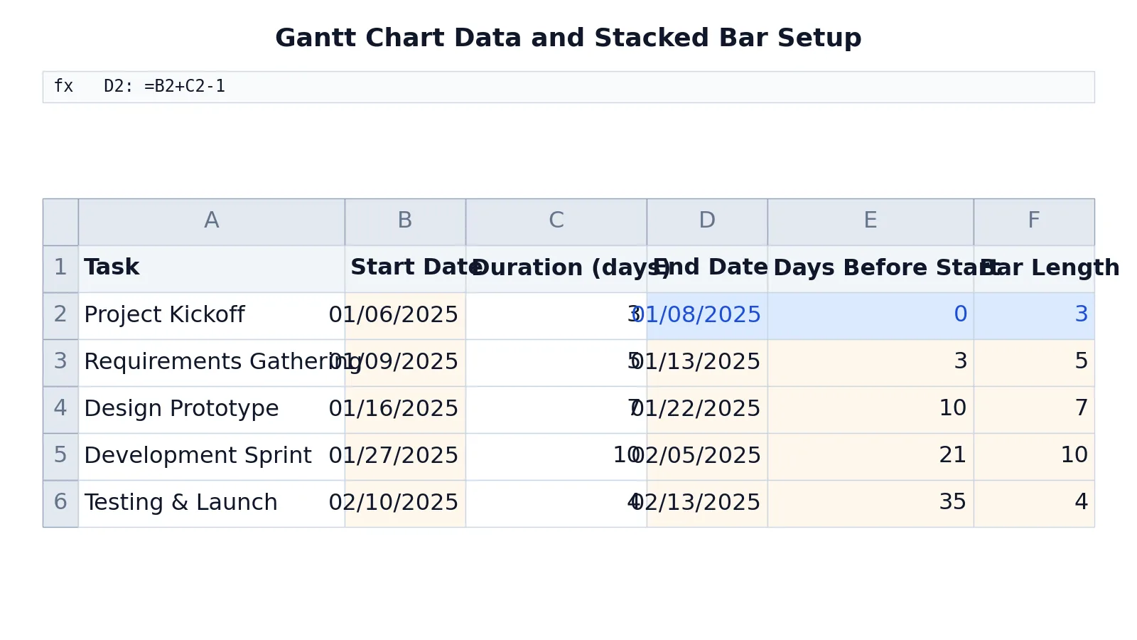
The table below is a five-task project schedule. The project starts January 6, 2025, and the helper columns are calculated from that anchor date.
| Row | A: Task | B: Start Date | C: Duration (days) | D: End Date | E: Days Before Start | F: Bar Length |
|---|---|---|---|---|---|---|
| 1 | Task | Start Date | Duration (days) | End Date | Days Before Start | Bar Length |
| 2 | Project Kickoff | =DATE(2025,1,6) -> displays 01/06/2025 | 3 | =B2+C2-1 -> displays 01/08/2025 | =B2-DATE(2025,1,6) -> displays 0 | =C2 -> displays 3 |
| 3 | Requirements Gathering | =DATE(2025,1,9) -> displays 01/09/2025 | 5 | =B3+C3-1 -> displays 01/13/2025 | =B3-DATE(2025,1,6) -> displays 3 | =C3 -> displays 5 |
| 4 | Design Prototype | =DATE(2025,1,16) -> displays 01/16/2025 | 7 | =B4+C4-1 -> displays 01/22/2025 | =B4-DATE(2025,1,6) -> displays 10 | =C4 -> displays 7 |
| 5 | Development Sprint | =DATE(2025,1,27) -> displays 01/27/2025 | 10 | =B5+C5-1 -> displays 02/05/2025 | =B5-DATE(2025,1,6) -> displays 21 | =C5 -> displays 10 |
| 6 | Testing & Launch | =DATE(2025,2,10) -> displays 02/10/2025 | 4 | =B6+C6-1 -> displays 02/13/2025 | =B6-DATE(2025,1,6) -> displays 35 | =C6 -> displays 4 |
The three formulas that do the work are:
$$D = B + C - 1$$
$$E = B - \text{ProjectStart}$$
$$F = C$$
The End Date formula adds the duration and subtracts one day so a three-day task starting January 6 ends January 8. The Days Before Start formula measures the gap from the project anchor, which becomes the invisible left segment of each stacked bar. The Bar Length formula copies the duration, which becomes the visible segment.
Notice that Requirements Gathering starts on January 9, three days after the project anchor, so its offset is 3. Development Sprint starts 21 days after the anchor. Those offsets are what place the bars correctly along the axis.
Other Ways to Do It
The stacked bar method is the standard approach because it works in every version of Excel and needs no add-ins. Two alternatives are worth knowing.
A conditional formatting approach keeps your data in a normal grid. You build a row of date columns across the top, then use a formula to fill cells that fall inside each task's date range. This gives you a calendar-style view that updates as you change dates, and it is easier to read for long projects with many tasks. The tradeoff is that it is not a real chart object, so you cannot copy it into a report as a picture as easily.
A bar chart with a date axis is a third option, but Excel's date axis handling for bar charts is less predictable than the numeric axis used here. If you want to compare this against other chart types, how to create an X Y graph in Excel explains how numeric axes behave.
If you need a Gantt chart outside Excel entirely, how to create a Gantt chart walks through the general method.
Troubleshooting
The bars start at the left edge instead of at their start dates. The Days Before Start series is still visible. Format it with No Fill and No Line.
The tasks are in reverse order. The category axis is not reversed. Right-click the vertical axis, choose Format Axis, and check Categories in reverse order.
The bars are too short to see. Your axis maximum is far beyond your last task. Set the maximum to a value just after the day your final task ends.
The offset column shows a date instead of a number. The cell is formatted as a date. Change the number format to General or Number.
A task bar is missing. Check that its duration is greater than zero and that its start date is a real date, not text.
Common Mistakes
- Using duration as the end date. A task starting January 6 with a duration of 3 ends January 8, not January 9. The fix is the
-1in the end date formula. - Including the date columns in the chart selection. If you select columns B and C as well, Excel adds extra series that clutter the chart. Select only the task names and the two helper columns.
- Forgetting to hide the offset series. The offset bars look like real tasks until you remove their fill and border.
- Typing dates as text. Text dates break the subtraction formulas and produce errors. Enter dates with
DATE()or a recognized date format. - Not reversing the category axis. Without this setting, your first task appears at the bottom, which reads backwards for most project plans.
Limitations
This method produces a static chart. It does not reschedule tasks, calculate dependencies, or update automatically when one task slips. If you change a start date, the bars move, but nothing warns you that a downstream task now overlaps. For dependency logic and critical path analysis you need project management software, not a chart.
The chart also cannot show progress within a task, milestones, or resource assignments without extra series and manual formatting. Adding a percent-complete overlay means adding another stacked series and doing the arithmetic yourself. For simple schedules with a handful of tasks, the Excel approach is fast and portable. For anything with more than about twenty interdependent tasks, it becomes harder to maintain than a dedicated tool.
Frequently Asked Questions
Can I make a Gantt chart in Excel without add-ins?
Yes. The stacked bar chart method uses only built-in chart features. You need helper columns for the offset and bar length, and you need to format two series and two axes. No add-in or template is required.
Why do my Gantt bars all start at the same point?
The Days Before Start series is still filled. That series is the invisible offset that positions each bar. Right-click it, choose Format Data Series, and set Fill to No Fill and Border to No Line.
How do I change the date range shown on the chart?
Right-click the horizontal axis, choose Format Axis, and set the Minimum and Maximum values. With this method the axis counts days from the project start, so 0 is January 6, 2025 and 40 is February 15, 2025. You can also set the Major unit to control how often tick labels appear.
Can I show task progress on the same chart?
You can, but it takes extra work. Add a percent-complete column, calculate a completed-length series, and stack it on top of the bar length series with a different fill color. The chart will not calculate progress for you, so you update the percentage column by hand.
Does this work in Excel for Mac and Excel for the web?
The stacked bar chart type and the Format Data Series and Format Axis panes exist in Excel for Mac and Excel for the web. Menu locations differ slightly between platforms, but the settings described here are the same ones you need in each.
References
This article draws on the standard references listed under Further Reading.
Further Reading
- Broman KW, Woo KH (2018). Data Organization in Spreadsheets. The American Statistician
- Ziemann M, Eren Y, El-Osta A (2016). Gene name errors are widespread in the scientific literature. Genome Biology
- Microsoft Support: Excel help and learning
- McCullough B, Heiser DA (2008). On the accuracy of statistical procedures in Microsoft Excel 2007. Computational Statistics & Data Analysis
- Abeysooriya M, Soria M, Kasu MS et al. (2021). Gene name errors: Lessons not learned. PLOS Computational Biology
- Wilson G, Bryan J, Cranston K et al. (2017). Good enough practices in scientific computing. PLOS Computational Biology