How to Flip the X and Y Axis in Excel (Step by Step)
By Dr. Zubair Khalid, DVM, MS, PhD ·
To flip the x and y axis in Excel, you change which series holds the categories and which holds the values, then pick a chart type that draws them the other way around. For most column and bar charts this means editing the Horizontal (Category) Axis Labels and switching between Clustered Column and Clustered Bar. The steps below show how to flip the x and y axis in Excel without retyping any data.
Quick Answer
- Open the chart, right-click it, and choose Select Data.
- Under Horizontal (Category) Axis Labels, click Edit and point it at the column you want on the horizontal axis.
- Click OK twice to close the dialogs.
- Right-click the chart and choose Change Chart Type.
- Pick Clustered Bar to move categories to the vertical axis and values to the horizontal axis.
Before You Start
Excel charts have two axes. The horizontal axis (also called the category axis or x axis) usually shows labels like months or names. The vertical axis (the value axis or y axis) shows numbers. When people say they want to flip the x and y axis, they usually mean one of two things.
The first is that the categories and values should trade places, so what was on the bottom moves to the side. The second is that the chart should read from a different direction, for example a column chart that becomes a bar chart. Both are handled by the same two controls: the data selection and the chart type.
Good axis design keeps the reader oriented, because the axis is what tells them how to read every mark on the chart [1]. Before you change anything, confirm three things.
- Your data is in a clean block with headers in the first row.
- You know which column holds the category labels and which holds the numbers.
- You have not already applied a chart style you cannot easily redo.
If you are building the chart from scratch, the general workflow is covered in How to Make a Chart in Excel (Step by Step). If your data is a scatter or line series instead of categories, see How to Create an X Y Graph in Excel (Step by Step), because scatter charts behave differently.
Step by Step
These are the interface steps for flipping the axes on an existing chart.
- Select the data range A1:B7.
- Go to Insert > Charts > Insert Column or Bar Chart > Clustered Column.
- Right-click the chart and choose Select Data.
- In the Select Data Source dialog, click Edit under Horizontal (Category) Axis Labels.
- Select the range A2:A7 and click OK.
- Click OK to close the Select Data Source dialog.
- Right-click the chart and choose Change Chart Type.
- Select Clustered Bar and click OK.
After step 8 the months sit on the vertical axis and the sales values run along the horizontal axis. The chart has been flipped.
If you only want to reverse the order of the categories, not swap the axes, you can instead open Format Axis for the category axis and turn on Categories in reverse order. That keeps the same chart type and mirrors the labels.
Worked Example
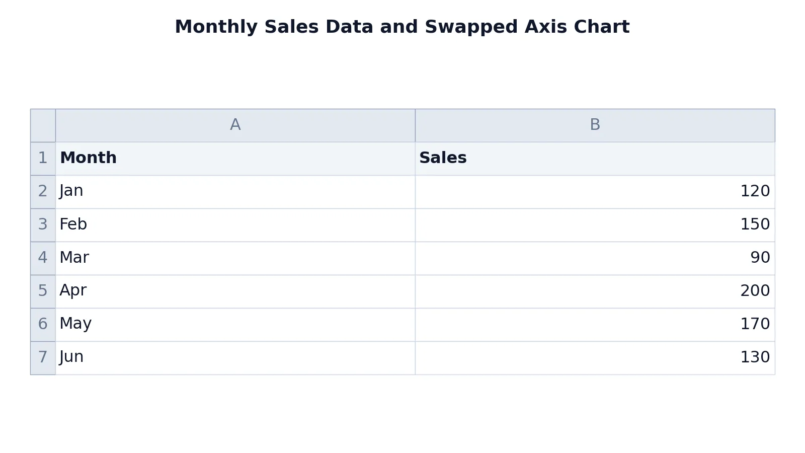
The table below is a small monthly sales sheet. Column A holds the month names and column B holds the sales figures.
| A | B | |
|---|---|---|
| 1 | Month | Sales |
| 2 | Jan | 120 |
| 3 | Feb | 150 |
| 4 | Mar | 90 |
| 5 | Apr | 200 |
| 6 | May | 170 |
| 7 | Jun | 130 |
There are no formulas in this sheet, so every cell is a literal value. The category column is A2:A7 and the value column is B2:B7.
When you build a Clustered Column chart from A1:B7, Excel puts the months along the horizontal axis and the sales values along the vertical axis. The tallest column is April at 200 and the shortest is March at 90.
After you follow the steps above and switch to Clustered Bar, the layout changes. The months now run down the vertical axis and the sales values run across the horizontal axis. April still has the longest bar at 200 and March still has the shortest at 90. Only the orientation changed, not the numbers.
That is the key point about flipping axes. It is a presentation change. The underlying values are untouched, so any totals or averages you computed elsewhere stay the same. If you need to recompute a total after editing the data, How to Sum a Column in Excel (Step by Step) covers the basic formulas.
Other Ways to Do It
There is more than one route to the same result.
Switch the chart type only. If your categories are already correct and you just want the bars to run horizontally, right-click the chart and choose Change Chart Type, then pick a bar variant. This is the fastest path when the data selection is already right.
Edit the series directly. In the Select Data Source dialog you can add, edit, or remove series. Editing a series lets you change both its name and its values, which is useful when you want to plot a different column without rebuilding the chart.
Reverse the category order. For a column chart, open Format Axis on the category axis and enable Categories in reverse order. This flips the reading direction without changing which axis holds what.
Rebuild from a different range. If the sheet is small, selecting the columns in the opposite order and inserting a fresh chart is sometimes quicker than editing an existing one. The chart-building basics are in How to Make a Bar Chart in Excel (Step by Step).
For time-based data, a line chart often communicates the trend better than a bar chart. See How to Make a Line Chart in Excel (Step by Step) for that layout.
Troubleshooting
The axis labels show 1, 2, 3 instead of my categories. The category range is not set. Open Select Data and edit the Horizontal (Category) Axis Labels so they point at your label column.
The chart looks empty after I change the type. Some chart types need a specific data shape. Switch back to Clustered Column, confirm the series are correct, then change the type again.
My numbers moved to the category axis. This happens when the value column is selected as the category range. Swap the two ranges in the Select Data Source dialog.
The bars are in the wrong order. Turn on Categories in reverse order in Format Axis, or sort the source table before charting.
Editing the chart changed my cells. It should not. Chart edits do not write back to the sheet. If a cell changed, something else edited it, and you can trace that with How to Find a Circular Reference in Excel (Step by Step) if a formula is involved.
Common Mistakes
- Confusing "flip the axes" with "reverse the order." Flipping swaps which axis holds categories and values. Reversing mirrors the existing order. Decide which one you actually need before you start.
- Pointing the category range at the numbers. If the value column becomes the category axis, you get meaningless labels. Set the category range to the text column.
- Forgetting to click OK twice. The Select Data Source dialog has its own OK button. Closing only the inner dialog leaves the change unapplied.
- Editing the source data to force the layout. Never retype or transpose your table just to change a chart. Fix the chart settings instead.
- Assuming the numbers changed. Flipping axes does not alter values. If a total looks different, check the formula, not the chart.
- Switching chart type on a chart with multiple series. With several series, a bar chart can become crowded. Check that the new orientation still reads clearly.
Limitations
Flipping axes works cleanly for column, bar, and line charts with a clear category column and value column. It does not work the same way for scatter charts, where both axes are numeric and the x values come from a dedicated series. For a scatter plot you change the x values by editing the series, not by swapping category labels.
Some chart types have no meaningful flipped version. Pie and doughnut charts have no axes at all, so there is nothing to flip. Waterfall and certain stock charts also depend on a fixed orientation.
A flipped chart can also mislead if the reader expects a conventional layout. A bar chart with time on the vertical axis reads less naturally than a column chart for many audiences, so flip only when the new orientation genuinely helps. The axis is the reader's guide to the data, and changing it changes how the chart is interpreted [1].
Frequently Asked Questions
How do I flip the x and y axis in Excel without changing my data?
Use Select Data to set the category range, then use Change Chart Type to switch between a column and a bar chart. Your cells are never modified by chart edits.
Can I swap the axes on a scatter chart?
Not the same way. In a scatter chart both axes are numeric, so you change the x values by editing the series in Select Data. There is no category axis to reassign.
Why did my axis labels turn into numbers?
The category range is missing or points at a numeric column. Open Select Data and set Horizontal (Category) Axis Labels to your text column.
Does flipping the axes change my totals?
No. Chart orientation is purely visual. Any SUM or AVERAGE formula returns the same value before and after. If you need to build those formulas, see How to Make a Formula in Excel (Step by Step).
How do I reverse the order of the categories instead?
Open Format Axis for the category axis and turn on Categories in reverse order. This mirrors the labels without swapping which axis holds the values.
References
Further Reading
- Broman KW, Woo KH (2018). Data Organization in Spreadsheets. The American Statistician
- Ziemann M, Eren Y, El-Osta A (2016). Gene name errors are widespread in the scientific literature. Genome Biology
- Microsoft Support: Excel help and learning
- McCullough B, Heiser DA (2008). On the accuracy of statistical procedures in Microsoft Excel 2007. Computational Statistics & Data Analysis
- Abeysooriya M, Soria M, Kasu MS et al. (2021). Gene name errors: Lessons not learned. PLOS Computational Biology