Data Table vs Graph: Differences and When to Use Each
By Dr. Zubair Khalid, DVM, MS, PhD ·
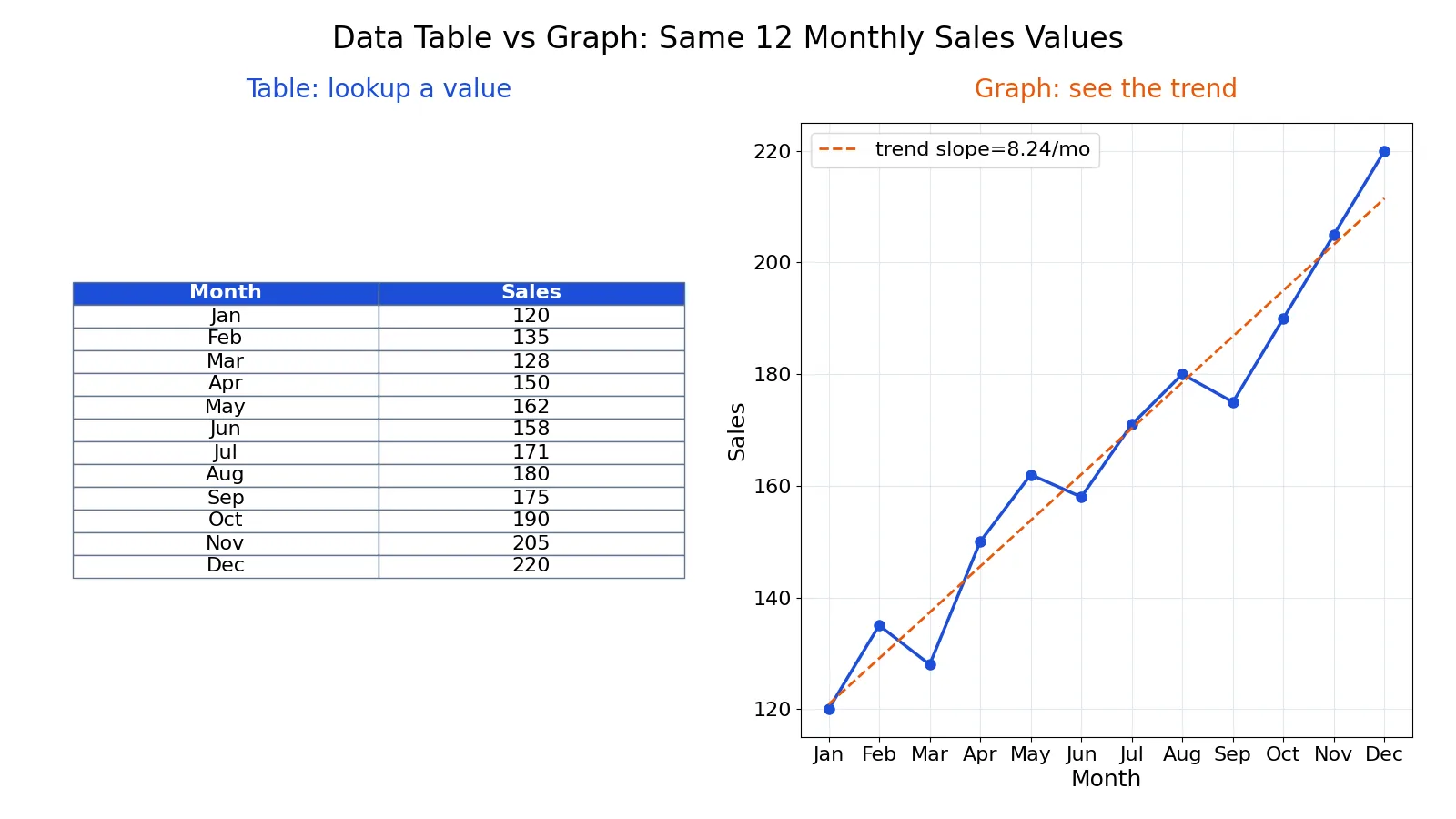
The choice between a data table vs graph comes down to one question: does your reader need exact numbers or a pattern? A table wins when people must look up, compare, or reuse precise values. A graph wins when the message is shape, trend, or spread. Most reports need both, but each one does a different job.
Quick Answer
- Use a table when readers need exact values, many variables, or numbers they will copy into another tool.
- Use a graph when the message is a trend, a comparison of magnitude, a distribution, or an outlier.
- A table of 12 monthly sales lets you answer "what were June sales?" A line chart of the same 12 values shows the rise from 120 to 220.
- If the pattern is the point, lead with the graph and keep the table as a reference. If the number is the point, lead with the table.
- Never force a graph to carry 40 exact values, and never force a table to carry a trend across 200 rows.
Key Differences
| Dimension | Data table | Graph |
|---|---|---|
| Primary job | Exact values and lookup | Pattern, trend, shape |
| Best for | Precise numbers, many variables | Comparisons, change over time |
| Reading effort | High per value, low per pattern | Low per pattern, high per value |
| Precision | Full precision | Approximate by eye |
| Data volume | Handles many rows and columns | Degrades past a few series |
| Supports calculation | Yes, values are reusable | No, values are encoded |
| Reveals outliers | Only if you scan carefully | Usually immediately |
| Accessibility | Screen readers read cells well | Needs alt text and a data table |
The trade is precision against perception. A table preserves every digit. A graph compresses those digits into position, length, or color, which is why a trend that hides in a column of numbers jumps out of a line chart [1].
Data Table Explained
A data table arranges values in rows and columns so each cell holds one number or label. Its strength is that nothing is lost. A reader can find a single value, compare two rows, or export the whole thing.
Tables also scale in a way graphs do not. You can list 50 products with 6 metrics each in a table and it stays readable. The same data as a chart becomes a wall of overlapping lines.
Use a table when:
- The reader needs a specific value, such as a rate, a total, or a date.
- You are reporting several variables per case, like mean, standard deviation, and count side by side.
- The numbers will be checked, cited, or re-entered elsewhere.
- The audience is technical and expects full precision.
The cost is that tables hide patterns. A slow upward drift across 12 rows is easy to miss when your eye is jumping cell to cell. That is exactly the gap a graph fills [2].
Graph Explained
A graph encodes values as visual properties: position, length, angle, or color. That encoding lets the eye process the whole set at once. You see the trend, the spread, and the odd point without reading a single number.
Graphs are the first step in most exploratory analysis for this reason. Simple plots of a response against time or against a factor reveal shifts in location and scale that a summary statistic can miss [1]. A run sequence plot can show that variability is larger in the first and last third of a dataset, a pattern no single mean would expose [2].
Use a graph when:
- The message is change over time, such as a trend or a seasonal swing.
- You are comparing magnitudes across a handful of categories.
- You need to show a distribution, a spread, or an outlier.
- The audience needs the takeaway in seconds.
The cost is precision. A reader can see that December is higher than January but cannot read 220 off the axis without help. Pair the graph with a small table when exact values matter.
One caution applies to every chart choice. Bar and line graphs that show only a summary, such as a mean with error bars, can hide the underlying distribution and make small datasets look more certain than they are [3]. When the spread matters, show the individual points.
Worked Example
Take monthly sales for one product line over 12 months. The question is simple: should this be a table, a graph, or both?
| month | sales |
|---|---|
| Jan | 120 |
| Feb | 135 |
| Mar | 128 |
| Apr | 150 |
| May | 162 |
| Jun | 158 |
| Jul | 171 |
| Aug | 180 |
| Sep | 175 |
| Oct | 190 |
| Nov | 205 |
| Dec | 220 |
Here are the summary values for the series.
- n = 12
- Total sales: sum = 1994
- Mean: 1994 / 12 = 166.1667
- Sample SD (n-1): sd = 30.4088
- Min / Max: min = 120 (Jan), max = 220 (Dec)
- Q1 = 146.2500, Q3 = 182.5000, IQR = 36.2500
- Change first to last: 220 - 120 = 100
- Percent change: (100 / 120) * 100 = 83.3333%
- Trend slope (least squares): 8.2378 units per month
The slope comes from a least squares fit, which estimates the average change in sales per month:
$$\hat{y} = a + b x, \quad b = 8.2378$$
Now the two tasks. If a reader asks "what were June sales?", the table answers directly: 158. If a reader asks "is the product growing?", the graph answers in one glance: yes, rising at about 8.24 units per month.
import pandas as pd
df = pd.DataFrame({'month': ['Jan', 'Feb', 'Mar', 'Apr', 'May', 'Jun', 'Jul', 'Aug', 'Sep', 'Oct', 'Nov', 'Dec'], 'sales': [120, 135, 128, 150, 162, 158, 171, 180, 175, 190, 205, 220]})
print(df.loc[df['month']=='Jun','sales'].iloc[0])  # lookup -> 158
df.plot(x='month', y='sales', kind='line')  # trend
Output:
158The same 12 values serve both purposes. The table handles the lookup, the line chart handles the trend. This is the practical answer to data table vs graph: you rarely pick one, you assign each its job.
Which One Should You Use?
Run through these checks in order.
- What is the one sentence your reader should leave with? If it contains a number, start with a table. If it contains a direction or a shape, start with a graph.
- How many values must the reader hold in mind? More than about five exact values points to a table.
- Is there a trend, distribution, or outlier? If yes, a graph shows it faster than any table [1].
- Will the numbers be reused? If they will be copied, cited, or recalculated, give a table.
- How large is the dataset? Small sets work in either format. Large sets need a graph for the pattern and a table for the detail.
A common pattern in reports is the graph first, table second. The graph delivers the message, the table backs it with exact values. If you are still deciding on the visual form, the decision tree for choosing a chart type walks through the common cases. For the broader principles behind these choices, see data visualization basics.
Common Mistakes
- Putting 30 rows in a chart. Overlapping lines or unreadable bars hide the pattern you wanted to show. Fix: chart the summary or a few key series, and put the full data in a table.
- Using a table to show a trend. A slow drift across many rows is easy to miss. Fix: add a line chart of the same values.
- Showing only a mean in a graph. A bar with error bars can hide a skewed or bimodal distribution. Fix: show the individual points when the spread matters [3].
- Rounding away the point in a table. Reporting 166 instead of 166.1667 can hide a real difference. Fix: keep enough decimals for the decision, and state the unit.
- No axis labels or units. A graph without units is unreadable, and a table without units invites errors. Fix: label every axis and every column.
- Assuming a graph is accessible. A chart alone excludes screen reader users. Fix: add alt text and a data table alongside the figure.
Limitations
Neither format proves anything on its own. A table shows what you measured, not whether the measurement is trustworthy. A graph can make a weak pattern look strong through axis scaling, and it can hide a weak pattern by compressing the range. A line drawn through noisy points implies a trend even when the fit is poor.
Graphs also fail silently when the data violate assumptions. A probability plot built on data with non-constant location and scale does not support distributional conclusions, no matter how clean the plot looks [1]. Treat both formats as communication tools, not as evidence. The statistics behind the numbers decide what you can claim.
Frequently Asked Questions
Is a graph always better than a table?
No. A graph is better for patterns, a table is better for exact values. If your reader needs to look up a specific number or compare several variables per case, a table communicates faster and more accurately. Many reports use both.
When should I use a table instead of a chart?
Use a table when precision matters, when there are many variables per case, or when the numbers will be reused. Tables also handle large row counts better than charts. If the reader's question starts with "what is the value of," a table is usually the answer.
Can I use both a table and a graph for the same data?
Yes, and it is often the best choice. Lead with the graph to show the trend or comparison, then include the table for exact values. In the sales example, the line chart shows the rise and the table gives the June value of 158.
What is the difference between a data table and a graph in Excel?
A data table holds values in cells, so you can sort, filter, and calculate from them. A chart references those cells and draws them as bars, lines, or points. The chart updates when the cells change, but the chart itself holds no values you can copy.
How many rows are too many for a chart?
There is no fixed cutoff, but readability drops fast once series overlap. A line chart with more than about five lines becomes hard to follow. When you have many rows, chart an aggregate and keep the full detail in a table.
References
- 6.6.1.2. Graphical Representation of the Data
- 1.4.2.7.2. Graphical Output and Interpretation
- Weissgerber TL, Milic NM, Winham SJ et al. (2015). Beyond Bar and Line Graphs: Time for a New Data Presentation Paradigm. PLOS Biology
Further Reading
- 1.4.2.1.2. Graphical Output and Interpretation
- Rougier NP, Droettboom M, Bourne PE (2014). Ten Simple Rules for Better Figures. PLoS Computational Biology
- NIST/SEMATECH e-Handbook: Graphical Techniques
Related Articles
- Chart vs Graph: Differences and When to Use Each
- Data Visualization Basics: How to Choose the Right Chart
- Structured vs Unstructured Data: Differences and Examples
- Mean vs Median: Differences and When to Use Each
- CDF vs PDF: Differences and When to Use Each
- Data Presentation in Research: Tables, Figures, and Text
- How to Choose the Right Slide Layout for Your Research Data: A Decision Guide
- Tabular Data: What It Is and How to Analyze It