How to Analyse Data in Excel: Step by Step
By Dr. Zubair Khalid, DVM, MS, PhD ·
Data analysis in Excel means turning a plain table of rows and columns into answers you can act on. The practical route is a short workflow: prepare the data, sort and filter it, calculate summary values with formulas, group them in a pivot table, then chart the result. This article walks through that workflow step by step using a small sales dataset.
Quick Answer
- Start with clean, tabular data. One header row, one record per row, no merged cells, no blank rows in the middle [1].
- Sort and filter first so you can see the shape of the data before you calculate anything.
- Use formulas such as
SUMIFto summarise categories, and check the totals against the raw rows. - Build a pivot table to group and aggregate without writing formulas, then add a chart to show the pattern.
- For heavier statistics, turn on the Analysis ToolPak, which adds tools such as Histogram and Fourier Analysis [2].
Before You Start
Good analysis starts before you type a formula. The structure of your sheet decides how easy everything else will be.
Put one variable in each column and one record in each row. A column called Revenue should hold only revenue numbers. If you mix units, dates and text in one column, formulas and pivot tables cannot group them correctly. This is the standard tidy layout recommended for spreadsheet data [3].
Use a single header row. Headers should be unique, non-blank labels, one row only. Avoid double header rows and merged cells, because they break sorting, filtering and pivot tables [1].
Convert the range to an Excel table. Click anywhere in your data, then go to Home > Styles > Format as Table. Tables expand automatically when you add rows and keep headers attached to columns [1].
Check for duplicates and blanks. Duplicate records inflate every total you calculate. If you need to clean them out, see how to find duplicates in Excel.
Decide your question first. "Which region sells most?" and "Is revenue rising over time?" need different summaries. Writing the question down keeps you from producing charts nobody asked for.
Step by Step
- Inspect the data. Scroll through the rows and check the column types. Numbers should be right-aligned by default, text left-aligned. A number stored as text will not sum.
- Sort the data. Select your range, then use Data > Sort & Filter > Sort and choose a column and order. Sorting by a category column groups identical labels together, which makes errors visible.
- Filter to subsets. Use Data > Sort & Filter > Filter to show only the rows you care about. For a full walkthrough, see how to filter in Excel.
- Write summary formulas. Use
SUMIFwhen you want a total for each category,AVERAGEIFfor averages, andCOUNTIFfor counts. Lock the ranges with$so the formula copies down correctly.
- Check the arithmetic. Add a control total with
SUMover the whole column and compare it with the sum of your category totals. They should match exactly.
- Build a pivot table. Select your data, then go to Insert > PivotTable and place it on a new worksheet. Drag a category field to Rows and a numeric field to Values. Change the value field setting from Sum to Average if you want averages instead of totals.
- Chart the result. Select the pivot table, then use Insert > Charts and pick a chart type. A clustered column chart works well for comparing categories.
- Interpret and record. Write one or two sentences stating what the numbers show. Note the filters you applied, because a filtered total is not the same as a full total.
If you want a deeper walkthrough of step 6, the pivot table in Excel tutorial covers field arrangement and formatting.
Worked Example
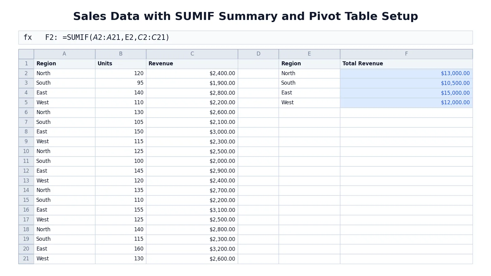
The dataset is a 20-row sales sheet with Region, Units and Revenue for five orders in each of four regions.
| A | B | C | |
|---|---|---|---|
| 1 | Region | Units | Revenue |
| 2 | North | 120 | 2400 |
| 3 | South | 95 | 1900 |
| 4 | East | 140 | 2800 |
| 5 | West | 110 | 2200 |
| 6 | North | 130 | 2600 |
| 7 | South | 105 | 2100 |
| 8 | East | 150 | 3000 |
| 9 | West | 115 | 2300 |
| 10 | North | 125 | 2500 |
| 11 | South | 100 | 2000 |
| 12 | East | 145 | 2900 |
| 13 | West | 120 | 2400 |
| 14 | North | 135 | 2700 |
| 15 | South | 110 | 2200 |
| 16 | East | 155 | 3100 |
| 17 | West | 125 | 2500 |
| 18 | North | 140 | 2800 |
| 19 | South | 115 | 2300 |
| 20 | East | 160 | 3200 |
| 21 | West | 130 | 2600 |
Now build a summary table in columns E and F. Each formula sums Revenue for one region, using absolute ranges so it can be copied down.
| E | F | |
|---|---|---|
| 1 | Region | Total Revenue |
| 2 | North | =SUMIF($A$2:$A$21,E2,$C$2:$C$21) -> displays $13,000.00 |
| 3 | South | =SUMIF($A$2:$A$21,E3,$C$2:$C$21) -> displays $10,500.00 |
| 4 | East | =SUMIF($A$2:$A$21,E4,$C$2:$C$21) -> displays $15,000.00 |
| 5 | West | =SUMIF($A$2:$A$21,E5,$C$2:$C$21) -> displays $12,000.00 |
The formula in F2 reads: sum the values in C2:C21 where the matching cell in A2:A21 equals the region named in E2. The $ signs freeze the ranges, so dragging F2 down to F5 keeps pointing at the same data and only the criteria cell changes.
The four totals add up to $50,500, which matches the sum of the whole Revenue column. East is the strongest region at $15,000 and South the weakest at $10,500.
To go further, follow these interface steps:
- Select A1:C21, then Data > Sort & Filter > Sort, sort by Region A to Z.
- Select A1:C21, then Insert > PivotTable, place it on a new worksheet, drag Region to Rows and Revenue to Values, then set the value field to Average.
- Select the pivot table, then Insert > Charts > Clustered Column to chart average revenue by region.
The pivot table gives you the same grouping as the SUMIF formulas, but with a different statistic and no formula writing. The chart then shows the comparison visually.
Other Ways to Do It
Analyze Data. Select a cell in your range, then on the Home tab select the Analyze Data button. Excel analyzes the data and returns visuals in a task pane. You can type a specific question in the query box and press Enter, and it returns answers as tables, charts or PivotTables that you can insert into the workbook [1]. Analyze Data works best with data formatted as an Excel table and does not currently support datasets over 1.5 million cells [1].
Copilot in Excel. Copilot answers questions about your data and returns charts, PivotTables, summaries, trends or outliers. Naming the columns you want analyzed produces more accurate results, and you should review and verify anything it generates [4].
Analysis ToolPak. For statistical work such as histograms, correlation or regression, the Analysis ToolPak provides ready-made tools that output a results table, and some also generate charts. You provide the data and parameters, and the tool runs the appropriate statistical functions [2]. See how to get the Data Analysis ToolPak in Excel for setup.
Power Query and Power Pivot. Power Query connects to multiple data sources and lets you shape and transform data before analysis [5]. Power Pivot is an add-in for building data models and analyzing large volumes of data from various sources [6].
What-If Analysis. Scenarios, Goal Seek and Data Tables let you change input values and see how the results change. Goal Seek works backwards from a result to find the input that produces it [7].
Troubleshooting
Numbers will not sum. The cells are probably stored as text. Check the alignment and convert them to numbers.
SUMIF returns 0. The criteria text does not match the data exactly. Extra spaces or stray characters in the source column will cause a miss. Capitalization does not matter, because SUMIF is not case-sensitive.
Pivot table shows Count instead of Sum. The value field contains text or blanks. Fix the source column, then refresh the pivot table.
Analyze Data is missing or does nothing. It may not support your dataset, for example if it exceeds 1.5 million cells. Filter the data and copy a smaller range to another location, then run Analyze Data on that copy [1].
Chart looks wrong after editing data. Charts built on a pivot table need a refresh. Right-click the pivot table and refresh it.
Common Mistakes
- Leaving blank rows inside the data. Sorting and pivot tables stop at the gap. Delete blank rows so the range is continuous.
- Using merged cells in headers. Merged cells break sorting and field lists. Use one clean header row instead [1].
- Hard-coding totals instead of formulas. Typed numbers go stale the moment the data changes. Use
SUMandSUMIFso totals update. - Forgetting absolute references. A
SUMIFcopied down without$shifts its range and returns wrong values. Lock the ranges. - Trusting a filtered total as the full total. Filtering hides rows, and
SUMover a filtered range still includes the hidden rows. UseSUBTOTALor clear the filter before totalling. - Charting before checking the numbers. A chart makes a wrong total look convincing. Verify the arithmetic first.
Limitations
Excel handles a lot, but it has ceilings. Analyze Data does not currently support datasets over 1.5 million cells, and there is no workaround other than filtering and copying a smaller range [1]. The Analysis ToolPak runs on only one worksheet at a time, and when you analyze grouped worksheets the results appear on the first sheet while the remaining sheets get empty formatted tables [2]. For very large or multi-source data, Power Query and Power Pivot exist precisely because the standard grid and formulas run out of room [5][6].
There is also a judgment limit. Excel will compute whatever you ask, including a correlation between two columns that have no real relationship. Automated tools such as Analyze Data and Copilot return patterns and outliers, but they do not know your subject matter, and AI-generated output should be reviewed and verified before you rely on it [4]. The statistics are only as good as the question and the data quality behind them.
Frequently Asked Questions
What is the fastest way to analyse data in Excel?
For a quick look, select a cell in your table and use Analyze Data on the Home tab. It returns visuals and answers to typed questions in a task pane [1]. For repeatable work, a pivot table plus a chart is usually faster than writing many formulas.
Can Excel do statistical analysis without extra software?
Yes, up to a point. The Analysis ToolPak adds tools for complex statistical and engineering analyses, including a Histogram tool that calculates individual and cumulative frequencies for a range of data and bins [2]. For anything beyond that, you would move to dedicated statistical software.
How do I summarise values by category?
Use SUMIF, AVERAGEIF or COUNTIF with the category column as the criteria range. Alternatively, build a pivot table and drag the category to Rows and the numeric field to Values. Both approaches give the same grouping.
Why does my pivot table show the wrong total?
The most common cause is that the value field is set to Count instead of Sum, which happens when the column contains text or blanks. Check the source column, then refresh the pivot table.
How many rows can Excel analyse?
The grid itself holds over a million rows, but specific features have their own limits. Analyze Data does not currently support datasets over 1.5 million cells [1]. Power Pivot is designed for much larger volumes and can process millions of rows using compression and multi-core processing [6].
References
- Analyze Data in Excel | Microsoft Support
- Use the Analysis ToolPak to perform complex data analysis | Microsoft Support
- Broman KW, Woo KH (2018). Data Organization in Spreadsheets. The American Statistician
- Get data insights with Copilot in Excel | Microsoft Support
- Import and analyze data | Microsoft Support
- Power Pivot: Powerful data analysis and data modeling in Excel | Microsoft Support
- Introduction to What-If Analysis | Microsoft Support
Further Reading
Related Articles
- How to Get Data Analysis ToolPak in Excel (Step by Step)
- How to Find and Search in Excel (Step by Step)
- How to Calculate the Mean in Excel (Step by Step)
- How to Calculate Correlation Coefficient in Excel (Step by Step)
- What Is Data Analysis? Definition, Steps and Examples
- How to Create a Data Extraction Form in Excel for a Systematic Review
- Tabular Data: What It Is and How to Analyze It
- Statistical Data Analysis