What Is Exploratory Data Analysis (EDA)? Steps and Examples
By Dr. Zubair Khalid, DVM, MS, PhD ·
Exploratory data analysis (EDA) is the process of examining a dataset before you build any formal model, so you can see its structure, patterns, anomalies and relationships. It is open-ended: you let the data suggest which questions are worth pursuing instead of starting from a fixed hypothesis [1]. The output is not a model but a set of artifacts, such as a data dictionary, a quality report and a preprocessing plan, that guide everything downstream [1].
Quick Answer
- EDA is the first pass over a new dataset: summary statistics, plots and checks for problems [2].
- It runs before modeling. Classical analysis imposes a model first, while EDA analyzes first and infers what model fits [3].
- Typical steps: state the objective, inspect structure, clean, summarize, visualize, check relationships, and record findings [4].
- Common plots: histograms, box plots, scatter plots, correlation heatmaps and missing-value charts [5].
- Expect to iterate. A thorough EDA can take 20 to 30 charts and sets of summary statistics before the data is well understood [4].
What Exploratory Data Analysis Means
In plain terms, EDA is opening the box before you try to assemble anything. You look at each piece, check whether it is damaged, and work out what can be built from it [1].
The precise definition: EDA is the initial process of examining a dataset to understand the structure, patterns, anomalies and relationships between variables [1]. It contrasts with confirmatory data analysis, where hypotheses identified during EDA are formally tested to see if they hold under scrutiny [1]. John Tukey, who created EDA, put the link this way: "Unless the detective finds clues, judge or jury has nothing to consider. Unless exploratory data analysis uncovers indications, usually quantitative ones, there is likely to be nothing for confirmatory data analysis to consider" [1].
The distinction is about sequence. Classical analysis follows Problem, Data, Model, Analysis, Conclusions. EDA follows Problem, Data, Analysis, Model, Conclusions. The data collection is not followed by a model imposition. It is followed immediately by analysis with the goal of inferring what model would be appropriate [3]. In practice, analysts mix all of these approaches freely [3].
How It Works
EDA has no single formula. It is a loop of questions and checks. The quantitative core is descriptive statistics and correlation, and the graphical core is distribution and relationship plots [5].
For a numeric column, the summary statistics are:
$$\bar{x} = \frac{1}{n}\sum_{i=1}^{n} x_i \qquad s = \sqrt{\frac{\sum_{i=1}^{n}(x_i - \bar{x})^2}{n-1}}$$
- $n$ is the number of observations.
- $x_i$ is the value of one observation.
- $\bar{x}$ is the sample mean, the arithmetic average.
- $s$ is the sample standard deviation, which uses $n-1$ in the denominator.
The interquartile range and the outlier fences are:
$$IQR = Q_3 - Q_1 \qquad \text{lower} = Q_1 - 1.5 \times IQR \qquad \text{upper} = Q_3 + 1.5 \times IQR$$
- $Q_1$ is the first quartile, the value below which 25% of the data falls.
- $Q_3$ is the third quartile, the value below which 75% falls.
- Any point outside the fences is flagged as a potential outlier under the 1.5 x IQR rule.
For two numeric columns, the Pearson correlation is:
$$r = \frac{\sum (x_i - \bar{x})(y_i - \bar{y})}{\sqrt{\sum (x_i - \bar{x})^2 \sum (y_i - \bar{y})^2}}$$
- $r$ ranges from -1 to 1. Values near 1 mean a strong positive linear relationship, values near -1 a strong negative one, and values near 0 a weak linear relationship.
Worked Example
The dataset is a 30-row survey of respondents with age, annual income in USD and a satisfaction score from 1 to 10.
| age | income | satisfaction |
|---|---|---|
| 22 | 28000 | 6 |
| 25 | 32000 | 7 |
| 28 | 41000 | 5 |
| 31 | 45000 | 8 |
| 34 | 52000 | 7 |
| 29 | 38000 | 6 |
| 41 | 61000 | 9 |
| 38 | 55000 | 7 |
| 45 | 72000 | 8 |
| 52 | 88000 | 9 |
| 27 | 34000 | 5 |
| 33 | 47000 | 7 |
| 36 | 50000 | 6 |
| 48 | 76000 | 8 |
| 55 | 95000 | 9 |
| 24 | 30000 | 6 |
| 30 | 43000 | 7 |
| 42 | 68000 | 8 |
| 39 | 60000 | 7 |
| 47 | 79000 | 9 |
| 26 | 31000 | 5 |
| 35 | 49000 | 7 |
| 44 | 71000 | 8 |
| 51 | 83000 | 9 |
| 58 | 102000 | 10 |
| 23 | 29000 | 6 |
| 32 | 46000 | 7 |
| 40 | 65000 | 8 |
| 49 | 81000 | 9 |
| 60 | 110000 | 10 |
Step 1, size. The sample has n = 30 respondents.
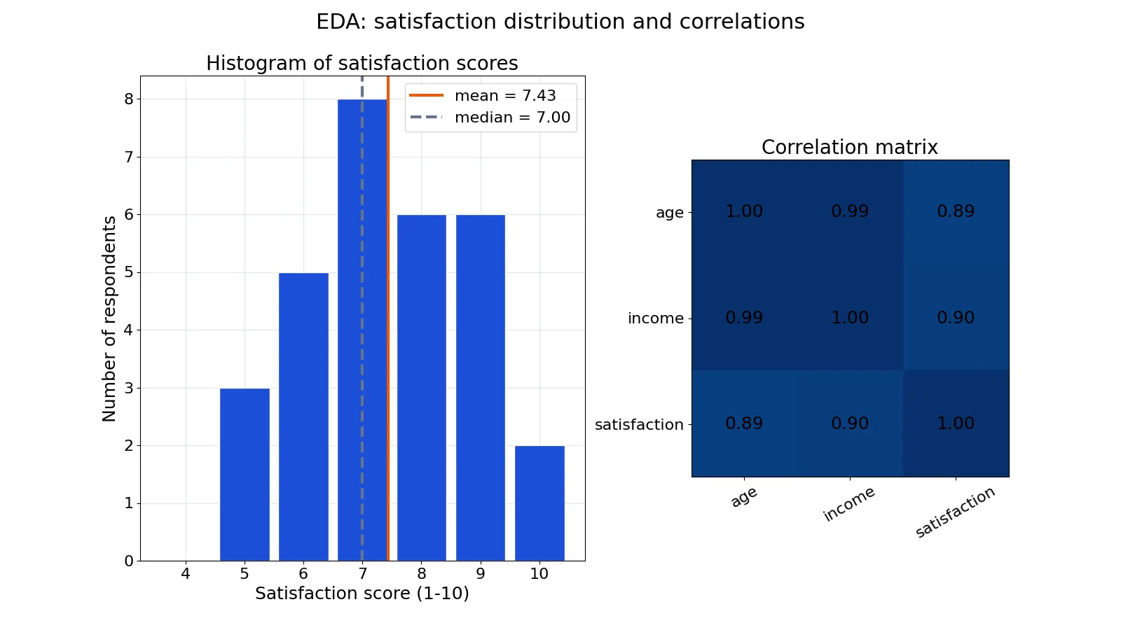
Step 2, center. Mean satisfaction is 223/30 = 7.4333. Median satisfaction is 7.0000. The mean sits slightly above the median, which hints at mild right skew.
Step 3, spread. Sample standard deviation is 1.4308. Quartiles are Q1 = 6.2500 and Q3 = 8.7500, so IQR = 2.5000.
Step 4, outliers. The lower fence is 6.2500 - 1.5 x 2.5000 = 2.5000 and the upper fence is 8.7500 + 1.5 x 2.5000 = 12.5000. No satisfaction score falls outside these fences, so no outliers are detected.
Step 5, relationships. Pearson correlation between age and income is r = 0.9947. Age and satisfaction give r = 0.8889. Income and satisfaction give r = 0.8966.
import pandas as pd
df = pd.read_csv('survey.csv')
print(df[['age','income','satisfaction']].describe())
print(df[['age','income','satisfaction']].corr())
Key results (summarized from the describe() and corr() output):
mean = 7.4333, median = 7.0000, stdev = 1.4308, IQR = 2.5000, outliers = none, r(age,income) = 0.9947, r(age,sat) = 0.8889, r(income,sat) = 0.8966How to Interpret It
Read the center and spread together. A mean of 7.4333 against a median of 7.0000 tells you the typical respondent is fairly satisfied and the distribution leans slightly high. A standard deviation of 1.4308 on a 1 to 10 scale means most scores sit within roughly one and a half points of the mean.
Read the fences next. With an IQR of 2.5000 and fences at 2.5000 and 12.5000, the satisfaction scale is fully inside the acceptable range. No score needs investigation as an outlier.
Read the correlations with care. The r = 0.9947 between age and income is extremely strong, which is unusual for survey data and worth questioning before you trust it. The r = 0.8889 and r = 0.8966 values show that satisfaction rises with both age and income. Because age and income move together so tightly, you cannot tell from these correlations alone which one drives satisfaction. That is a question for modeling, not for EDA.
Graphically, a histogram of satisfaction with the mean and median marked shows the shape directly, and a correlation heatmap shows all three pairwise relationships at once.
When to Use It (and when not to)
Use EDA at the start of any project with a new dataset. It is where you get familiar with the data, discover patterns, spot anomalies or outliers, and check assumptions [2]. It is also where you form ideas for feature engineering and modeling approaches [4].
Use it when you need to check whether a planned method is even appropriate. If a histogram shows severe skew, a test that assumes normality will mislead you. If a scatter plot shows a curve, a linear model will fit poorly.
Do not use EDA as a substitute for confirmatory analysis. EDA has its own pitfalls and must be used with confirmatory statistics and studies [6]. If you test many hypotheses during exploration and report only the ones that looked interesting, your results will not hold up. Treat EDA findings as clues, then test them properly.
EDA vs Confirmatory Data Analysis
| Aspect | Exploratory Data Analysis | Confirmatory Data Analysis |
|---|---|---|
| Starting point | Open-ended, no fixed hypothesis [1] | A stated hypothesis to test [1] |
| Sequence | Problem, Data, Analysis, Model, Conclusions [3] | Problem, Data, Model, Analysis, Conclusions [3] |
| Main tools | Summary statistics, histograms, box plots, scatter plots [5] | Formal tests and estimation on a chosen model [3] |
| Output | Data dictionary, quality report, preprocessing plan [1] | Test results and conclusions about the hypothesis |
| Risk | Finding patterns that are noise | Testing a model that does not fit the data |
Common Mistakes
- Skipping EDA and jumping straight to a model. You will not notice skew, outliers or leakage until the results look wrong. Fix: run summary statistics and plots first.
- Treating every flagged outlier as an error. The 1.5 x IQR rule flags unusual values, not necessarily wrong ones. Fix: inspect each flagged point in context before removing it.
- Reading correlation as causation. A high r between two columns can come from a third variable driving both. Fix: check the other pairwise correlations before drawing conclusions.
- Ignoring missing values until modeling. Many statistical libraries cannot handle missing data, so you may have to enter a value for it [2]. Fix: count missingness per column during EDA and decide on an imputation strategy early.
- Stopping after two or three charts. A thorough EDA can take 20 to 30 charts and sets of summary statistics [4]. Fix: budget real time for iteration.
- Forgetting to document. EDA that lives only in your head is not reusable. Fix: write a data dictionary, a quality report and a preprocessing plan as you go [1].
Limitations
EDA cannot confirm anything. It generates hypotheses, and those hypotheses still need formal testing before you can claim a result [1]. A pattern that looks convincing in a scatter plot can vanish under a proper test.
EDA is also sensitive to the analyst. Different people plotting the same data will notice different things, and the order in which you look at columns shapes what you find. Correlation measures only linear relationships, so a strong curved relationship can show a low r and go unnoticed. Summary statistics compress a distribution into a few numbers and can hide clusters, gaps and mixed populations entirely. For those reasons, EDA works best alongside confirmatory methods, not in place of them [6].
Frequently Asked Questions
What is exploratory data analysis in simple terms?
It is the first careful look at a dataset before any modeling. You compute summary statistics, draw plots, check for missing values and outliers, and note relationships between variables. The goal is to understand what you have and what questions are worth asking [1].
What are the main steps of EDA?
State your objective, inspect the structure of the data, clean it, compute summary statistics, visualize distributions and relationships, check assumptions, and record your findings in artifacts such as a data dictionary and preprocessing plan [1][4]. The steps repeat as you learn more about the data.
Which plots should I use for EDA?
Histograms and box plots for single variables, scatter plots for pairs, correlation heatmaps for several numeric columns at once, and missing-value charts for data quality [5]. The right choice depends on whether your variable is numeric or categorical and whether you are studying one column or a relationship.
How long should EDA take?
Longer than most beginners expect. A thorough EDA can involve 20 to 30 charts and sets of summary statistics, and you should not expect to finish it in a single day [4]. Data cleaning alone consumes a large share of project time [2].
Does EDA replace statistical testing?
No. EDA uncovers indicators, and confirmatory data analysis tests whether those indicators hold under scrutiny [1]. Relying on EDA alone risks reporting patterns that are just noise, so pair it with formal tests and studies [6].
References
- Beginner’s Guide to Exploratory Data Analysis - OMSCS 7641: Machine Learning
- Exploratory Data Analysis Overview - Data Science Discovery
- 1.1.2. How Does Exploratory Data Analysis differ from Classical Data Analysis?
- Exploratory data analysis
- 1. Exploratory Data Analysis
- Shelly MA. (1996). Exploratory data analysis: data visualization or torture? Infection control and hospital epidemiology
Further Reading
Related Articles
- What Is Data Analysis? Definition, Steps and Examples
- Explanatory Variable: Definition, Examples and Role in Regression
- Bivariate Data: Definition, Examples and Analysis
- Multivariate Analysis: Definition, Methods and Examples
- Dataset Examples: Types of Data Sets With Real Samples
- Statistical Data Analysis