Bivariate Data: Definition, Examples and Analysis
By Dr. Zubair Khalid, DVM, MS, PhD ·
Bivariate data is a set of observations in which two variables are measured on the same unit, so every row of your dataset holds a matched pair of values. You analyze those pairs together to see whether the two variables move in a related way. The most common first step is a scatterplot, followed by a correlation coefficient and a regression line.
Quick Answer
- Bivariate data means two variables recorded together for each observation, written as pairs $(x, y)$ [1].
- The variable you think explains the outcome is the independent or explanatory variable $x$. The outcome is the dependent or response variable $y$ [2].
- A scatterplot shows the pattern. Correlation ($r$) measures the strength and direction of a linear relationship [1].
- Bivariate analysis can be symmetrical (association only) or asymmetrical (one variable explains the other) [3].
- Two variables can be strongly related without one causing the other.
What Bivariate Data Means
In plain terms, bivariate data is data where you record two things about each subject or item at the same time. If you measure study hours and exam score for each student, you have bivariate data. If you measure only exam score, you have univariate data.
The precise statistical definition: bivariate data involves two variables, typically measured simultaneously for each observation or data point, where each variable is paired and each pair represents a single observation in the dataset [1]. The pairs are written as $(x, y)$, with $x$ the independent variable and $y$ the dependent variable [1].
This pairing is what separates bivariate data from two unrelated single-variable datasets. The order matters. A score of 94 belongs to the student who studied 10 hours, and that link is the whole point of the analysis.
Bivariate data is used to analyze and understand the relationship between two variables, to determine if and how they are related, and to quantify the strength and direction of that relationship [1]. For a broader view of where this fits, see statistical data analysis.
How It Works
The core idea is that you summarize each variable on its own, then summarize how they move together. The moving-together part is covariance, and its standardized version is the Pearson correlation.
Covariance measures whether high values of $x$ tend to appear with high values of $y$:
$$\text{cov}(x,y) = \frac{\sum (x_i - \bar{x})(y_i - \bar{y})}{n - 1}$$
- $x_i$ and $y_i$ are the paired values for observation $i$.
- $\bar{x}$ and $\bar{y}$ are the sample means.
- $n$ is the number of pairs.
- $n - 1$ is the degrees-of-freedom divisor used for a sample.
Covariance depends on the units, so you divide by both standard deviations to get a unitless correlation:
$$r = \frac{\text{cov}(x,y)}{s_x \, s_y}$$
- $s_x$ and $s_y$ are the sample standard deviations.
- $r$ runs from $-1$ to $1$.
If the relationship looks linear, you can fit a least-squares line $\hat{y} = b_0 + b_1 x$, where $b_1$ is the slope and $b_0$ is the intercept. The squared correlation, $r^2$, is the coefficient of determination, the share of variance in $y$ explained by $x$. For the difference between the two summary measures, see correlation vs covariance.
Worked Example
The dataset below holds paired values for 10 students: hours studied and exam score.
| hours_studied (x) | exam_score (y) |
|---|---|
| 1 | 45 |
| 2 | 52 |
| 3 | 58 |
| 4 | 63 |
| 5 | 68 |
| 6 | 72 |
| 7 | 78 |
| 8 | 84 |
| 9 | 88 |
| 10 | 94 |
Step 1. Sample size: $n = 10$.
Step 2. Mean hours studied: $\bar{x} = (1 + 2 + 3 + 4 + 5 + 6 + 7 + 8 + 9 + 10) / 10 = 5.5000$.
Step 3. Mean exam score: $\bar{y} = (45 + 52 + 58 + 63 + 68 + 72 + 78 + 84 + 88 + 94) / 10 = 70.2000$.
Step 4. Sample standard deviations: $s_x = 3.0277$ and $s_y = 16.0194$.
Step 5. Covariance: $\text{cov}(x,y) = 48.4444$.
Step 6. Pearson correlation: $r = 48.4444 / (3.0277 \times 16.0194) = 0.9988$.
Step 7. Coefficient of determination: $r^2 = (0.9988)^2 = 0.9977$.
Step 8. Least-squares slope: $b_1 = r \times (s_y / s_x) = 0.9988 \times (16.0194 / 3.0277) = 5.2848$.
Step 9. Least-squares intercept: $b_0 = \bar{y} - b_1 \bar{x} = 70.2000 - 5.2848 \times 5.5000 = 41.1333$.
Step 10. Fitted line: $\hat{y} = 41.1333 + 5.2848x$.
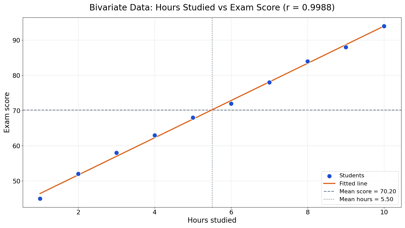
The scatterplot of these pairs with the fitted line shows a near-perfect upward trend, with $r = 0.9988$.
You can reproduce every number in Python:
import pandas as pd
import numpy as np
df = pd.DataFrame({'hours_studied': [1,2,3,4,5,6,7,8,9,10],
                   'exam_score': [45,52,58,63,68,72,78,84,88,94]})
r = df['hours_studied'].corr(df['exam_score'])
slope, intercept = np.polyfit(df['hours_studied'], df['exam_score'], 1)
print(f"r = {r:.4f}")
print(f"slope = {slope:.4f}, intercept = {intercept:.4f}")
Output:
r = 0.9988
slope = 5.2848, intercept = 41.1333
In Excel, with hours in A2:A11 and scores in B2:B11, the same results come from =CORREL(B2:B11,A2:A11) returning 0.9988, =SLOPE(B2:B11,A2:A11) returning 5.2848, =INTERCEPT(B2:B11,A2:A11) returning 41.1333, and =RSQ(B2:B11,A2:A11) returning 0.9977.
How to Interpret It
Start with the scatterplot. Look for an overall pattern and any deviations from it, then use numerical descriptions such as the correlation and coefficient of determination, and finally consider a mathematical model such as regression [2].
Read $r$ in two parts. The sign tells you direction: positive means $y$ tends to rise as $x$ rises, negative means $y$ tends to fall. The magnitude tells you strength, with values near $\pm 1$ indicating a tight linear fit and values near 0 indicating little linear relationship.
Read $r^2$ as a percentage of explained variance. In the example, $r^2 = 0.9977$ means about 99.8% of the variation in exam scores is accounted for by the linear relationship with hours studied.
Read the slope in context. Here $b_1 = 5.2848$ means each additional hour studied is associated with about 5.28 more points on the exam, on average, within the observed range.
When to Use It (and when not to)
Use bivariate analysis when you have two quantitative variables measured on the same units and you want to describe their relationship, test whether an association exists, or build a simple prediction model [3]. It is the natural starting point before moving to models with more predictors, such as those covered in multivariate analysis or generalized linear models.
Do not use a Pearson correlation when the relationship is clearly curved, when one variable is categorical, or when extreme outliers dominate the plot. For a binary outcome, a linear correlation is the wrong tool and logistic regression is the usual choice.
Also avoid treating bivariate results as causal. A strong $r$ only says the two variables move together in your sample.
Bivariate vs Multivariate
The distinction is the number of variables analyzed together, not the number of columns in your file.
| Feature | Bivariate | Multivariate |
|---|---|---|
| Variables analyzed together | Two | Three or more |
| Typical question | Are $x$ and $y$ related? | How do several variables jointly relate? |
| Common tools | Scatterplot, correlation, simple regression | Multiple regression, MANOVA, factor analysis |
| Control for confounders | No | Yes, if included in the model |
| Main risk | Confounding by a third variable | Overfitting and multicollinearity |
Bivariate analysis explores how the dependent variable depends on the independent variable, or the association between two variables with no assumed cause and effect [3]. Multivariate analysis extends this to several variables at once.
Common Mistakes
- Correlation implies causation. A high $r$ does not prove that $x$ causes $y$. Fix: describe the association, and only claim causation with a proper design such as a randomized experiment.
- Ignoring the scatterplot. A single number hides curves, clusters, and outliers. Fix: always plot the pairs before computing $r$.
- Using Pearson $r$ on a curved relationship. A strong curve can produce a misleadingly low or high $r$. Fix: check the shape first and consider a transformation or a rank correlation.
- Mixing up the axes. Swapping $x$ and $y$ changes the regression line, though not $r$. Fix: decide which variable is explanatory before you fit.
- Extrapolating beyond the data. The fitted line is only trustworthy inside the observed range. Fix: keep predictions within the range of $x$ you actually measured.
- Dropping outliers without reason. Removing points just to raise $r$ is data manipulation. Fix: report outliers and analyze the data with and without them.
Limitations
Bivariate analysis cannot control for confounding. If a third variable drives both $x$ and $y$, the correlation you see may be spurious, and only a design or model that accounts for that variable can address it.
It also cannot capture complex relationships on its own. Pearson $r$ measures linear association only, so it can miss strong nonlinear patterns. And a correlation computed on a small sample is unstable, so treat $r$ from a handful of points as a rough signal, not a precise estimate.
Frequently Asked Questions
What is the definition of bivariate data?
Bivariate data is data in which two variables are measured simultaneously for each observation, and each pair of values represents one data point [1]. The variables are usually labeled $x$ and $y$, with $x$ the independent variable and $y$ the dependent variable [1].
What is an example of bivariate data?
Hours studied and exam score for the same students is a classic example. Each student contributes one pair, such as (5 hours, 68 points). Income and years of education is another common pairing.
How do you plot bivariate data?
Use a scatterplot, a graph displaying data points on a coordinate plane where each point represents a pair of values, with one variable on the x-axis and the other on the y-axis [1]. Scatterplots help identify patterns, trends, and correlations such as positive, negative, or no correlation [1].
What is the difference between bivariate and univariate data?
Univariate data involves one variable per observation, so you summarize a single distribution. Bivariate data involves two paired variables, so you can study how they relate. The step from one to two variables is what makes correlation and regression possible.
Can bivariate data show causation?
No. Bivariate analysis can show that two variables are associated, but association alone does not establish cause and effect [3]. Establishing causation requires a study design that rules out alternative explanations, such as a controlled experiment.
References
- 10.1: Bivariate Data and Scatter Plots - Statistics LibreTexts
- 9.1 Introduction to Bivariate Data and Scatterplots - Significant Statistics - beta (extended) version
- Bertani A, Di Paola G, Russo E, Tuzzolino F. (2018). How to describe bivariate data. Journal of thoracic disease
Further Reading
- 6.4.5.1. Example of Multivariate Time Series Analysis
- NIST/SEMATECH e-Handbook of Statistical Methods
- OpenStax. Introductory Statistics 2e
Related Articles
- Multivariate Analysis: Definition, Methods and Examples
- Correlation vs Covariance: Differences and When to Use Each
- ANOVA Table Explained: Components, Formulas and Example
- Dataset Examples: Types of Data Sets With Real Samples
- Quantitative Data Examples: Definition and Types
- Statistical Data Analysis
- Predictor vs. Covariate: Clarifying Terminology in Research
- Common Pitfalls in Multivariate Analysis of Biological Data