What Is Cross Tabulation? Definition, Examples and How to Read It
By Dr. Zubair Khalid, DVM, MS, PhD ·
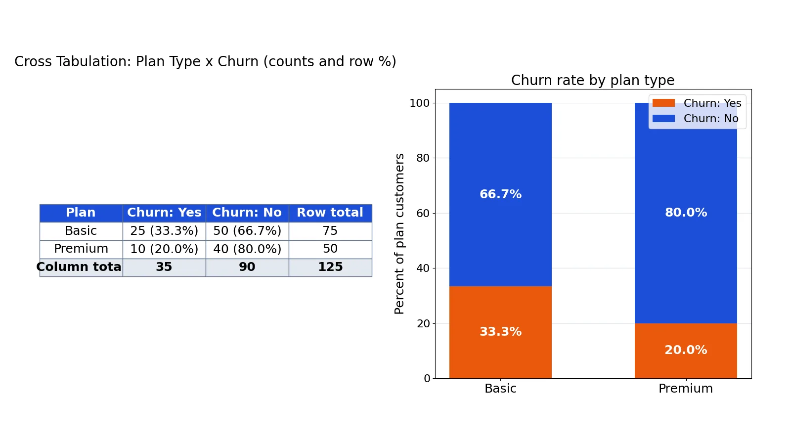
A cross tab is a table that counts how often each combination of two categorical variables occurs. If you have ever asked "do Basic customers churn more than Premium customers?", a cross tab answers it by putting plan type in the rows and churn in the columns, then filling each cell with a count. This article explains the definition, how to build one by hand or in code, and how to read the counts and percentages without fooling yourself.
Quick Answer
- A cross tab (also written cross-tab, crosstab, or contingency table) is a grid of counts for two categorical variables at once.
- Rows hold one variable, columns hold the other, and each cell holds the number of cases in that combination.
- Row and column totals, called marginals, sit at the edges and give you the base for percentages.
- Counts tell you how much data you have. Percentages show whether a difference remains once unequal group sizes are taken into account.
- A chi-square test checks whether the pattern in the table is larger than you would expect from chance alone [1][2].
What Cross Tabulation Means
In plain terms, cross tabulation is counting two things at the same time. You take a dataset of cases (people, orders, sessions) and two categorical variables, then tally every combination.
The precise statistical definition: a cross tabulation, or contingency table, is a two-way frequency distribution that displays the joint frequency of two categorical variables, with row and column marginals showing the univariate frequency of each variable separately [2]. The cells hold joint frequencies. The margins hold marginal frequencies. That distinction matters, because most interpretation errors come from reading a joint count as if it were a marginal one.
Cross tabulation works for nominal variables (unordered categories like plan type or region) and for ordinal variables (ordered categories like satisfaction levels). It does not work for continuous variables unless you first bin them into categories.
How It Works
The mechanism is simple counting. For two variables $X$ and $Y$, each cell holds the number of cases where both conditions are true:
$$n_{ij} = \sum_{k=1}^{N} I(X_k = i \text{ and } Y_k = j)$$
Each symbol means:
- $n_{ij}$ is the count in the cell at row $i$ and column $j$.
- $N$ is the total number of cases in the dataset.
- $I(\cdot)$ is an indicator that equals 1 when the condition is true and 0 when it is false.
- $X_k$ and $Y_k$ are the category values for case $k$.
The row marginal is the sum across a row, $n_{i\cdot} = \sum_j n_{ij}$. The column marginal is the sum down a column, $n_{\cdot j} = \sum_i n_{ij}$. The grand total is $n_{\cdot\cdot} = N$.
Once you have counts, you convert them to percentages by choosing a base. A row percentage divides each cell by its row total. A column percentage divides each cell by its column total. A total percentage divides each cell by the grand total. The base you pick changes the story, so pick it deliberately.
Worked Example
The dataset is a survey of customers with two variables: plan type (Basic or Premium) and churn (Yes or No). Here is the raw data in compact form.
| plan | churn |
|---|---|
| Basic | Yes |
| Basic | No |
| Premium | Yes |
| Premium | No |
The full dataset has 125 rows. Counting the combinations gives these steps:
| Step | Value |
|---|---|
| Total customers surveyed | 125 |
| Basic plan customers | 75 |
| Premium plan customers | 50 |
| Basic churned (Yes) | 25 |
| Basic retained (No) | 50 |
| Premium churned (Yes) | 10 |
| Premium retained (No) | 40 |
| Basic churn rate | 25 / 75 = 33.3333% |
| Premium churn rate | 10 / 50 = 20.0000% |
| Overall churn rate | (25 + 10) / 125 = 28.0000% |
Here is the resulting contingency table with counts.
| plan | Yes | No | Total |
|---|---|---|---|
| Basic | 25 | 50 | 75 |
| Premium | 10 | 40 | 50 |
| Total | 35 | 90 | 125 |
And here are the row percentages, which put both plans on the same footing.
| plan | Yes | No |
|---|---|---|
| Basic | 33.3333 | 66.6667 |
| Premium | 20.0000 | 80.0000 |
In Python with pandas, the whole thing takes two lines.
import pandas as pd
df = pd.DataFrame({'plan': [...], 'churn': [...]})
ct = pd.crosstab(df['plan'], df['churn'])
row_pct = pd.crosstab(df['plan'], df['churn'], normalize='index') * 100
Output:
Basic churn: 25/75 = 33.33%; Premium churn: 10/50 = 20.00%; Overall: 28.00%The counts show that Basic has more churners in absolute terms (25 versus 10). The row percentages show that Basic also has a higher churn rate (33.3% versus 20.0%). Both statements are true, and they answer different questions. If you only looked at counts, you would miss that Basic has 50% more customers than Premium, which inflates its raw churn number. For a deeper walkthrough of the pandas function, see pandas crosstab: How to Tabulate Counts in Python.
How to Interpret It
Start with the marginals. They tell you the size of each group and whether the comparison is balanced. In the example, Basic has 75 customers and Premium has 50, so any raw count comparison is tilted toward Basic.
Then read the cells as percentages on the base that matches your question.
- Comparing groups within a category? Use row percentages. "What share of Basic customers churned?" is a row percentage.
- Comparing categories within a group? Use column percentages. "Of those who churned, what share were on Basic?" is a column percentage.
- Describing the whole sample? Use total percentages. "What share of all customers were Basic churners?" is a total percentage.
Finally, look at the gap between the percentages. A 13.3 percentage point difference between 33.3% and 20.0% is a visible pattern. Whether it is statistically meaningful depends on sample size, which is where a chi-square test comes in. Chi-square compares the observed cell counts to the counts you would expect if the two variables were unrelated, using the marginals to compute those expected values [2]. The null hypothesis is that there is no relationship between the two variables [1].
When to Use It (and when not to)
Use a cross tab when both variables are categorical and you want to see whether they move together. Typical cases include survey questions with answer choices, A/B test outcomes by segment, churn or conversion by plan, and defect counts by production line.
Do not use it when one variable is continuous and you have not binned it. A cross tab of exact income values would produce hundreds of near-empty rows. Use a scatter plot or a correlation instead. Do not use it when you need to control for a third variable, because a two-way table cannot hold that adjustment. Do not use it as a substitute for a formal test when you plan to make a claim about significance.
Cross Tab vs Pivot Table
These two get confused because they often produce similar-looking output.
| Aspect | Cross tab | Pivot table |
|---|---|---|
| Purpose | Show the joint frequency of two categorical variables | Summarize and reshape data by any number of fields |
| Typical values | Counts and percentages | Counts, sums, averages, any aggregation |
| Number of variables | Two, by definition | One or many, in rows and columns |
| Statistical role | Base for chi-square and association measures | Reporting and exploration tool |
| Output | Contingency table with marginals | Configurable grid |
A pivot table can produce a cross tab, but a cross tab is a specific statistical object with a specific interpretation. If you build a pivot table with two categorical fields and counts as the value, you have made a cross tab.
Common Mistakes
- Reading counts when group sizes differ. Basic has 25 churners and Premium has 10, but Basic also has 50% more customers. Fix: convert to row percentages before comparing.
- Mixing up row and column percentages. They answer different questions and can point in opposite directions. Fix: state your question first, then choose the base that matches it.
- Ignoring small cell counts. A cell with 3 cases produces an unstable percentage. Fix: report the count alongside every percentage, and treat cells under about 5 with caution.
- Treating a visible gap as proven. A difference in percentages is descriptive, not inferential. Fix: run a chi-square test and check its assumptions before claiming a relationship [1].
- Binning continuous data carelessly. Unequal or arbitrary bins can create or hide patterns. Fix: use meaningful cut points and check that no bin is nearly empty.
- Dropping missing values silently. Most cross tab tools exclude rows with missing values, so the total shrinks. Fix: report how many cases were excluded.
Limitations
A cross tab shows association, not causation. If Basic customers churn more, the table cannot tell you whether the plan caused it or whether a third factor, such as customer tenure or price sensitivity, drives both. You need an experiment or a model that adjusts for confounders to make a causal claim.
Cross tabs also degrade quickly as categories multiply. A table with 10 rows and 10 columns has 100 cells, and most will be sparse or empty, which makes patterns hard to see and chi-square unreliable. When you need to control for several variables at once, a cross tab is the wrong tool. Reach for logistic regression or another model that handles multiple predictors together.
Frequently Asked Questions
What is the difference between a cross tab and a contingency table?
They are the same thing. "Contingency table" is the statistical term, and "cross tab" or "crosstab" is the common name used in survey research and spreadsheet software. Both refer to a two-way frequency table with row and column marginals [2].
Should I use row percentages or column percentages?
It depends on which variable you treat as the grouping variable. If you are comparing churn rates across plan types, use row percentages so each plan sums to 100%. If you are comparing the composition of churners versus retainers, use column percentages so each churn category sums to 100%.
How do I know if the relationship in my cross tab is significant?
Run a chi-square test for independence. It compares observed counts to expected counts computed from the marginals, and it returns a p-value for the null hypothesis of no relationship [1]. Check the test assumptions first, particularly that expected counts are large enough in each cell.
Can I cross tabulate more than two variables?
Not in a single two-way table. You can stack several two-way tables, one per level of a third variable, or move to a modeling approach. Stacking works for a few levels but becomes hard to read quickly.
What does an empty cell mean?
An empty cell means no cases fell into that combination. That is informative, but it also weakens chi-square because expected counts in that cell may be too small. Report empty cells explicitly instead of letting them disappear into a blank space.
References
- Analyzing Categorical Data - Survey Design Basics - Library Guides at Penn State University
- Notes on Bivariate Analysis
Further Reading
- NIST/SEMATECH e-Handbook of Statistical Methods
- OpenStax. Introductory Statistics 2e
- Krzywinski M, Altman N (2013). Importance of being uncertain. Nature Methods
- Krzywinski M, Altman N (2013). Significance, P values and t-tests. Nature Methods