Semi-Log Plot: Definition, When to Use It and Examples
By Dr. Zubair Khalid, DVM, MS, PhD ·
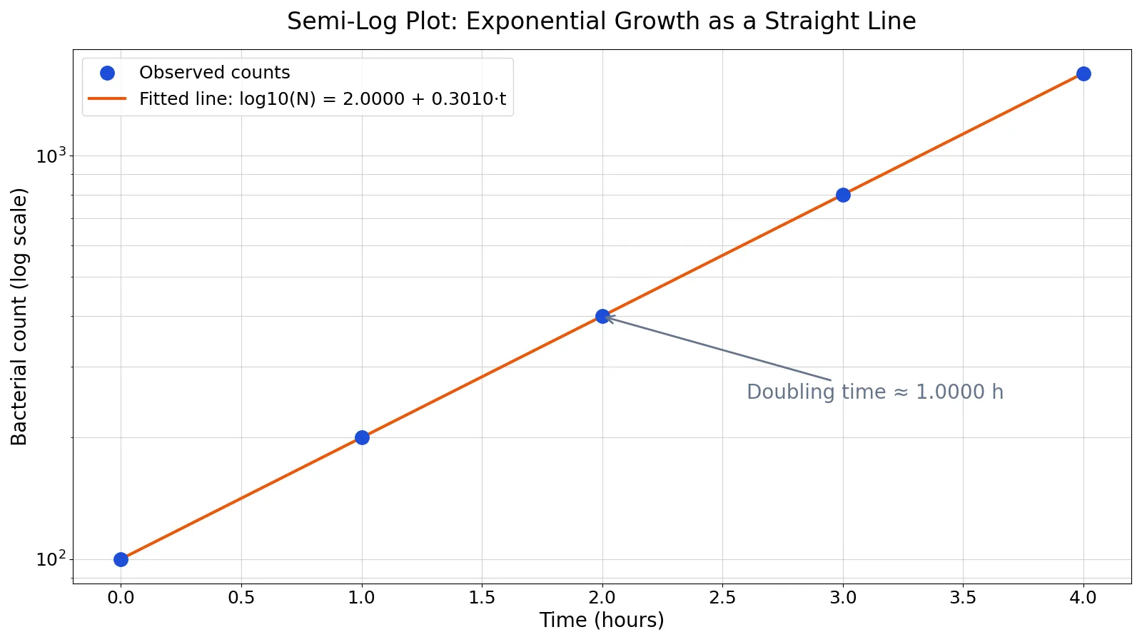
A semi log plot is a graph where one axis uses a logarithmic scale and the other uses a linear scale. It is the standard way to show exponential growth or decay, because a curve that bends upward on ordinary axes becomes a straight line once you take the log of the values. If your data spans several orders of magnitude or changes by a constant percentage each period, a semi log plot is usually the right choice.
Quick Answer
- A semi log plot has one log axis and one linear axis. Use a log y-axis when the quantity grows or shrinks by a constant factor per step.
- Exponential growth $y = a \cdot b^{x}$ becomes a straight line on a log y-axis, with slope $\log_{10}(b)$.
- The slope of that line gives the growth rate. The doubling time is $\log_{10}(2)$ divided by the slope.
- Use a log x-axis when the x variable itself spans many orders of magnitude, such as concentrations or frequencies.
- Do not use a log axis for values at or below zero. Log scales cannot show zero or negative numbers.
What Semi Log Plot Means
In plain terms, a semi log plot is a chart where you compress one axis so that equal distances represent equal ratios instead of equal differences. On a normal axis, the gap from 1 to 2 equals the gap from 2 to 3. On a log axis, the gap from 1 to 10 equals the gap from 10 to 100, because both are one decade, a factor of 10.
The precise definition: a semi logarithmic plot is a two-dimensional plot in which exactly one coordinate axis is scaled logarithmically while the other remains linear. If the y-axis is logarithmic, the transformation is $\log(y)$ against $x$. If the x-axis is logarithmic, it is $y$ against $\log(x)$. When both axes are logarithmic, the chart is a log-log plot, which is a different tool for a different job [1].
The related search terms all describe the same idea: semi log scale, semi logarithmic graph, semi logarithmic plot, semi logarithmic scale, semi-log graph, semi-log scale, semi-logarithmic graph, semilog, semilog graph, and semilog plot. They differ only in spelling and hyphenation.
How It Works
The mechanism is a change of coordinates. Suppose your data follow an exponential model:
$$y = a \cdot b^{x}$$
Take the base-10 logarithm of both sides:
$$\log_{10}(y) = \log_{10}(a) + x \cdot \log_{10}(b)$$
That is a linear equation in $x$. Here is what each symbol means:
- $y$ is the measured value, such as a population count or a dose.
- $x$ is the input, often time.
- $a$ is the value at $x = 0$, so $\log_{10}(a)$ is the intercept.
- $b$ is the growth factor per unit of $x$.
- $\log_{10}(b)$ is the slope of the straight line on the semi log plot.
Because the relationship is linear in the transformed space, you can fit it with ordinary least squares on $\log_{10}(y)$ and read the growth rate straight off the slope. A positive slope means growth, a negative slope means decay, and a slope of zero means the quantity is flat on the log scale, which corresponds to no change at all.
Worked Example
This dataset records bacterial counts in colony-forming units (CFU) measured hourly over 5 hours, showing clean exponential growth.
| hour | count |
|---|---|
| 0 | 100 |
| 1 | 200 |
| 2 | 400 |
| 3 | 800 |
| 4 | 1600 |
The raw counts are [100, 200, 400, 800, 1600]. Taking the base-10 log of each count gives [2.0, 2.301, 2.6021, 2.9031, 3.2041]. Now fit a straight line to hour versus log10(count).
The mean of the hours is $\bar{x} = 2.0000$ and the mean of the log counts is $\bar{y} = 2.6021$. The sums of squares are $S_{xx} = 10.0000$ and $S_{xy} = 3.0103$. The slope is:
$$\text{slope} = \frac{S_{xy}}{S_{xx}} = \frac{3.0103}{10.0000} = 0.3010$$
The intercept is:
$$\text{intercept} = \bar{y} - \text{slope} \cdot \bar{x} = 2.6021 - 0.3010 \cdot 2.0000 = 2.0000$$
The doubling time follows from the slope:
$$t_d = \frac{\log_{10}(2)}{\text{slope}} = \frac{0.3010}{0.3010} = 1.0000 \text{ hours}$$
The fit is perfect here, with $R^2 = 1.0000$, and the fitted counts are [100, 200, 400, 800, 1600], matching the data exactly.
import numpy as np
hours = np.array([0,1,2,3,4])
counts = np.array([100,200,400,800,1600])
log_counts = np.log10(counts)
slope, intercept = np.polyfit(hours, log_counts, 1)
doubling_time = np.log10(2) / slope  # 1.0000 h
fitted = slope * hours + intercept
r2 = 1 - ((log_counts - fitted)**2).sum() / ((log_counts - log_counts.mean())**2).sum()
print(f"slope={slope:.4f}, intercept={intercept:.4f}, doubling_time={doubling_time:.4f} h, R^2={r2:.4f}")
Output:
slope=0.3010, intercept=2.0000, doubling_time=1.0000 h, R^2=1.0000The semi-log plot of bacterial counts over 4 hours shows points falling on a straight line with slope 0.3010, giving a doubling time of 1.0000 hours and $R^2 = 1.0000$.
How to Interpret It
Read the shape first. A straight line on a semi log plot means a constant percentage change per unit of x. An upward line means growth, a downward line means decay. A curve that bends upward on the semi log plot means the growth rate itself is accelerating, which is faster than exponential.
Read the slope second. On a log10 y-axis, a slope of 0.3010 means the value multiplies by 10 every $1/0.3010 \approx 3.32$ units of x, since $\log_{10}(10) = 1$. A slope of 0.3010 per hour, as in the example, means the count doubles every hour.
Read the intercept third. The intercept is the log of the starting value. An intercept of 2.0000 means the starting count is $10^{2} = 100$, which matches the data.
Check the residuals. If the points scatter around the line without a pattern, the exponential model fits. If they curve systematically, the underlying process is not exponential. A residual plot makes that pattern easy to spot.
When to Use It (and when not to)
Use a semi log plot when:
- Your values span several orders of magnitude, so a linear axis would squash the small values into a flat line near zero [2].
- You expect exponential growth or decay, such as populations, viral loads, radioactive decay, or compound interest.
- You want to compare growth rates across groups. Parallel lines mean equal rates, steeper lines mean faster rates.
- You want to read a doubling time or half-life directly from the slope.
Do not use a semi log plot when:
- Your data include zero or negative values. Log scales are undefined there, and plotting libraries either mask or clip those points [3][4].
- You want to show absolute differences. A log axis hides the size of additive gaps.
- Your audience needs to read exact values off the axis. Log axes make that harder.
- The data are already linear. A log axis adds distortion for no benefit.
If you are choosing between chart types, a general guide to data visualization basics helps you match the chart to the question.
Semi Log Plot vs Log-Log Plot
The closest related idea is the log-log plot, which puts both axes on a log scale. The difference matters because each one linearizes a different model.
| Feature | Semi log plot | Log-log plot |
|---|---|---|
| Axes on log scale | One | Both |
| Model linearized | Exponential, $y = a \cdot b^{x}$ | Power law, $y = a \cdot x^{b}$ |
| Straight line means | Constant percentage change | Constant elasticity |
| Slope reads as | Growth rate per unit x | Exponent $b$ |
| Typical use | Growth curves, decay, dose response | Scaling laws, allometry, size effects |
If your data look straight on a semi log plot, you have an exponential relationship. If they look straight on a log-log plot, you have a power relationship [1]. Trying the wrong one produces a curve that never quite straightens out.
Common Mistakes
- Plotting zero or negative values on the log axis. The log of zero is undefined and the log of a negative number is not real. Fix: filter, offset, or switch to a linear axis, and check how your library handles nonpositive values [3][4].
- Reading the slope as an absolute change. A slope of 0.3010 on a log10 axis is a doubling per unit x, not an increase of 0.3010 units. Fix: convert the slope back with $10^{\text{slope}}$ to get the growth factor.
- Assuming any straight line means exponential growth. A straight line on a semi log plot means exponential only if the log axis is the y-axis. Fix: confirm which axis is logarithmic before interpreting.
- Ignoring the intercept. The intercept carries the starting value, which often matters more than the slope. Fix: report both, and back-transform the intercept with $10^{\text{intercept}}$.
- Using a log axis to hide a bad fit. Compressing the axis can make a poor model look acceptable. Fix: inspect residuals on the original scale.
- Forgetting the units of the slope. The slope has units of log(value) per unit x. Fix: state the doubling time or growth factor, which readers understand.
Limitations
A semi log plot cannot show zero or negative values, so it fails for data that cross or touch zero, such as a profit-and-loss series or a change score. It also compresses large values and expands small ones, which means a small absolute error at the top of the range can look tiny while the same absolute error at the bottom looks large. Readers who are not used to log axes often misjudge the size of differences.
The method also assumes you know which axis to transform. If you log the wrong axis, the plot will not straighten and you may wrongly conclude the data are not exponential. And a straight line on a semi log plot confirms exponential behavior only within the observed range. Extrapolating beyond the data is risky, because real processes often slow down, saturate, or change regime outside the measured window.
Frequently Asked Questions
What is the difference between a semi log plot and a log-log plot?
A semi log plot has one logarithmic axis and one linear axis, and it linearizes exponential relationships. A log-log plot has both axes logarithmic, and it linearizes power-law relationships. Use the semi log plot for growth and decay over time, and the log-log plot for scaling relationships between two quantities [1].
When should I use a semi log scale?
Use a semi log scale when your values span several orders of magnitude or change by a constant percentage per step. It is the natural choice for population growth, viral load, radioactive decay, and any quantity where the ratio between consecutive values stays roughly constant [2].
Can a semi log plot show zero?
No. A logarithmic scale is undefined at zero and for negative numbers. Plotting libraries handle these values by masking them as invalid or clipping them to a small positive number, and both options distort the chart [3][4]. If your data include zero, use a linear axis or transform the data first.
How do I find the doubling time from a semi log plot?
Fit a straight line to the log-transformed values, then divide $\log_{10}(2)$ by the slope. In the worked example, the slope is 0.3010 and $\log_{10}(2) = 0.3010$, so the doubling time is 1.0000 hours. For decay, the same formula gives the half-life.
What does a straight line on a semi log plot mean?
A straight line means the quantity changes by a constant factor for every unit of x. An upward line means exponential growth, a downward line means exponential decay, and the steepness of the line is the growth or decay rate. If the line curves, the process is not exponential over that range.
If you plot in Python, matplotlib.pyplot.semilogy sets log scaling on the y-axis and matplotlib.pyplot.semilogx sets it on the x-axis, each as a thin wrapper around the standard plot function [3][4]. For lab data in R, a ggplot2 tutorial shows how to build the same chart with publication-quality styling.
References
- matplotlib.pyplot.loglog, Matplotlib 3.11.2 documentation
- Try it out
- matplotlib.pyplot.semilogx, Matplotlib 3.11.2 documentation
- matplotlib.pyplot.semilogy, Matplotlib 3.11.2 documentation
Further Reading
- Weissgerber TL, Milic NM, Winham SJ et al. (2015). Beyond Bar and Line Graphs: Time for a New Data Presentation Paradigm. PLOS Biology
- Rougier NP, Droettboom M, Bourne PE (2014). Ten Simple Rules for Better Figures. PLoS Computational Biology