Marketing Dashboard: Metrics, Layout and Examples
By Dr. Zubair Khalid, DVM, MS, PhD ·
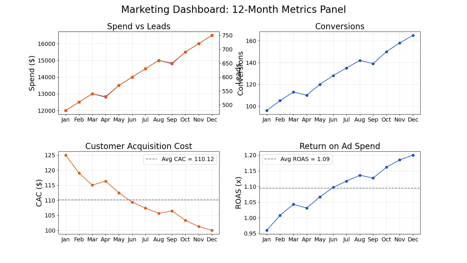
A marketing dashboard is a single screen that tracks the few metrics that show whether marketing is working: spend, leads, conversions, cost per acquisition and return on ad spend. The goal is not to show everything you can measure. It is to show the numbers that connect marketing activity to revenue, so a decision-maker can see performance in seconds. This article covers the metrics, the layout, and a worked example you can copy.
Quick Answer
- A marketing dashboard should answer one question: is marketing producing profitable customers at an acceptable cost?
- Core metrics: spend, leads, conversions, cost per acquisition (CAC) and return on ad spend (ROAS). Add customer lifetime value if you have it.
- Layout rule: one metric per panel, biggest panel for the metric that matters most, time on the x-axis.
- Dashboards are interactive and updated, not static files, so users can filter and find trends [1].
- Executives need clarity and speed, so identify the right KPIs and display them in the clearest way possible [2].
What a Marketing Dashboard Means
In plain terms, a marketing dashboard is a visual summary of marketing performance that updates as new data arrives. It replaces the pile of spreadsheets and one-off reports that nobody reads with one view that a board member or marketing lead can scan.
The precise definition: a marketing dashboard is a structured set of metrics that measure the impact of marketing activities against the goals of the corporation [3]. That structure matters. Isolated measures of marketing performance are often insufficient, irrelevant or misleading, and a dashboard lets leaders routinely assess how well marketing supports corporate strategy and spot when the two are misaligned [3].
A related idea is the customer equity dashboard, which links marketing to finance by tracking the value of customer relationships over time [4]. If your audience is senior executives, that framing helps, because financial reports often contain little marketing information and marketing metrics often omit the language executives understand: value [4].
How It Works
A dashboard works by turning raw activity data into ratios and trends. Two formulas do most of the work.
Cost per acquisition:
$$CAC = \frac{\text{spend}}{\text{conversions}}$$
Return on ad spend:
$$ROAS = \frac{\text{conversions} \times \text{average order value}}{\text{spend}}$$
Each symbol:
- spend: total money spent on the marketing channel or campaign in the period.
- conversions: the number of completed target actions, such as purchases or signups.
- average order value (AOV): the average revenue per conversion.
- CAC: what you paid to get one conversion. Lower is better.
- ROAS: revenue returned per unit of spend. Above 1.0 means revenue exceeds spend.
CAC and ROAS move in opposite directions when performance improves. As CAC falls, ROAS rises. That inverse relationship is why they belong side by side on the same dashboard.
Worked Example
The dataset is 12 months of marketing data with spend, leads and conversions, plus computed CAC and ROAS using an average order value of 120.
| Month | Spend | Leads | Conversions | CAC | ROAS |
|---|---|---|---|---|---|
| Jan | 12000 | 480 | 96 | 125.0000 | 0.9600 |
| Feb | 12500 | 510 | 105 | 119.0476 | 1.0080 |
| Mar | 13000 | 540 | 113 | 115.0442 | 1.0431 |
| Apr | 12800 | 530 | 110 | 116.3636 | 1.0312 |
| May | 13500 | 570 | 120 | 112.5000 | 1.0667 |
| Jun | 14000 | 600 | 128 | 109.3750 | 1.0971 |
| Jul | 14500 | 630 | 135 | 107.4074 | 1.1172 |
| Aug | 15000 | 660 | 142 | 105.6338 | 1.1360 |
| Sep | 14800 | 650 | 139 | 106.4748 | 1.1270 |
| Oct | 15500 | 690 | 150 | 103.3333 | 1.1613 |
| Nov | 16000 | 720 | 158 | 101.2658 | 1.1850 |
| Dec | 16500 | 750 | 165 | 100.0000 | 1.2000 |
Steps:
- CAC = spend / conversions. For January: 12000 / 96 = 125.0000.
- ROAS = (conversions × 120) / spend. For January: (96 × 120) / 12000 = 0.9600.
- February CAC: 12500 / 105 = 119.0476. February ROAS: (105 × 120) / 12500 = 1.0080.
- March CAC: 13000 / 113 = 115.0442. March ROAS: (113 × 120) / 13000 = 1.0431.
The code that produces the full table:
import pandas as pd
df = pd.DataFrame({
    "month": ["Jan","Feb","Mar","Apr","May","Jun","Jul","Aug","Sep","Oct","Nov","Dec"],
    "spend": [12000,12500,13000,12800,13500,14000,14500,15000,14800,15500,16000,16500],
    "leads": [480,510,540,530,570,600,630,660,650,690,720,750],
    "conversions": [96,105,113,110,120,128,135,142,139,150,158,165],
})
df["cac"] = df["spend"] / df["conversions"]
df["roas"] = (df["conversions"] * 120) / df["spend"]
print(df[["month","cac","roas"]].round(4))
Output:
   month       cac    roas
0    Jan  125.0000  0.9600
1    Feb  119.0476  1.0080
2    Mar  115.0442  1.0431
3    Apr  116.3636  1.0312
4    May  112.5000  1.0667
5    Jun  109.3750  1.0971
6    Jul  107.4074  1.1172
7    Aug  105.6338  1.1360
8    Sep  106.4748  1.1270
9    Oct  103.3333  1.1613
10   Nov  101.2658  1.1850
11   Dec  100.0000  1.2000
Across the year, average CAC is 110.1205, average ROAS is 1.0944, total spend is 170100 and total conversions are 1561. December is the best ROAS month at 1.2000.
How to Interpret It
Read the trend, not the single month. In this example, CAC falls from 125.0000 in January to 100.0000 in December while ROAS climbs from 0.9600 to 1.2000. Spend rose over the same period, so the improvement is not from cutting budget. Efficiency improved as scale grew.
The crossover point matters. January ROAS is 0.9600, below 1.0, which means revenue did not cover spend that month. ROAS passes 1.0 in February at 1.0080 and stays above it. On a dashboard, that crossing is the single most useful thing to highlight, because it marks the point where the channel turned profitable.
A 2x2 panel layout works well for this dataset: spend versus leads, conversions, CAC (average 110.12), and ROAS (average 1.09) over 12 months. Four panels, one metric each, time on the x-axis. If you are choosing between chart types for each panel, the principles in data visualization basics apply directly: line charts for trends over time, bars for comparisons between categories.
When to Use It (and when not to)
Use a marketing dashboard when:
- You report to executives or a board and need a fast, repeatable view [3].
- You run multiple channels and need to compare efficiency across them.
- You want to spot trends early, since dashboards reveal predictable trends that help you plan [1].
- You need to connect marketing spend to financial outcomes, which is where customer equity framing helps [4].
Do not use one when:
- The metric set is still being defined. A dashboard built on the wrong metrics just makes bad numbers load faster.
- You need a one-time deep analysis. A dashboard is for monitoring, not for a single investigation.
- Your data updates less often than you check the dashboard. Stale panels train people to ignore them.
Marketing Dashboard vs Marketing Report
These two get confused constantly. A report is a snapshot you produce at a point in time. A dashboard is a live view you check continuously.
| Feature | Marketing Dashboard | Marketing Report |
|---|---|---|
| Update | Continuous, interactive [1] | Fixed at creation |
| Purpose | Monitor and spot trends | Explain and document |
| Audience | Executives, ongoing decisions [2] | Stakeholders, periodic review |
| Length | One screen | Multiple pages |
| Interactivity | Filters and drill-down [1] | None |
A dashboard can filter information to reveal insights that are not readily seen in a static file [1]. That is the practical difference. If you cannot click into it, it is a report.
Common Mistakes
- Tracking too many metrics. A dashboard with 30 numbers is a report. Fix: keep the top panel to five or fewer metrics tied to strategy [3].
- Showing raw counts only. Leads and conversions alone hide cost. Fix: pair every volume metric with its ratio, such as CAC or ROAS.
- Ignoring the revenue link. Metrics that cannot be correlated with marketing activities and revenue results are not very helpful [3]. Fix: include ROAS or customer lifetime value.
- Building a static file and calling it a dashboard. Dashboards are interactive and constantly updated [1]. Fix: connect live data and add filters.
- Designing for analysts instead of executives. Executives have limited time and need the greatest clarity possible [2]. Fix: one metric per panel, clear labels, no clutter.
- No comparison baseline. A number with no target or prior period tells you nothing. Fix: show the target line or the same month last year.
Limitations
A dashboard cannot tell you why something changed. It shows that CAC fell from 125.0000 to 100.0000, but the cause might be creative, audience, seasonality or a pricing change. You still need analysis behind the panel.
Dashboards also mislead when the underlying metric definitions drift. If CAC is computed one way in January and another way in June, the trend is fiction. Lock the formulas, document them, and treat the dashboard as a monitoring tool, not a substitute for causal analysis. For the statistical side of reading trends, see trend analysis in research.
Frequently Asked Questions
Which metrics should go on a marketing dashboard?
Start with spend, leads, conversions, CAC and ROAS. These five connect activity to cost and revenue. Add customer lifetime value if you can measure it, since it links marketing to finance in the language executives understand [4]. Keep the top level to five or fewer metrics and push detail into drill-downs.
How many panels should a marketing dashboard have?
Four to six panels is a practical ceiling for a single screen. A 2x2 layout with one metric per panel stays readable. If you need more, split into tabs by channel or by funnel stage instead of shrinking the panels.
What is a good ROAS?
It depends on your margin. In the worked example, ROAS starts at 0.9600 in January, which is below 1.0, meaning revenue did not cover spend. It climbs to 1.2000 by December. A ROAS above 1.0 means revenue exceeds spend, but profitability also depends on your cost structure and average order value.
How is CAC different from CPA?
They are usually the same calculation, spend divided by conversions. CAC is the more common term when you are thinking about the long-term value of a customer. CPA is more common when you are thinking about a single campaign action. Pick one term and use it consistently across the dashboard.
Should a marketing dashboard be static or interactive?
Interactive. Dashboards are not static, they are interactive and constantly updated, and filtering lets users find insights that are not visible in a static file [1]. A static export is a report, and it loses the main advantage of the format. If you are building one from a spreadsheet, start with the dataset examples to structure your columns before you design panels.
References
- Dashboards for Informed Decision Making | Institutional Planning and Operations
- Learn to Design Visual Data Dashboards - USI Online
- Fixing the Marketing-CEO Disconnect | Working Knowledge
- Reading the signs of your customer value | IESE Insight
Further Reading
- Weissgerber TL, Milic NM, Winham SJ et al. (2015). Beyond Bar and Line Graphs: Time for a New Data Presentation Paradigm. PLOS Biology
- Rougier NP, Droettboom M, Bourne PE (2014). Ten Simple Rules for Better Figures. PLoS Computational Biology
Related Articles
- Correlation Examples: Positive, Negative and Zero Relationships
- Data Visualization Basics: How to Choose the Right Chart
- Ranking Correlation Coefficient: Spearman and Kendall
- Bivariate Data: Definition, Examples and Analysis
- Measures of Variability: Range, Variance and Standard Deviation
- Building a Custom Research Dashboard with the Zotero API
- Research Figures: Making Methods and Results Easier to Evaluate
- The Application Tracking Spreadsheet