How to Create a Scatter Plot in Excel (Step by Step)
By Dr. Zubair Khalid, DVM, MS, PhD ·
To create a scatter plot in Excel, put your x values in one column and your y values in the next, select both columns including the headers, then go to Insert > Charts > Scatter (X, Y) and pick Scatter with only Markers. Excel plots each row as one point, with the first column on the horizontal axis and the second on the vertical axis [1]. You can then add axis titles and a trendline from Chart Design > Add Chart Element.
Quick Answer
- Arrange data in two columns: x values first, y values second, with a header row [2].
- Select the whole range, then choose Insert > Charts > Scatter (X, Y) > Scatter with only Markers.
- A scatter chart never puts categories on the horizontal axis. It plots numeric x values there [1].
- Add axis titles and a trendline from Chart Design > Add Chart Element [3].
- Turn on "Display Equation on chart" and "Display R-squared value on chart" in the Format Trendline pane to read the fit.
Before You Start
A scatter chart, often called an xy chart, shows pairs of numeric values as points. The horizontal axis holds one variable and the vertical axis holds the other [1]. This is different from a line chart, which treats the horizontal axis as categories. If your horizontal values are numbers you want measured on a scale, a scatter chart is the right choice [1].
Your data needs a specific shape. Put your x values in the first column and your y values in the next column, with one row per observation [2]. Headers in the top row help Excel label the series. If your data sits in a continuous range, you can select any single cell in that range and Excel will include the whole block [2].
Two columns are enough for a basic scatter plot. If you have several groups, you can add more y columns, but keep the x values in the first column [2]. For a broader tour of chart types before you commit, see how to make a chart in Excel.
Step by Step
- Enter your data. Put the x variable in column A and the y variable in column B. Add headers in row 1, such as "Ad Spend ($)" and "Sales ($)".
- Select the range. Click the first header cell and drag to the last data cell, or select any cell in a continuous range and let Excel take the whole block [2].
- Insert the chart. Go to Insert > Charts > Scatter (X, Y) and choose Scatter with only Markers. This shows points without connecting lines, which suits comparing pairs of values [3].
- Add the horizontal axis title. On the Chart Design tab, choose Add Chart Element > Axis Titles > Primary Horizontal, then type your x label [3].
- Add the vertical axis title. Choose Add Chart Element > Axis Titles > Primary Vertical, then type your y label [3].
- Add a trendline. Choose Add Chart Element > Trendline > Linear. Excel draws the best-fit straight line through your points [3].
- Show the equation and R-squared. Open the Format Trendline pane, go to Trendline Options, and check "Display Equation on chart" and "Display R-squared value on chart". The equation gives the slope and intercept, and R-squared tells you how much of the variation in y the line explains.
If you want a connected version of the same idea, the steps in how to make a line chart in Excel are close, but the axis behavior differs.
Worked Example
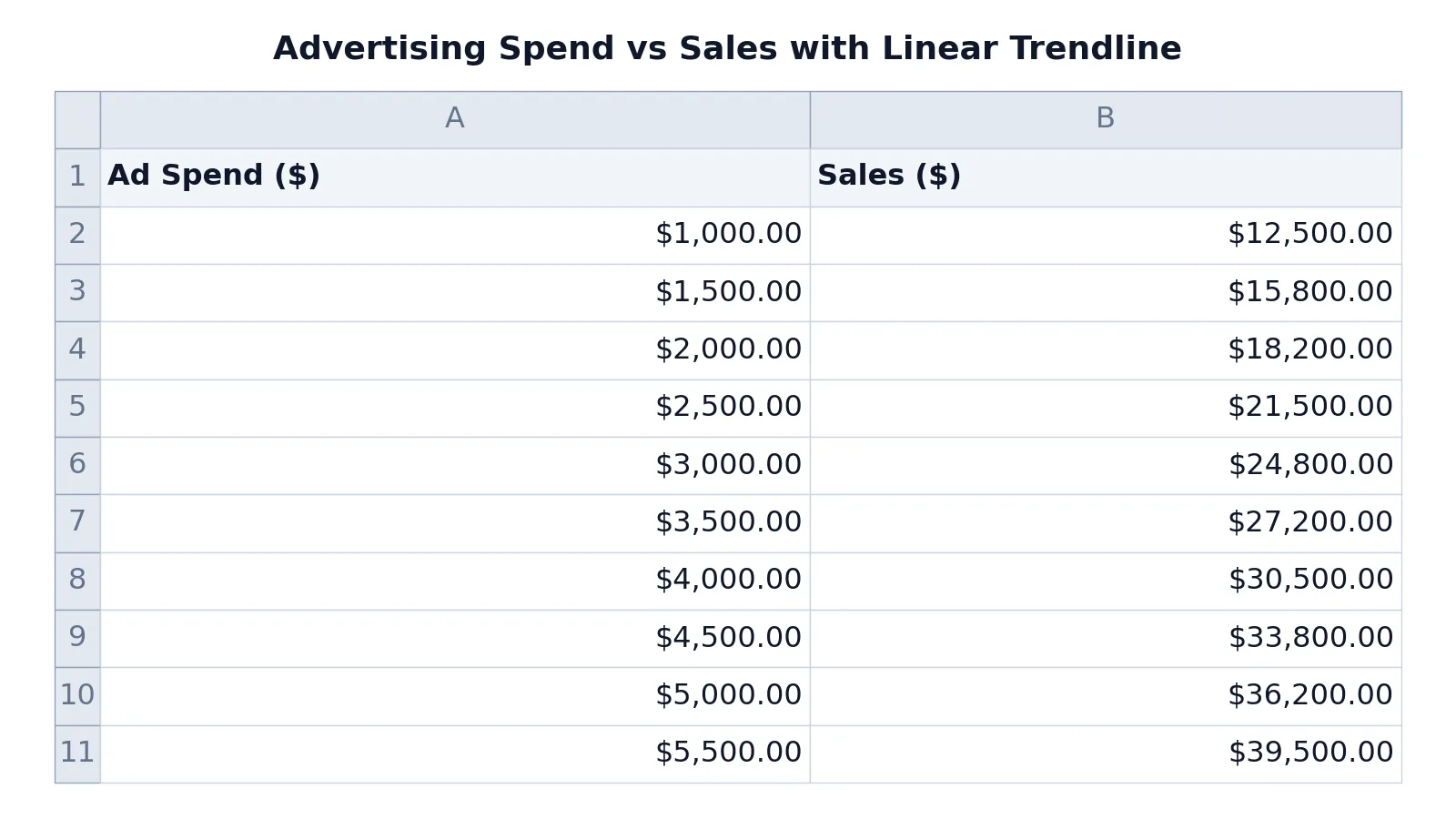
This example uses ten months of advertising spend and the matching sales figures for a small business.
| A | B | |
|---|---|---|
| 1 | Ad Spend ($) | Sales ($) |
| 2 | 1000 | 12500 |
| 3 | 1500 | 15800 |
| 4 | 2000 | 18200 |
| 5 | 2500 | 21500 |
| 6 | 3000 | 24800 |
| 7 | 3500 | 27200 |
| 8 | 4000 | 30500 |
| 9 | 4500 | 33800 |
| 10 | 5000 | 36200 |
| 11 | 5500 | 39500 |
The interface steps for this sheet are:
- Select range A1:B11.
- Insert > Charts > Scatter (X, Y) > Scatter with only Markers.
- Chart Design > Add Chart Element > Axis Titles > Primary Horizontal, type "Ad Spend ($)".
- Chart Design > Add Chart Element > Axis Titles > Primary Vertical, type "Sales ($)".
- Chart Design > Add Chart Element > Trendline > Linear.
- Format Trendline pane > Trendline Options > check "Display Equation on chart" and "Display R-squared value on chart".
The result is an XY scatter plot of 10 advertising spend and sales pairs with a linear trendline, equation, and R-squared value. The points rise from lower left to upper right, and the trendline passes through the middle of them. Because the relationship is close to straight, a linear trendline fits well here.
If you want to check the slope by hand, the trendline equation takes the form:
$$y = mx + b$$
where $m$ is the slope and $b$ is the intercept. Excel reports both numbers on the chart once you enable the equation. For a deeper walkthrough of the fit line and its interpretation, see how to make a scatter plot with a trendline, equation and R-squared.
Other Ways to Do It
You do not have to start from the Insert tab. Select your data and press ALT + F1 to create a chart immediately, though Excel may not pick a scatter chart for you [3]. If it picks something else, open the All Charts tab and choose Scatter.
If your chart is on the same worksheet as your data, you can drag new data next to the existing source data to add it to the chart. If the chart sits on a separate sheet, use the Select Data Source dialog box instead [4].
If Excel plots your rows and columns the wrong way around, you can switch them. Excel decides which axis to use based on the number of rows and columns you include, and it places the larger number on the horizontal axis [5]. You can change this by switching rows to columns in the chart [5].
For a quick visual check without building a chart in a workbook, the Scatter Plot Maker plots two columns of numbers and draws the fit line for you.
Troubleshooting
The horizontal axis shows 1, 2, 3 instead of your x values. Excel is treating your x column as text or as a category. Make sure the x values are stored as numbers and that you chose a Scatter chart type, not a Line chart, since scatter charts never display categories on the horizontal axis [1].
The axes are swapped. Excel may have plotted rows on the horizontal axis. Switch rows to columns to move the data to the axis you want [5].
The trendline option is missing. Trendlines attach to a data series. Click directly on a data point to select the series, then add the trendline [3].
The equation does not appear. The equation and R-squared only show when you check those boxes in the Format Trendline pane. They are off by default.
The chart ignores some rows. Hidden rows are left out of a chart. Unhide them or use chart filters to control which points appear [2].
Common Mistakes
- Using a line chart for numeric x values. A line chart spaces categories evenly and ignores the actual x distances. Use a scatter chart when both variables are numeric [1]. Fix: change the chart type to Scatter.
- Leaving out the header row. Without headers, Excel names the series "Series1" and your legend is useless. Fix: include row 1 in your selection [2].
- Selecting only the y column. Excel then has no x values to plot against. Fix: select both columns before inserting the chart [2].
- Forcing a straight trendline on curved data. A linear fit on a curved relationship hides the pattern. Fix: try the Exponential or Moving Average trendline types instead [3].
- Reporting R-squared without the equation. The R-squared alone does not tell a reader the slope or intercept. Fix: display both on the chart.
- Adding a trendline to the wrong series. With multiple series, the line may attach to a series you did not intend. Fix: click the correct data point first, then add the trendline [3].
Limitations
A scatter plot shows association, not causation. A rising trendline between ad spend and sales does not prove that spending caused the sales increase. Some third factor, such as season or a promotion, could drive both.
The chart also depends entirely on the data you feed it. Outliers pull the trendline toward them, and a single bad row can flatten or steepen the slope. Excel's linear trendline only fits a straight line, so it will mislead you when the true relationship curves. Check the R-squared value and look at the points around the line before you trust the fit.
Frequently Asked Questions
How do I create a scatter graph in Excel with two columns?
Put your x values in the first column and your y values in the second, with headers in row 1. Select the whole range, then go to Insert > Charts > Scatter (X, Y) and choose Scatter with only Markers [2]. Excel plots one point per row.
How do I make an x y graph in Excel?
An x y graph is the same thing as a scatter chart. Excel calls it a scatter chart and notes that it is often referred to as an xy chart [1]. Follow the same steps: two numeric columns, select the range, then insert a Scatter chart.
Why does my scatter plot show categories on the x-axis?
It should not. A scatter chart never displays categories on the horizontal axis [1]. If you see categories, you likely inserted a Line chart instead. Delete it and insert a Scatter chart from the Insert > Charts menu.
How do I add a trendline to a scatter plot in Excel?
Select the chart, then choose Chart Design > Add Chart Element > Trendline and pick a type such as Linear, Exponential, Linear Forecast, or Moving Average [3]. To show the equation and R-squared, open the Format Trendline pane and check the display boxes.
Can I add more than one data series to a scatter plot?
Yes. Enter the new series next to or below your existing source data on the same worksheet and drag it onto the chart, or use the Select Data Source dialog box if the chart is on a separate sheet [4]. Each series gets its own set of points and its own trendline option.
References
- Present your data in a scatter chart or a line chart | Microsoft Support
- Select data for a chart | Microsoft Support
- Create a chart from start to finish | Microsoft Support
- Add a data series to your chart | Microsoft Support
- Change how rows and columns of data are plotted in a chart | Microsoft Support
Further Reading
- Broman KW, Woo KH (2018). Data Organization in Spreadsheets. The American Statistician
- Ziemann M, Eren Y, El-Osta A (2016). Gene name errors are widespread in the scientific literature. Genome Biology
Related Articles
- How to Make a Line Chart in Excel (Step by Step)
- How to Make a Chart in Excel (Step by Step)
- How to Make a Box Plot in Excel (Step by Step)
- How to Make a Formula in Excel (Step by Step)
- How to Create an X Y Graph in Excel (Step by Step)
- How to Make a Scatter Plot with a Trendline, Equation and R-squared
- Best Line of Fit: Scatter Plot Guide