geom_point in ggplot2: Syntax, Aesthetics and Examples
By Dr. Zubair Khalid, DVM, MS, PhD ·
Scatter plots are the default way to show the relationship between two numeric variables, and geom_point() is the function that draws them in ggplot2. You map a numeric variable to x, another to y, and each row of your data becomes one point. This article covers the syntax, the aesthetics geom point understands, a worked example with real numbers, and the mistakes that trip people up most often.
Quick Answer
geom_point()adds a scatter plot layer. The only required aesthetics arexandy[1].- Optional aesthetics include
alpha,colour,fill,shape,size, andstroke[1]. - Set an aesthetic to a constant outside
aes()(for examplesize = 3) or map it to a variable insideaes()(for exampleaes(color = group)). - The
fillaesthetic only applies to shapes 21 through 25 [1]. - Overplotting is the main visual risk with scatter plots. Transparency (
alpha) or smaller points help [1].
Syntax
The layer constructor takes the usual ggplot2 arguments.
| Argument | Required? | Meaning |
|---|---|---|
mapping | No | A call to aes() that maps data columns to aesthetics. Inherited from ggplot() if omitted. |
data | No | A data frame for this layer. Inherited from ggplot() if omitted. |
stat | No | The statistical transformation. Defaults to "identity", so raw values are plotted. |
position | No | Position adjustment. Defaults to "identity". |
... | No | Other arguments passed to the layer, such as na.rm. |
show.legend | No | Logical. Whether this layer appears in the legend. |
inherit.aes | No | Logical. Whether to inherit the default aesthetics from the plot. Defaults to TRUE. |
Inside aes() you can map any of the point aesthetics. Required aesthetics are x and y. Optional ones are alpha, colour, fill, shape, size, and stroke [1].
How It Works
A ggplot2 plot is built by adding layers. Each layer has a geometry, called a geom, and a statistical transformation, called a stat. The geom determines how the data looks on the plot, and the stat determines what values are computed before drawing [2].
geom_point() is the geometry for points. With the default stat = "identity", no transformation happens. Each row of the data frame is drawn as one point at the coordinates given by the x and y mappings.
Aesthetics work in two modes. If you put an aesthetic inside aes(), ggplot2 maps it to a column, creates a scale, and builds a legend. If you put it outside aes(), ggplot2 applies it as a fixed value to every point. So aes(color = group) colors points by group, while color = "blue" colors every point blue.
Because a geom is just a layer, you can stack several point layers to build compound shapes. The ggplot2 documentation shows this pattern with mtcars, layering a large colored point, a smaller grey point, and a black point to create a ring effect [1].
Worked Example
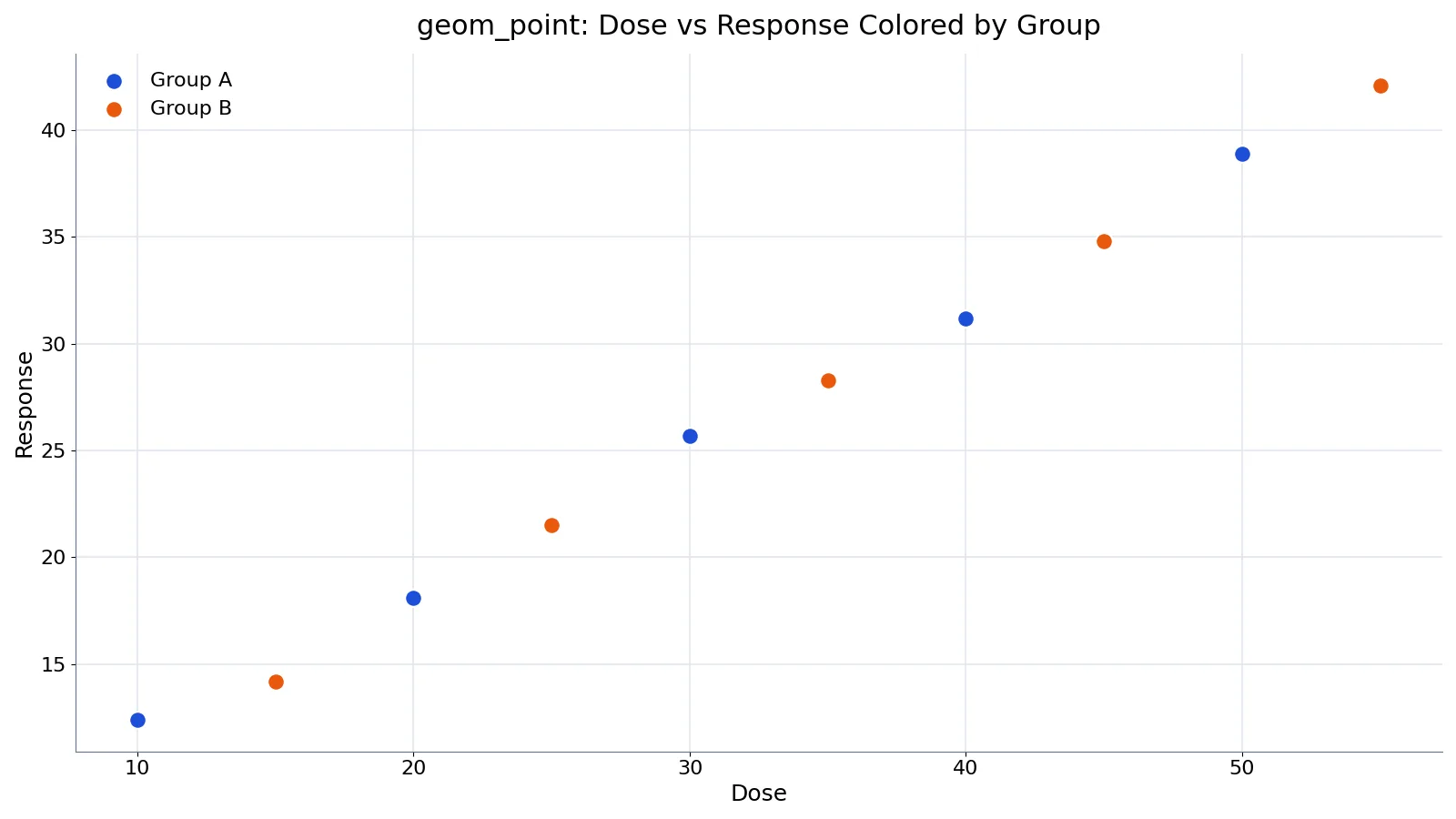
The dataset below holds 10 lab samples with a dose, a measured response, and a group label.
| dose | response | group |
|---|---|---|
| 10 | 12.4 | A |
| 20 | 18.1 | A |
| 30 | 25.7 | A |
| 40 | 31.2 | A |
| 50 | 38.9 | A |
| 15 | 14.2 | B |
| 25 | 21.5 | B |
| 35 | 28.3 | B |
| 45 | 34.8 | B |
| 55 | 42.1 | B |
The data frame has $n = 10$ rows. Group A has a mean response of 25.2600 and group B has a mean response of 28.1800. The Pearson correlation between dose and response is $r = 0.9987$, which is close to a perfect positive linear relationship.
$$r = \frac{\sum (x_i - \bar{x})(y_i - \bar{y})}{\sqrt{\sum (x_i - \bar{x})^2 \sum (y_i - \bar{y})^2}} = 0.9987$$
The plot maps dose to x, response to y, and group to color, then draws points with a fixed size of 3.
library(ggplot2)
df <- data.frame(
  dose = c(10, 20, 30, 40, 50, 15, 25, 35, 45, 55),
  response = c(12.4, 18.1, 25.7, 31.2, 38.9, 14.2, 21.5, 28.3, 34.8, 42.1),
  group = c("A", "A", "A", "A", "A", "B", "B", "B", "B", "B")
)
ggplot(df, aes(x = dose, y = response, color = group)) +
  geom_point(size = 3) +
  labs(title = "Dose vs Response by Group",
       x = "Dose", y = "Response", color = "Group") +
  theme_minimal()
Output: a scatter plot with 10 points, colored by group. Group A contributes 5 points and group B contributes 5 points. The points fall close to a straight line, matching $r = 0.9987$.
More Examples
Fixed color and size. When you want one uniform style, keep the aesthetics outside aes().
ggplot(df, aes(x = dose, y = response)) +
  geom_point(color = "steelblue", size = 2, alpha = 0.8)
Map shape to a factor. Shape is a discrete aesthetic, so it works well with categorical columns.
ggplot(df, aes(x = dose, y = response, shape = group)) +
  geom_point(size = 3)
Handle overplotting with transparency. When many points overlap, a low alpha value reveals density [1].
ggplot(df, aes(x = dose, y = response)) +
  geom_point(alpha = 0.05)
Layer points for a ring effect. Two point layers with different sizes produce a hollow marker [1].
ggplot(df, aes(x = dose, y = response, color = group)) +
  geom_point(size = 4) +
  geom_point(color = "white", size = 1.5)
If you need to reshape or add columns before plotting, the R transform function is a quick way to do it in base R.
Errors and How to Fix Them
"Removed N rows containing missing values." geom_point() warns when rows with NA values are dropped from the plot. This is a warning, not an error. If you expect the missing values and want a quiet output, set na.rm = TRUE in the layer [1].
"Continuous value supplied to discrete scale." This happens when you map a numeric column to shape or color and then apply a discrete scale. Convert the column with factor() first.
"Aesthetics must be either length 1 or the same as the data." You passed a vector to an aesthetic that does not match the number of rows. Check the length of the vector or move the value outside aes().
"object 'x' not found." The column name in aes() does not exist in the data. Check spelling and confirm the data frame passed to ggplot().
"geom_point requires the following missing aesthetics: x and y." You omitted a required mapping. Add both x and y inside aes().
Common Mistakes
- Putting constants inside
aes(). Writingaes(color = "blue")maps every point to the literal string "blue" and creates a legend. Usecolor = "blue"outsideaes()for a fixed color. - Expecting
fillto work on default shapes. The default point shape is solid, sofillhas no visible effect. Use shapes 21 through 25 if you want a separate fill color [1]. - Ignoring overplotting. With more than a few points, markers stack on top of each other and hide the real density. Lower
alphaor reducesize[1]. - Mapping a continuous variable to
shape. Shape scales are discrete. Convert the column withfactor()before mapping it. - Forgetting that
sizeis in millimeters. A size of 3 is already fairly large. Values above 6 often look clumsy. - Reusing the same
aes()for layers with different data. Each layer can take its owndataandmappingarguments, so override them per layer when needed.
Limitations
geom_point() draws one marker per row. It does not summarize, bin, or aggregate your data. When thousands of points land in the same region, the plot shows a solid blob and the visual density no longer reflects the underlying counts. Transparency, small sizes, and binning geoms such as geom_hex() or geom_count() are the usual workarounds [1].
Points also carry no information about ordering or connection. If your data has a time or sequence dimension, a line layer communicates the trend better. And because point size and shape are visual encodings, they can mislead when the scale is not explained in the legend or caption.
Frequently Asked Questions
What is the difference between geom_point and geom_jitter?
geom_point() draws each point at its exact coordinates. geom_jitter() adds a small random offset to reduce overplotting, which is useful when one axis holds discrete or rounded values. Use geom_point() when exact positions matter and geom_jitter() when many points share the same location.
How do I change the color of all points in geom_point?
Set color outside aes(), for example geom_point(color = "red"). If you place it inside aes(), ggplot2 treats the value as a data mapping and adds a legend. The same rule applies to size, shape, and alpha.
Why does fill not change my point color?
The default point shapes are solid, so fill has no effect on them. The fill aesthetic only applies to shapes 21 through 25, which have separate fill and stroke colors [1]. Set shape = 21 and then use fill for the interior color.
How do I add a regression line to a scatter plot?
Add geom_smooth(method = "lm") after geom_point(). The smoother layer draws a fitted line with a confidence band on top of the points. Both layers inherit the same aes() mapping from ggplot().
Can I plot two point layers with different data?
Yes. Each layer accepts its own data and mapping arguments. Pass a different data frame to the second geom_point() call and set inherit.aes = FALSE if you do not want it to reuse the plot-level mapping.
For a broader walkthrough of building publication-quality figures, see this ggplot2 tutorial for beginners. If you work with sequencing data, this guide to ggplot2 for RNA-seq visualization covers related plotting patterns.
References
Further Reading
- Wickham H (2014). Tidy Data. Journal of Statistical Software
- Wickham H, Averick M, Bryan J et al. (2019). Welcome to the Tidyverse. Journal of Open Source Software
- An Introduction to R (R Core Team)
- Wickham H, Cetinkaya-Rundel M, Grolemund G. R for Data Science (2e)
Related Articles
- R transform Function: Syntax and Examples
- ggplot2 Tutorial for Beginners: Publication-Ready Plots for Lab Data
- How to Use ggplot2 for RNA-seq Visualization: A Practical Guide for Custom Publication-Ready Plots
- R letters Function: Generate Lowercase Letter Sequences
- R ones: How to Create a Vector of Ones in R