Box Plot Outliers: How to Identify and Interpret Them
By Dr. Zubair Khalid, DVM, MS, PhD ·
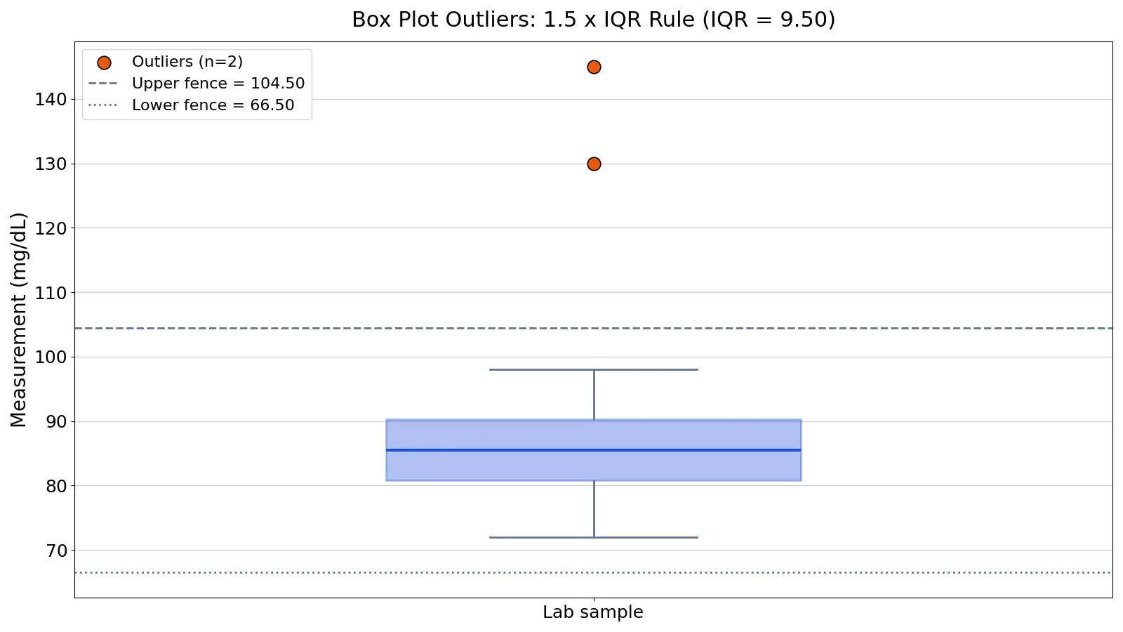
A box plot and outliers go together because the plot was designed to flag unusual values automatically. Any point beyond 1.5 times the interquartile range from the box edge is drawn as an individual marker instead of being absorbed into the whisker. This article shows the exact rule, a worked example with real numbers, and how to interpret what you see.
Quick Answer
- A box plot marks outliers as individual points beyond the whiskers, using the 1.5 IQR rule [1][2].
- The interquartile range is $IQR = Q3 - Q1$, the width of the box [3].
- Fences sit at $Q1 - 1.5 \times IQR$ and $Q3 + 1.5 \times IQR$. Points outside them are outliers [3].
- Whiskers extend to the smallest and largest values that are not outliers [1].
- Some conventions split outliers into mild (beyond 1.5 IQR) and extreme (beyond 3 IQR) [2][3].
What Box Plot Outliers Mean
A box plot outlier is a data point that sits far enough from the middle of the distribution that the plot draws it separately. In plain terms, it is a value the plot is telling you to look at before you trust any summary statistic.
The precise statistical definition comes from the fences. If $Q1$ is the lower quartile and $Q3$ is the upper quartile, the interquartile range is $Q3 - Q1$ [3]. A point beyond an inner fence on either side is a mild outlier, and a point beyond an outer fence is an extreme outlier [3]. The box plot flags outliers, which is one of its main advantages over a histogram for showing a distribution [1].
How It Works
The mechanism is a fixed multiple of the IQR applied to both ends of the box. Here are the symbols:
- $Q1$: the 25th percentile, the left or bottom edge of the box [2].
- $Q3$: the 75th percentile, the right or top edge of the box [2].
- $IQR$: the interquartile range, $Q3 - Q1$, the length of the box [2].
- Median: the line inside the box, splitting the data into a bottom 50% and a top 50% [4].
The fences are:
$$ \text{Lower fence} = Q1 - 1.5 \times IQR $$
$$ \text{Upper fence} = Q3 + 1.5 \times IQR $$
Any value below the lower fence or above the upper fence is an outlier. The whiskers then extend from each side of the box to the smallest or largest data value that is not an outlier, so every point outside the whiskers is an outlier [1]. Stars are often used for minor outliers beyond 1.5 IQR, and circles for major outliers beyond 3 IQR [2].
Worked Example
Take 40 lab measurements in mg/dL, most clustered between 72 and 98, with two high values at 130 and 145.
| # | Value | # | Value | # | Value | # | Value |
|---|---|---|---|---|---|---|---|
| 1 | 72 | 11 | 81 | 21 | 86 | 31 | 92 |
| 2 | 74 | 12 | 81 | 22 | 86 | 32 | 93 |
| 3 | 75 | 13 | 82 | 23 | 87 | 33 | 94 |
| 4 | 76 | 14 | 82 | 24 | 87 | 34 | 95 |
| 5 | 77 | 15 | 83 | 25 | 88 | 35 | 96 |
| 6 | 78 | 16 | 83 | 26 | 88 | 36 | 98 |
| 7 | 78 | 17 | 84 | 27 | 89 | 37 | 130 |
| 8 | 79 | 18 | 84 | 28 | 89 | 38 | 145 |
| 9 | 80 | 19 | 85 | 29 | 90 | 39 | 92 |
| 10 | 80 | 20 | 85 | 30 | 90 | 40 | 91 |
Step by step:
- Sample size: $n = 40$.
- Sorted data runs from 72 to 145.
- $Q1 = 80.7500$ (25th percentile, linear interpolation).
- $Q3 = 90.2500$ (75th percentile, linear interpolation).
- $IQR = 90.2500 - 80.7500 = 9.5000$.
- Lower fence $= 80.7500 - 1.5 \times 9.5000 = 66.5000$.
- Upper fence $= 90.2500 + 1.5 \times 9.5000 = 104.5000$.
- Outliers outside the fences: 130 and 145.
For context, the median is 85.5000, the mean is 87.6250, and the sample standard deviation is 13.3083. Notice that the mean sits above the median because the two high values pull it up, while the median barely moves.
Here is the same calculation in Python:
import numpy as np
data = [72, 74, 75, 76, 77, 78, 78, 79, 80, 80, 81, 81, 82, 82, 83, 83, 84, 84, 85, 85, 86, 86, 87, 87, 88, 88, 89, 89, 90, 90, 91, 92, 92, 93, 94, 95, 96, 98, 130, 145]
q1, q3 = np.percentile(data, [25, 75])
iqr = q3 - q1
lower, upper = q1 - 1.5*iqr, q3 + 1.5*iqr
outliers = [x for x in data if x < lower or x > upper]
print(f"Q1={q1:.4f}, Q3={q3:.4f}, IQR={iqr:.4f}, lower fence={lower:.4f}, upper fence={upper:.4f}, outliers={outliers}")
Output:
Q1=80.7500, Q3=90.2500, IQR=9.5000, lower fence=66.5000, upper fence=104.5000, outliers=[130, 145]You can reproduce this with the Outlier Calculator or draw the plot with the Box Plot Maker.
How to Interpret It
The flagged points are a prompt to investigate, not a verdict. Outliers often contain valuable information about the process under investigation or the data gathering and recording process, so try to understand why they appeared before considering removal [3].
Ask whether the value came from a different population than the rest of the data, or whether it reflects a sampling problem [1]. One useful clue is whether the same row shows discrepant values on other variables. The more discrepant the other values in that row, the more likely the point is a genuine outlier [1].
The box plot also tells you about shape. If the lower 25% of the data is squished into a shorter distance than the upper 25%, the distribution is right skewed [4]. That matters because a skewed distribution can produce flagged points that are simply the tail of a legitimate shape. For a deeper look at that pattern, see left-skewed box plot interpretation.
When to Use It (and when not to)
Use the 1.5 IQR rule when you want a fast, distribution-free screen during exploratory analysis. It works on any numeric variable and needs no assumption about normality. It is also the natural companion to a box plot when you compare groups, as in side-by-side boxplots.
Do not use it as a formal hypothesis test. The rule is a convention, not a probability statement, and the 1.5 multiplier is somewhat arbitrary [1]. If you need a test with a stated error rate, use a dedicated method such as the Grubbs test or a modified z-score, covered in how to detect outliers. Also avoid applying a single-outlier test repeatedly to find several outliers, because masking and swamping can distort the results [5].
Box Plot Outliers vs Z-Score Outliers
Both approaches flag unusual values, but they measure distance differently.
| Feature | 1.5 IQR rule | Z-score method |
|---|---|---|
| Reference point | Quartiles (Q1, Q3) | Mean and standard deviation |
| Spread measure | IQR | Standard deviation |
| Typical cutoff | 1.5 IQR (3 IQR for extreme) | Often 2 or 3 standard deviations |
| Sensitive to extreme values | No, quartiles resist them | Yes, the mean and SD are pulled by them |
| Assumes a distribution | No | Usually assumes roughly normal data |
The IQR approach is more resistant because quartiles do not move much when a few extreme values appear. The z-score approach is more informative when your data are close to normal and you want a distance in standard deviation units. For a fuller comparison, see measures of variability.
Common Mistakes
- Treating every flagged point as an error. The fix: investigate first, since outliers often carry real information about the process [3].
- Deleting outliers without documenting why. The fix: record the reason and keep the original data.
- Using the mean and standard deviation to set fences. The fix: use Q1, Q3, and the IQR, which resist extreme values.
- Forgetting that the whisker is not the maximum. The fix: remember the whisker stops at the largest or smallest non-outlier value [1].
- Confusing mild and extreme outliers. The fix: apply the 1.5 IQR cutoff for mild and the 3 IQR cutoff for extreme [2][3].
- Reading a box plot as a full distribution. The fix: note that a box plot does not show the distribution shape, so you cannot generally identify modes from it [4].
Limitations
The 1.5 IQR rule cannot tell you whether a point is a mistake or a genuine extreme value. It only tells you the point is far from the middle relative to the spread. A value can be flagged in one sample and not in another simply because the IQR changed.
The rule also struggles with small samples, where quartiles are unstable, and with heavily skewed data, where legitimate tail values get flagged routinely. Formal outlier tests add their own assumptions. If the data are not normal, a determination that a point is an outlier may reflect non-normality instead, so generating a normal probability plot before applying a test is recommended [5].
Frequently Asked Questions
What is the 1.5 IQR rule for outliers?
It flags any value below $Q1 - 1.5 \times IQR$ or above $Q3 + 1.5 \times IQR$ [3]. The IQR is the distance between the 25th and 75th percentiles. Points outside those fences are drawn individually on the box plot.
Why does a box plot show some points as dots?
Dots are values outside the whiskers, meaning they fall beyond the fences [1]. The whisker stops at the most extreme value that is still inside the fence, so anything past it is plotted as a separate marker.
Is a box plot outlier always a data error?
No. Outliers often contain valuable information about the process or the data recording process [3]. Investigate the cause before deciding whether to keep, correct, or remove the value.
What is the difference between a mild and an extreme outlier?
A point beyond the inner fence at 1.5 IQR is a mild outlier, and a point beyond the outer fence at 3 IQR is an extreme outlier [3]. Some software marks these with different symbols, such as stars for minor and circles for major outliers [2].
Can I use the 1.5 IQR rule on skewed data?
You can, but expect more false flags. Skewed distributions have long tails, and the rule will mark tail values that are part of the natural shape. Check the skew first, as described in reading skewness in box plots, and interpret flagged points with that context.
References
- 6 Influence and Outliers - Introduction to Machine Learning
- boxplot
- 7.1.6. What are outliers in the data?
- AHSS Numerical summaries and box plots
- 1.3.5.17. Detection of Outliers
Further Reading
- 3.4: Box Plots (Box and Whisker Plot) - Statistics LibreTexts/03%3A_Descriptive_Statistics/3.04%3A_Box_Plots_(Box_and_Whisker_Plot))
- 5.4: Boxplots - Statistics LibreTexts
Related Articles
- Residual Plots: How to Interpret Them with Examples
- Left-Skewed Box Plot: How to Read Skewness in Box Plots
- How to Find Outliers: IQR Method and Z-Scores Explained
- Side-by-Side Boxplots: How to Read and Create Them
- Measures of Variability: Range, Variance and Standard Deviation
- How to Make and Read a Box Plot: Quartiles, Whiskers and Outliers
- How to Detect Outliers: Grubbs Test, IQR Fences and Modified Z-Score
- ggplot2 Tutorial for Beginners: Publication-Ready Plots for Lab Data