What Is a Quartile? Definition, Formula and Examples
By Dr. Zubair Khalid, DVM, MS, PhD ·
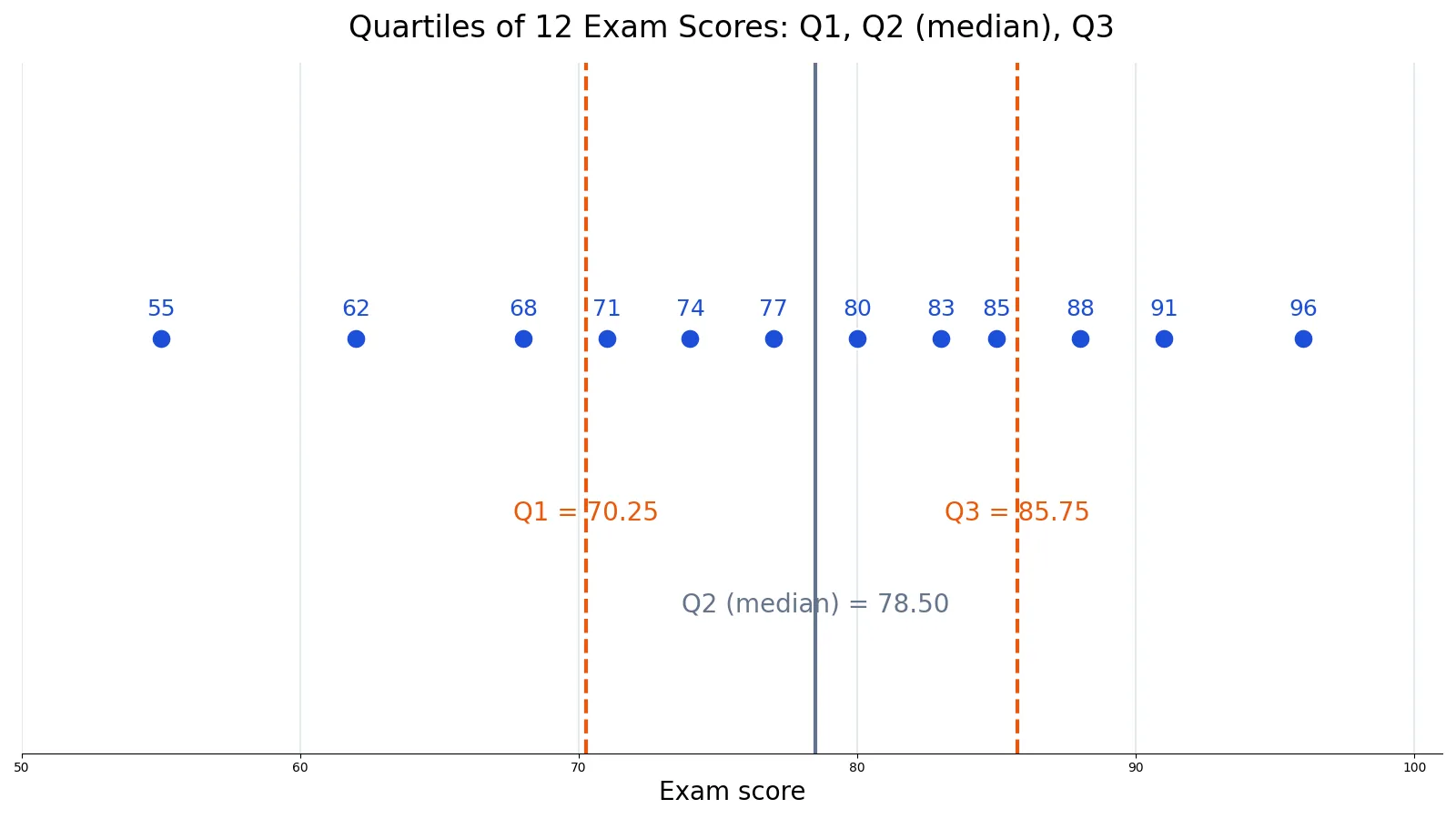
The definition of quartile is simple: a quartile is a cut point that divides ordered data into four parts, each holding about 25% of the values. There are three of them, Q1, Q2 and Q3, and together they tell you where the middle of your data sits and how far the values spread around it. This article gives you the exact formulas, a worked example you can follow line by line, and the mistakes that trip people up most often.
Quick Answer
- A quartile is a cut point that splits ordered data into four groups of roughly equal size [1].
- Q1 is the 25th percentile, Q2 is the 50th percentile (the median), and Q3 is the 75th percentile [1][2].
- You must sort the data from smallest to largest before computing anything [1].
- The interquartile range is $IQR = Q3 - Q1$, the spread of the middle 50% of the data [1].
- Different software uses slightly different formulas, so Q1 and Q3 can differ by a small amount between tools.
What a Quartile Means
In plain terms, imagine lining up every value in your dataset from smallest to largest and splitting the line into four equal chunks. The three points where the chunks meet are the quartiles. Each chunk contains about a quarter of your data points.
The precise statistical definition is that quartiles are a type of quantile that divides the number of data points into four parts, or quarters, of more or less equal size [1]. Because the split depends on position in the sorted list, quartiles are a form of order statistic [1]. The three cut points are:
- The first quartile (Q1) is the 25th percentile, where the lowest 25% of the data lies below this point. It is also called the lower quartile [1].
- The second quartile (Q2) is the median of the dataset, so 50% of the data lies below this point [1].
- The third quartile (Q3) is the 75th percentile, where the lowest 75% of the data lies below this point. It is also called the upper quartile [1].
Along with the minimum and maximum, these three values form the five-number summary, which describes both the center and the spread of a dataset [1]. If you want more practice with the mechanics, see How to Find Q1 and Q3: Quartiles Explained with Examples.
How It Works
The core idea is to convert a percentile into a position in the sorted list, then read off the value at that position. A common approach uses the true index location [2]:
$$\text{True Index Location} = (n - 1) \times p$$
Here is what each symbol means:
- $n$ is the number of data points in the dataset.
- $p$ is the percentile of interest written as a decimal. For Q1 use 0.25, for Q2 use 0.50, and for Q3 use 0.75 [2].
- The result is a position in the sorted list, counted from zero.
If the position lands exactly on a whole number, the quartile is the value at that index. If it lands between two values, you interpolate linearly between them:
$$Q = x_{i} + f \times (x_{i+1} - x_{i})$$
- $x_{i}$ is the value at the lower index.
- $x_{i+1}$ is the value at the next index up.
- $f$ is the fractional part of the position, the decimal left over after the whole number.
This is the linear interpolation method, and it is what NumPy's percentile function uses when you pass method='linear'. Excel's QUARTILE.INC function returns the same values for this dataset.
Worked Example
Take the exam scores of 12 students in a class. The dataset is small enough to list in full.
| student_id | score |
|---|---|
| 1 | 55 |
| 2 | 62 |
| 3 | 68 |
| 4 | 71 |
| 5 | 74 |
| 6 | 77 |
| 7 | 80 |
| 8 | 83 |
| 9 | 85 |
| 10 | 88 |
| 11 | 91 |
| 12 | 96 |
Step 1. Sort the data. The scores are already in ascending order: 55, 62, 68, 71, 74, 77, 80, 83, 85, 88, 91, 96. Here $n = 12$.
Step 2. Find the position of Q1. Using the formula with $p = 0.25$:
$$(12 - 1) \times 0.25 = 2.75$$
The position is 2.75, so Q1 sits between index 2 (the value 68) and index 3 (the value 71).
Step 3. Interpolate Q1.
$$68 + 0.75 \times (71 - 68) = 68 + 2.25 = 70.2500$$
Step 4. Find the position of Q2. With $p = 0.50$:
$$(12 - 1) \times 0.50 = 5.50$$
Step 5. Interpolate Q2.
$$77 + 0.50 \times (80 - 77) = 77 + 1.50 = 78.5000$$
This matches the median of the dataset, which is 78.5000.
Step 6. Find the position of Q3. With $p = 0.75$:
$$(12 - 1) \times 0.75 = 8.25$$
Step 7. Interpolate Q3.
$$85 + 0.25 \times (88 - 85) = 85 + 0.75 = 85.7500$$
Step 8. Compute the interquartile range.
$$IQR = Q3 - Q1 = 85.7500 - 70.2500 = 15.5000$$
You can reproduce all of this in a few lines of Python:
import numpy as np
scores = [55, 62, 68, 71, 74, 77, 80, 83, 85, 88, 91, 96]
q1, q2, q3 = np.percentile(scores, [25, 50, 75], method='linear')
print(f"Q1 = {q1:.4f}, Q2 = {q2:.4f}, Q3 = {q3:.4f}, IQR = {q3 - q1:.4f}")
Output:
Q1 = 70.2500, Q2 = 78.5000, Q3 = 85.7500, IQR = 15.5000How to Interpret It
Q2 tells you where the typical value sits. Half the class scored at or below 78.50 and half scored at or above it [2]. Q1 tells you where the bottom quarter ends, and Q3 tells you where the top quarter begins.
The gap between Q1 and Q3 is the interquartile range, and it captures the middle 50% of the data [1]. Here that band runs from 70.25 to 85.75, a width of 15.50 points. A narrow IQR means the middle of your data is tightly packed. A wide IQR means scores are spread out even among the students near the center.
Quartiles also reveal skew. Because they divide the data points evenly, the gaps between adjacent quartiles are usually not equal, so $Q3 - Q2$ rarely equals $Q2 - Q1$ [1]. In this dataset, $Q3 - Q2 = 7.25$ and $Q2 - Q1 = 8.25$. The lower gap is slightly larger, which hints at a mild pull toward the lower end. The upper and lower quartiles also help you spot outliers and see how the middle 50% compares with the outer data points [1].
When to Use It (and when not to)
Use quartiles when you want a spread measure that resists extreme values. A single very high or very low score barely moves Q1 or Q3, while it can drag the mean and standard deviation a long way. That makes quartiles a good fit for skewed data such as incomes, house prices, or response times.
Use them when you need to compare distributions across groups, since the five-number summary condenses a dataset into five values you can put side by side [1]. They also feed directly into box plots, which divide data into equally sized intervals called quartiles [2].
Avoid quartiles when your dataset is very small. With fewer than about five values, the cut points fall between so few numbers that the result is unstable and hard to interpret. Avoid them when you need to compare a single value against a normal distribution, since percentiles and z-scores answer different questions. If your data is categorical, quartiles do not apply at all, because there is no meaningful order to sort. For a related idea about summarizing parts of a whole, see What Is a Proportion? Definition, Formula and Examples.
Quartile vs Percentile
Quartiles and percentiles are both quantiles, so they measure the same kind of thing at different resolutions. Percentiles cut data into 100 parts, while quartiles cut it into 4 [1]. Every quartile is a percentile, but most percentiles are not quartiles.
| Feature | Quartile | Percentile |
|---|---|---|
| Number of cut points | 3 (Q1, Q2, Q3) | 99 |
| Parts created | 4 | 100 |
| Q1 equals | 25th percentile | 25th percentile |
| Q2 equals | 50th percentile (median) | 50th percentile |
| Q3 equals | 75th percentile | 75th percentile |
| Typical use | Five-number summary, box plots | Growth charts, test scores, ranking |
Common Mistakes
- Forgetting to sort the data first. Quartiles depend on position, so an unsorted list gives meaningless cut points. Sort from smallest to largest before you start [1].
- Treating Q2 as something other than the median. Q2 is the median by definition, so if your Q2 does not match your median, something went wrong [1][2].
- Mixing the median-of-halves method with interpolation. Taking Q1 and Q3 as the medians of the lower and upper halves (Tukey's hinges) is a legitimate convention, but it can give different values from the interpolation method used here. Use one method throughout [2].
- Mixing formulas across tools. NumPy, Excel, R and various textbooks use slightly different quartile definitions, so Q1 and Q3 can differ by a small amount. Pick one method and state it.
- Reporting Q1 and Q3 without the IQR. The two cut points alone do not tell a reader how wide the middle band is. Report $Q3 - Q1$ alongside them.
- Using quartiles on unordered categories. Labels like color or city have no natural order, so there is no 25th percentile to find.
Limitations
Quartiles throw away a lot of detail. Two datasets can share identical Q1, Q2 and Q3 values while looking completely different, because quartiles say nothing about the shape of the data between the cut points or in the tails. They also give no information about the mean, so they cannot substitute for measures that depend on every value.
The bigger practical limitation is that there is no single universal formula. Different conventions place the cut points slightly differently, especially for small samples, so the same dataset can produce Q1 values that differ by a fraction of a unit depending on the software. That is not an error, it is a definitional choice. Always note which method you used, and never compare quartiles computed with two different conventions as if they were the same number.
Frequently Asked Questions
What is the definition of quartile in simple terms?
A quartile is one of three cut points that split sorted data into four equal chunks. Q1 marks the bottom quarter, Q2 marks the halfway point, and Q3 marks the top quarter. Each chunk holds roughly 25% of the data points [1].
How do you calculate Q1, Q2 and Q3?
Sort the data, then compute the position $(n - 1) \times p$ for each quartile, using 0.25, 0.50 and 0.75 for $p$ [2]. If the position is a whole number, take that value. If not, interpolate between the two neighboring values.
Is Q2 always the median?
Yes. Q2 is defined as the median of the dataset, so 50% of the values lie below it [1]. If you compute the median separately and it does not equal Q2, check your sorting and your formula.
What is the interquartile range?
The interquartile range is $Q3 - Q1$, the difference between the 75th and 25th percentiles [1]. It measures the spread of the middle half of the data and is far less sensitive to extreme values than the full range.
Why do different tools give different quartile values?
Software packages use different conventions for placing cut points, particularly with small samples or when the position falls between two values. NumPy's linear method and Excel's QUARTILE.INC agree on the example above, but other methods can shift Q1 and Q3 slightly. Report which method you used.
References
Further Reading
- NIST/SEMATECH e-Handbook of Statistical Methods
- OpenStax. Introductory Statistics 2e
- Krzywinski M, Altman N (2013). Importance of being uncertain. Nature Methods
- Krzywinski M, Altman N (2013). Significance, P values and t-tests. Nature Methods