Lorenz Curve: Definition, Formula and Examples
By Dr. Zubair Khalid, DVM, MS, PhD ·
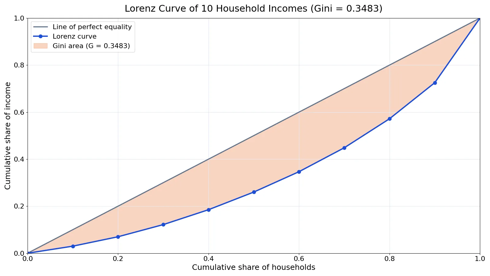
A Lorenz curve is a graph that shows what share of total income goes to each cumulative share of the population, ordered from poorest to richest. It turns a list of incomes into a single picture of inequality. The further the curve bends below the diagonal line of perfect equality, the more unequal the distribution.
Quick Answer
- The horizontal axis is the cumulative share of the population, from 0 to 1, sorted from lowest income to highest.
- The vertical axis is the cumulative share of total income received by that group.
- Perfect equality is the 45-degree diagonal from (0,0) to (1,1), called the Line of Equality [1].
- The area between that line and the actual curve is the area of inequality [1].
- The Gini coefficient equals twice that area, so $G = 1 - 2 \times (\text{area under the Lorenz curve})$ [2].
What the Lorenz Curve Means
In plain terms, the curve answers one question at every point: if you line everyone up from poorest to richest and walk along the line, what fraction of all income have you passed by the time you have covered a given fraction of the people?
The precise statistical definition is a plot of the cumulative normalized size against the cumulative normalized rank. For a variable $y$ with $n$ observations sorted from smallest to largest, the vertical coordinate at the $i$-th point is
$$ L\left(\frac{i}{n}\right) = \frac{\sum_{k=1}^{i} Y_{k}}{\sum_{k=1}^{n} Y_{k}} $$
where $Y_k$ is the $k$-th smallest value [2]. The curve is defined on a 0 to 1 scale in both directions, and a reference line runs from (0,0) to (1,1) [2]. That reference line represents perfect equality, and the greater the distance from it to the curve, the greater the inequality [2].
The Lorenz curve is used widely in econometrics to characterize distributions of wealth or income, and it also applies to other non-negative quantities such as disease risk in a population [3]. Some writers call it the "Lorenz coefficient" or "Lorenz function," but the standard name for the graph is the Lorenz curve.
How It Works
Building the curve takes four steps.
- Sort the values from smallest to largest.
- Compute the cumulative sum at each position.
- Divide each cumulative sum by the total to get the cumulative income share.
- Plot those shares against the cumulative population share, which is just $i/n$.
Each symbol in the formula above has a specific job. The index $i$ marks how many people you have included so far. The numerator $\sum_{k=1}^{i} Y_k$ is the total income of the poorest $i$ people. The denominator $\sum_{k=1}^{n} Y_k$ is total income for everyone. Their ratio is the cumulative share of income held by the poorest $i$ people.
Two extreme cases anchor the graph. If everyone has exactly the same income, the curve is the straight diagonal line, because the poorest 10% hold 10% of income, the poorest 50% hold 50%, and so on [1]. If one person has all the income, the curve runs flat along the bottom and then jumps vertically at the end [4].
The Gini coefficient summarizes the whole curve in one number. It can be computed from the Lorenz curve as twice the difference between 0.5 and the integral of the plotted curve, which is the same as twice the area between the curve and the diagonal [2]. A Gini of 0 means perfect equality and a Gini near 1 means extreme concentration.
Worked Example
The dataset is annual income in thousands of dollars for 10 households. The incomes are 18, 24, 31, 38, 45, 52, 61, 74, 92, and 165.
| Household | Income | Cumulative income | Cumulative income share | Cumulative population share |
|---|---|---|---|---|
| 1 | 18 | 18 | 0.0300 | 0.1 |
| 2 | 24 | 42 | 0.0700 | 0.2 |
| 3 | 31 | 73 | 0.1217 | 0.3 |
| 4 | 38 | 111 | 0.1850 | 0.4 |
| 5 | 45 | 156 | 0.2600 | 0.5 |
| 6 | 52 | 208 | 0.3467 | 0.6 |
| 7 | 61 | 269 | 0.4483 | 0.7 |
| 8 | 74 | 343 | 0.5717 | 0.8 |
| 9 | 92 | 435 | 0.7250 | 0.9 |
| 10 | 165 | 600 | 1.0000 | 1.0 |
Total income is 600, so mean income is 600 / 10 = 60.0000. The first household holds 18 / 600 = 0.0300 of all income. The first two hold 42 / 600 = 0.0700. The pattern continues until the tenth household brings the cumulative share to 600 / 600 = 1.0000.
The area under the curve, computed by the trapezoid rule across these points, is 0.3258. The Gini coefficient is then 1 - 2 × 0.3258 = 0.3483. A second route gives the same answer: summing all pairwise absolute differences gives 4180, and 4180 / (2 × 10 × 10 × 60.0000) = 0.3483. Two independent formulas agreeing is a good check that the curve was built correctly.
Here is the same calculation in Python.
import numpy as np
incomes = [18, 24, 31, 38, 45, 52, 61, 74, 92, 165]
x = np.concatenate(([0], np.arange(1, len(incomes)+1)/len(incomes)))
y = np.concatenate(([0], np.cumsum(sorted(incomes))/sum(incomes)))
gini = 1 - 2*np.trapz(y, x)
print(round(gini, 4))  # 0.3483
Output:
gini = 0.3483How to Interpret It
Read the curve at any population share to get an income share. In the example, the poorest 60% of households receive 34.67% of income. The richest 40% receive the remaining 65.33%. That single comparison often communicates more than the Gini number alone.
A useful reference point is the diagonal. If a point on the curve sits at (0.5, 0.26), the poorest half of the population holds 26% of income, well below the 50% they would hold under equality. The vertical gap between the curve and the diagonal at that point is the shortfall.
Curves can also be compared across groups or years. If one Lorenz curve lies entirely below another at every point, the lower curve represents more inequality. When curves cross, the comparison is ambiguous and the Gini coefficient alone may hide which part of the distribution changed.
When to Use It (and when not to)
Use a Lorenz curve when your variable is non-negative and you care about concentration. Income, wealth, hospital visits, and predicted disease risk all fit [3][5]. It is a good choice when you want to show the full shape of a distribution instead of a single summary number.
Skip it when values can be negative. The cumulative share logic breaks down if the total can shrink or change sign as you add observations. Skip it when you only need a single number for a report, since the Gini coefficient is easier to tabulate. Also be careful with very small samples, where each point on the curve moves a lot and the shape is unstable.
Lorenz Curve vs Gini Coefficient
| Feature | Lorenz Curve | Gini Coefficient |
|---|---|---|
| What it is | A graph of cumulative shares | A single number from 0 to 1 |
| Range | A curve on a 0 to 1 by 0 to 1 grid | 0 (equality) to near 1 (concentration) |
| Shows shape | Yes, including where inequality sits | No, it collapses the curve to one value |
| Computed from | Sorted cumulative sums | Twice the area between curve and diagonal [2] |
| Best for | Comparing distributions visually | Ranking or tracking inequality over time |
The two are complements. The curve shows you where the inequality lives, and the coefficient gives you a number you can sort, chart, or test.
Common Mistakes
- Forgetting to sort the values first. The curve only makes sense from poorest to richest, so an unsorted list produces a meaningless shape.
- Plotting raw cumulative income instead of shares. Both axes must be normalized to a 0 to 1 scale, otherwise the curve cannot be compared across datasets [2].
- Assuming the Gini coefficient captures everything. It has been criticized for not distinguishing whether inequality sits in the center of the distribution or in the tails [2].
- Using error-prone rankings. When the variable used to rank units contains random error, the ranking can be wrong and the curve will exaggerate the true concentration [5].
- Treating a crossing pair of curves as a clear ranking. If two Lorenz curves cross, neither dominates and the Gini values may be close for different reasons.
- Ignoring zeros. Datasets with many zero values produce a flat segment at the start of the curve, and some functional forms handle this differently from others [6].
Limitations
A Lorenz curve cannot tell you why inequality exists. It describes the distribution of a single variable at a single point in time, with no information about mobility, age, household size, or transfers. Two populations with identical curves can have very different underlying stories.
The curve is also sensitive to how you define the population and the measure. Changing the unit from individuals to households, or from market income to income after taxes, changes the curve. Measurement error in the ranking variable biases the empirical curve toward showing more concentration than actually exists [5]. And because the Gini coefficient is a single summary, it can stay flat while the shape of the distribution shifts underneath it.
Frequently Asked Questions
What is the difference between the Lorenz curve and the line of equality?
The line of equality is the diagonal from (0,0) to (1,1) that represents a perfectly even distribution, where the poorest 10% hold 10% of income and the poorest 50% hold 50% [1]. The Lorenz curve is the actual distribution, and it almost always falls below that line [1]. The gap between them is the area of inequality.
How do you calculate the Gini coefficient from a Lorenz curve?
Find the area under the Lorenz curve, then compute $G = 1 - 2 \times \text{area}$. In the worked example the area is 0.3258, so the Gini is 0.3483. The same value comes from summing pairwise absolute differences and dividing by $2n^2\bar{y}$.
Can a Lorenz curve go above the diagonal?
No, for non-negative values. If everyone has the same income the curve coincides with the diagonal, and any real inequality pushes it below [1]. A curve above the diagonal would imply the poorest people hold more than their population share of total income, which is impossible when all values are non-negative.
What does a Gini coefficient of 0.35 mean?
It means the area between the Lorenz curve and the diagonal is 0.175, since the Gini is twice that area. Practically, it describes a moderate level of concentration. You should still read the curve itself, because the same Gini can come from different distribution shapes.
Is the Lorenz curve only for income?
No. It applies to any non-negative quantity where concentration matters. Researchers have used it to characterize population distributions of disease risk and to evaluate the yield of screening programs [3]. It is also used to assess how concentrated health care visits are among patients [5].
References
- World Map, Lorenz Curve, Gini, Histogram - Pardee Wiki
- Lorenz Curve
- Mauguen A, Begg CB. (2016). Using the Lorenz Curve to Characterize Risk Predictiveness and Etiologic Heterogeneity. Epidemiology (Cambridge, Mass.)
- Gini Index
- Moskowitz CS, Seshan VE, Riedel ER, Begg CB. (2008). Estimating the empirical Lorenz curve and Gini coefficient in the presence of error with nested data. Statistics in medicine
- A universal model for the Lorenz curve with novel applications for datasets containing zeros and/or exhibiting extreme inequality - PMC