How to Do a Linear Fit in Excel (Step by Step)
By Dr. Zubair Khalid, DVM, MS, PhD ·
A linear fit in Excel means finding the straight line $y = mx + b$ that best matches your data, then using that line to describe the trend or predict new values. You can do it with worksheet functions such as SLOPE and INTERCEPT, with the array function LINEST, or visually with a chart trendline. All three approaches use the same least-squares math, so they return the same slope and intercept when your data are the same [1][2].
Quick Answer
- Fastest single value:
=SLOPE(known_ys, known_xs)returns the slope $m$, and=INTERCEPT(known_ys, known_xs)returns the intercept $b$. - Most statistics:
LINEST(known_ys, known_xs, TRUE, TRUE)returns the slope, intercept, standard errors, R-squared and more in one array [3]. - Easiest to see: add a scatter chart, then add a linear trendline and display the equation and R-squared on the chart [4].
- Check the fit: R-squared close to 1 means the straight line explains most of the variation in y [4].
- Watch the order: both
SLOPEandINTERCEPTtake the y values first, then the x values.
Before You Start
Lay your data out in two columns. Put the independent variable (x) in one column and the dependent variable (y) in the next, with one row per observation and no blank rows inside the range. A header row is fine because you will reference the data cells, not the headers.
Excel's line-fitting functions assume a straight-line relationship. Before you fit, decide from your theory or your field whether a straight line is the right model. A curved relationship can still produce a high R-squared, so a good number alone does not prove the line is appropriate [5].
If you are new to writing formulas, review how to make a formula in Excel first, since every method below depends on correct cell references. It also helps to know how to calculate the mean in Excel, because the least-squares line always passes through the point of the mean x and mean y [3].
Step by Step
- Enter your data. Put x values in column A and y values in column B, starting at row 2. Keep the ranges the same length.
- Compute the slope. In an empty cell, type
=SLOPE(B2:B11,A2:A11). The first argument is the y range, the second is the x range. - Compute the intercept. In the next cell, type
=INTERCEPT(B2:B11,A2:A11). - Build the equation. Write it as $y = mx + b$ using the two values you just calculated.
- Predict a value. Multiply the slope by any x value and add the intercept, for example
=E2*25+E3. - Get full statistics with LINEST. Select a block of cells, type
=LINEST(B2:B11,A2:A11,TRUE,TRUE), and confirm with Control-Shift-Enter so Excel fills the whole array [1]. - Or add a trendline. Select the data, go to Insert > Charts > Scatter, then click the chart and choose Chart Design > Add Chart Element > Trendline > Linear. In the Format Trendline pane, check Display Equation on chart and Display R-squared value on chart.
Worked Example
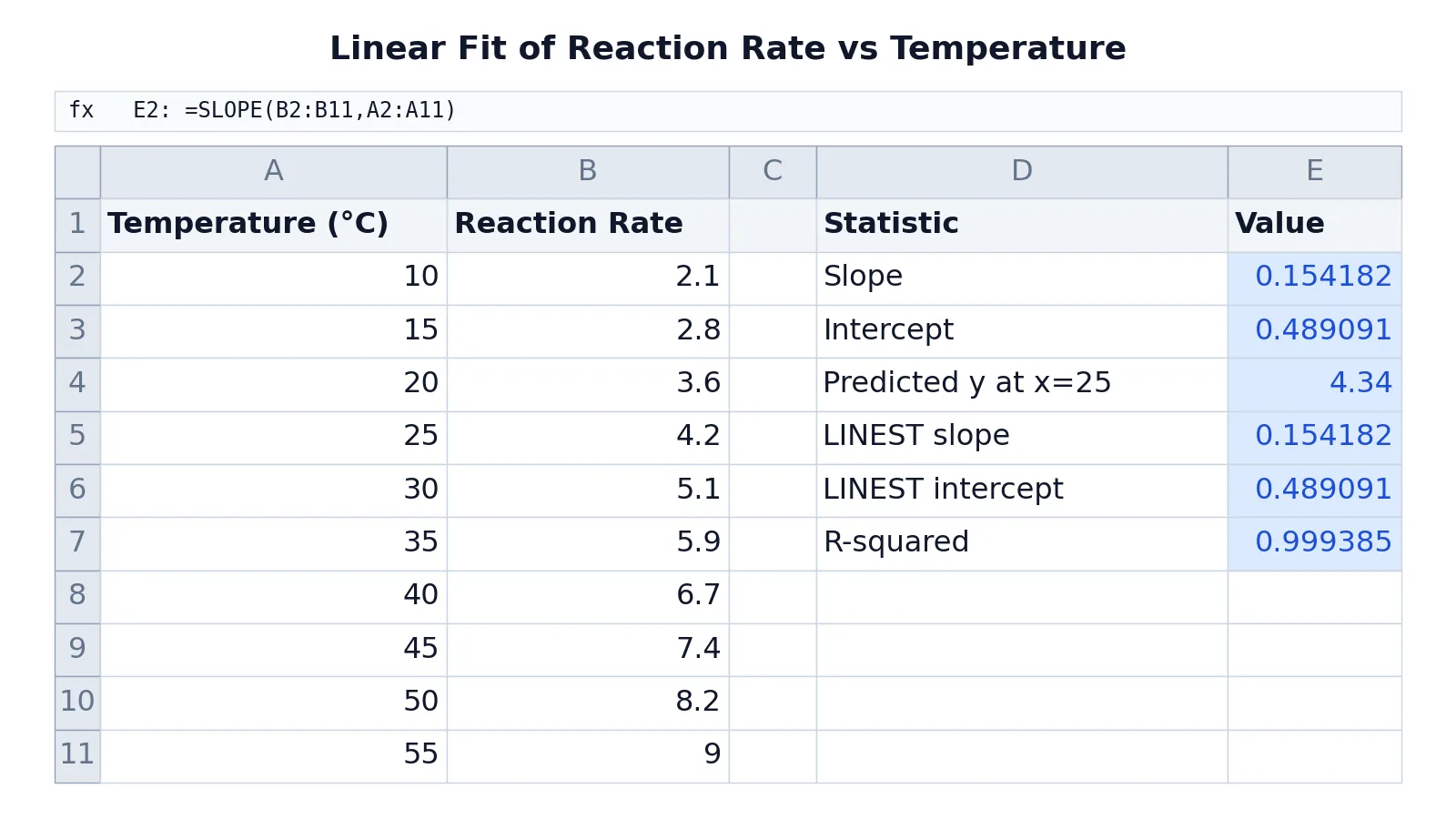
This example uses reaction rate measured at ten temperatures, from 10 °C to 55 °C.
| A | B | C | D | E | |
|---|---|---|---|---|---|
| 1 | Temperature (°C) | Reaction Rate | Statistic | Value | |
| 2 | 10 | 2.1 | Slope | =SLOPE(B2:B11,A2:A11) -> 0.154182 | |
| 3 | 15 | 2.8 | Intercept | =INTERCEPT(B2:B11,A2:A11) -> 0.489091 | |
| 4 | 20 | 3.6 | Predicted y at x=25 | =E2*25+E3 -> 4.34 | |
| 5 | 25 | 4.2 | LINEST slope | =INDEX(LINEST(B2:B11,A2:A11),1,1) -> 0.154182 | |
| 6 | 30 | 5.1 | LINEST intercept | =INDEX(LINEST(B2:B11,A2:A11),1,2) -> 0.489091 | |
| 7 | 35 | 5.9 | R-squared | =INDEX(LINEST(B2:B11,A2:A11,TRUE,TRUE),3,1) -> 0.999385 | |
| 8 | 40 | 6.7 | |||
| 9 | 45 | 7.4 | |||
| 10 | 50 | 8.2 | |||
| 11 | 55 | 9 |
The fitted line is:
$$y = 0.154182x + 0.489091$$
At 25 °C the model predicts a reaction rate of 4.34. The R-squared value of 0.999385 means the straight line explains almost all of the variation in reaction rate, so the linear fit is a strong description of this dataset [4].
The INDEX wrapper is only there to pull one number out of the LINEST array. Without it, LINEST spills or fills a block of cells, and the slope sits in the first row, first column, the intercept in the first row, second column, and R-squared in the third row, first column when stats is TRUE [3].
Other Ways to Do It
Chart trendline. The scatter chart with a linear trendline is the quickest way to see the fit and read the equation. It is the method most lab courses teach first [4].
LINEST array. For a full statistical summary, LINEST returns the slope, intercept, their standard errors, R-squared, the standard error of the estimate, the F statistic and the degrees of freedom [3]. This is the closest thing Excel has to a regression report.
Manual least squares. You can also compute the slope and intercept from sums of x, y, xy and x-squared using the standard regression formulas [2]. This is useful for teaching, but the built-in functions give the same answers with less work.
TREND for predictions. TREND(known_ys, known_xs) returns predicted y values along the fitted line at your existing x values, which is handy for comparing predictions with actuals [3].
Troubleshooting
- The slope looks wrong. Check the argument order.
SLOPEandINTERCEPTtake y first, x second. Swapping them gives a different, meaningless number. LINESTreturns one value instead of an array. You confirmed with Enter instead of Control-Shift-Enter, or you wrapped it inINDEXon purpose. Both are fine, but know which one you want [1].- R-squared is missing. The fourth argument of
LINESTmust be TRUE to return statistics [3]. - The trendline equation differs from
SLOPE. Usually the chart is plotting the wrong columns, or the x axis is a category axis instead of a value axis. Use a scatter chart, not a line chart. - A coefficient comes back as 0. With multiple x columns,
LINESTremoves redundant columns and reports a 0 coefficient and 0 standard error for them [3].
Common Mistakes
- Swapping x and y. The fix is to remember that the dependent variable comes first in
SLOPE,INTERCEPTandLINEST. - Including the header row in the range. The fix is to start the range at the first data row, for example B2:B11.
- Ranges of different lengths. If the x range has 10 cells and the y range has 9, Excel returns an error or a wrong result. The fix is to select both ranges carefully or use a table.
- Trusting R-squared alone. A high R-squared can hide a curved relationship [5]. The fix is to plot the data and check the residuals.
- Forgetting Control-Shift-Enter for
LINEST. The fix is to select the output block first, then confirm the array formula [1]. - Reporting too many decimals. The fix is to round the slope and intercept to the precision your measurement supports.
Limitations
A linear fit only describes a straight-line relationship. If your data curve, the line will still be calculated, but it will misrepresent the trend, and a high R-squared does not rescue it [5]. Excel also does not warn you about outliers, influential points or measurement error in x, so the fit can be pulled off course by a single bad value.
LINEST handles multiple x columns and checks for collinearity, removing redundant columns and reporting them with 0 coefficients [3]. It does not, however, perform weighted regression or report confidence intervals for predictions directly, so for those you need extra formulas or different software.
Frequently Asked Questions
What is the difference between SLOPE and LINEST?
SLOPE returns one number, the slope of the best-fit line. LINEST returns an array that includes the slope, the intercept and a set of regression statistics when you set the stats argument to TRUE [3]. Use SLOPE for a quick answer and LINEST when you need standard errors, R-squared or an F statistic.
Why does my trendline equation not match my SLOPE formula?
The most common cause is that the chart is using a line chart with a category x axis instead of a scatter chart with a numeric x axis. Another cause is that the chart series references different cells than your formula. Check both the chart source data and the formula ranges.
How do I get R-squared from LINEST?
Set the fourth argument to TRUE, then read the value in the third row, first column of the returned array. Wrapped in a single cell, that is =INDEX(LINEST(known_ys,known_xs,TRUE,TRUE),3,1). The value ranges from 0 to 1, and closer to 1 means a better linear fit [4].
Can I fit a line through the origin?
Yes. In LINEST, set the third argument to FALSE to force the intercept to zero [3]. On a chart trendline, check the Set Intercept box in the Format Trendline pane and enter 0. Be sure a zero intercept is justified by your theory before you force it.
How many data points do I need for a linear fit?
Two points define a line exactly, but you need more to judge whether a straight line is appropriate. A common rule is at least five to ten points spread across the range of x. With very few points, R-squared is unstable and the fit can look better than it is [5].
References
- Curve Fits
- Excel Tutorial on Linear Regression
- LINEST function | Microsoft Support
- Graphing With Excel - Linear Regression
- 5.6: Using Excel and R for a Linear Regression - Chemistry LibreTexts/05%3A_Standardizing_Analytical_Methods/5.06%3A_Using_Excel_and_R_for_a_Linear_Regression)