Scientific Research Presentation Template: Choosing a Layout
By Dr. Zubair Khalid, DVM, MS, PhD ·

The layouts available for a scientific talk differ mainly in where they put the punchline. A linear, IMRAD-style deck builds toward the conclusion, while an argument-first deck states the conclusion on slide two and spends the rest of the talk defending it. The rule of thumb is simple: pick the layout that matches the decision your audience has to make in the room. A hiring committee, a grant panel, a journal club, and a safety review board each need a different sequence of evidence, and the right scientific research presentation template is the one that delivers that sequence with the least friction.
This guide walks through the main template options, compares them side by side on the criteria that actually decide real choices, and works through concrete scenarios drawn from current life science research practice.
What a presentation template actually controls
A template is more than a color scheme. In slide software, a template defines the master slides, the placeholder positions for titles and body text, the default fonts, and the grid that figures snap to. A layout is the order and structure of the content you pour into that frame. The two decisions are separate, and conflating them is one of the most common reasons decks look polished but argue poorly.
A useful way to think about the distinction comes from measurement science in an unrelated field, food sensory analysis. A review of consumer evaluation methods distinguishes between the intrinsic quality of a product, the quality a consumer perceives, and the acceptance decision the consumer makes, and it argues that the assessment method should be selected according to the decision it is intended to inform [1]. Presentation layouts follow the same logic. The content of your talk is the analytical quality. The layout shapes what the audience perceives. The template choice should be driven by the decision at the end of the talk, not by aesthetics.
Scientific research presentation template options
There are five layout families that cover nearly every talk a life scientist gives. Each one is described here on its own terms before the comparison.
The IMRAD-style linear deck
IMRAD stands for Introduction, Methods, Results, and Discussion, the same structure used by most research journals. In a linear deck, slides follow that order exactly. The audience sees background first, then methods, then data, and the conclusion arrives near the end.
This layout mirrors how a paper is written, which makes it familiar and easy to assemble. It works well when the audience genuinely needs the background to interpret the data, such as a classroom seminar or a thesis committee that has not read your recent work. Its weakness is speed. If your conference slot is ten minutes, spending four of them on background before any data appears risks losing the room.
The argument-first deck
In an argument-first layout, the conclusion appears on the second or third slide as a full-sentence assertion, for example, "Quilting sutures without drains are non-inferior to conventional sutures with drains for patient function at six months." Every subsequent slide exists to defend, qualify, or contextualize that sentence. Background and methods appear only where they support the argument.
This layout is the default recommendation for short conference talks and for any audience of specialists who already know the field. Its pros and cons are the mirror image of the linear deck. It respects a busy audience's attention, but it demands that you actually have a defensible single-sentence conclusion. Early-stage projects without a clear answer often force awkward argument-first decks, and in those cases the linear layout is the safer choice.
The structured reporting template
A structured reporting template replaces free-form narrative with a fixed checklist of items that must appear, usually in a fixed order, on designated slides. The clearest evidence for the value of this approach comes from radiology. A retrospective audit of 60 pelvic MRI reports for primary rectal cancer compared 30 free-text reports with 30 reports written after a structured template was introduced. The structured reports were more complete for the management-relevant elements, including tumor distance from the anal verge, circumferential resection margin status, depth of extramural spread, extramural vascular invasion, and lateral pelvic lymph node status [2]. The same principle transfers to presentations. If your audience must verify that specific items were addressed, a checklist-driven layout beats prose.
Structured presentation templates are already standard in regulated settings. The Brighton Collaboration case definition for acute multi-organ dysfunction, an adverse event following immunization, comes bundled with explicit guidelines for data collection, analysis, and presentation of safety data, and it defines the condition as acute dysfunction involving two or more of six organ systems, with onset within the same clinical episode [3]. A safety presentation built on that definition is effectively required to follow the structured layout, because the case definition specifies exactly which organ systems must be addressed and at what level of diagnostic certainty.
The comparison or benchmark layout
A comparison layout organizes the entire talk around a side-by-side contrast, such as a new technique versus a standard of care. Each slide presents one criterion, with the two options evaluated against it. This layout suits method-evaluation talks, tool comparisons, and any decision meeting where the audience must choose between alternatives.
Staged evaluation frameworks fit naturally here. The IDEAL framework, used to evaluate surgical innovations, organizes evidence into stages from idea through development, exploration, assessment, and long-term study, and it has been applied to robotic-assisted esophagectomy, where early proof-of-concept reports, later randomized trials, and a global registry with thousands of accumulated cases each answered different questions at different stages [4]. If your talk covers a technology at a particular maturity stage, the comparison layout with an explicit framework keeps the audience oriented about what your data can and cannot claim.
The lab meeting and journal club layout
Journal club and lab meeting decks have a different job from conference talks. The goal is critical appraisal, not persuasion. A good appraisal layout devotes one slide to the study question, one to the design, one or two to the results with effect sizes visible, one to the study limitations, and one to the implication for your own lab's work. Methods get more airtime relative to results than in any other talk type, because evaluating methods is the point of the exercise.
Side-by-side comparison
The table below is the core of the decision. Match the row to your situation.
| Layout | Best for | Main strength | Main weakness | Typical failure mode |
|---|---|---|---|---|
| IMRAD linear | Seminars, thesis defenses, classrooms | Familiar structure, easy to build | Slow to reach the point | Background eats the time limit before any data appears |
| Argument-first | Conference talks, ten-minute slots, grant interviews | Front-loads the conclusion for busy specialists | Needs a defensible single-sentence finding | An unproven claim stated boldly gets dismantled in Q&A |
| Structured reporting | Safety reviews, regulatory settings, audits | Guarantees completeness, supports cross-study comparison | Rigid, can feel repetitive | Checklist compliance replaces interpretation |
| Comparison or benchmark | Method evaluations, decision meetings | Makes the choice criteria explicit | Only fits two-sided questions | Criteria are chosen after the preference, biasing the contrast |
| Journal club or lab meeting | Critical appraisal sessions | Emphasizes methods and limitations | Low persuasion value | Turns into a summary instead of an appraisal |
Scientific research presentation template pros and cons
For quick reference, the pros and cons of each scientific research presentation template option compress into a few lines each.
IMRAD linear. Pros include low design effort, natural alignment with your manuscript, and comfort for mixed audiences. Cons include poor time efficiency and a delayed payoff that loses expert listeners.
Argument-first. Pros include efficient use of short slots, forceful delivery, and easy slide-to-title mapping, because every slide title can be a full supporting sentence. Cons include the risk of overstating preliminary data and the difficulty of handling genuinely ambiguous results.
Structured reporting. Pros include completeness, auditability, and comparability across presenters and settings, which is exactly why structured reporting improved rectal cancer staging documentation in the audit cited above [2]. Cons include rigidity and the temptation to treat boxes as checked rather than findings as interpreted.
Comparison. Pros include transparent decision criteria and even-handed treatment of alternatives. Cons include poor fit for single-arm or exploratory data and the risk of false symmetry between options with very different evidence bases.
Journal club. Pros include training value and honest limitation discussion. Cons include weak persuasion and the risk that a method-heavy deck bores an audience expecting new data.
How to choose: the criteria that decide real choices
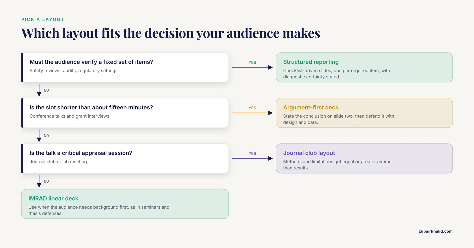
Four questions settle almost every template decision.
First, what decision must the audience make? This is the guiding principle from the sensory evaluation literature, where assessment methods are matched to the decisions they inform [1]. A grant panel decides whether to fund. A journal club decides whether to believe. A safety committee decides whether to act. Name the decision in one sentence before you open the slide software, and the layout usually picks itself.
Second, how long is the slot? Below about fifteen minutes, linear structures rarely work. Above forty-five minutes, a pure argument-first deck runs out of substance, and hybrid structures with a linear methods-and-results core work better.
Third, does any external framework apply? If you are presenting immunization safety data, the Brighton Collaboration guidelines for presentation of safety data [3] constrain your layout. If you are presenting a surgical innovation, the IDEAL stage of your evidence [4] shapes what claims belong on which slide. External frameworks outrank personal preference.
Fourth, will the deck be reused or audited? Decks that feed institutional records benefit from structured layouts, because the checklist survives after the presenter leaves the room.
Worked scenarios
Scenario 1: A ten-minute conference talk on an early-phase trial
Suppose you are presenting results from a single-arm, open-label phase 2 neoadjuvant trial of zanidatamab in early-stage HER2-positive breast cancer, where 20 patients were enrolled, the primary endpoint was pathologic complete response, and 30 percent of patients achieved it [5]. Use the argument-first layout. Slide two states the headline, for example, "HER2-directed therapy alone achieved the prespecified pathologic complete response target in this single-arm trial." The next slides carry the design, the response data, the tolerability profile, and an explicit slide on why single-arm design limits causal claims. The linear layout would burn minutes on HER2 biology that this audience already knows.
Scenario 2: A departmental seminar on a pragmatic randomized trial
Suppose you are presenting the protocol and rationale for the BE-Quilt trial, a multicenter pragmatic randomized controlled trial comparing quilting sutures with conventional sutures and drain placement after mastectomy, with patient-reported function and quality of life at six months as the key outcome [6]. A mixed audience of surgeons, students, and methodologists benefits from background on why seroma prevention matters and why quilting has not entered routine practice despite established evidence. The IMRAD linear layout fits, with a dedicated slide on the non-inferiority design, because non-inferiority margins confuse audiences who have not seen them before and deserve unhurried explanation.
Scenario 3: A vaccine safety review board presentation
Safety presentations follow structured templates by design. Using the acute multi-organ dysfunction case definition, your deck would dedicate slides to each of the six relevant organ systems, state the level of diagnostic certainty for each case, and document the data collection and analysis choices specified in the guidelines [3]. The comparison layout is inappropriate here, because the question is not which of two options is better. The question is whether a defined set of criteria was met. The structured reporting template is the only defensible choice.
Scenario 4: A journal club appraisal of a methods paper
Suppose your journal club is appraising a rapid review of generative AI in qualitative health research, which followed Joanna Briggs Institute and PRISMA guidelines, used a structured template for data extraction, and assessed study quality with the Critical Appraisal Skills Programme checklist [7]. The journal club layout fits, with early slides interrogating whether the rapid review format itself limited comprehensiveness, and a later slide asking whether the structured extraction template captured the equity and ethics concerns the review set out to address [7].
Building the deck once the layout is chosen
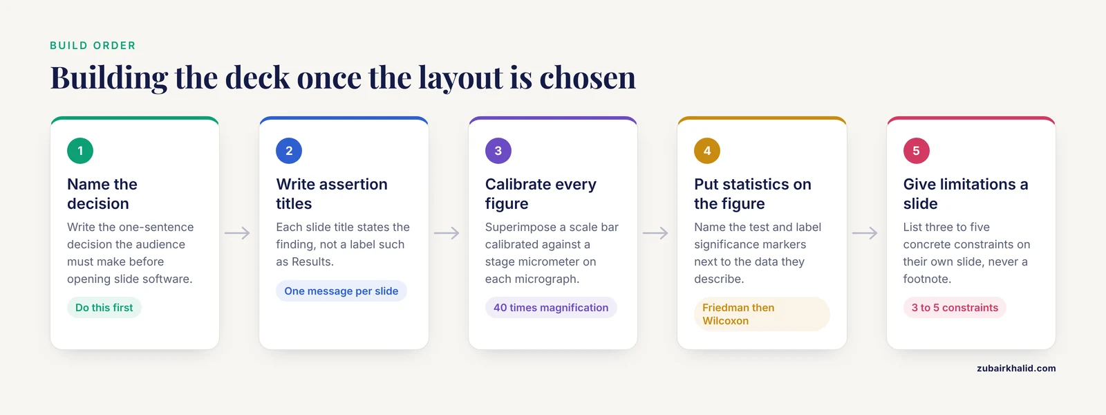
Whichever layout you pick, certain slide-craft standards are universal.
One message per slide, stated in the title. Slide titles should be readable assertions, not labels. "Results" tells the audience nothing. "Crystallization appeared within one hour in bicarbonate mixtures" tells them the finding before they read the figure.
Figures must be self-calibrating. Any microscopy image needs a scale bar, and the scale bar is only trustworthy if the imaging software was calibrated against a stage micrometer before acquisition. An in vitro compatibility study of levobupivacaine mixtures illustrates the standard practice, examining mixtures under light microscopy at 40 times magnification at zero minutes, fifteen minutes, and one hour, with a stage micrometer used to calibrate the digital imaging software and a calibrated scale bar superimposed on every micrograph [8]. Reproduce that chain of calibration on your methods slide, and your audience can trust every dimension you later quote.
Statistics belong next to the figure they describe. If your analysis used a Friedman test across matched time points followed by pairwise Wilcoxon signed-rank tests with Holm adjustment, say so in a compact methods line and label the significance markers on the figure itself [8]. Splitting the test details into an appendix nobody opens invites the question "what test was this?" at the worst possible moment.
Limitations get their own slide, never a footnote. Audiences judge credibility largely by how limitations are handled. A structured limitations slide listing three to five concrete constraints outperforms a hedging sentence buried in the discussion.
Backup slides carry the depth. Detailed protocols, full statistical output, and additional patient subgroups go after the closing slide, where they support Q&A without cluttering the main argument.
Research templates beyond the slide deck
Slides are the last link in a template chain that starts at the bench. A lab notebook template PDF is a pre-formatted record with fixed fields for date, experiment ID, reagent lots, concentrations, instrument settings, and observations, and it exists so that any experiment can be reconstructed later by someone who was not there. The connection to presentations is direct. Talks assembled from well-structured lab records are faster to build and harder to challenge in Q&A, because concentrations, lot numbers, and timestamps are already documented rather than reconstructed from memory. Choosing a research template family early, from notebook to analysis to slides, pays off every time a collaborator asks for details three months later.
The same standardization logic applies to data extraction and analysis workflows. Reviews that follow PRISMA guidance and use structured data extraction templates produce outputs that can be audited and synthesized, which is precisely why the generative AI review cited above applied them [7].
Using software and AI tools without losing rigor
Modern slide software provides master slides, placeholder systems, and theme libraries that handle the visual half of the template decision. Pick a master layout with generous figure zones and small default text blocks, because life science talks are figure-driven, and a text-heavy master fights you on every slide.
Generative AI tools can draft slide text, summarize papers for journal club handouts, and suggest structure. A rapid review of generative AI in qualitative health research found that these tools can process large volumes of textual data efficiently, while raising documented concerns about methodological rigor, interpretive capacity, equity, and ethical implications [7]. Applied to presentations, the practical translation is this: let AI draft first-pass slide titles or compress your own notes, but verify every number against the primary source before it reaches an audience, and never let a generated summary substitute for reading the methods of a paper you are presenting. Structured human oversight is the pattern the evidence supports [7].
Common Mistakes and Limitations
The most frequent errors in template selection are practical, and each has a direct fix.
Choosing the layout before naming the audience decision. Every poor template choice traces back to this. Write the decision sentence first.
Importing a paper's structure into a talk. A ten-minute talk is not a read-aloud manuscript. Table-of-contents slides, dense methods lists, and paragraph-length bullet points are all symptoms of paper-first thinking.
Using the argument-first layout without the evidence to back the assertion. Bold headline slides are only as strong as the data behind them. Presenting preliminary or single-arm findings as settled conclusions invites Q&A damage, a risk made explicit by the careful language surrounding early-phase trial results such as the zanidatamab study, which framed de-escalation as potentially feasible and called for further research [5].
Treating a structured template as a substitute for interpretation. The rectal cancer audit showed that structured reporting improves completeness, not that it improves insight [2]. Checking every box while explaining none of it is a real and common failure mode.
Uncalibrated figures. A microscopy image without a calibrated scale bar, calibrated against a stage micrometer, cannot support any statement about size [8]. This single omission undermines otherwise strong data slides.
Letting AI text go unverified. The concerns documented in the health research literature about generative AI outputs, including rigor and interpretive capacity [7], apply directly to slide text. Unverified generated numbers are a presentation-integrity risk.
One general limitation applies to this whole guide. Template choice is context-dependent, and the specific requirements of your institution, conference, or committee always take precedence over general layout advice. When in doubt, ask the organizer or your supervisor for the expected format before building anything.
Frequently Asked Questions
What is the best scientific research presentation template for a short conference talk?
The argument-first layout is the best fit for most short conference talks, because it states the conclusion on slide two and uses the remaining minutes to defend it. If your findings are genuinely ambiguous or preliminary, use the IMRAD linear layout instead so the structure matches your evidence.
How many slides should a research presentation have?
A widely used working pace is roughly one content slide per minute, minus slides for title, outline, and closing, so a ten-minute talk carries about eight to ten content slides. Adjust for figure-heavy talks, which need more time per slide.
Should I use a structured reporting template for my results slides?
Yes, whenever your audience must verify that specific items were addressed, such as safety reviews, audits, or regulatory settings. Evidence from radiology shows that structured templates improved the completeness of rectal cancer staging reports compared with free-text reports [2], and the same completeness benefit applies to slide decks.
Can I use generative AI to help build my research presentation?
You can use generative AI for drafting slide titles, compressing your own notes, and restructuring text, but verify every claim and number against primary sources before presenting. A rapid review found efficiency benefits alongside documented concerns about rigor, interpretive capacity, and ethics in AI-assisted research work [7].
What is the difference between a slide template and a lab notebook template PDF?
A slide template controls the visual frame and layout of your presentation, while a lab notebook template PDF is a pre-formatted record with fixed fields for experimental details such as dates, reagent lots, and conditions. The notebook feeds the presentation, and standardizing both makes talks faster to build and easier to defend.
How do I choose a layout for journal club versus a grant review?
For journal club, use the appraisal layout that gives methods and limitations equal or greater weight than results, because the goal is critical evaluation. For a grant review, use an argument-first layout with a structured significance and approach section, because the panel must decide whether to fund and needs the case stated early and defended with a clear feasibility plan.
Sources
- Reference-based consumer evaluation for sensory quality assessment of fresh horticultural products.
- Impact of a Structured MRI Reporting Template on the Completeness of Primary Rectal Cancer Staging Reports: A Retrospective Audit.
- Acute multi-organ dysfunction (aMOD): Brighton Collaboration case definition and guidelines for data collection, analysis, and presentation of immunization safety data.
- The Impact of Robotics on Benchmarking Criteria for the Surgical Treatment of Esophageal Cancer in Western Centers: An Evaluation Using the IDEAL Framework.
- Zanidatamab in patients with early stage HER2-positive breast cancer: the NeoZanHER phase 2 single-arm open-label trial.
- Comparison of 'quilting sutures' with 'conventional sutures and drain placement' after mastectomy: protocol for the BE-Quilt - a multicentre, pragmatic randomised controlled trial.
- Generative Artificial Intelligence for Qualitative Methods in Health Research: Rapid Review.
- Microscopic Evaluation of Crystallization Dynamics in 0.25% Levobupivacaine Mixed with Common Regional Anaesthesia Adjuvants: An in vitro Compatibility Study.