Common Mistakes When Choosing a Poster Template and How to Fix Them
By Dr. Zubair Khalid, DVM, MS, PhD ·

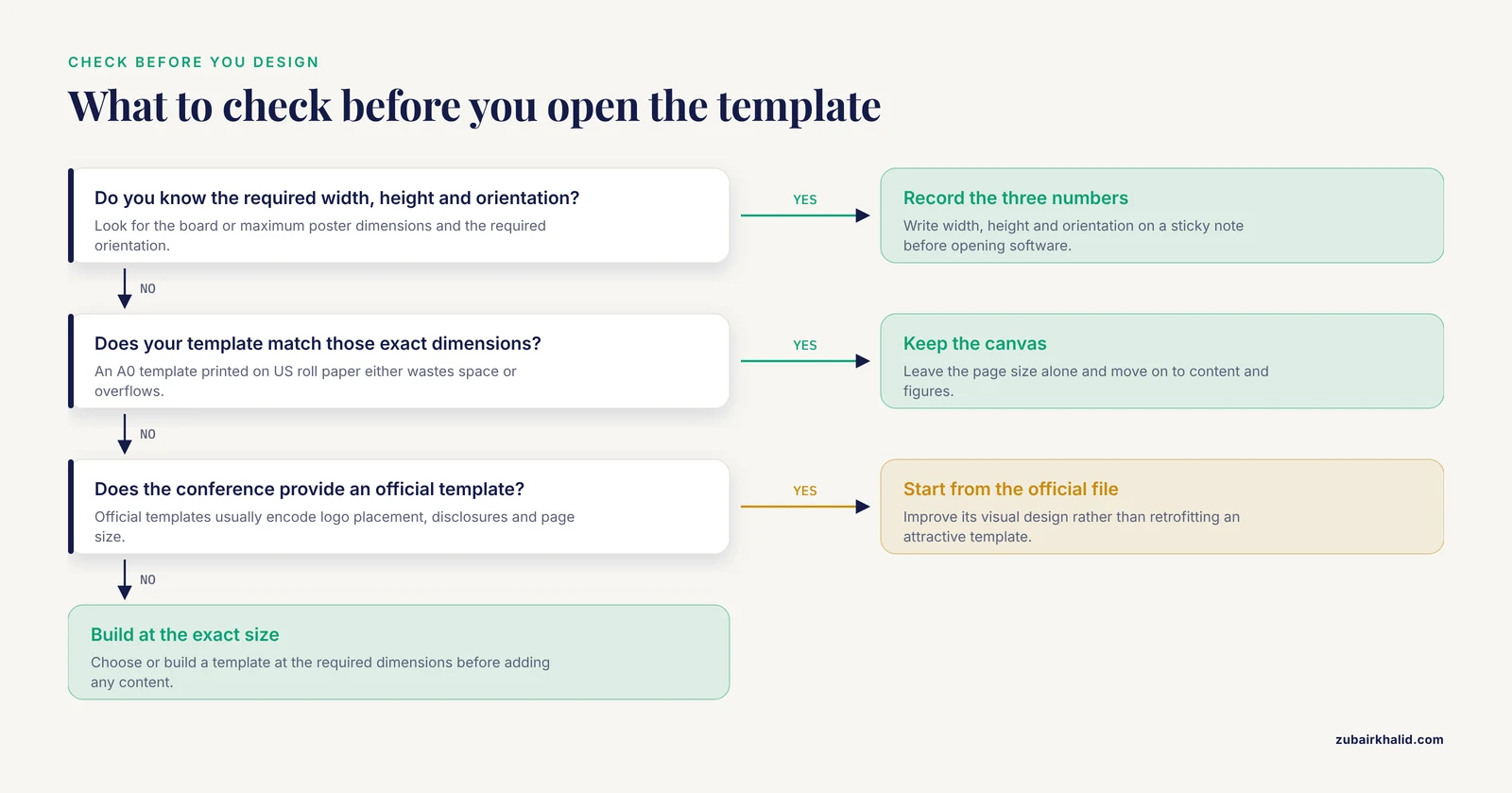
The single most common poster template mistake is picking a template before checking the size, orientation, and format your conference actually requires. A beautifully designed 36 by 48 inch landscape template is useless if your session only allows a 40 by 30 inch portrait board, and no amount of last-minute resizing fixes the layout damage cleanly. The first thing to check is the conference's poster specifications page. Look for three numbers: the board or maximum poster dimensions, the required orientation, and the accepted file format for printing.
Once you confirm those three facts, almost every other template problem becomes easier to prevent. This article walks through the mistakes people make when selecting and filling in a poster template, explains why each one happens, gives you a short diagnostic sequence, and ends with prevention habits that make research poster design faster the next time around.
Start Here: A 60-Second Diagnostic Sequence
If your poster already looks wrong and you need answers fast, run through this sequence in order. Most problems are caught in the first three steps.
- Check the dimensions. Open your file's page setup and compare the width and height against the conference specifications, in inches or centimeters, exactly as listed.
- Check the orientation. Portrait and landscape templates are not interchangeable. Rotating a landscape template 90 degrees does not fix a portrait requirement, because text columns and figure placement rotate with it.
- Zoom to 100 percent and read the body text. If you must squint at full size on screen, viewers will squint at the printed poster too. Body text should be readable from about three to four feet away, which in practice means roughly 24 point font or larger for main paragraphs on a full-size poster.
- Look for leftover placeholder text. Template samples such as "Insert figure 1 here" or lorem ipsum paragraphs are the most embarrassing errors caught at the print shop.
- Export a PDF and open it on a different computer. If fonts shift, images go blurry, or colors change, your file has an export or font-embedding problem that will also appear in print.
If all five checks pass, your template choice is probably fine and the remaining work is content and polish. If any check fails, the sections below explain the mechanism behind the failure and how to fix it.
Troubleshooting Table: Symptom, Likely Cause, How to Confirm, Fix
| Symptom | Likely cause | How to confirm | Fix |
|---|---|---|---|
| Poster prints with white strips on edges or cropped content | Template size does not match paper size, or margins ignore the printer's printable area | Compare page setup to the print shop's largest paper width, often 36, 42, or 54 inches wide on a roll | Resize the document to the conference limit, keep a margin of at least half an inch on all sides, and ask the print shop for its printable-area spec |
| Text reflows, columns break, fonts change between computers | Fonts not embedded in the exported file, or text boxes left in an editable flow layout | Open the exported PDF on a machine without your fonts installed | Convert fonts to outlines or embed all fonts when exporting, and finalize in PDF rather than passing the native file around |
| Figures look sharp on screen but blurry in print | Low-resolution raster images, or screenshots pasted at the wrong scale | Zoom the exported PDF to 200 to 300 percent and inspect image edges | Re-export figures as vector formats such as PDF, SVG, or EMF where possible, or use raster images at 200 to 300 dots per inch at final print size |
| Colors look different on paper than on screen | Screen colors are defined in RGB while commercial printers use CMYK, and large solid background colors print unevenly | Request a small test print or proof strip from the print shop | Soft-proof in CMYK, avoid neon colors that sit outside the CMYK range, and use dark text on light backgrounds for body text |
| Poster looks crowded and nobody stops to read it | Template chosen for its many content boxes rather than for fit to content | Count your content blocks against the template's placeholders | Cut content, keep one central message per column, and remove template boxes you do not need |
| Sections appear in a confusing order | Template column order does not match reading flow | Ask a colleague to point out where they start reading and where they get lost | Rearrange columns so reading flows left to right, top to bottom, in logical order, typically introduction, methods, results, conclusions |
| Poster will not upload to the virtual poster portal | File format, file size, or page size fails the portal's checks | Read the portal's upload error message and its listed limits | Re-export as a flattened PDF at the required size, compress oversized images, and rename the file to the requested convention |
| Everything shrinks when resized to a new board size | Scaling a template down proportionally scales the text down too | Print one section at 100 percent on letter paper and read it at arm's length | Resize the canvas, then manually reset font sizes to your minimum readable values rather than accepting the scaled result |
Poster Template Mistakes, From Most Common to Rarest
Mistake 1: Choosing size and orientation before checking the conference rules
This is the error behind most print-shop emergencies. Poster sessions specify a maximum board size, and templates you find online default to whatever their designers chose, commonly 36 by 48 inches in the United States or A0 (about 33.1 by 46.8 inches) in venues that use ISO paper sizes. The two families are close enough to cause trouble, because an A0 template printed on US roll paper, or the reverse, either wastes space or overflows.
The mechanism is simple. A template is a fixed canvas. When you change canvas size after designing, most applications move placeholders, resize images, and reflow text in ways you then have to repair by hand. The larger the change, the more repair work. Fixing this is cheap before you start and expensive after.
Fix: Before opening any software, write the three required numbers on a sticky note: width, height, orientation. Choose or build a template at exactly those dimensions. If your conference provides an official template, start from it even if it is plain, because it usually encodes logo placement, required disclosures, and the correct page size.
Mistake 2: Starting from a pretty template instead of a structural one
Search results for poster templates surface designs chosen for visual appeal, with decorative headers, gradient backgrounds, and many small content cards. These templates cause two problems. First, decoration consumes space that data and explanation need. Second, the visual weight draws attention to the template's features rather than your findings, which is the opposite of what a scientific audience wants.
A useful poster in research settings follows the same logical skeleton as a short paper: a clear title, author list and affiliation, a short statement of the question, methods, results, and a conclusion the reader can act on. Poster abstracts at technical conferences illustrate the pattern well. A published poster abstract from an IPSN work on protecting clinical time-series data from membership inference attacks states the problem, the approach of adding trained adversarial perturbations to raw data, and the preliminary finding that the method protected data better than baselines while passing data quality checks, all in a few dense sentences [1]. That level of compression is the target, whether the template helps you achieve it or fights it.
Fix: Strip any template down to its structural boxes before adding content. Delete decorative panels you will not fill. Keep one column for context and methods, one or two for results, and one for conclusions and contact information.
Mistake 3: Designing at the wrong working scale
Some people design on a letter-sized canvas and plan to scale up at print time. Others design at full poster size and struggle to judge how big the text will feel in person. Both approaches work, but each has a failure mode people fall into.
Scaling up from letter size multiplies every dimension, including font sizes, which sounds safe until you realize that 11 point body text at letter scale becomes legible only if you scale by the correct factor and the software does not round image resolution down along the way. Designing at full size, meanwhile, tempts people to set body text at 18 or 20 point because it looks large on a screen that is two feet from their face.
Fix: Pick one scale and commit. If you design at full size, set body text between roughly 24 and 32 point, section headers larger, and the title large enough to read across an aisle. If you design at reduced scale, compute your scale factor at the start, multiply your minimum font sizes by that factor, and note the factor in the file so collaborators do not guess.
Mistake 4: Leaving placeholder content in place
Templates ship with sample headings, sample figure captions, and sometimes stock photos of people who have nothing to do with your research. Leftover placeholders happen because templates are built to be skimmed, and during a long editing session your eye stops registering text it has seen dozens of times.
Fix: Use the application's search function for common placeholder strings such as "click", "insert", "lorem", "sample", and "example". Then do one final read of the exported PDF top to bottom, out loud if you can, because reading aloud forces you to actually process each line.
Mistake 5: Ignoring visual hierarchy
A poster has about three seconds to earn a closer look. Templates that give every box the same border, every header the same color, and every figure the same size produce a flat wall of content. The mechanism behind the mistake is that template authors design for generic content, and generic means undifferentiated.
Hierarchy in research poster design is created with at most four tools: size, weight, color, and position. The title is the largest text. Section headers are the second largest. The single most important figure gets the most space. Supporting details shrink toward the edges.
Fix: After filling your template, step back from your screen and squint. Whatever you can still identify, that is your hierarchy. If the sponsor logo is as visible as your main result, rebalance.
Mistake 6: Text too small and too abundant
Posters fail when they try to be papers. Dense paragraphs, small fonts, and full abstracts pasted into a box are the classic signs. The cause is usually time pressure plus the feeling that omitting text looks like omitting work. In practice, an overfull poster communicates less, because viewers at a busy session will not fight through it.
Fix: Target roughly 300 to 800 words of body text on a full-size poster, well under a tenth of what the same project would produce as a manuscript. Convert paragraphs to short statements. Move method detail to a QR code or a handout rather than shrinking the font.
Mistake 7: Low-resolution and screenshot figures
Pasting a screenshot of a chart, or an image copied from a slide deck, produces figures that look acceptable on screen and muddy in print. The mechanism is resolution. Screens display around 96 to 144 pixels per inch, while print needs roughly 200 to 300 dots per inch at final size. A screenshot that fills a quarter of a 48-inch-wide poster needs far more pixels than a screenshot contains.
Fix: Re-export figures from the original analysis tool at print size, ideally as vector files such as PDF, SVG, or EMF, which stay sharp at any scale. Check axis labels in every figure at print size, because figures produced for a manuscript are often sized for a journal page, not a poster panel.
Mistake 8: Color and contrast errors
Three distinct problems hide under this heading. First, insufficient contrast, such as light gray text on white, which fails for readers with low vision and for anyone viewing the poster under session lighting. Second, colors that cannot be reproduced in print, especially saturated neon backgrounds that shift badly from RGB to CMYK. Third, color choices that fail for colorblind readers, most commonly red and green used together to encode meaning in charts.
Fix: Keep body text dark on a light background. Test the poster in grayscale by printing a letter-sized proof or converting a copy to grayscale, which reveals contrast problems immediately. For charts, vary shape and line style in addition to color. Run your palette through a color-vision-deficiency simulator before finalizing.
Mistake 9: Margins, bleed, and printer limits ignored
Large-format printers cannot print to the very edge of the paper, and roll paper comes in fixed widths. A 42-inch-wide design sent to a printer loaded with 42-inch paper may lose a sliver on each side or require trimming. Designs that place critical content, such as the affiliation line, flush against an edge are the ones that get damaged.
Fix: Ask your print shop for its printable area and roll widths before you finalize. Keep all content at least half an inch from the edges, and keep logos, footers, and contact details well inside that margin. If you want a full-bleed background color, add bleed as the shop directs and expect trimming.
Mistake 10: Export and font-embedding failures
The poster that looks perfect on your laptop and wrong on the print-shop computer almost always has the same cause: the exported file does not contain your fonts, or the layout depends on a software version the shop does not have. Fonts substitute, text shifts, and boxes that aligned perfectly no longer do.
Fix: Always deliver a PDF. In the export dialog, embed fonts or convert text to outlines, flatten transparency, and set the PDF to the actual page size rather than scaling to fit. Open the final PDF on a different machine before sending it anywhere.
Mistake 11: Choosing a template that fights your content
The rarest and most subtle mistake. You picked a three-column template, but your project has one big figure, one small table, and a methods section that needs almost no space. The template's equal boxes now dictate your emphasis, and your best result sits in a box the same size as a box listing minor reagents.
This happens because templates encode an assumed content structure, and people choose them on appearance rather than fit. Poster content varies enormously between fields. A poster reporting a machine learning method, such as the IPSN work on adversarial perturbations for privacy protection, needs space for a pipeline diagram and evaluation metrics [1]. A poster reporting a field survey needs a map and demographic tables. One template will not serve both.
Fix: Sketch your content blocks on paper first, with approximate proportions, then choose or modify a template to fit the sketch. Modify templates without guilt. Moving a header, deleting a box, or splitting a column is expected, not a violation.
How to Make a Scientific Poster That Works
The mistakes above share one root cause: the template was treated as the design, when the template is only scaffolding. Working in the right order prevents nearly all of them.
- Read the conference poster specifications. Record dimensions, orientation, file format, and any required elements such as funding statements or logos.
- Define one central message. Write it as a single sentence. Every content decision tests against it.
- List your content blocks and sketch their relative sizes on paper before opening any software.
- Choose or build a template at the exact required size, stripped of decoration you will not use.
- Place figures before text. Figures carry the argument at a poster. Text supports them.
- Write tight text at readable sizes, aiming for scannable statements rather than paragraphs.
- Check accessibility: sufficient contrast, colorblind-safe charts, logical reading order.
- Export a print-ready PDF with embedded fonts at exact page size, then proof it on a second machine and on paper.
- Print early. Leave time for one test proof and one correction cycle before the deadline.
A useful sanity check comes from how poster abstracts are evaluated at good venues. A strong abstract, like the one describing trained adversarial perturbations that force a model to mispredict user identities while preserving data utility, names the problem, the method, and the result with a clear comparison point [1]. Your poster title and headers should do the same job at a glance.
Poster Template Mistakes Solutions: A Practical Fix Sequence
If you have already built a poster and identified one or more problems, work through the fixes in this order to avoid redoing work.
- Fix the canvas first. Correct the page size and orientation to match the conference requirements before touching anything else. All later adjustments depend on this.
- Repair the skeleton. Rearrange or delete template boxes so the reading order and block proportions match your content sketch.
- Replace weak figures. Re-export every figure at print resolution in a vector format where possible, and size each one to its importance.
- Reset typography. Set the title, section headers, and body text sizes deliberately. Do not accept whatever the last resize produced.
- Cut text. Remove every sentence that does not support the central message. Shorten method descriptions to what a passerby needs to evaluate the result.
- Fix color and contrast. Convert body text to dark-on-light, test grayscale, and adjust charts for color-vision accessibility.
- Set safe margins according to your print shop's printable area.
- Export and verify. Produce a flattened PDF with embedded fonts at exact size, open it elsewhere, and order a proof if the shop offers one.
- Do a placeholder sweep. Search for leftover template text one final time after all other edits, because late edits often reintroduce gaps.
Prevention Practices
The habits below cost minutes per poster and prevent the expensive mistakes.
- Keep a personal master template at the sizes your field's main conferences use, saved with correct fonts, margins, and placeholder labels. Reusing your own template eliminates most sourcing errors.
- Record the specifications in the file name. A file named with its dimensions and orientation, for example "lastname_poster_48x36_landscape_v3", prevents wrong-file submissions.
- Version your exports. Keep dated PDF exports so you can compare prints and roll back a bad edit.
- Build a pre-flight checklist from the troubleshooting table above and run it every time, ideally with a colleague as a second reader.
- Proof on paper at reduced size. A letter-sized printout lets you check reading order, typos, and contrast cheaply, though not final font legibility.
- Budget printing time. Large-format jobs can take a day or more during conference season, and same-day service costs more everywhere. Know your submission deadline for printed or virtual posters and work backward.
One practical safety note for the printing step: large-format laminators and some finishing equipment run hot, and rolled posters under tension can spring open sharply when unrolled. Follow the print shop's staff instructions at the finishing counter and let freshly laminated posters cool flat before rolling them for transport.
Common Mistakes and Limitations
Even careful authors make predictable errors that are worth naming separately from template mechanics.
- Confusing the template with the design. A template controls scaffolding, not emphasis. Your decisions about message, figures, and hierarchy determine whether the poster works.
- Designing for yourself instead of the audience. You know the project intimately. A session visitor does not. Test the poster on someone outside your subfield and watch where they stop reading.
- Cramming in every result. A poster that reports everything reports nothing memorable. Choose the one or two findings that carry the central message and route interested readers to the full paper or preprint.
- Assuming the template's fonts are licensed for print. Some decorative fonts bundled with templates carry license restrictions on commercial or large-format output. Check the license before the print run, or substitute a standard open font.
- Skipping the test print for color. Screen proofing catches layout problems but not color shift. A small paid proof strip is cheap insurance on a large-format order.
- Waiting until the deadline week. Every fix in this article is cheap with time and expensive without it. Most poster disasters are schedule disasters.
One general limitation applies to all guidance of this kind: conferences differ in their requirements and printing vendors differ in their equipment, so individual cases need to be checked against the specific instructions from your conference and your print provider.
Frequently Asked Questions
What is the most common poster template mistake?
Choosing a template before checking the conference's required poster size, orientation, and file format. Fix it by recording those three specifications first and selecting a template at exactly those dimensions before you add any content.
What size should my poster text be?
Body text on a full-size poster should be roughly 24 point or larger so it can be read from three to four feet away, with section headers larger and the title readable from across the aisle. If you design at a reduced scale, multiply these minimums by your scale factor.
Should I use the conference's official template even if it is plain?
Yes. Official templates usually encode the correct page size, required logos, funding statements, and disclosure placement. Start from the official template and improve its visual design, rather than retrofitting an attractive template to meet the requirements.
How do I stop my poster fonts from changing at the print shop?
Export a PDF with all fonts embedded, or convert text to outlines, and flatten transparency before sending the file. Then open the PDF on a different computer to confirm the layout is stable before submission.
What resolution do my images need for a poster?
Raster images should be about 200 to 300 dots per inch at final print size, and vector formats such as PDF, SVG, or EMF are better whenever your analysis software can export them. Screenshots copied from slides almost never have enough pixels for a poster panel.
How much text should a scientific poster have?
Aim for roughly 300 to 800 words of body text on a full-size poster. Convert paragraphs into short statements, and move detailed methods or extra tables to a handout or linked resource rather than shrinking the font.
Can I resize a finished poster to fit a different board size?
You can resize the canvas, but proportional scaling shrinks your text and can distort figures. After resizing, manually reset all font sizes to your readable minimums, recheck figure placement, and re-export and re-proof the file as if it were new.
What file format should I submit for printing?
A flattened PDF at the exact final page size, with embedded fonts, is the safest choice for both commercial printers and virtual poster portals. Confirm the conference's stated format and any file size limit, since some portals reject oversized PDFs until images are compressed.