How to Choose Analogies for Scientific Presentations
By Dr. Zubair Khalid, DVM, MS, PhD ·

By the end of this article you will be able to pick an analogy for a scientific presentation in a repeatable way. You will map your concept against candidate analogies, score them with a weighted rubric, check the mapping for points where it breaks down, and test the winner on a live listener before you finalize your research presentation slides. You need nothing installed except a spreadsheet or a plain text editor, though the walkthrough below includes a short Python script if you want the scoring automated.
Analogies are not decoration. Cognitive science research shows that analogy remains a working engine of new ideas in real laboratories, and that the type of analogy scientists use shifts depending on the setting, with far-domain analogies appearing far more often in formal talks than in bench-side reasoning. Choosing one deliberately, rather than grabbing the first comparison that comes to mind, is a skill you can practice with a method.
Why Analogies Carry So Much Weight in a Scientific Presentation
A metaphor does more than simplify. Historically, scientists have compared the brain to hydraulic systems, telephone exchanges, factories, and libraries, and each comparison shaped which questions researchers asked and which methods they used. The computer metaphor for the mind grew into a central scientific framework that guided theory, predictions, and methodology for decades [2]. When you pick an analogy, you are quietly telling your audience which features of your system matter and which can be ignored.
This influence cuts both ways. The same mechanism that helps a lay audience grasp RNA interference can, if chosen loosely, seed a durable misconception that later distorts how the public evaluates the science. Researchers studying popular science communication describe how loose conceptual metaphors contribute to the formation of scientific myths that shape public attitudes toward science and scientists [3]. In media contexts, analysts have documented "making illegal analogies" as a recognized manipulation technique, one where a comparison is pushed past the point where the shared features actually hold [4]. Your job as a presenter is to capture the benefits while staying on the right side of that line.
The setting matters as much as the content. In observational work on psychology labs and colloquia, analogies between very different domains were never used during reasoning inside the lab group, yet appeared frequently during formal colloquium presentations. Analogies between similar domains stayed important in both settings as a source of new ideas and a method for solving problems. The practical reading is straightforward. Far-domain analogies are communication tools for talks. Near-domain analogies are thinking tools for research. Confusing the two roles is one of the most common errors in scientific presentation practice.
Start With the Audience, Not the Analogy
Most presenters begin by brainstorming clever comparisons. That order is backwards. An analogy is a match between a concept you understand and a mental model your audience already owns, so the audience model is the fixed constraint.
A visualization design study offers a useful framework here. When researchers built a notebook-embedded visualization used by computational scientists, machine learning researchers, and system maintainers, they adapted personas to categorize which tasks were shared across stakeholder groups and which were unique to each group. Shared tasks belonged in the interactive visualization. Unique tasks were deferred to scripting [5]. The same partition applies to analogy choice. Features of your concept that every audience segment needs to understand belong in your central analogy. Features only one segment cares about can be handled in a side comment, an appendix slide, or a one-on-one conversation, rather than forcing one comparison to carry everything.
Communication research on how scientific ideas move through public debate reaches a similar conclusion. Analysis of a long-running Soviet-era scientific controversy found that the trajectory of a scientific idea in public communication depended on the addressee, the information channel, and the broader communicative situation, with the volume of scientific knowledge presented expanding and contracting at different stages of the controversy [6]. Translated to your talk, the same data and the same analogy will land differently in a ten-minute conference slot, a departmental seminar, and a public lecture, because the addressee and the channel have changed.
A practical audience audit takes about fifteen minutes. For each expected audience segment, write down three things:
- Three systems the audience already understands deeply (clinical workflows for nurses, fermentation for brewers, version control for software teams).
- One thing they must be able to do after your talk (approve a budget, interpret a plot, choose a reagent).
- One misconception they are likely to arrive with.
That third item matters more than presenters usually admit. In a mixed-methods study of 362 medical students, complex adaptation to audience expectations was among the primary reported challenges of presenting, alongside time constraints named by 40.1 percent of students [7]. If you do not know what your audience expects and misunderstands, you cannot choose an analogy that corrects course.
How to Choose Analogies for Scientific Presentation Step by Step
This walkthrough uses a running example. Suppose you must explain epigenetic methylation, the attachment of methyl groups to DNA that changes gene expression without changing the DNA sequence, to a mixed audience of hospital administrators and clinicians in a twenty-minute slot. The steps generalize to any concept.
Step 1. Isolate the two or three features that must transfer
Write down the features of your concept that the audience must acquire. For methylation, you might choose:
- Chemical tags attach to DNA without altering the sequence itself.
- Tags act like switches that raise or lower gene expression.
- Tag patterns can be stable across cell divisions and, in some contexts, influenced by environment.
Anything beyond these three belongs in the question period. Resist the urge to bundle chromatin architecture, imprinting, and transgenerational inheritance into one comparison. Every extra feature you force into the analogy is a place it can snap.
Step 2. List four to six candidate analogies from the audience audit
Draw from the systems your audience already knows. For administrators and clinicians, plausible candidates include a software toggle, a dimmer switch on a light circuit, sticky notes on a recipe card, and an access-control badge system. Do not self-censor yet. At this stage you want volume.
Note that candidate quality depends on the audience you audited. The same list would fail for a room of molecular biologists, who already own the technical vocabulary and would find dimmer switches patronizing. For experts, your near-domain analogies, comparisons to adjacent biological systems, are often more productive than everyday comparisons, because near-domain analogy remains a live problem-solving tool among scientists.
Step 3. Map each candidate feature by feature
Take each candidate and write which of your three target features it captures. Then, and this step is skipped far too often, write which features it imports wrongly. The software toggle captures switching well, but imports the false idea that methylation is binary and instantly reversible. The dimmer switch captures graded expression, which is a genuine feature of methylation's effect on expression levels. Sticky notes capture tags-on-a-document but fail on switching. The badge system captures differential access but suggests a central administrator, which imports an implied agent that does not exist.
Step 4. Score with a weighted rubric
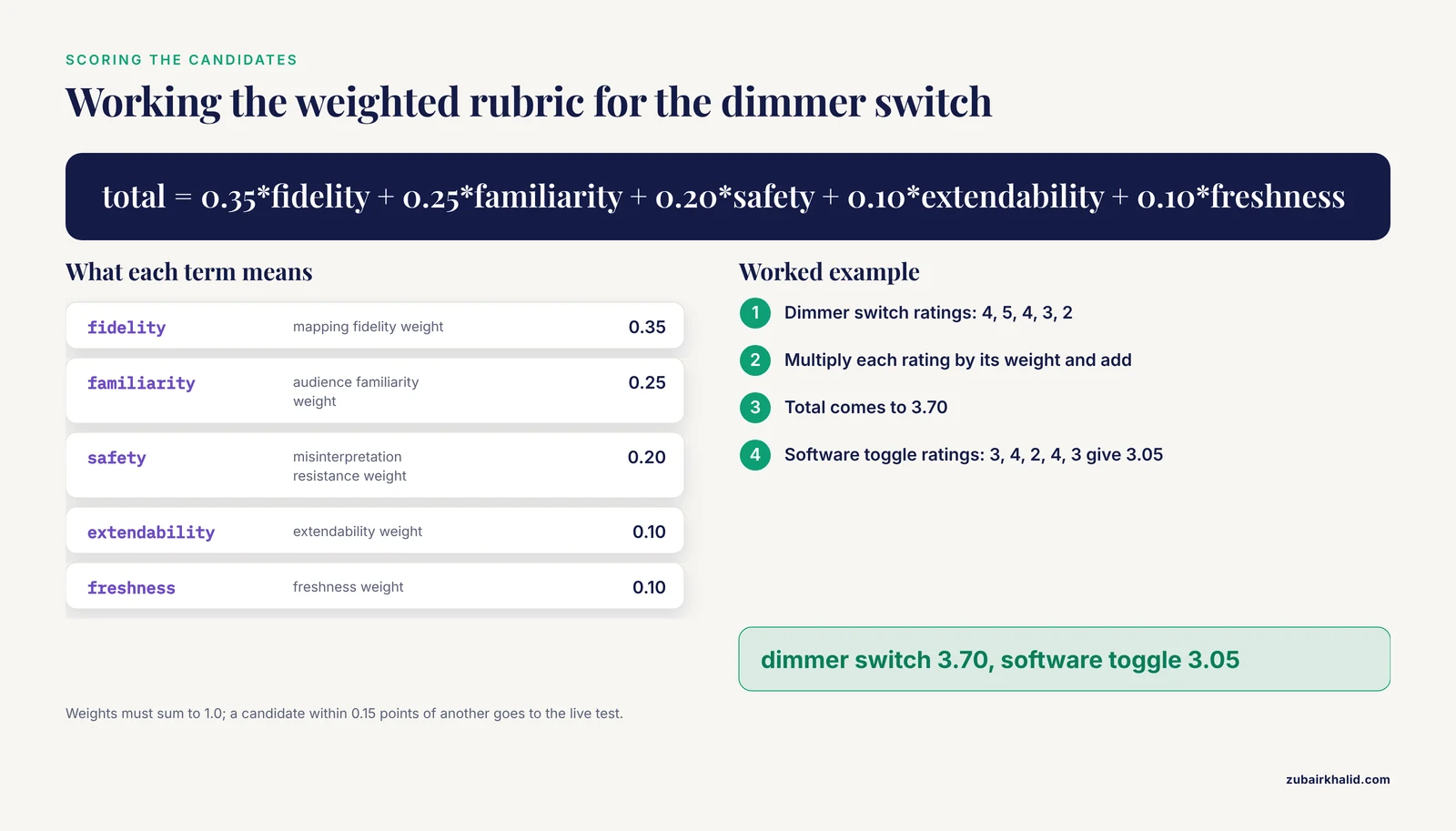
Assign a score from 1 to 5 on five criteria. Two criteria, fidelity and misinterpretation risk, are scored in reverse for risk, meaning a high score means low risk, so that higher totals are always better.
| Criterion | Weight | What a 5 looks like | What a 1 looks like |
|---|---|---|---|
| Mapping fidelity | 0.35 | Captures all target features correctly | Captures one feature, and distorts it |
| Audience familiarity | 0.25 | Every listener uses the source system weekly | Almost no listener has encountered it |
| Misinterpretation resistance | 0.20 | Imports no false features | Imports a misconception the audience will repeat |
| Extendability | 0.10 | New questions map cleanly onto it | Every follow-up question breaks it |
| Freshness | 0.10 | Novel enough to be remembered | So overused the audience hears it as noise |
The weights total 1.0. Adjust them to your setting. For a grant review panel, raise fidelity to 0.45 and drop freshness to 0.05. For a public science festival, raise audience familiarity to 0.35. The weights are parameters you own, not constants of nature, and declaring them before scoring keeps the process honest.
Step 5. Automate the arithmetic
If your candidates live in a text file, a short script keeps the scoring consistent across talks. Save this as score_analogy.py:
weights = {
    "fidelity": 0.35,
    "familiarity": 0.25,
    "safety": 0.20,
    "extendability": 0.10,
    "freshness": 0.10,
}

def score_analogy(name, ratings):
    missing = [k for k in weights if k not in ratings]
    if missing:
        raise KeyError(f"Missing rating(s) for '{name}': {missing}")
    if abs(sum(weights.values()) - 1.0) > 0.001:
        raise ValueError("Weights must sum to 1.0")
    if any(not 1 <= v <= 5 for v in ratings.values()):
        raise ValueError("All ratings must be between 1 and 5")
    total = sum(weights[k] * ratings[k] for k in weights)
    print(f"{name}: {total:.2f}")

score_analogy("dimmer switch", {
    "fidelity": 4, "familiarity": 5, "safety": 4,
    "extendability": 3, "freshness": 2,
})
score_analogy("software toggle", {
    "fidelity": 3, "familiarity": 4, "safety": 2,
    "extendability": 4, "freshness": 3,
})
Expected output:
dimmer switch: 3.70
software toggle: 3.05
The dimmer switch wins because its one weakness, mild staleness, costs it little, while the toggle's false implication of binary switching costs it heavily on the safety criterion, which carries a 0.20 weight.
Step 6. Read the errors, not just the output
The script raises three failure modes you will also hit when scoring by hand, and each has a direct fix:
KeyError: Missing rating(s) for 'software toggle': ['freshness']. A candidate has an unrated criterion. Fix by scoring every criterion for every candidate before comparing totals. Unrated criteria are usually the ones you were avoiding because the candidate performs badly on them.ValueError: Weights must sum to 1.0. You adjusted weights for a new audience and broke the total. Fix by renormalizing. If you raise fidelity to 0.45, lower something else by 0.10.ValueError: All ratings must be between 1 and 5. A rating fell outside the scale, usually a 0 entered for "does not apply." Fix by rating it 1 and writing a note, because a candidate that fails a criterion entirely should lose points, not be exempted from scoring.
The most important diagnostic is not in the error messages. If two candidates land within 0.15 points of each other, the rubric cannot distinguish them, and the decision should move to the live test in Step 8.
Step 7. Define the boundary of the analogy explicitly
Before you present, write one sentence stating where the analogy stops. For the dimmer switch: "The dimmer captures graded control of expression. Unlike a light circuit, methylation patterns can be copied when DNA replicates, and some marks persist through many cell divisions." Put this boundary sentence either in your speech or, better, as a small footnote line on the research presentation slides where the analogy appears. Presenters who state the boundary out loud recover faster when a question pushes past the mapping, because the limit was already on the record.
Step 8. Test on one live listener before the talk
Sit down with a colleague who matches your target audience and does not work in your subfield. Deliver only the analogy, in under sixty seconds, then ask them to explain the concept back to you in their own words. If their restatement imports a feature you never claimed, the analogy over-maps and you need a new boundary sentence or a new candidate. If their restatement misses a target feature, the analogy under-maps and you need to make the mapping explicit on the slide.
This test costs ten minutes and catches more failures than any amount of internal review, because the failure mode of an analogy is invisible to the person who built it. The mapping exists in your head, complete with the caveats. In the listener's head, only the comparison exists.
Matching Analogy Type to Talk Type
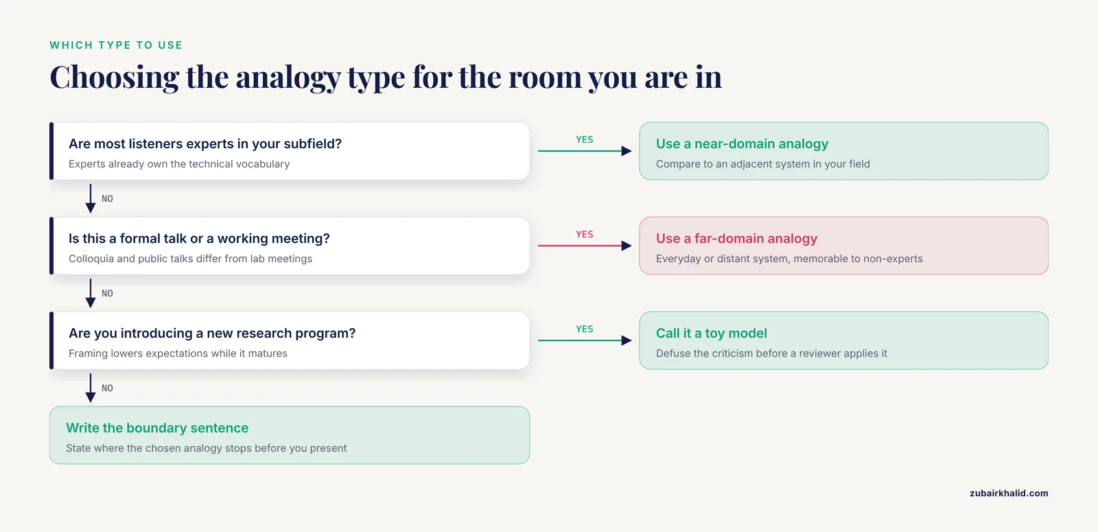
The rubric treats all analogies as interchangeable. They are not, and recognizing the main types keeps you from applying a public-lecture comparison to a lab meeting. The classification below parallels the way methodologists organize techniques by analogy with established categories, in the same spirit as classifying management methods by analogy into economic, organizational-administrative, socio-psychological, and technological types [8].
| Analogy type | Best setting | Main strength | Main risk |
|---|---|---|---|
| Near-domain (adjacent system in your field) | Lab meetings, methods talks | Supports genuine problem solving [1] | Can feel trivial to experts |
| Far-domain (everyday or distant system) | Colloquia, public talks, teaching | Memorable, reaches non-experts [1] | Imports false features under pressure |
| Toy model | Introducing a new research program | Legitimizes a system before it matures | Audience dismisses it as a plaything |
| Extended central metaphor | Framework-level talks, reviews | Organizes an entire narrative | Becomes a scientific myth if overstretched [3] |
| Classification analogy | Talks proposing taxonomies or methods | Anchors the new in the familiar | Hides genuine differences between classes |
The toy model deserves a note. Physicists studying artificial spin ice explicitly framed their system's trajectory as moving from scientific toy to material by design, using the toy framing deliberately to lower expectations while the system's potential matured [9]. Calling your own work a toy model, on your own terms, can defuse the criticism before it lands. Letting a reviewer apply the label first costs you the framing.
The extended central metaphor carries the highest stakes. When a metaphor matures into a central scientific framework, it stops being a communication aid and starts determining which experiments get run, as the computer metaphor did for cognitive science [2]. If your talk proposes such a framework, as recent work proposing music as a metaphor for brain dynamics does, emphasizing continuous adaptation, context dependence, and multiple simultaneous layers of meaning [2], your analogy choice is itself a scientific claim. Score it with the fidelity weight pushed high, and expect expert audiences to probe the mapping hard.
Common Mistakes and Limitations
The mistakes below account for most failed analogies in real scientific presentation settings. Each one is fixable in minutes once you know to look for it.
Mistake 1: Choosing the analogy before choosing the audience. The addressee factor, the channel, and the communicative situation jointly determine how a scientific idea lands [6]. An analogy chosen in the shower, before you have written down who is in the room, is a guess. Run the fifteen-minute audience audit first.
Mistake 2: Pushing the analogy into illegal territory. A comparison becomes an "illegal analogy," in the terminology used in analyses of manipulative speech, when the claimed shared features do not actually support the conclusion being drawn [4]. The signal that you have crossed the line is when you find yourself defending the analogy itself, rather than the science, in the question period. Fix by writing the boundary sentence from Step 7 and holding to it.
Mistake 3: Letting the metaphor do logical work it cannot support. Classical logic treats an analogy as an inductive move, not a deductive proof. Methodological work on presenting research results correctly emphasizes that conclusions must be warranted by the logical content of the evidence, not by rhetorical force [10]. If a skeptical colleague could dismantle your argument by dismantling your analogy, the analogy is load-bearing, and that is a structural flaw. Restructure so the data carries the argument and the analogy carries the intuition.
Mistake 4: Bundling too many features into one comparison. The persona-based partition from visualization design applies directly. Shared tasks go in the main analogy. Group-specific tasks get their own handling. One comparison carrying five concepts fails on all five.
Mistake 5: Using a far-domain analogy in a working meeting. Observational evidence shows far-domain analogies simply do not function as reasoning tools inside lab groups, even though they thrive in formal talks. Bring the dimmer switch to the colloquium. In the project meeting, compare methylation to a well-characterized adjacent chromatin system instead.
Mistake 6: Skipping the live test. In the medical student survey, the strongest reported challenges were time constraints, the need for more practice, and adapting to audience expectations, and presentation skill correlated strongly with communication skill overall [7]. Rehearsal time spent testing the analogy on a real listener is the highest-yield rehearsal time available, and it is the first thing cut when schedules compress.
A limitation worth naming once. No rubric replaces knowing your own material and your own audience. Individual talks vary in context, constraints, and expectations, and the judgment of an experienced mentor who knows your field still outperforms any scoring script. Use the method to structure your thinking, not to replace it.
Where the Analogy Lives on Your Slides
Research presentation slides should carry the analogy lightly. Three placements work:
- Title or section-transition slide. A single image of the source system, with no text beyond a short caption, primes the audience before the technical content arrives.
- The concept slide itself. Place the source system image and your actual system image side by side, with the mapped features labeled on each. Visible labels make the boundary of the mapping explicit without a footnote.
- Never as a wall of text. An analogy paragraph on a slide invites the audience to read instead of listen. The spoken boundary sentence and the labeled pair of images do the work.
If your talk runs short on time, the analogy is the wrong thing to cut. Cut a supporting detail instead. The analogy is what the audience will still hold three weeks later, and the medical student data showing interns identifying more strongly as storytellers than students in earlier years, with a self-rating of 7.9 out of 10 [7], fits the broader pattern that narrative framing skill grows with presenting experience. Investing in the analogy now compounds across your career.
Frequently Asked Questions
How do I choose an analogy for a scientific presentation step by step?
Audit your audience's existing knowledge, list four to six candidate analogies, map each one feature by feature against your concept, score the candidates on a weighted rubric covering fidelity, familiarity, misinterpretation risk, extendability, and freshness, state the analogy's boundary explicitly, and test the winner on one live listener before the talk.
What makes an analogy bad or misleading in a scientific talk?
An analogy becomes misleading when it imports features the audience will wrongly transfer to your concept, or when it is stretched to support conclusions the shared features cannot carry. The documented manipulation technique of making illegal analogies describes exactly this overreach [4], and in a scientific setting the same overreach produces honest but false understanding.
Should I use the same analogy for expert and non-expert audiences?
No. Experts benefit from near-domain analogies tied to adjacent systems in your field, which remain active reasoning tools among scientists, while non-expert audiences need far-domain analogies drawn from systems they use daily. Reusing a public-lecture analogy in front of experts risks patronizing them and underselling the technical content.
How far can I stretch an analogy before it breaks?
Stretch it until the next feature you want to transfer no longer maps cleanly, then stop and say so out loud. A written or spoken boundary sentence, such as "the dimmer switch captures graded control but not inheritance of the pattern," protects you in the question period and trains the audience to ask where the mapping ends.
Do analogies belong on research presentation slides or only in the spoken talk?
Both, in different forms. Slides should carry the analogy as a labeled pair of images, the source system and your system side by side, with mapped features marked on each. The boundary statement works better spoken than written, and full analogy paragraphs on slides reliably pull audience attention away from your delivery.
How do I test whether my analogy actually works?
Deliver it in under sixty seconds to a colleague who matches your target audience but does not work in your subfield, then ask them to explain the concept back to you. A restatement that imports features you never claimed signals over-mapping. A restatement that misses your target features signals under-mapping.
Can an analogy mislead me as a scientist, not just my audience?
Yes. Central metaphors shape theoretical frameworks, empirical questions, and research methodologies, sometimes for decades, as the computer metaphor did for the mind and brain sciences [2]. If your working analogy determines which experiments you consider worth running, examine it with the same skepticism you apply to your data.
How much of a talk should an analogy take?
A working target is sixty to ninety seconds to introduce, plus the boundary sentence, inside a talk of any length. If your analogy needs five minutes to set up, it is doing work your concept slide should do, and the setup is a sign the mapping is too complicated for the audience you chose.
Sources
- Analogies Out of the Blue: When History Seems to Retell Itself
- Music as a scientific metaphor for mind and brain.
- LINGUO-COGNITIVE MECHANISMS FOR THE FORMATION OF A SCIENTIFIC MYTH IN POPULAR SCIENCE DISCOURSE: TO THE STATEMENT OF THE PROBLEM
- Methods of speech manipulation of factual and logical levels in information and analytical texts of English-language media
- Same Data, Different Audiences: Using Personas to Scope a Supercomputing Job Queue Visualization.
- The project of the “turn” of Siberian rivers: The dynamics of presentation in the texts of the Soviet media
- Beyond Curriculum Reform: The Influence of Integration on Communication and Presentation Skills in Medical Students: A Mixed-Method Study.
- Self-management: methods and implementation stages
- Artificial spin ice: from scientific toy to material by design (Presentation Recording)
- Syllogisms and Corrective Inductive Analysis in Pedagogical Research as Factors Determining Its Scientific Value